joe_l
-
Posts
1,093 -
Joined
-
Last visited
Everything posted by joe_l
-
I would love to see a simple toggle for show / hide. Currently working on a layout, which looks very similar, but has small differences. Right now I am too often clicking on the show / hide buttons for my taste.
-
Inserting picture over or next to text
joe_l replied to Finn Bjørklid's topic in Desktop Questions (macOS and Windows)
Of course you can place a file without pasting. Just use the Place tool or via menu File > Place. Just be sure, that no textframe is selected while doing so. -
Inserting picture over or next to text
joe_l replied to Finn Bjørklid's topic in Desktop Questions (macOS and Windows)
There seems to be a Text Wrap active. This can be found at the top context toolbar. If it is not visible for you, you can add it via menu View > Customise Toolbar. -
A clumsy workaround would be, that all the off-canvas elements would be in a massive bleed area. Unfortunately Illustrator CS6 (Win) only allows 25,4 mm bleed, newer versions seem to not have this restriction.
-
I don't know if this was asked before: E.g. three attached pages in a row of width 210 + 7 + 210 mm. It would be nice to have fold marks for the 7 mm page. Of course I could set them manually, but it would save some time. From time to time I would need this feature.
-
Ups. Übersehen. Es ist so, wie du gesagt hast. Entweder Füllung auf Transparent setzen oder den von dir erwähnten Button anklicken. 👍
-
Das ist alles heiteres Rätselraten ohne die Publisher-Datei und die PNG, denn mit Transparenzen hatte ich noch nie Probleme in Publisher.
-
Semipraktisch. Wie gesagt, Publisher-Datei und PNG zippen und hochladen. Müssen ja nur diese beiden Elemente sein.
-
Glaube ich nicht. Weiß es aber nicht, weil ich auf Win unterwegs bin. Zwei Möglichkeiten: a) Du lädst mal ein Publisher-Testdokument hoch. Bild hast du ja bereits hochgeladen. EDIT: Zur Sicherheit auch die PNG, am besten als ZIP verpackt. b) Klick den Bilderrahmen an mit dem Tourenplan an. Ist oben in der Kontextleiste die Schaltfläche "Füllung beim Einsetzen von Inhalten löschen" aktiviert? Wenn Ja, einmal deaktivieren bitte.
-
Wenn du beim Export bei Matte keinen Fehler gemacht hast, dann ist es so wie Walt beschrieben hat. Ist der Hintergrund von Publisher Weiß, dann sind die transparenten Teile natürlich auch weiß. Leg mal etwas Farbiges hinter dein PNG des Bilderrahmens und du wirst sehen, dass die Transparenz nicht mehr Weiß ist. Was willst du denn mit der Transparenz des Bildes erreichen?
-
Konturen werden als Flächen exportiert
joe_l replied to Gerhard 1967's topic in Desktop Questions (macOS and Windows)
Ändere bitte alle Elemente im Kontur-Panel auf "Ausrichten: Umrisslinie mittig ausrichten". Dann sollte der Export korrekt sein. Change the stroke alignment for all elements to "Align stroke to centre". -
This is a short-lived post and one I get punished for I guess. For no good reason I thought last night on how to decorate a leading zero. Suddenly I had an inspiration ...

-
- 2
-

-
Designer 2 random missing text on PDF import
joe_l replied to rdA Design's topic in Desktop Questions (macOS and Windows)
For some reason the text will be hidden by curves being a child of the text. Look up e.g. 3150 mm in the Layers panel, expand the layer and remove the curve. -
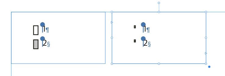
I have a small textframe with two pinned (float) rectangles. Whenever I copy and paste this textframe the rectangles become smaller. This happens within a document. And to my knowledge the textframe wasn't copied from a document with different DPI. Trying to create this from scratch doesn't show a downscaling. HWA on or off makes no difference. .afpub is attached. copypaste.afpub
-
Document won't export in anything other than low res
joe_l replied to Jane P's topic in Desktop Questions (macOS and Windows)
I wonder why I had no problems exporting. -
Document won't export in anything other than low res
joe_l replied to Jane P's topic in Desktop Questions (macOS and Windows)
Do you have a crash report? The devs might be interested in that. Nothing unusual in your settings. Debugging the hard way: 1) Try to export only portions of the document, e.g. pages 1-10. If this fails then try to export 1-5 etc. pp. 2) If every page fails to export, replace the used fonts one by one with e.g. Arial. This is MY way of debugging if everything else does not work out. -
Document won't export in anything other than low res
joe_l replied to Jane P's topic in Desktop Questions (macOS and Windows)
Exports fine for me as well. Should the document be printed? With no bleed? What I cannot clear is the overflowing page number on page 19. PDF press ready is attached. Grant App.pdf -
Affinity Design crashes when loading PDF
joe_l replied to Wusuraambya's topic in V2 Bugs found on Windows
For those large documents I would recommend Affinity Publisher (equivalent to Indesign), not Affinity Designer (equivalent to Illustrator). Affinity Publisher might not crash. If it does, a crash report would be useful for the devs from Serif. -
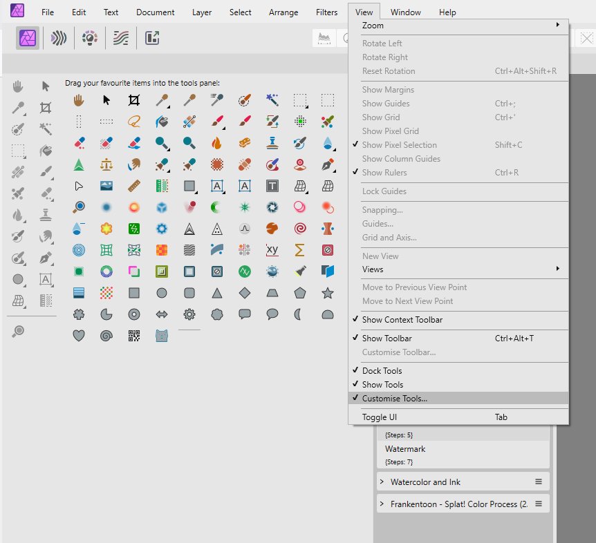
But you are looking for the menu in Affinity Photo? Not Affinity Designer or Affinity Publisher? It was always there, even five years ago. Edit: To make this clear. Customise Tools is in every application, but not with the toolset you are looking for. Or you were not ticking the tool. Some have a small triangle, hiding more tool "beneath" it.
-
You are right, this file was creating while experimenting. Nothing I would do normally.
-
Hmm. Does not work for me. EDIT: Interesting. Your method works if I turn off HW acceleration. EDIT 2: Top left node still behaves strange, even with HW acceleration off. 🤔
-
No problem. nodesbehaviour.afpub
-
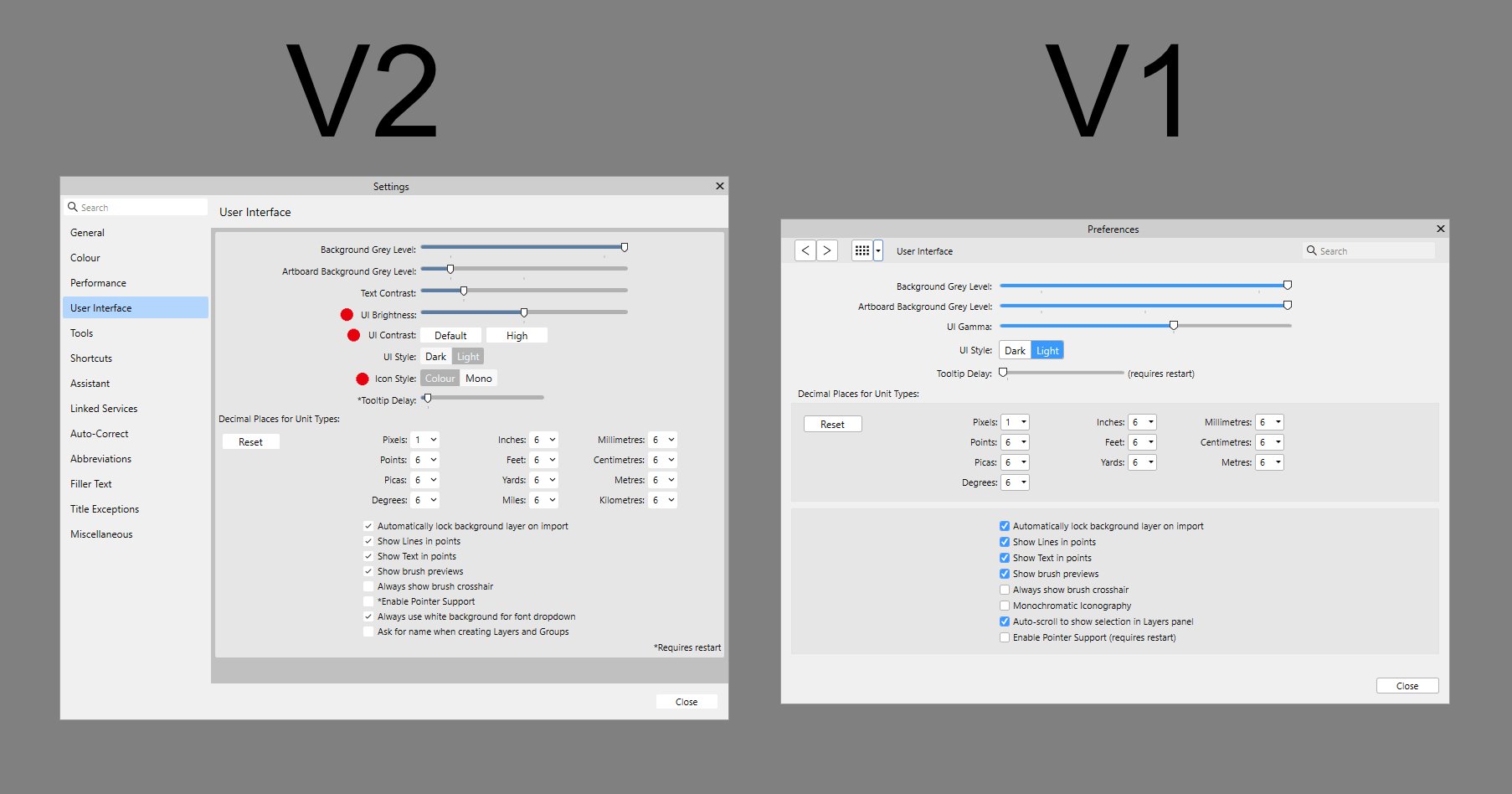
There were some options added in V2, have you tried them already?
-
Affinity Designer: First Impressions
joe_l replied to PromoDesigner's topic in Feedback for the Affinity V2 Suite of Products
There are layers and there are Layers. I often complained about this wording. I would prefer elements and layers. If you add a Layer via the button on the Layers panel and move the elements into this Layer, "Include layers" preserves this structure. I don't see too much annoyance in this. You have to use a command anyway in Illustrator. If it is CTRL+S or ALT+E makes no big difference to ME. You can hit the dot . on the keyboard to get the regular bounds. Yes, I would like to see this too to have a sticky option for that. -
I turned a modified rectangle into a textframe. Moving the nodes irritates me a bit. Is this correct? Attached a video, where the first three nodes behave correct (my opinion), whereas the other three nodes behave wrong (my opinion). nodesbehaviour.mp4