typeglyph
-
Posts
36 -
Joined
-
Last visited
-

affinity designer 2.5.5 smooth curve crash
typeglyph replied to typeglyph's topic in V2 Bugs found on macOS
thank you very much... -
affinity designer 2.5.5 smooth curve crash
typeglyph replied to typeglyph's topic in V2 Bugs found on macOS
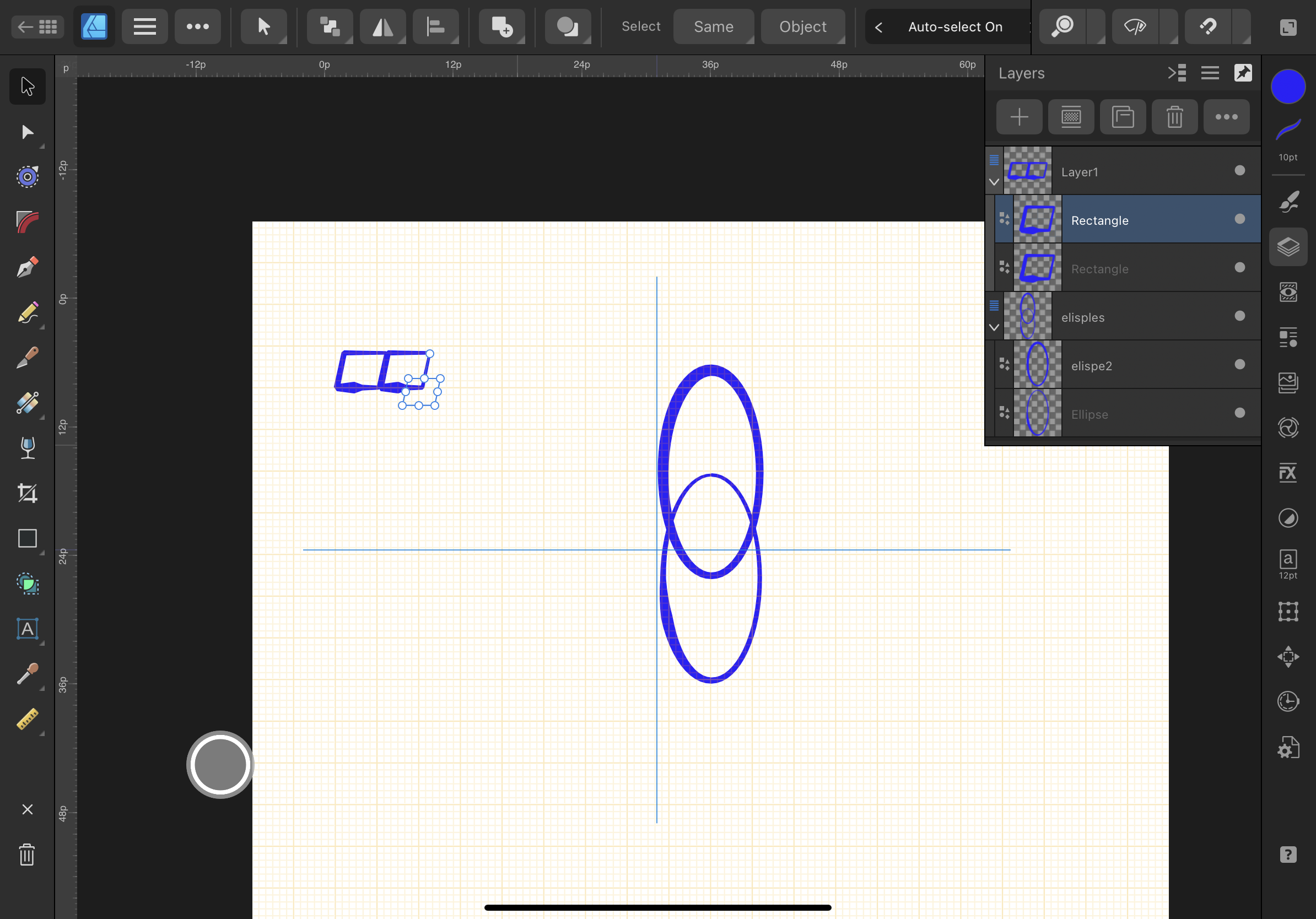
I can attach the file. What happens when selecting the smooth curve function and having 5+ nodes selected it crashes. You don't have autotrace yet (there are some codes on github) so I use Glyphs app for tracing. Tools to help here would be: 'remove short segments', delete overlapping nodes' (with tolerance 0 = no point difference x,y with up to 3 point x,y difference and fractional inbetween). An easier method to create bezier nodes with BCPs [rt click is ok but sometimes fails]. I am attempting to simplify the wood cut image and add a background colour. Ultimate target will be embroidery shirt pocket size. Currently too many nodes which results in artifacts. My major wish for Designer would be typographic tools like in Publisher and RTL support in all three.... cyclist blk.afdesign -
After selecting a few nodes to smooth the software crashes. This has happened 5 times selecting different nodes. attached is the crash report from MacOS 15.0.1 M1 16gb affinityDesigner2.5.5-crash-rpt.rtf
-
I'd ask why, but it is obvious to HCD, that a simple search function should be on the Affinity Web presence on Learn & Spotlight pages. And it should be prominent at the top of the pages. Screenshot 2023-12-02 at 17.48.24.pdf Screenshot 2023-12-02 at 17.47.59.pdf
-
typeglyph changed their profile photo
-
 MikeO reacted to a post in a topic:
Vector/pattern fill
MikeO reacted to a post in a topic:
Vector/pattern fill
-
Sean Sorry I've been away. iPad Pro [3rd gen] OS 16.6.1 Display zoom is default. Brightness is at 100 with true tone. This does not happen in the 2.0 version. I am on a computer now and I have not tried this on the desktop beta. One other thing if you would pass it on to Publisher folks. Pub 2.0 and 2.1 beta. Changing the type size by typing the point size. Then hit the tab key to "exit the requester" when you move the mouse the point size changes dynamically... this is an unwanted behaviour. Using the tab key to exit a requester is quite normal on MacOS. Many thanx pattern test.afdesign
-
Humbucker reacted to a post in a topic:
Where is the Document Menu?
-
Where is the Document Menu?
typeglyph replied to Humbucker's topic in Desktop Questions (macOS and Windows)
I am not sure which program you are asking about: Publisher: top most menu bar > Window > Font Manger Font Manger is near the top of the list Designer and Photo I do not believe have this function instead use the resource manager found again in the Window menu. I have found that often time the help function actually does help. -
Folks at Serif and end users. Screen readers use the document's structure, HTML and CSS to interpret that structure. HTML and CSS are ALSO part of ePub. So two benefits
-
HawaiiAna reacted to a post in a topic:
Tagged PDF support for accessibility
-
Note in the screen shot the artifact for the sheared rectangle not on the actual rectangle selected. Designer 2.1 beta 1713

-
Vector/pattern fill
typeglyph replied to jc4d's topic in Feedback for Affinity Designer V1 on Desktop
Comet I guess you waited a decade or more for Illustrator to get vector pattern fill, I do not remember it in version 8. -
I was able to replicate this crash. I was modifying the decorations in a paragraph style, that would become a style. Attached is a pdf of the crash report sent to Apple. iMac M1, Monterey 12.6 16GB ram crash repost AF-pub.pdf
-
Pyanepsion reacted to a post in a topic:
Publisher workbook: errors and typos
-
Old Bruce reacted to a post in a topic:
Publisher workbook: errors and typos
-
Publisher workbook: errors and typos
typeglyph replied to Pyanepsion's topic in Feedback for Affinity Publisher V1 on Desktop
Pyanepsion, what would be even better than just a translation — a version of Brinhurst that addresses the nuances of multi-language typography. Back in the day of metal [and wood] sorts, the accents were integrated with the character. The Angstrom was nestled or cradled by the apex. The diareses was inside the counter of the geometric O or on the side of the A apex not just dangled on top. As an example look at the original designs for Renner’s Futura or Frutiger’s Univers. Yes this brings up the design of the glyphs as another issue, and not part of this forum. My intention here is to highlight how myopic we’ve become because we can flick a few chicklets and set type. And to demonstrate how this myopic view generated from computer use has led to so many errors not just in the book but on the help pages as well. I remain impressed by how far Affinity has gone, and hope they will continue further with longer strides. -
Pyanepsion reacted to a post in a topic:
Publisher workbook: errors and typos
-
Publisher workbook: errors and typos
typeglyph replied to Pyanepsion's topic in Feedback for Affinity Publisher V1 on Desktop
Page 171 and others. According to the “elements of typographic style” by Robert Bringhurst – considered to be the bible on all things typographic: Pg. 325 Elements of Typographic Style, version 3.1 © 2005, Hartley & Marks. Em: In linear measure, a distance equal to the type size. Thus an em is 12 pt. [or a 12 pt square] in 12 pt type and 11 pt [or an 11 pt square] in 11 pt type. Also called a mutton En: Half an em. To avoid misunderstanding when instructions are given orally, typographers often speak of ems as muttons and ens as nuts. Look on page 323 to see the definition of ‘body size’ or type size. Pages 80 to 83 will give you a more professional look at the use of dashes etc. At no point in many of the more astute texts on typography do they refer to the dashes as being the height of an upper case glyph. The full body of the metal glyph is used to measure the point size or body size. The old adage “to err is human, but it takes a computer to really F*** things up” is very true especially in fine typography & font design. Do strongly consider using standard typographic definitions please. Consider also multiple languages use things differently than English (British/Canadian and the USA version is really dfferent — hence the American Dictionary) -
Vector/pattern fill
typeglyph replied to jc4d's topic in Feedback for Affinity Designer V1 on Desktop
R C-R, Most OSs have icon hints. Hold your cursor over the icon and a little flag will pop up with the function. -
capegreg reacted to a post in a topic:
Request for a statement about PDF accessibility from Serif please
-
MarkWahlstenDI reacted to a post in a topic:
Tagged PDF support for accessibility
-
The Accessibility Checker in Acrobat, usually returns “errors” on items that need manual checks. This table in PaoloT post shows areas that the “designer” failed to initiate in the overall structure of the document. Besides Acrobat DC. There are other tools available (especially in the Windows world) that will remediate documents. At this point in time Affinity Publisher does not do this. Most screen readers require a structured document in order for them the provide “accessibility”. They do this via “tags” and these tags are part and parcel of an extensible markup language (the subset is hypertext markup language, which is used in ePubs). Tags, document structure and tab order have to be in sync. MS Word has rudimentary document structure, and tags implemented through Character and Paragraph styles (same as InDesign). MarkWahlstenDI makes strong points in his post above... At this point in time Affinity Publisher does not do this. Also Photo and Designer will need to add alt text descriptions to images.
-
 typeglyph reacted to a post in a topic:
HTML export/import is required please.
typeglyph reacted to a post in a topic:
HTML export/import is required please.
-
Megnusin reacted to a post in a topic:
Vector/pattern fill
-
One thing missing is the ability to have table styles and cell styles. Background fills and stroke styles applied as needed. Styles make workflow so much better.