TinaInNH
-
Posts
12 -
Joined
-
Last visited
-
 NotMyFault reacted to a post in a topic:
Change aspect ratio in Affinity Designer 2
NotMyFault reacted to a post in a topic:
Change aspect ratio in Affinity Designer 2
-
Change aspect ratio in Affinity Designer 2
TinaInNH replied to TinaInNH's topic in Desktop Questions (macOS and Windows)
This puts undue burden on users. We've given you the feedback in detail, at our own time expense. I understand "this would not be the correct way to raise this, as it's not a software bug according to our development team." Providing feedback is onerous enough without us having to consider "the correct way" to address your internal process and convince recalcitrant developers. We are trying to make your product better. -
 R C-R reacted to a post in a topic:
Change aspect ratio in Affinity Designer 2
R C-R reacted to a post in a topic:
Change aspect ratio in Affinity Designer 2
-
Brian_J reacted to a post in a topic:
Change aspect ratio in Affinity Designer 2
-
Alfred reacted to a post in a topic:
Change aspect ratio in Affinity Designer 2
-
Change aspect ratio in Affinity Designer 2
TinaInNH replied to TinaInNH's topic in Desktop Questions (macOS and Windows)
Dan, please provide a pointer to the "Feedback section" if that's where we need to report this, but really I want this to post suffice without me finding somewhere else to write this. The nearly invisible icon in light mode is clearly a bug, as we all agree. It is industry practice to gray out disabled buttons/icons, so graying out the button to indicate a state change other than disabling is wrong in both dark and light mode. I understand it is "as intended." It is a design bug. It needs fixing. Contrast testing is required. There are free sites for this. Don't rely on the objective assessment of developers, especially if they have good vision. This is good for all customers, and a legal requirement if any of your customers are government agencies, due to ADA. Consider redesigning the icons. I always have to experiment to determine to determine which icon means which state. Perhaps this is because the icon(s) are so delicate and low-contrast. I have decades of experience writing code, designing UIs, hiring developers and designers, addressing ADA issues for major corporations. The fact that code works "as intended" does not mean it is correct. Design, develop, test with real users, rethink, repeat. You have feedback from real users, so now you have the privilege of graduating to the next phase, to rethink and redesign. That's how software becomes excellent instead of limping along irritating customers. Don't dig in your heels telling users they are wrong. In this case, we're talking about an afternoon's worth of design and coding. These little details make a big contrast between Affinity and Adobe. -
Change aspect ratio in Affinity Designer 2
TinaInNH replied to TinaInNH's topic in Desktop Questions (macOS and Windows)
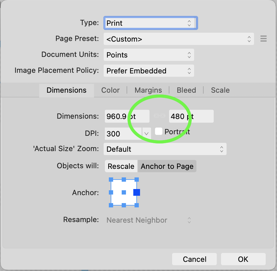
Here's the requested screenshot of the other state. Although I can see this one, in my opinion the contrast is too low for such a delicate graphic even in this case. Do some real contrast testing, don't just eyeball it.
-
TinaInNH reacted to a post in a topic:
Change aspect ratio in Affinity Designer 2
-
Change aspect ratio in Affinity Designer 2
TinaInNH replied to TinaInNH's topic in Desktop Questions (macOS and Windows)
Yes, I can see now, in the zoomed screenshot, that there is in fact a barely visible button. Even knowing it is there, I still can't see it on the running GUI. A frustrating bug in a high-use feature. Check out https://accessibleweb.com/color-contrast-checker/ -
Change aspect ratio in Affinity Designer 2
TinaInNH replied to TinaInNH's topic in Desktop Questions (macOS and Windows)
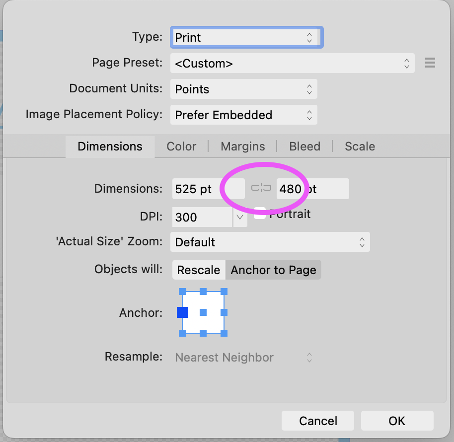
There is no chain button at all when the dimensions are linked, only when they are NOT linked. Therefor, I had nothing visible to click on, no affordance at all. This is a bug. Still, your guidance did solve my problem. When I click on the invisible button, the dimensions are no longer linked. Thank you. Is this sufficient as a bug report? Affinity Designer 2, 2.5.3 on MacOS 13.4.1
-
I want to change the aspect ratio of my document in Affinity Designer 2. File > Document Setup > Dimensions insists on preserving the old aspect ratio. If I change the width, it automatically changes the height. How can I get the dimensions to act independently?
-
Print > Document Layout > Model > Tiled
TinaInNH replied to TinaInNH's topic in V2 Bugs found on macOS
Sorry about the repeated files in the bug note. The attachments were hidden, so I uploaded multiple times. Note that the AD2 file was modified - I deleted a hidden image layer. -
Context Affinity Designer 2, latest Mac OS 13.4.1 (22F82) Print scale=100%, Document Layout > Model > Tiled Symptom The image is tiled, but on each page, only the bottom half of the image is rendered. The broken rendering is visible in the Print dialog's preview thumbnails and also on the printed paper. There are huge gaps in the image. The problem appears whether I choose letter or tabloid size. Workaround Use old Affinity Designer. I was able to cut and paste my AD2 layers into a newly created doc in OldAD and print from OldAD. Odd and probably important It seems that the file created in OldAD can be printed correctly from AD2. At least, the thumbnails in the Print dialog look correct. I didn't print that on paper. Plea Please fix. Matters a lot to me. V3 using AD2.afdesign V3 using old AD.afdesign V3 using AD2.afdesign V3 using old AD.afdesign
-
I can't figure out the Move tool. I select a rectangular area with the marquee tool, then click on move and I don't see any handles. When I drag from the area where I think the invisible handles might be, the marquee stays put and the whole image moves. This is beyond frustrating. I'm a software engineer with 40 years of experience. I used Photoshop daily for 15 years. I used the older Affinity Photo, but only occasionally, then upgraded to the new one. It shouldn't be this hard to figure out select, move, stretch. There must be a place to turn on the handles, but I've spent an embarrassing amount of time on this and I can't find it. Thanks.
-
Printing Gridlines
TinaInNH replied to Hill216's topic in Pre-V2 Archive of Desktop Questions (macOS and Windows)
I want this feature, too. Printing grid lines is useful for quilt designs. -
TinaInNH reacted to a post in a topic:
Tile printing
-
TinaInNH reacted to a post in a topic:
Tile printing
-
Dan, see attached. Psenda, it's in inches, not pixels. Thanks. Affinity 200729.afdesign
-
I'm trying to precisely place a rectangle. The canvas is 34x34. The rectangle is 34x34, at (0,0), so the rectangle should fill the canvas, but it doesn't. Note the very small edge of the transparent canvas background showing through on the right edge. This leads me to mistrust all the sizing and placing features, on all my layers, most hidden in the uploaded image.