Pyanepsion
-
Posts
1,060 -
Joined
Everything posted by Pyanepsion
-

SVG Format
Pyanepsion replied to Pyanepsion's topic in Feedback for the Affinity V2 Suite of Products
This kind of improvement would indeed make perfect sense as part of the 2.7 update, rather than waiting for a full 3.0 upgrade. -
Hello everyone, The arrival of QR codes in Affinity, with the integration into Canva, was a welcome improvement. It was expected, and it is certainly useful. However, time is passing, and the tool still remains too limited for truly professional use. Here are the main areas for improvement: – Narrow window: the field for entering the address is tiny, which makes it hard to read and verify. This is especially problematic for long URLs, which cannot be fully viewed or scrolled horizontally! – Visual appearance: the generated codes are very basic, with no option to enhance the design. This is surprising in software aimed at print and internet publishing. – Automatic linking: no hyperlink is associated with the QR code. It has to be added manually, which is time-consuming and prone to omission, especially in PDF files. – Hover effect: all links appear by default with an “Invert” highlight effect, often considered unattractive, with no option to choose a different style. – Error correction: it is not possible to adjust the redundancy level, which is essential in some contexts (damaged prints, complex textures, etc.). – Shapes and appearance: there is no option to customise the modules (rounded corners, circles, decorative styles), unlike what most other tools offer. – Logotype: it is not possible to insert a logo in the centre of the code — a very frequently used feature. Admittedly, it often raises legibility issues in competing tools. – Background: it is not possible to add a background behind the code (for example, a white square), which limits its readability on certain backgrounds. – Narrow window: the field for entering the address is tiny, which makes it hard to read and verify. – Styles and consistency: it is not possible to save a style or template for QR codes, which complicates consistency across multiple pages. – Master page limitation: unlike image frames, QR code frames placed on a master page cannot have their hyperlink edited individually on document pages. This prevents using them as dynamic placeholders, which would be especially useful for automating multi-page documents. – No automation: no function allows for generating several QR codes from a data source. Yet this is useful in personalised documents. A complementary tool, applying the same treatment options where appropriate, should also be considered alongside the QR code generator: – Barcodes: support for creating EAN or ISBN barcodes, which are essential in both print and web publishing. It is indeed time to bring this essential tool up to standard, as it has become important for many of us.
-
Hi, @Belleson, You made an excellent choice in adopting Affinity Publisher. It offers a much more professional working environment than general-purpose solutions. Equation editor Like you, I regret the absence of a proper equation editor. It would be an extremely valuable addition, particularly for technical and scientific documents. While Serif does not appear to prioritise this feature at present, it could significantly expand the software’s potential use cases. Perhaps you might consider supporting your request with examples of real-world needs, target demographics, and potential user benefit? Out of interest, how are you currently handling equations within Publisher? Automatic figure numbering and cross-referencing As for automatic figure numbering and cross-referencing, there are indeed indirect methods available, as @MikeTO has clearly explained. While not native, they are entirely feasible with a disciplined workflow. However Allow me, however, to nuance some of your comparisons. For professionals in editorial work, LibreOffice remains highly limited. Microsoft Office is markedly superior in terms of typographic precision, automation, and stability. In fact, many practitioners prefer not to accept ODT files, as the time required to correct them far exceeds their usefulness. Lastly, Affinity Publisher is not a successor to PageMaker, which was discontinued in 2004. It is better understood as a modern evolution of InDesign, itself the successor to QuarkXPress. Desktop publishing bears little relation to word processing: word processors serve us, as layout artists and typesetters, merely as a starting point—never as a final formatting tool. Have a great day,
-
Importing and exporting SVG files in Affinity Designer reveals several structural shortcomings that significantly limit the format’s usability in modern production workflows. I. Issues with SVG handling in Affinity – References not preserved: The xlink:href or href attributes, used to replicate elements without duplicating code, are neither recognised on import nor reinstated on export. Each instance is converted into a complete copy, nullifying the benefits of structural reuse and reduced file size. – Exported file size: SVG files generated by Affinity are often unnecessarily large and verbose, even for relatively simple documents. As another user also pointed out in a separate post¹, a well-structured SVG using approximately 200 references via href may result in a file of just 14 kB — while the same content exported from Affinity Designer can reach up to 16 MB, due to repeated full duplication of elements. This directly illustrates the structural inefficiency caused by the lack of reference reuse in Affinity’s SVG export. – Unexpected rounding and loss of precision: Bézier curves and coordinates are frequently approximated, leading to rounded shapes or slight distortions in the exported SVG. This compromises the visual fidelity and makes the output unreliable for use cases requiring vector accuracy. – Loss of <pattern> fills²: SVG files that include <pattern> tags cannot be properly imported into Affinity Designer, as the contents of the tag are not rendered. This means that SVG files created in other programmes cannot be correctly imported or edited in Affinity Designer. I consistently need to rework exported SVG files: I reduce their size by half, correct geometric inaccuracies, and document the structure, whether the files are intended for the web or for print publishing. It results in a considerable loss of time, and by extension, of money. II. Technical hypothesis These limitations suggest that Affinity’s SVG engine is based on an outdated and incomplete implementation — possibly derived from the original SVG 1.0 specification (W3C Recommendation, 2001), which was issued at a time when the format was still in its infancy. Many features introduced in later specifications (1.1, 1.2, and even the draft of SVG 2) do not appear to be supported. III. Industry impact and relevance Today, SVG is a strategic format across a range of industries: – Scalable vector graphics for user interfaces and games, – Laser cutting, CNC machining, and vector-based printing, – Web and mobile applications (particularly with libraries like D3.js and React), – Vector illustration workflows in AI image generation, prior to raster or 3D conversion. As it stands, Affinity’s support for SVG falls short of the needs of these professional contexts, especially when compared to open-source tools like Inkscape or proprietary software offering cleaner, more efficient exports. Conclusion The current SVG implementation is a major weakness in the Affinity suite³. A thorough overhaul of the import/export engine — with full support for references, groups, symbols, and precise coordinates — would not only align the software with modern standards, but also unlock new professional uses. ¹ SVG xlink:href / SVG 2 href for reused elements inside a document to reduce export file size ² Please implement vector pattern fill in Affinity Designer ³ Please create QR code with swquare hol for logos inside
-
Hello @matt.baker, Would you be able to share the original SVG file, along with the steps you followed to produce the .afdesign document? That would help clarify the software’s behaviour and illustrate the issue more concretely.
-
Publisher Document Setup Why?
Pyanepsion replied to bt1138's topic in Feedback for the Affinity V2 Suite of Products
📚 This discussion might serve as a gentle reminder that reasoning detached from reality tends to unravel when put to the test. At the very least, it has helped highlight that. And that, in itself, is worth something. -
Publisher Document Setup Why?
Pyanepsion replied to bt1138's topic in Feedback for the Affinity V2 Suite of Products
@bbrother, When professionals describe their actual workflow, and you respond with theories that are clearly AI-generated (we could even name which one)… the masquerade becomes obvious. End of discussion. -
Publisher Document Setup Why?
Pyanepsion replied to bt1138's topic in Feedback for the Affinity V2 Suite of Products
@bbrother — thank you for your detailed replies. Let’s now take a moment to clarify a few essential points, for the benefit of everyone following this discussion. 1. Steve Krug, an American based in Chestnut Hill, does not advocate following labels at the expense of logic. Quite the opposite. His well-known principle — “Don’t make me think” — means: “Design so clearly that the user never has to wonder.” It does not mean: “Place functions wherever the wording feels familiar.” What Krug (as well as Norman, Tidwell, Cooper…) consistently defend is this: A good interface does not maintain ambiguity — it resolves it. 2. The “Setup” menu acts on the container, not on the editorial structure. Changing a document’s size, margins, resolution or units affects the file itself, not its content. → That is precisely why its logical place is under File, alongside other global settings. Adding the label “of the document” is entirely appropriate, as it clarifies the scope of the command. → But it certainly does not justify a change of menu. 3. The “Document” menu is aptly named — but not everything containing the word “document” belongs in it. This menu is dedicated to editorial actions: adding pages, managing styles, navigating through sections… It is therefore perfectly legitimate and functionally sound. But that does not mean every command mentioning the word document must be placed there. → “Document Setup” modifies the container, not the editorial structure — which is why it rightly belongs under File. It is not the menu label that causes confusion, but an overly literal interpretation of it. In summary: Coherence, clarity and predictability remain the foundations of sound interface design — not lexical proximity. And that is precisely why, @BBrother, so many professional tools — and so many users — do not follow your reasoning. → And have not done so for nearly half a century. You are now defending the opposite of your own arguments, simply to avoid acknowledging the obvious. And evidently, you did not grasp the reference to the packet of sweets, nor the one about the banana peel — though both were perfectly clear. This is no longer a discussion — it’s a loop. Perhaps it’s time to consult the sources — the real ones — rather than argue from impressions. -
Publisher Document Setup Why?
Pyanepsion replied to bt1138's topic in Feedback for the Affinity V2 Suite of Products
@BBrother, we cannot follow you down that path. The distinction is clear, necessary and universal — even on digital game distribution platforms. Manufacturers who ignore it sooner or later adopt it… or vanish. Is that what you want, @BBrother? Here, have a banana split. And don’t worry — I haven’t confused the wrapper (the peel) with the content. 😊
-
Publisher Document Setup Why?
Pyanepsion replied to bt1138's topic in Feedback for the Affinity V2 Suite of Products
One must always instruct with the right tools. 75% soft caramel, 25% cocoa. 😊 -
Publisher Document Setup Why?
Pyanepsion replied to bt1138's topic in Feedback for the Affinity V2 Suite of Products
Thank you, @bbrother, for your response, which usefully clarifies the debate. We probably all agree on one essential point: user experience must take precedence. But that must be grounded in coherent logic, not in a superficial convenience of terminology. That a menu is labelled Document does not mean that everything related to the document must be placed there. Let me offer a concrete analogy: if you give someone a packet of sweets, no one would think to eat the wrapper simply because it, too, bears the word “sweets”. The distinction between what is consumed and what contains it is obvious — and it is just as obvious here. There is nothing artificial, then, in distinguishing: what relates to editorial content (pages, sections, styles), → which rightly belongs under Document; and what concerns the physical or digital properties of the file (page size, margins, resolution), → which naturally belongs under File. This structuring is anything but arbitrary: it has long been adopted by most software, especially in word processing and publishing (Adobe, Scribus, Microsoft, Jutoh, Soft-Logic…), because it promotes a clear, intelligible and sustainable interface. Affinity’s suite has nothing to gain by departing from these proven standards. And much to lose by clouding the interface in the name of a personal sense of consistency.
-
Affinity Suite: moving files tabs
Pyanepsion replied to Pyanepsion's topic in Feedback for the Affinity V2 Suite of Products
That sounds promising. Would you mind explaining how you did it? -
Publisher Document Setup Why?
Pyanepsion replied to bt1138's topic in Feedback for the Affinity V2 Suite of Products
The Document menu is traditionally intended, where it exists, for editorial or contextual actions. It includes: —options related to content, such as sections, pages, styles and navigation; —commands that affect the logical or narrative structure of the document; —and, in some cases, tools specific to page layout. → This menu operates on what the document contains, not on its ‘container’ (page size, resolution, etc.). The File menu, by contrast, is traditionally used for: —operations that apply to the document as a whole, such as opening, saving, exporting or printing; —global settings for the file, such as page format, margins, units of measurement, colour profiles or resolution. → These elements concern the physical structure of the file, which is why they are grouped under File, as it relates to the digital container of the document. As Ali rightly pointed out, there is also the Document Setup button, which is quite handy, as well as the Preferences button in both Affinity Publisher and Affinity Designer. This does not apply to Affinity Photo, since we are not dealing with a document, but with a working canvas. -
@Oufti Thank you for the video. It helped me understand how to insert the required space relatively easily. @carl123 I would add that automatic replacement should also cover superscripts when they exist in the font: typing superscript 2 should replace it with ² (U+00B2); typing 1er should replace it with 1ᵉʳ (U+1D49 and U+02B3). This would greatly simplify the transcription of text across different platforms. @MikeTO The use of spacing before punctuation marks depends on the typographic conventions of each language or publishing style. It should not be integrated into the typeface. This is not the role of the type designer, but of the typographer. This idea that these conventions should be managed by the font itself is, I believe, an American conception, far removed from typographic practice anywhere else. 🤫Yes, until this limitation is addressed, we’ll still have to rely on regex-based find-and-replace. Alas. Microsoft Word already implements something similar using its AutoCorrect and so-called "Automath" dictionaries. These apply formatting or character substitution depending on the context. Affinity Publisher could adopt a comparable approach.
-
Hello, I am working on fine typography in Affinity Publisher. Some high punctuation marks (such as ?, !, ;, etc.) must be preceded by a specific space. I cannot find any way to automate this in the automatic replacement module while typing (menu Preferences > Auto-correction > Replacement), which would allow automatic input without having to go through a long and tedious search. Example with U+2006: <word>? → <word><6/EMSP>? How should I proceed? Thank you for your help.
-
Export to .BMP please! (Affinity Photo)
Pyanepsion replied to Kaizu's topic in Feedback for the Affinity V2 Suite of Products
@Kaizu, The Affinity suite does support BMP files on import, but does not allow exporting to this format. This appears to be due to the fact that BMP is now rarely used, particularly in professional settings. BMP is indeed an uncompressed, bulky format, lacking support for advanced transparency or modern metadata. It has largely been replaced by formats better suited to current needs, such as PNG, TIFF, or JPEG XL. This absence of export functionality therefore necessitates using another piece of software to perform the conversion, which may seem surprising in the context of a suite designed for professional use. → It would thus be helpful to understand the purpose of your request, It might warrant future support. Serif’s position on this decision would also be of interest. P.S.: It is also worth noting that the list of export formats is still not arranged alphabetically, which unnecessarily complicates selection. It is surprising that such a minor detail — presumably easy to address — has yet to be implemented, despite the clear improvement it would bring to everyday usability.
- 3 replies
-
- 3
-

-
- proposal
- bmp export
- (and 1 more)
-
Affinity Suite: QR Code Tool
Pyanepsion replied to Pyanepsion's topic in Feedback for the Affinity V2 Suite of Products
The “Edit Frame Content” command does allow access to the QR code link, but at a cost. It appears to be impossible to restrict the edit to what is actually needed: the link, and nothing else. In practice, this is not true content customization, but a disguised full detachment, which opens the door to user errors and undermines the logic of the master layout. Concrete examples: In a document structured with several types of master pages (chapter starts, left pages, right pages, etc.), you may have 30 to 50 inherited QR codes per page. Having to activate Edit Frame Content on every page — while carefully avoiding any accidental shift, resizing or modification — quickly becomes unworkable in real production settings. → What is really needed is the ability to modify the QR code link directly on the page, while preserving the structure, position and appearance inherited from the master page — just like you can replace an image inside a frame without altering its placement. -
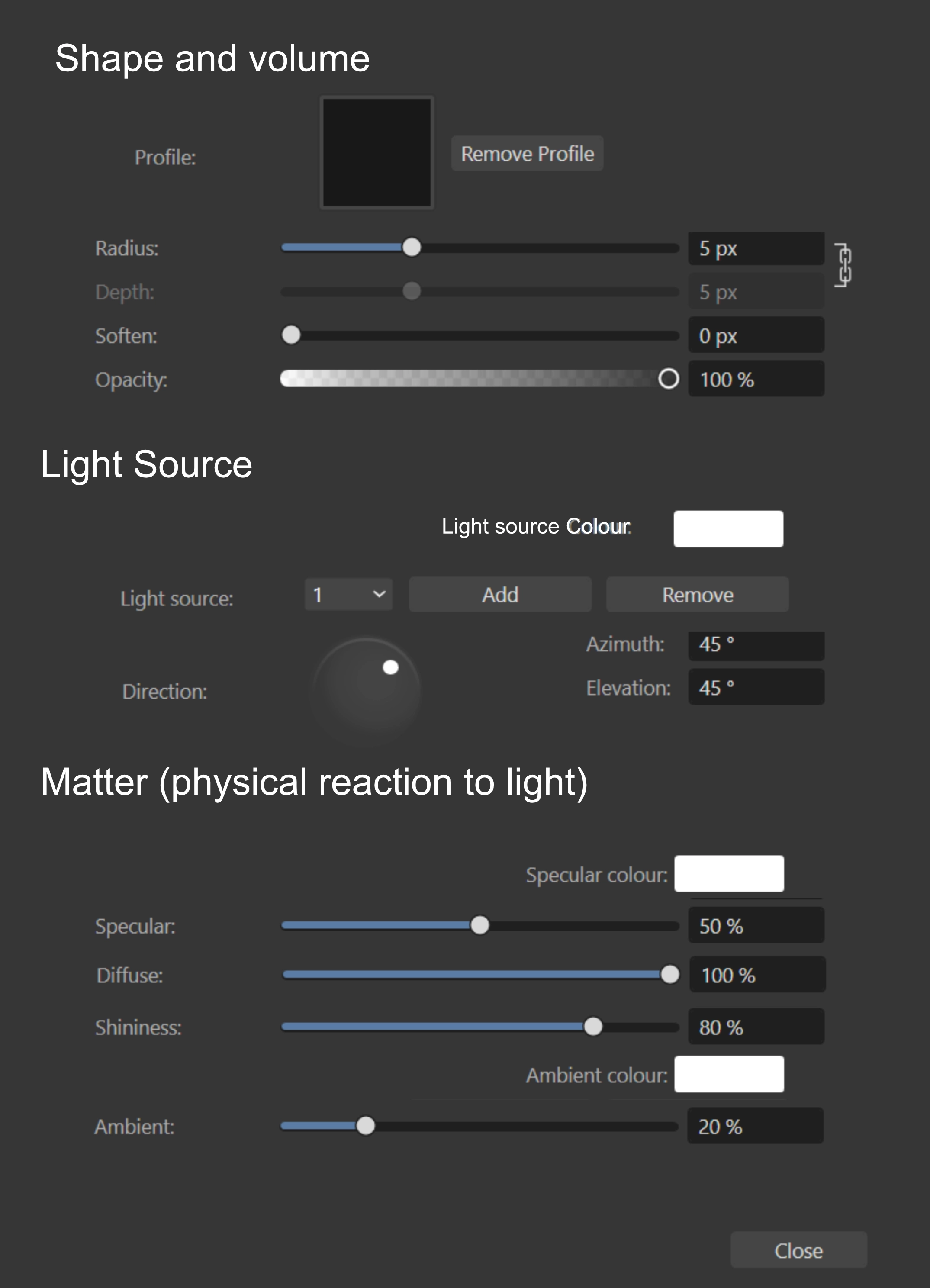
Hello everyone, While working extensively with the 3D Layer Effect in Affinity Publisher, I’ve noticed that the current layout of the panel is somewhat confusing — and at times contradictory. It mixes unrelated controls, separates logically linked ones, and doesn’t follow a clear progression from object to light behaviour. To help clarify the interface, I’ve restructured the panel into three functional areas. I’m sharing here a visual mock-up of a proposed reorganisation, along with some terminology refinements and a note on a likely bug. 🔁 Current issues Related parameters (e.g. Specular and Specular Colour) are currently separated. Light source attributes and material reactions are mixed in a flat list. The logic of progression — from object shape to lighting interaction — is not reflected in the current order. Labels such as Add / Remove are semantically misleading. ✅ Reorganisation principles This revised structure follows a logical and ergonomic order: Shape and Volume Defines the object’s physical geometry and depth profile. Light Source Describes the number, position, and colour of the light source(s). Matter (Physical Reaction to Light) Groups the material’s optical properties, including diffuse, specular and ambient responses — with each value paired to its corresponding colour field where applicable. I’ve also renamed Light source Colour (previously just Colour) for clarity and consistency. The mild redundancy is intentional: repeating the term Light source helps visual scanning and reinforces category separation. You can view the mock-up below: The panel is slightly taller, but it’s also much more readable and easier to work with. Grouping related controls and adding spacing between sections brings real comfort — especially during longer editing sessions. ⚠️ Minor bug report The Remove button under Light Source does not behave as expected: while it reduces the number of light sources, the object doesn’t update accordingly in real time. A manual refresh (disabling/re-enabling the effect) is needed to reflect the change. Moreover, the labels Add and Remove are problematic: Add may be confused with Add blending modes or other addition-type operations found elsewhere in the interface. Remove is misleading: it doesn’t delete anything — it simply decreases the number of light sources. To improve clarity, I suggest the following alternative terms: Add → Increment (Inc) Remove → Decrement (Dec) This terminology more accurately reflects the true function: adjusting a numerical count, not performing object-level creation or deletion. 🧊 New order Shape and Volume Profile Remove Profile Radius Depth Soften Opacity Light Source Light Source Colour Light Source Add Remove Direction Azimuth Elevation Matter (Physical Reaction to Light) Specular Specular Colour Diffuse Shininess Ambient Ambient Colour 🧾 Conclusion This suggestion is shared in the spirit of contribution. The 3D effect tool is powerful, but a more structured and readable UI could make it even more accessible — particularly to less technically inclined users. Thanks for your work and for considering this feedback. Best regards,
-
Hi, @currentuser, I think there's a confusion (which we've all made at one time or another). A 400 × 400 px image gives 160,000 pixels. If you export it at 100 × 100 pixels, it will contain 10,000 pixels. Put another way, you've lost 150,000 pixels of information. And vice versa.
-
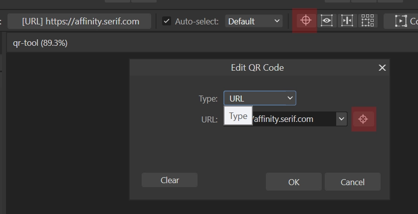
Hello everyone, The QR code creation tool still suffers from several notable shortcomings, despite the time that has passed: Desktop 2025-07-01 06-11-38.mp4 1. No direct background management It remains impossible to apply a background directly to the QR object. To achieve a visually acceptable result, one must manually create a rectangle, place it behind the code QR object, and then group the elements — a repetitive task that unnecessarily complicates the layout process. 2. Functional lock on master pages More problematic still: when a QR code is placed on a master page, its link cannot be modified on the associated pages. Unlike images, the object remains fixed. This limitation forced me to revise around twenty layouts to remove all master-page QR codes, and then reinsert them manually across 190 placements in the document — with, of course, an increased risk of positioning errors or omissions. 3. Ambiguous Icon in the Interface Finally, the same icon (a cross in a circle) is used for two entirely different functions: Enable Transform Origin in the transformation bar, and Visit target URL in the link options. This redundancy undermines interface clarity and leads to confusion. These limitations are difficult to accept in a commercial professional tool. The feature appears to have been rushed to release — and remains uncorrected to this day. qr-tool.afpub
-
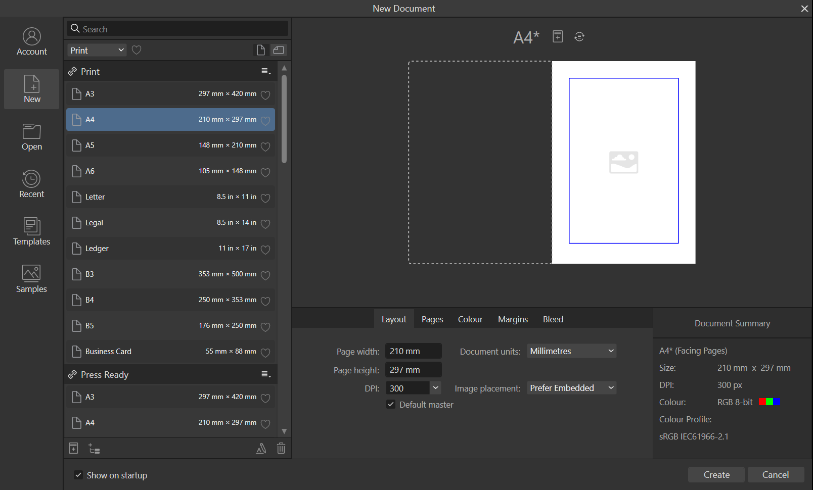
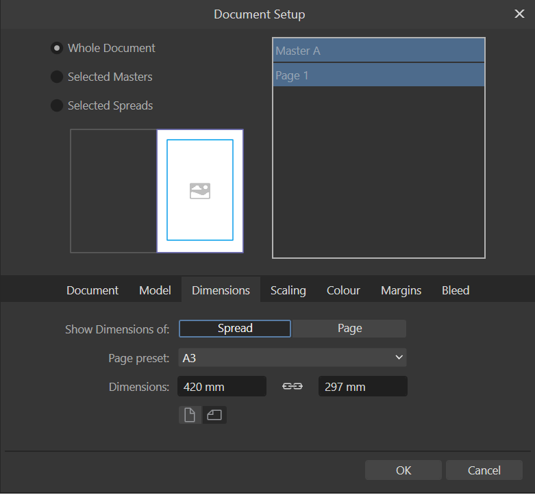
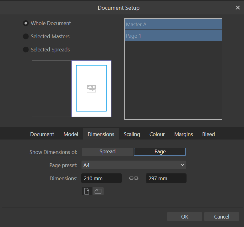
Hello @Red Al First, check both the spread and the individual page settings — they show different things. You should create and see something like this: 📄 Layout: 210 × 297 mm (or 297 × 210 mm), depending on whether your page is in portrait or landscape orientation. 📄 Page settings: If Facing pages is ticked, Publisher displays a spread made of two A4 pages side by side, which equals an A3 width. If it’s unticked, you’re working with a single A4 page, and the size shown will reflect that. So this isn’t a bug — it’s just that the software is showing the spread size, not the size of one page. This is intentional, and useful when working with double-page layouts. You'll then find it in File | Document Setup. Layout (so, A3) Or page (so A4).
-
Affinity Suite: moving files tabs
Pyanepsion replied to Pyanepsion's topic in Feedback for the Affinity V2 Suite of Products
→ Not at all! On the contrary, the solution should lie in simplification. The perpendicular constraint should simply be removed. The tab movement should be interpreted only along the main axis of the bar (horizontal in this case), and its position confirmed only upon release of the mouse button. This would prevent accidental detachment while maintaining a simple, fluid, and intuitive behavior. 🙂This is, in fact, the rule followed by most modern software. -
Affinity Suite: moving files tabs
Pyanepsion replied to Pyanepsion's topic in Feedback for the Affinity V2 Suite of Products
The issue becomes more noticeable as screen size and resolution increase, particularly on today's most common displays (24–27"). Tabs detach too easily, even when dragged carefully in a straight line — see the second video (recorded on a 5K screen). This sensitivity makes the behaviour problematic and worth fixing. -
Affinity Suite: moving files tabs
Pyanepsion replied to Pyanepsion's topic in Feedback for the Affinity V2 Suite of Products
@Ali 🙂That’s exactly the issue — the file tab detaches too easily, even with careful horizontal dragging. The second video shows how hard it is to control. Compare it with the first video using another software — there, tab movement is smooth and predictable. -
Affinity Suite: moving files tabs
Pyanepsion replied to Pyanepsion's topic in Feedback for the Affinity V2 Suite of Products
Just to clarify: I’m talking about file tabs, meaning the documents opened at the top of the workspace – not panel tabs like those in the Studio on the left or right. On Windows, when I try to rearrange a file tab in the tab bar, it almost always detaches and becomes a floating window. When I reinsert it, it’s automatically placed at the far right, regardless of the position I intended. This behavior is what I find frustrating and unintuitive, especially compared to editors like Notepad++ (video in first message) or VSCode, where tabs move exactly where you drop them. My explanation was apparently misunderstood. I suspect it may have been due to a poor translation of my original message in French. So this time, I’ve recorded a video directly in Affinity to illustrate the issue more clearly. See at 8s and 25s. Desktop 2025-06-20 06-52-11.mp4