

lacerto
-
Posts
6,440 -
Joined
Posts posted by lacerto
-
-
1 hour ago, matisso said:
I digressed quite a bit there. Bottom line, by all means use professional, industry standard ICC profiles, and if they include dot gain, so be it!
I am not sure what you mean, but I referred on using dot gain profiles in adjusting grayscale images knowing what kind of stock they will be printed on. This is manual work and based on qualities of individual images and partly also on subjective preferences (sometimes including the client), though can at times (and especially on request) be made a batch job when there are lots of images and the project is not too critical. I just meant that I do not bother to measure the results and try to achieve methodic accuracy, but naturally make subsequent amendments if there is something to improve. As for the main target, we always use a profile that we know suits well for the job, and if in doubt, ask the printer. Never regrets.
-
12 minutes ago, matisso said:
You are providing insanely useful and detailed information, but I think you are wrong here.
It may be. I assumed that there is kind of a double effect when film is additionally used. But as mentioned, the dot gain profiles are still useful, even if I have not examined closely how realistically they operate.
-
4 hours ago, benged123 said:
Fascinating. I'm going to copy all your work, and turn it into a college class ...
I am afraid it typically ends up like that, fascinating but unfertile, without concrete examples..., so let's try again
")
Perhaps this clip, using the familiar image in Gamma 2.2/Greyscale D50 mode, and then pasted without touching numbers in a simulated DotGain 15% grayscale space (approximating conditions of printing on an average coated stock), and demonstrating the equivalent with Adobe Acrobat Pro and Publisher, when viewing the two PDFs you provided, serves better as an example trying to explain what might have caused the topic of this post (we can only guess what exactly caused what you experienced):
Depending on the paper you are going to use in your book, you might end up in a bit bland grays, but it may come just fine, if they use only slightly coated paper, or uncoated stock.
Dot gain profiles (by Adobe) might be somewhat obsolete because I suppose they date from the time when film was used in printing press, and I think that dot gain is generally less when printing digital dot directly on plates, but they are still useful especially in context of RGB/Grayscale to press kinds of projects and generally when adjusting grayscales for different kinds papers. Using directly CMYK workflow where grayscale is interpreted and rendered as K-ink (like when working with InDesign, or when applying K-Only attribute when working with Affinity apps), and using the exact production target profile that can be accurately simulated (including the placed RGB content), is in many ways more predictable and therefore the recommended workflow (or at least the preferred one for me).
-
3 hours ago, matisso said:
You appear to be dropping some real gold nuggets there. Thanks! Could you please elaborate a little more on the restrictions you mentioned, @lacerto?
I was referring mainly to what Serif calls PDF compatibility rules, which dictate that if a document contains placed PDFs to be passed through, they need to have PDF version that is the same or lower than that of the production file, which means 1.4 or lower for PDF/X-1a:2003, and PDF/X-3, and 1.6 for PDF/X-4, but also that any non-PDF/X-based placed PDF is incompatible with PDF/X and becomes rasterized and its color values will be recalculated, meaning e.g. that K-only values become four-color.
Affinity apps also flatten transparencies always by using rasterization (rather than trying to keep flattened areas as vectors similarly as e.g. InDesign and QXP do) so using PDF/X-1a or PDF/X-3 for the purpose of transparency flattening may become with a price in quality (Affinity apps also lack PDF 1.3, which can flatten transparencies without using PDF/X).
Whether a specific project is affected by these restrictions or whether they matter, is individual/circumstantial but nevertheless something that at least anyone coming from e.g. Adobe ecosystem, or QXP, where these restrictions do not exist, should be aware of.
The Affinity specific restrictions also mean – as was demonstrated above -- that you get warnings about incompatibility of Greyscale D50 profile (the only one that is natively available for Affinity apps) with PDF/X, probably because it is based on composite grays/RGB and basically intended (similarly as Gamma profiles) for display productions, and would result in split of gray definitions into four-color CMYK values (it would however be technically possible to produce a DeviceGray PDF/X-1a document that passes PDF/X-1a verification, but within Affinity apps, one needs a 3rd party grayscale profile, intended for press purposes, to do that).
There are multiple posts on the forum (not just by me) demonstrating the issues related to grayscale production using Affinity apps. It is possible, but it is often tricky and requires job-specific instructions and fixes.
-
7 minutes ago, benged123 said:
The text is all supposed to be BLACK. Have no idea where the grey comes from.
It is most probably a result of having defined your text as K100 (CMY 0) in your document. If you export using Gray (or RGB), this will become dark gray. In a non-CMYK color mode document, you need to define pure black either as RGB 0,0,0 or Gray 0 (which in Affinity apps are handled similarly). Conversely, using these definitions and exporting to CMYK would produce four-color black (rich black). This is logical, but confusing
You should be able to change this by selecting all text objects and define its fill color either as RGB 0,0,0 or Gray 0.
-
There is one thing that is good to make sure, though. Your text is not pure black but dark gray (in both PDFs provided). Is this intentional?
-
Never having produced anything to Lulu, and finding their instructions a bit vague, the advises given by @Ldina are IMO generally sound. The Remembering 202526.pdf is a DeviceGray file and without knowing on which kind of stock you are going to print, viewing it simulated e.g. with DotGain 20% profile in Adobe Acrobat (which is typical for slightly coated paper) it looks just fine (and would probably look ok even if printed on uncoated stock). The Remembering 202525.pdf file is ICC based and has multiple color spaces (Gray and RGB, though NOT CMYK), and its text is dark gray (not pure black), and while it could be converted to K-only project (printed with merely black ink) with prepress tools (at professional press), I would assume that it would be rejected as a color job at Lulu.
[BTW, having RGB and grayscale images mixed in your document probably explains the kind of variance you have been experiencing in appearance of your gray images, so you might have had the same image in two color spaces or profiles placed in your document at some point.]
The way these kinds of projects would typically be produced professionally would be working in CMYK color space, defining text and all that needs to be printed on black plate only using K values, and then having all black and white images saved as grayscale images processed with appropriate dot gain applied (and within Publisher, having K-Only attributes applied). Then it would be exported ICC-less in CMYK color space all color values already resolved and that has all its output on K plate. [It could also be processed with initially ICC-based grays and be resolved ICC-less to specific target color space with methods like PDF/X-1a, or left ICC-based by using methods like PDF/X-3, but Affinity apps have many restrictions that makes these kinds of production methods risky and not satisfactory.] This takes more effort and typically requires some experience, and could easily be messed up when exporting, so the RGB/Grayscale route and exporting to Gray is basically just fine (making sure that image color spaces and possible placed RGB images are converted to grayscale).
All press-related jobs can easily be ruined at export time, so specific instructions are often needed. The problem with tools like Affinity Publisher is that you are not likely to get these instructions from the printer, or their generic production tips, typically assuming that the customer uses Adobe ecosystem. So it can be a pain to get where you aim...
-
It is all related to HDR and I am not sure if the intensity adjustment makes sense on a display that does not support HDR. The new MBPs with M4 chip and high-end Windows computers support several stops of boosting (and reducing) brightness.
I have myself only a vague concept of HDR and the way features specific to 32-bit mode, like color intensity adjustment and gain maps, operate, just based on superficial experimenting using RAW HDR images shot with iPhone 16 Pro, and Photoshop and Adobe Gain Map Demo App, and have no clear understanding of the underlying technology.
But you can read more about HDR color intensity e.g. here:
-
Another method to avoid the size issue would be using e.g. 1270 or 2540 as the document DPI. When exporting, 300 dpi or anything appropriate for rasterization can be used, but the resulting PDF will have an exact mm dimension, and any UI rounding issues can also be avoided. High document DPI would of course result in large in-place rasterizations, but downsampling at export would nevertheless produce appropriately sized production files. [You could naturally use lower integer DPI values integer divisible with inch-to-mm ratio, like 127, 254, 508 and 635, too.]
Btw. Exporting from CorelDRAW has similar issue but exporting from VectorStyler does not. EDIT: CorelDRAW does not, after all (I just made an error that caused the mediabox positioned at -1.0 -1.0 coordinates resulting in incorrect Artbox dimensions).
-
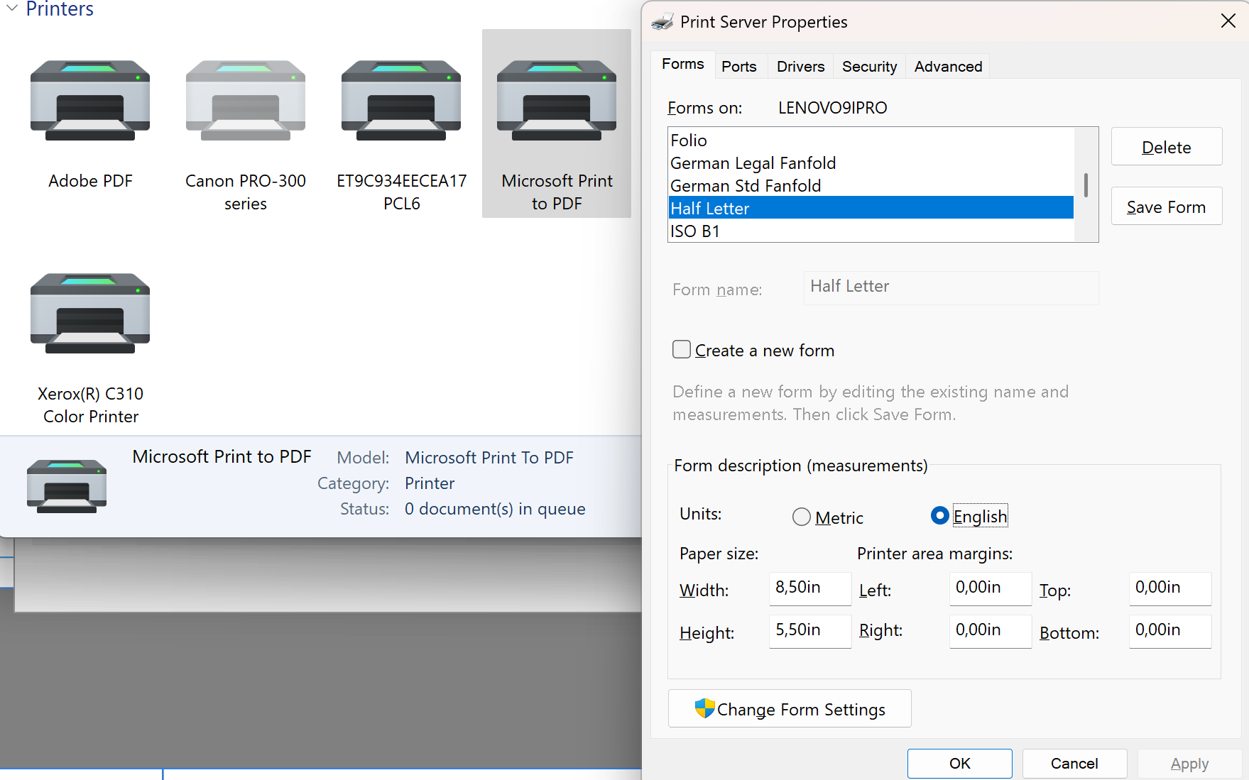
As it seems that RGB output is fine with you, you could, if you have a virtual printer driver like PDF/X-Change or Adobe PDF available (Microsoft Print to PDF would work, as well, but defining custom page sizes for it is pretty tricky -- but if you want to try, here is a link; and for more generic setting to enable custom form sizes, here), try as a workaround printing first using booklet layout on a half letter size sheet:

and then either open the resulting booklet format PDF in Publisher, or alternatively, place it in a 8.5x5.5 size document passing through the pages (in case opened and interpreted pages fail to render correctly), and then have a second round printing using the N-Up options to print two copies on a Letter size paper:
This would allow doing this without creating a specific imposition-based layout and might be a useful workflow if you have repeatedly these kinds of tasks.
For projects intended for commercial press this would not work because Affinity apps cannot output color-managed CMYK to virtual printers, so for those situations exporting method with custom manual imposition layouts would be the only choice (if the job is wanted to be done merely with the Affinity suite).
UPDATE: It proved out that specifying a custom paper size for one of the virtual printers makes it available also for Microsoft Print to PDF. If other virtual printers are not available, custom sizes can be defined via Control Panel, as long as definition of custom sizes is made possible (instructions are in the link provided above). After that, following becomes possible:
-
In addition to what is said above, it is good to understand that there are several factors that are Affinity-specific and that have effect on how "grayscale" images are interpreted, rendered and exported.
The Color Preferences setting mentioned above, NOT automatically converting an image with a conflicting embedded ICC (and if converting, getting a warning) are the defaults and something that should normally be kept, but they basically only apply to OPENED, not placed images (Affinity documents are the major difference to the concept, and at least on Windows, they, if conflicting, would be converted without a warning when placed).
Differences in the source (as for gamma, ICC, etc.) and difference in image color space (RGB, Grayscale, CMYK) are all possible explanations for difference in appearance, but there is also a chance that changes are caused by peculiar handling of grayscales within Affinity apps, and complexities in (especially PDF) export, which can cause inadvertent changes, conversions of color spaces, or just recalculated color values. Also, when converting the document color mode, it is good to understand that raster images that are in "Pixel" layer, will be converted (e.g. from RGB to CMYK or vice versa), while raster images in "Image" layer will not -- which can result in inadvertent conversions.
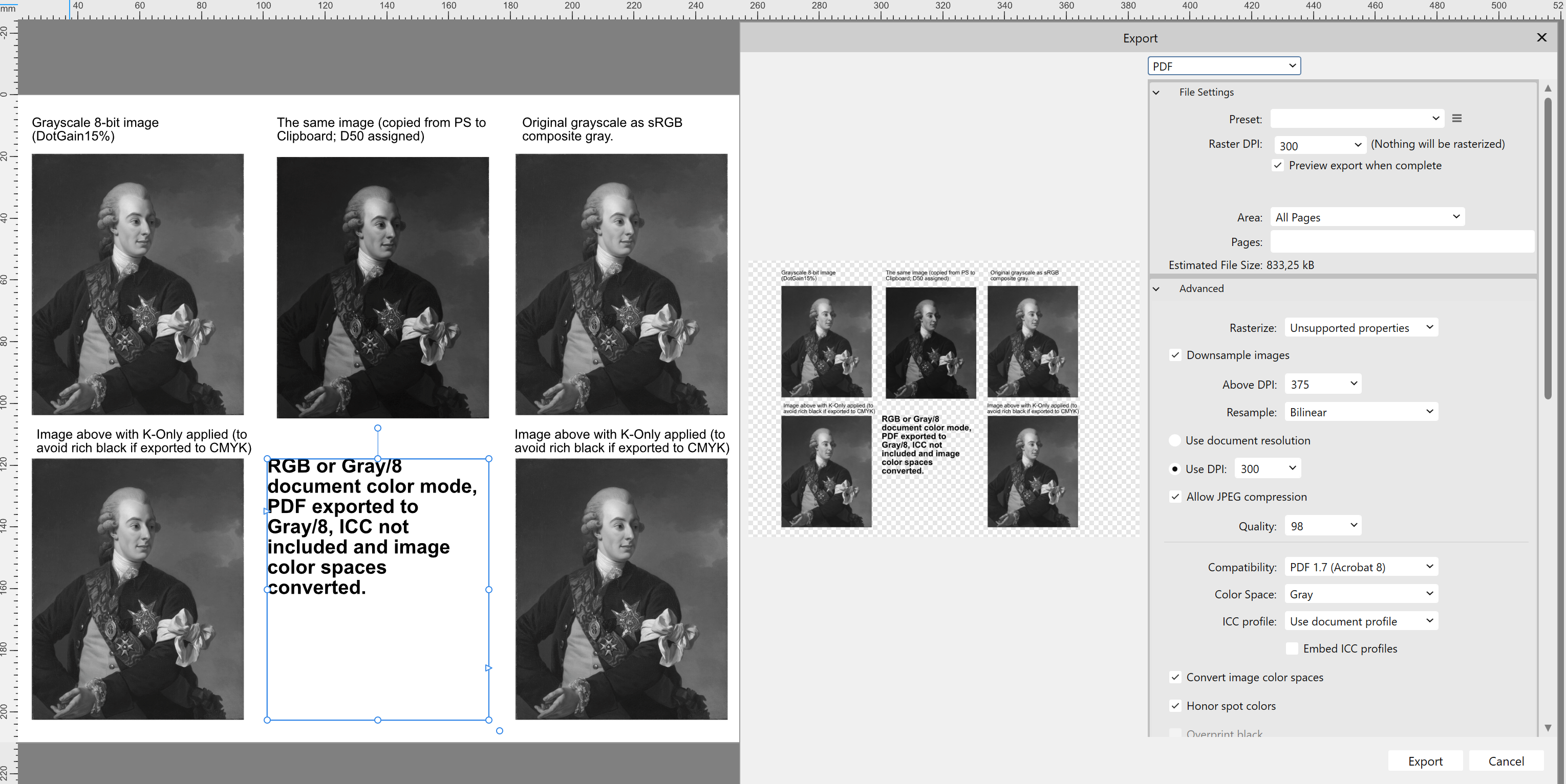
Below is an example of a grayscale image with DotGain15% profile embedded. It is basically intended for press production with coated paper (and produced initially using Photoshop). When placed in RGB/Grayscale document color mode, it will have its initial grayscale status retained, as well as the embedded ICC, and behave as expected (as true grayscale), as long as it is exported to gray color space (even if having the document color space in RGB). RGB and grayscale images with the default D50 profile are handled basically identically within Publisher so if you convert the original grayscale having D50 profile to sRGB (composite grays), the visual appearance stays pretty much the same and you will get gray output (as long as exporting to gray color space).
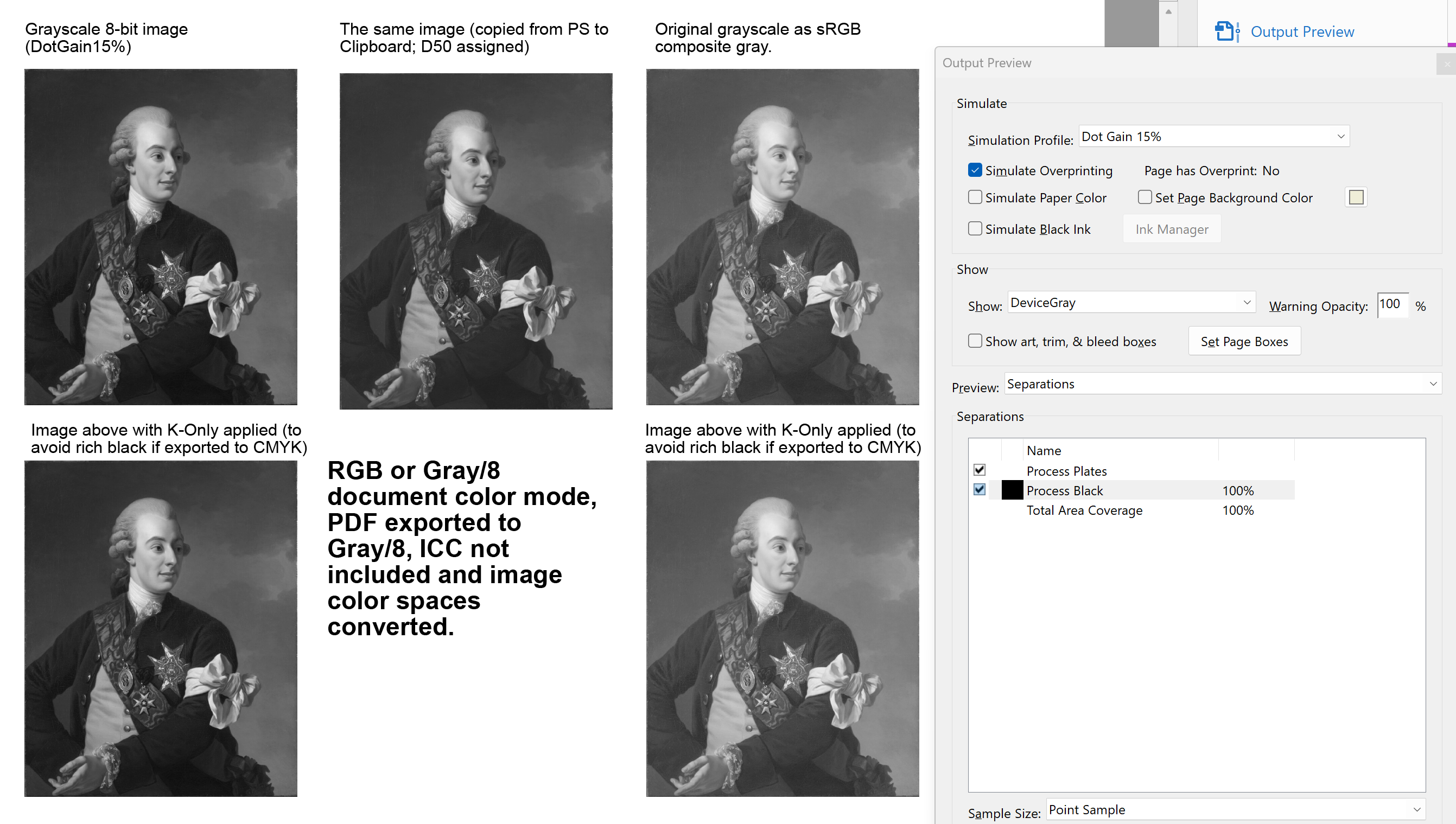
This is how an export made with settings demonstrated above would be shown in Adobe Acrobat with Dot Gain 15% simulation profile (note how all images are in DeviceGray color space so without an embedded ICC):
Here is the same document when exporting using the "Print" preset and ICC embedded, producing output that is guaranteed to confuse the printer.
As shown, working with grayscale images can be pretty complex within Affinity apps. There are plenty of posts on the forum demonstrating this, but learning to use e.g. Publisher for producing the kind of grayscale the printer expects, may take a while, and would typically require Adobe Acrobat (Pro) or equivalent to trustworthily preview production PDFs before sending for production.
-
Because the feature is probably copied from PS, you might learn something about it from this video by PiXimperfect describing some of the advantages of working in 32-Bit mode (the one related to intensity starts somewhere around 2:50):
-
Two quick workarounds would be copying the problematic group and hiding it (so that you can later continue editing, if needed), and rasterize the original problematic group. Or export to PDF (and convert it to a bitmap, if needed). In both situations the visual appearance or rasterization seems to match the viewport so you'll get what you see.
-
10 hours ago, Matt Varney said:
As I mentioned, version 2.6.3 for Mac is capable of printing K-only images, whether to PDFs or to physical printers.
Yes, macOS has traditionally been better equipped to handle CMYK print jobs natively (and specifically anything PostScript), but there have been excellent workarounds on Windows, for decades (I would take any of the mentioned three virtual printers and especially Adobe PDF, which AFAIK has only been available for Windows, rather than the current macOS skinny print to PDF feature), so whether there is even currently direct OS support for CMYK print jobs or not, on Windows, it does not really show when you have professional software. Another thing is that even on macOS, CMYK printing is not accurate and fully transparent, and properly color managed (possibly because of underlying ICC discrepancies which are hard to control) while on Windows, using e.g. Adobe PDF and supporting software (not Affinity, though), it is.
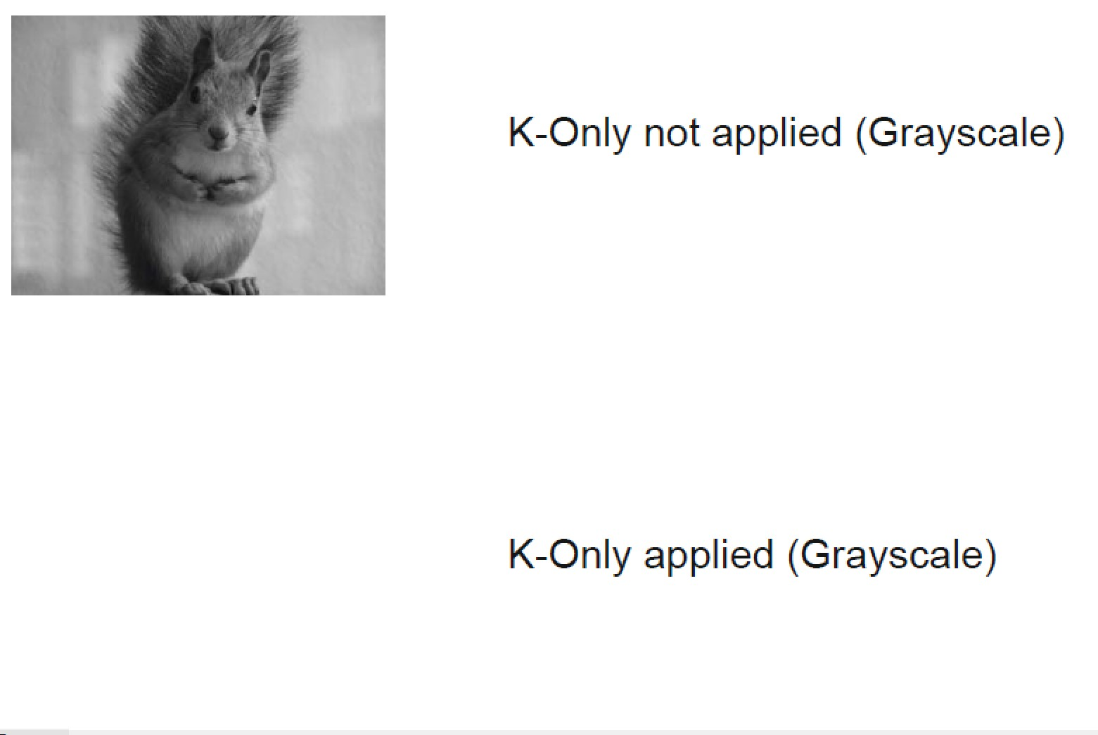
Anyway, on Windows, when you can get CMYK and grayscale images printed within Affinity apps (on v2 versions having K-Only attributes turned off), it is because anything CMYK or grayscale is first converted (by Affinity apps) to RGB and then to CMYK by the printer driver. The initial color values in the document will be translated in the process. I do not live in a hope that this will ever get fixed, but not being able to print K-only attributed grayscale images (which happens automatically when you have the document in CMYK color mode and place grayscales, or when you open v1 .apub docs, no matter how K-only attributes are applied for images of the opened document) should certainly be fixed. On macOS there currently also seems to be a glitch where the status of K-Only attribute is not properly shown in the K-Only button appearance.
Incidentally, what was fixed in handling of grayscales in v2 versions (on Windows, when printing), was this:
Version 1:
and in version 2 (with the price paid):
-
Do you mean that there is a change? I have not tested this for a while but I just tried this on v.2.4.2 on Windows 11 Pro, using PDF/X-Change Standard, Microsoft Print to PDF and Adobe PDF (which natively also supports CMYK), and it does not work on any of these with an image set to print "K-only" so just get blank output, instead.
Using any of the mentioned virtual printers from other apps does not have any issues, and e.g. from within CorelDRAW you can also deliberately use the RGB-based virtual printers to output CMYK, and output grayscale specifically to just the K-plate. Perhaps printing to virtual printers has sometimes worked reasonably well in context of Affinity apps, but basically they cannot handle CMYK or color managed printing, at all, so I'd only use RGB output in context of Affinity initiated printing. Or output to PDF and print from there...
UPDATE: I ran a test with the same grayscale image using Publisher 1.10.6, outputting to Adobe PDF, and v1 did output a grayscale image with K-Only applied, while 2.x versions I have tested cannot. As mentioned, the error occurs both with virtual printers (even CMYK capable) and actual printer drivers (drivers typically expect RGB input, but if you have a PostScript printer and PS based driver, it should be able to handle CMYK; but I do not think that this is driver related, it is clearly an Affinity thing, changes related to the odd way they handle grayscale in the first place, and inability to handle native CMYK in printing; some things appear to have improved because of these changes, while other things have then broken).
-
On 5/16/2025 at 10:20 PM, user_0815 said:
In the end it's just a tool. Does it do what you need to do? Take your time and try out as much as you can.
This is the key question. If it were "just" a tool (similarly as it is when you use a Windows or a macOS computer: they are basically just different branded spades to shovel the same stuff). But considering capabilities in context of press production, they are not comparable tools...
-
On 5/16/2025 at 3:47 PM, affinityuser1976 said:
our main reason is simply because we do not want the cost associated with Adobe anymore.
It would be interesting to learn about the details. At the time the CS suite was developed (somewhere between 2003 and 2013) we practically purchased every version (including the mid version 5.5), alternating Master and Designer Suite licenses to save some money; but the CS suite was strongly developed and it was all worth the money. We are just a family business, but when I recently calculated the value of CC compared to this old Adobe plan (which did additionally require purchases of a FontFolio 8/9 20-user license and an OTF update 11.1 for 5 users, a few versions of Adobe Acrobat Pro, and acquisition of multiple alternates, from e.g. Aldus, AltSys/Macromedia, Ventura, Corel, etc.). When all this is converted to today's money, I can see that we can get so much more with much more little... We refused to purchase the CC suite and managed to get by for about a decade with the CS6 suite on Windows (where it still runs without any issues on the latest Windows 11 version; on macOS the story is much less fortunate, resulting in many frustrated hobbyist/semiprofessional users, probably pretty much the base of Affinity users), because we did not feel that the CC Suite offered us anything new and crucial, and this was of course insanely affordable; but now it is a whole different story, multiplatform (on Windows, macOS, and iPadOs and iOS, and soon on Android) and with hefty development. We at least think that this is (again) all totally worth the money.
I can understand that it is different for small businesses like us specifically within graphic design industry and still strongly producing for printing press, and managing this all with individual licenses, and, on the other hand, being a print business company with multiple employees. But in my understanding Adobe licensing for teams is flexible, and different for different size of businesses (1-10, 10-20 etc.). Is this not so (team licensing becoming significantly more affordable than purchasing multiple individual licenses, and having e.g. the benefit of licenses being transferrable) -- and specifically, is there a change within Adobe policy that is driving you for a switch? As you mentioned, it seems that pretty much all competition is running service-based nowadays (on a subscription model) -- and when comparing, I have not seen significantly more affordable solutions, as long as you get approximately the same.
I apologize for being probably too frank in my reaction, but I really cannot think of a printing press business advertizing "NOT using Adobe apps" and trying to handle diverse prepress tasks (many of which are likely to be caused by using inappropriate Adobe app settings, and most of the clients still using Adobe apps) with a tool set that is basically totally dependent on a third party PDF provider.
Serif used to advertize that they are a "new standard" in graphic design and printing industry. They are now significantly more low key, partly probably because it is so obvious that the "old" standards are not "dead, yet", and that providers for the old ones are so busy in creating new ones.
-
11 hours ago, Shane-o said:
Edit: I'm now 90% sure that the problem is inherent to the HP Smart app.
Yes, based on pretty superficial googling this seems to be a HP specific issue. The error message PDF-XChange shows is probably inaccurate even if it can seemingly "fix" the error. Another search clue of the cause of the error would be using an encryption algorithm when saving the file, but none of the apps I tried reported anything encryption related, and it seems that basically any app that can open the file and subsequently saves it, "fixes" the error. So the actual cause remains unknown.
-
First of all, it would be interesting to know why you need to make a switch, if you are a professional print company? Surely not for economical reasons, or because you're unhappy with results you get with Adobe apps? Or perhaps because of political/ideological reasons?
Anyways, there are multiple serious issues specifically related to press production related to Affinity apps. I suggest you spend a little time on the forum to have a look.
Personally I have spent here on the forum about 6 years, and initially considered making a "switch", but have come to senses. Affinity apps have become a nice addition to our toolbox, but for serious prepress, they are not up to the task.
-
When opened in PDF-XChange Editor, the following error message is given:
...which the app fixes, and when saved, all Affinity apps open the file without issues.
(The Affinity apps were the only one of about 15 apps I tried which could not open this file. PDF/X-Change was also the only app that reported any issue with the file, and I assume it did not make any other changes in the file than corrected the mentioned "misalignment" problem.)
-
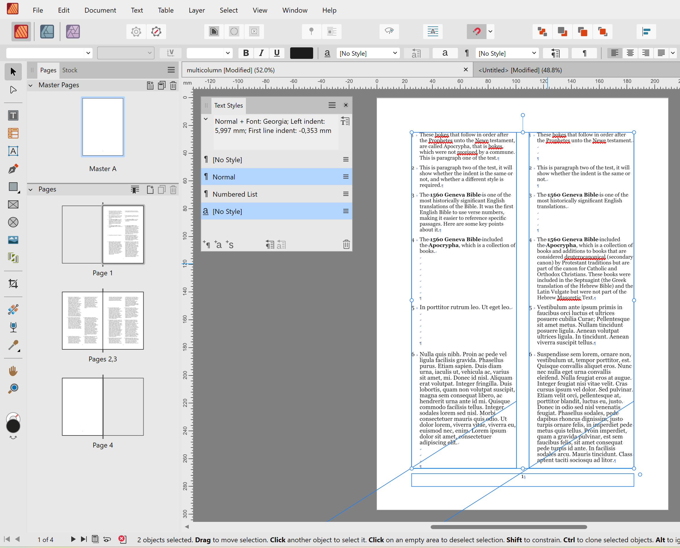
It is basically a matter of seconds to separate table columns to separate text sections (and retain the formatting), which could then be imported formatted in Publisher and flown into two independent continuing text frames placed side by side and guided by master frames. The level of tediousness of this job comes from the (likely) need to have the numbered paragraphs aligned, but that is a very easy task, as well.
-
Affinity apps do not really support free page structure layouts similarly as e.g. InDesign with its document- and spread-wide shuffle toggle, which e.g. allows up to ten pages being added freely within an existing spread, side by side, while retaining their page properties, but Publisher can simulate these kinds of structures with multiple spread sizes and then using e.g. (multiple column) text frames to lay out "multipage" documents side by side.
These kinds of structures can also be exported to PDF and then opened in Designer so that pages are opened as layers in a common area where "pages" can be moved in whatever way preferred.
Not a real thing, but potentially useful in certain kinds of projects...
PS. I forgot to mention that I have no experience of Serif earlier apps so I have no idea how they handled multipage structures and whether these kinds of simulations can serve similar functions...
-
In the Layout section, make sure that you specify a sheet size that can fit print marks without needing to scale down the document size.
Also, you should include bleed (0,5cm) also in the inner edge (the Booklet feature will ignore inner bleed but will not position and crop the impositioned job correctly if not specified).
As for color production, I do not think that you can use Adobe PDF virtual printer in a trustworthy manner from within Affinity apps. The output of this driver is basically DeviceCMYK (not embedding ICC profiles), determined by the document CMYK color profile, but the output values when used from within Affinity apps are not retained.
You might be better off producing a booklet manually from Publisher, using standard PDF page-wise exports with bleeds as the source.
-
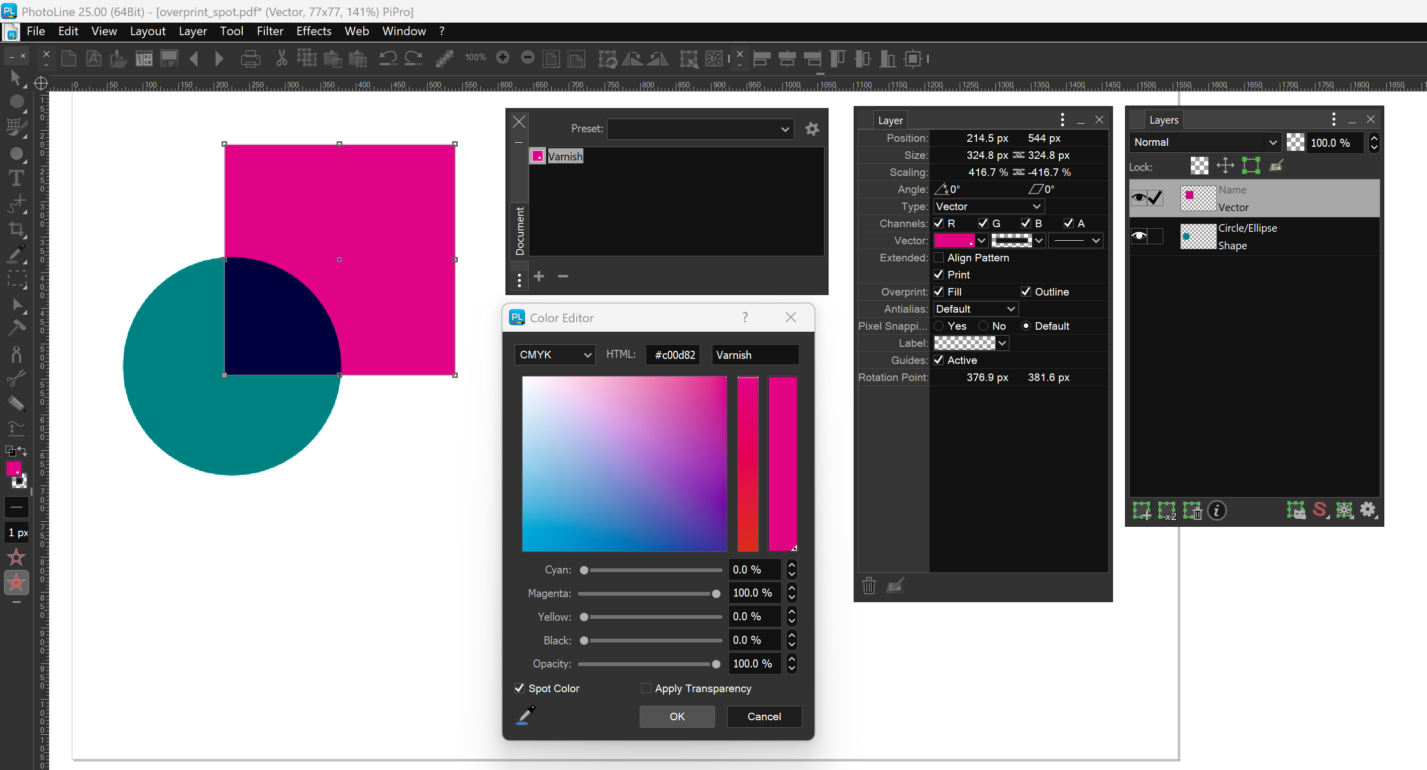
In addition to Packzview (which is free but selectively available, and needs to be begged to be "reactivated" when forced updated), and Adobe apps, there are affordable tools like PhotoLine (available for both Windows and macOS), that let you check the overprint and spot status of PDF document colors and individual objects:
Proper prepress software like callas pdfToolbox (expensive) would of course also expose and allow editing all press related properties of a PDF file, but in addition to Adobe apps, also e.g. CorelDRAW (also both for Windows and macOS) would allow to verify spot and overprint status of objects within imported PDFs. The value of apps like Adobe Acrobat Pro is that they allow both viewing / analyzing PDF properties, and changing them, without actually opening and reinterpreting the whole content. There is really no reasonably priced replacement for this tool.
The problem with Affinity apps is that even if they can produce from native objects a PDF that has an overprint attribute set (applied via a swatch attribute), they not only cannot simulate overprinting, but they also cannot read the overprint attribute within an opened (interpreted) PDF (or EPS) file, nor can they pass through it within a placed PDF or EPS file. They also lose a spot color status of a placed PDF if there is a PDF compatibility issue, and do not recognize spot colors or overprint attributes within standard EPS files.
- blackbird9, Ldina, sfriedberg and 3 others
-
 5
5
-
 1
1


Why is photo 'lighter' when I bring it into Affinity Publisher?
in Desktop Questions (macOS and Windows)
Posted
No, basically I mean first choosing the most appropriate profile considering the stock the images will be printed on, so e.g. different for glossy, heavily coated, lightly coated, uncoated and heavily absorbing (non-white) stock, and newsprint. After that, adjustments will be made manually as per image qualities and personal / client preferences. But choosing the right dot gain profile basically guarantees that all adjustments will be done in correct range and that you have a reasonably realistic print preview at hand when making adjustments.
It would of course be possible also to use dot gain profiles for direct (and automated) conversion (rather than just assigning them and making manual adjustments), and this is what we would do if there were lots of images that do not require critical processing (we have e.g. created an image catalogue consisting of thousands of grayscale thumbnails of works of art many of which have been presented in full size and often also in full color in the main part of the same publication, and there is really no point in such situations spending time individually with each image).