Search the Community
Showing results for tags 'logo'.
-
First project for my graphic design class

-
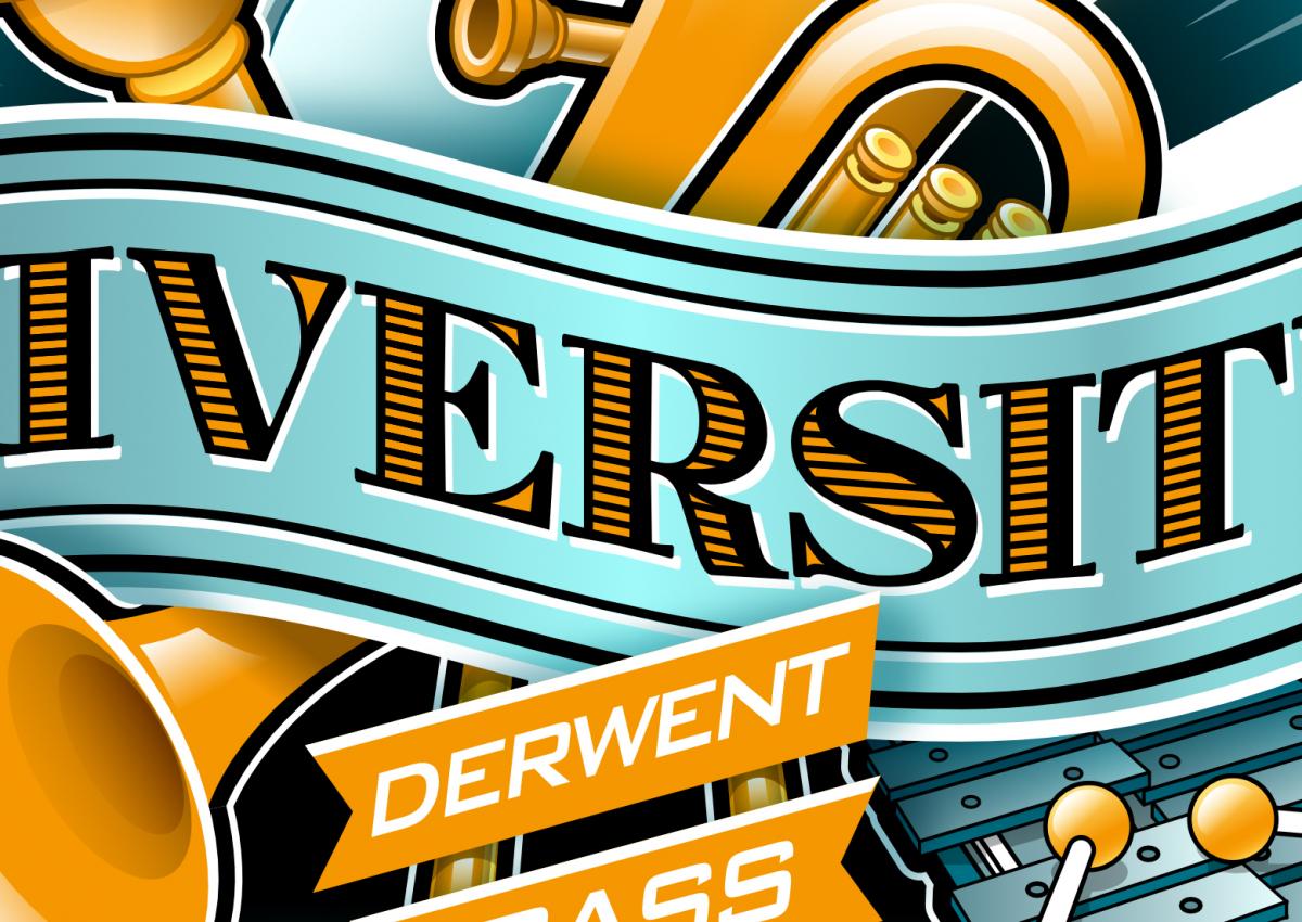
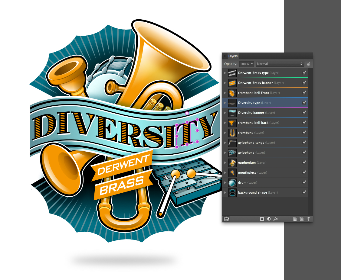
 Hi all, here is a recent client project and my first logo/illustration piece done in Designer. It's for the CD cover of the Derwent Brass, a brass band in the UK. The title of the disc is "Diversity" The idea here was to try to suggest or display some of the many instruments in a stylistic way that are included in the band as a grouping that forms the backdrop for the CD's title banner. My usual process was adhered to here, approved sketch followed by vector buildup of elements on separated layers. See below for screenshots. I made use of the "erase" blend mode to hide certain areas which worked perfectly. Each letter was "skewed" individually, to conform to the contours of the banner. Colour palette was kept to a minimum of blues and golds and a heavy black outline style was used to delineate and visually connect each element. As usual, it was a delight to create in Designer. I am looking forward to the up-coming distort and warp tools mentioned in the "road map" to be able to do more of this kind of work with type in Designer. :)
- 24 replies
-
- 12
-

-

affinity designer First logo created in Affinity Designer
RedBilby posted a topic in Share your work
Just bought Affinity Designer and so far I am really impressed. Whipped up this logo to test it out. ADAPT-Logo.pdf -
Here's a WIP logo idea I made for a new pod/webcast I'm thinking about maybe starting up.
-
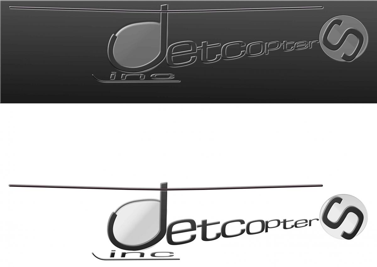
This mock design has been flying around my head, since 1984. It was my attempt at designing a logo, that contained letters that create shapes. This is the firm that supplied the helicopters for Airwolf. It still takes me ages, but I'm learning...I have used theses filters, glass and onyx. These give the desired effects. peter Ps is Hilary the only forum member to have a filter named after her? (Sunset) jetcopters inc.afdesign
-
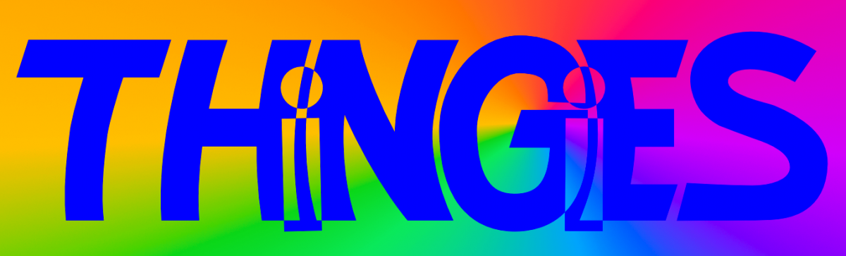
A very quick hand-trace of my original logo sketch for my upcoming comic Thingies: First I placed the hand-lettered concept sketch into its own layer. Then, I just made simple pen lines (with a stroke of 30 pt/px) and made each individual stroke the curve I wanted. Next, expanded strokes and added shapes together to form completed letters and then with the "i" letters I did an combine on each one and the letters they overlap. Finally I made the whole word a combined shaped. Added a conical gradient to a layer underneath it all to make sure the combine/compound shape was the way I wanted it. Pretty happy with it. BTW, Thingies is about sentient salamanders and I really kept their biology in mind when I made them into "funny animals". Depending on how Affinity Publisher works, I may want to use it to letter my comic rather than ComicLife (which is a fine app, but somewhat limiting in how it can fill shapes with bitmaps and such.
-
 Dear Affinity team and users, I came recently across your product. I am currently looking for a product which covers my interests. I am more of a developer than a designer, but occasionally I have or want to do some design work my self. Most of the time I get asked to design a simple website, create a Flyer to print or a Logo. For my pet projects I would like to be able to create game assets for 2D development (e.g. Pixel Art) and UI-elements. I am also interested into digital painting and own a Wacom tablet. Until yesterday, I thought I am going to buy Pixelmator/Acorn and Sketch, then I saw your product. For the Flyer and Logo use cases, it seems that the Affinity Designer is the perfect solution. Is AD also capable to solve my other use cases? How does it compare to Software like Sketch which is focused on Web/UI? Is web and UI design a use case that you try to solve with your product? Thank you for answering my questions.
 -
 I am VERY new to this and totally inexperiened, so please forgive this stupid question. I finally came up with a design I like, but I can't figure out how to export it in a way that I can resize as needed. I need it for print and web use. Any help greatly appreciated!!!!