William Overington
-
Posts
3,062 -
Joined
-
Last visited
Everything posted by William Overington
-
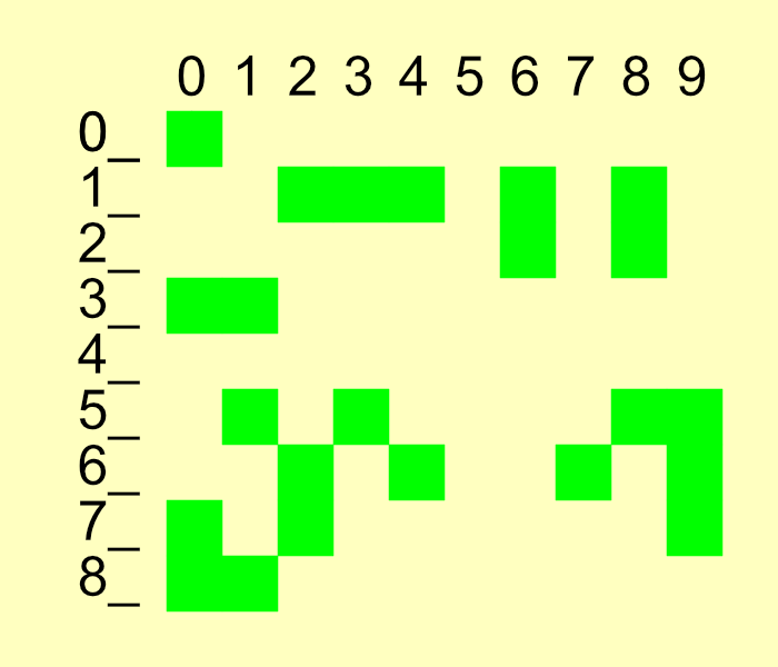
I was thinking that I would like to make progress with writing the novel. That rather than thinking of producing some art using Affinity Designer, which is what I have done on other occasions, other threads. Thinking that it was rather complicated to work out how to continue, I decided that a graphical illustration of which chapters still needed writing would probably be helpful. So I set about producing the diagram using Affinity Designer as a tool to do that, looking at the following web page as I proceeded so as to find out which chapters were not yet written. http://www.users.globalnet.co.uk/~ngo/locse_novel2.htm When the diagram was nearing completion I realized that posting it in this forum it might not be clear as to where the dividing line between the diagram and the background of the Share your work forum web page is located. So I decided at that time that when otherwise complete, I would add a background colour to the diagram. I used the Rectangle Tool with a zero width border, then I set the size and location using the Transform panel, chose the fill colour and then moved it to the back. William
-
But then the boxes with the digits in would be off the canvas. By making the Chapter 0 square at (1000, 1000) and the cells 100 pixels square I have everything on the canvas and also have nice round numbers for locating items. William
-
I have produced this graphic to help me continue to write the novel. The graphic shows a green square for each chapter that still needs to be written, though Chapter 0 refers to the Title Page and other pages such as half title and colophon, though the colophon is at the end. The exported image is at half scale. I produced the image in an A3 landscape document, working in pixels, I only exported the image, not the whole A3 page. I worked using pixels as the measurement unit. I devised a way of working so as to make the image as straightforward to produce as possible. The background colour panel was added at the end, so most of the time it was not present. Everything is on an imagined grid with each cell 100 pixels square and with the upper left corner of the cell being at an X value an exact number of hundreds of pixels and the Y value at an exact number of hundreds of pixels. In addition, the upper left corner of the Chapter 0 green-filled square is at X=1000 and Y=1000. So adding other green-filled squares is as easy to do as possible. I copied the square at (X=1000, Y=1000) onto the clipboard. For each green-filled square needed, to indicate a chapter that still needs to be written, I simply pasted a green filled square and then adjusted its position using the Transform panel. For example, for Chapter 67. Paste a green-filled square. In the Transform panel, this is at (X=1000, Y=1000). Now change the X value to 1700 and the Y value to 1600. The new green-filled square is now located in the correct place. William

-
a question about the TRANSFORM tool
William Overington replied to Tom Owens's topic in Desktop Questions (macOS and Windows)
No. It was a post late at night trying to think about how to do it. The grouping might not be necessary, but as it only takes a short time to do, it is something I tend to do. I find that if I am doing something a bit complicated that writing a few notes with pen and paper as I proceed often makes it much easier to get a good result. As for plodding through it methodically, well if there are lots of frames needed then unless the repeated power duplication produces the EXACTLY result that is required (and I accept that it might - I had not known of power duplication until reading your post) then a marathon plodding session might be the only way to get the required result. On an off-topic note, your example graphic has six steps. How about continuing for lots of steps and posting the result in Share your work together with an explanation of how to do it please? William -
a question about the TRANSFORM tool
William Overington replied to Tom Owens's topic in Desktop Questions (macOS and Windows)
@Alfred Is there a way to do it a frame at a time by grouping everything on the canvas, then doing a copy and paste to a new frame, then using the transform panel to enlarge the image, perhaps around the centre of the grouped items? Somewhat mathematical some may say, but by writing it all down on a piece of paper and methodically plodding through it, the desired result might be obtained with precision and provenance. Some fancy method might work but it might end up in a muddle, depending on what the fancy method deems that the person wants and is going to get! William -
The thread in the Share your work forum is interesting. Hopefully the Affinity team will see teh following post, amongst others. William
-
@GarryP I am wondering why you chose that particular name as the name of the author? There was a famous singer of that name active particularly in the 1950s. William
-
Conniption Definition & Meaning - Merriam-Webster William
-
Is that the name of the purported publisher of the book at the base of the spine? Conniption Apparently it is an American word for a display of bad temper as in having a conniption. So the emoji-like logo just above the name expresses that well. William
-
No, that would be flagged as an error by the (as far as I know not yet existing) software system as the specification is that as the first digit and the third digit are the same, then that number of extra digits (and no more digits) are needed for a well-formed code number. If you want a longer code number then make the third digit a zero and then follow it with three digits to indicate how many more digits after that are needed. So, for example !810123 would be followed by 123 digits after those six digits. The second group of digits can be any number from 000 to 999 so that the specification provides for a vast encoding space. At present the longest codes are six digits and the shortest three digits. There is a way to go outside of the encoding specification without disrupting it. As for example was done by a company in the first novel where codes starting 883 were used, as codes using an immediately repeated digit in the first three digits are not used in the system that I have devised. William
-
AI discussion (split from Canva thread)
William Overington replied to JGD's topic in Desktop Questions (macOS and Windows)
Well, yes. 😁 William -
@Alfred If you, or indeed anyone else, wants to have a play/experiment with encoding you are welcome to use codes that start with !828 and have eight more digits and/or !919 and nine more digits. I tend to avoid zeros but you do not need to do so, I tend to avoid having two digits the same next to each other but you do not need to do so. Two chapters of this second novel have a coding example. http://www.users.globalnet.co.uk/~ngo/localizable_sentences_the_second_novel_chapter_002.pdf http://www.users.globalnet.co.uk/~ngo/localizable_sentences_the_second_novel_chapter_006.pdf These documents are relevant to following the above encoding example. http://www.users.globalnet.co.uk/~ngo/locse027.pdf http://www.users.globalnet.co.uk/~ngo/localizable_sentences_the_novel_chapter_042.pdf William
-
AI discussion (split from Canva thread)
William Overington replied to JGD's topic in Desktop Questions (macOS and Windows)
Ah, but that date is when the video was added to YouTube not necessarily when it was produced. For example, I remember this programme when it was new in the 1990s, yet the video is listed as added to YouTube three years ago. So, here as an example, yet please enjoy as a serendipitous experience. Later in the video there is some wonderful singing from Edith Prock. William -
I now realize a better way to have proceeded. The original image was 1024 pixels square and I started a 1024 pixels square canvas and put the original image in a layer then drew in a new layer with a rounded chalk brush that was supplied as 48 pixels wide and I reduced it to 15 pixels wide. I now realize that I should have enlarged a copy of the original image to 3072 pixels square and used a canvas of 3072 pixels square and drawn with the rounded chalk brush at the supplied width of 48 pixels, because for what I was doing any chunkiness in the enlarged copy of the original picture was not an issue. William
-
AI discussion (split from Canva thread)
William Overington replied to JGD's topic in Desktop Questions (macOS and Windows)
Do we know when that was recorded please? William -
The document mentions the integral sign and circled digits, and those can still be used, but please read it as the same for an exclamation mark and ordinary digits respectively as that is a later additional format. The documents and the slide show were all made using Serif PagePlus. The font was made using High-Logic FontCreator. William
-
Er, no, .... Are they? I am not sure. Certainly lots of possibilities. But infinite? There is a specification. http://www.users.globalnet.co.uk/~ngo/An_encoding_space_designed_for_application_in_encoding_localizable_sentences2.pdf That and other documents are available on the following web page. http://www.users.globalnet.co.uk/~ngo/localizable_sentences_research.htm The codes used in the novels are compatible with the codes in the research documents. William
-
Other princesses with four cylinders from the 1930s. LMS Princess Royal Class - Wikipedia William
-
I have today written and published Chapter 56. http://www.users.globalnet.co.uk/~ngo/localizable_sentences_the_second_novel_chapter_056.pdf 21.91 kilobytes. William
-
I sent Chapter 48 in PDF document format for Legal Deposit at 11:25 am today. I received a reply, (not automated) acknowledging receipt at 12:20 pm. William
-
If anyone is interested, the first novel, together with the author notes made as I proceeded, are available, free to read, no registration needed nor sought, as follows. http://www.users.globalnet.co.uk/~ngo/novel_plus.htm Documents about the research upon which the novel is based and a slideshow are located as follows. http://www.users.globalnet.co.uk/~ngo/localizable_sentences_research.htm William
-
The altered version is now the version to which the link in the first post of this thread now links. William
-
Ah yes. I meant to include them but forgot and now I have altered them, but it was three numbers r, g, b each in the low 30s, but not all exactly the same value. I have also altered the line spacing to 16 point, though Affinity Publisher calls it Leading, but for me, having done handset metal typesetting and printing, it is 2 point leading, as the type is 14 point, as the leading in letterpress printing - it still survives, though much less so than when it was mainstream in the 1960s - is strips a bit shorter than type high, which is used to separate each line of metal type from the next line of metal type, having the effect of spacing, visible on the printed paper, and keeping the type from all falling about. Though I don't know how Affinity does type size, but some years ago I noticed that then (I don't know if it is still the same) Microsoft Windows had the point size as the space above the type font baseline, and descenders were not included, whereas in metal type the point size was the vertical height (on the page) of the piece of metal type, regardless of the size of the printing glyph upon it. William
-
Thank you. How do I make it the same as it was then now please? I suppose that it will need to go onto three pages, but that is not an issue. I also noticed that the ink is not so dark. After publication I noticed that the ink colour in Affinity Publisher is set at I am unsure whether that is the default setting or something that I have set perhaps some time ago, but I don't remember doing so. William