William Overington
-
Posts
3,062 -
Joined
-
Last visited
Everything posted by William Overington
-
I hope that this post does not annoy some people but I wonder if I may express my point of view about training videos please. I have only tried to watch a few and so maybe there are some that are different from those that I have seen. Basically I have given up on them as I find the ones that I have tried to watch unfollowable to me. They seem to be images of the full screen, usually the black background version whereas I use the light grey version that has black lettering, but people seem to rush the pointer over the menu and click click click quickly. To me, and I realize that I might be criticised for stating this opinion, but the videos that I have seen seem as if answering an examination question, where the audience (that is, the examiner) already knows the answer and the author of the video is trying to prove to the examiner that the author of the video knows what to do, rather than trying to teach people who do not already know the answer. For me, not already knowing the answer and trying to learn, the presentation is too fast and too tiny and does not explain what is being done. Can there be frames, on screen for long enough to read it and take it in, in a larger size of type please, with zoomed in views of menus showing what to click. I hope that this is useful feedback and that this can be discussed please? William
-
Yes, indeed I would have. That had not occurred to me. William
-
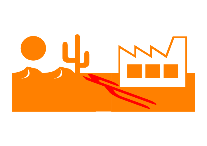
Following on from my experience with the Quest art thread, I experimented with producing a picture using glyphs from the Webdings font. This picture uses two glyphs from the Webdings font, and a rectangle, an Affinity Designer shape. I produced the shadow by copying the one glyph, rotating it 180 degrees, changing the colour, shearing and then flipping 180 degrees and generally adjusting the position and the shear angle. The rectangle was introduced to put more space betwwn the cactus and the factory so that the shadow would not overlap the factory. I know that the angle of the shadow is not right, but this is a first attempt, more modern art than like a photograph. William

-
- 1
-

-
It depends on one's viewpoint I suppose. I generated an A3 landscape document with Document units as Pixels rather than the default Millimetres. So one untitled document open, a blank document. I then used File Save As... and saved it as Quest art 005.afdesign I then used File Save As.. and saved as Quest art 006.afdesign I then used Fle Save As.. and saved as Quest art 007.afdesign So now I have one file open, with a blank canvas. But, I want the files open across teh page in the order from left to right of 5, 6, 7 So I close Quest art 007.afdesign I then open the files in the ordr 5, 6, 7 and so I have access to the three documents, and I work from left to right four times. Quest art 005.afdesign is loaded with the picture at the start and that picture is unchanged but is copied four times. Quest art 007.afdesign, over at the right, is blank at first and the final picture is gradually built up there. Quest art 006.afdesign, in the centre, is the workspace. For each of the four colours it is cleared to start, a copy of the whole image in black is copied from Quest art 005.afdesign, parts of the picture not to be in the current colour deleted, then the remainder coloured to the desired colour, then copied and pasted into Quest art 007.afdesign. So by closing Quest art 007.afdesign after it had been generated and then opening the three files in the order 5, 6, 7 a convenient workflow order from left to right is produced. William
-
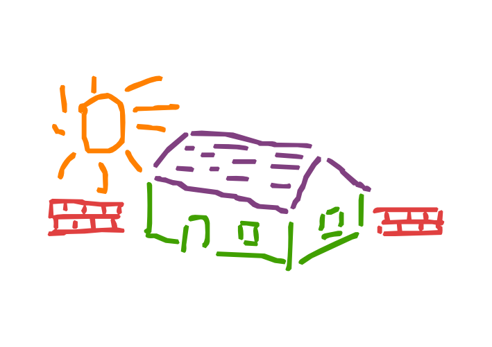
I managed to produce the colourful version. I had open three documents, from left to right. Quest art 005.addesign Quest art 006.addesign Quest art 007.addesign Into Quest art 005.afdesign I copied just the picture from Quest art 004.afdesign, thereby not having the remnants of the original text frame in Quest art 005.afdesign. I added a filled black square 300 by 300 with no border at (300, 300), so at the top left corner, to ensure correct register, though in fact this might not have been necessary, though it did give provenance that all was correct. Select All, and group. Quest art 006.afdesign was a workspace. Quest art 007.afdesign to build the colourful picture. Then four times, one time for the sun, one time for the walls, one time for the roof, one time for the non-roof parts of the building, in that order, starting each time with a blank canvas in Quest art 006.afdesign, I copied the whole picture from Quest art 005.afdesign to Quest art 006.afdesign. In Quest art 006.afdesign I then used the Node Tool to show all the nodes, then deleted all parts of the picture except the current chosen part. I then was able to colour what was left on the canvas. In fact I used the RGB sliders as I like setting things by entering numbers. I then copied everything then pasted into Quest art 007.afdesign, ungrouped, checked that the alignment square was in the right place using the Transform panel and then deleted it. William
-
William
-
https://forum.affinity.serif.com/index.php?/topic/203275-quest-art-question William
-
I started a thread in the Share your work forum. As I asked a question, @Alfred has suggested that I ask here, and @PaulEC has liked his post. As I would like the result to be in the Share your work forum, rather than ask to have the thread moved, may I instead post a link to the Share your work forum here and ask that suggestions as to technique are posted in this thread and any attempts at producing such aa result are in the Share your work thread please. Part of my reasoning is that I have thought of a possible way to proceed, so I might get a result for the Share your work forum. Here is the link. https://forum.affinity.serif.com/index.php?/topic/203266-quest-art William
-
I think that I may have worked out a way to do it, so I will try to have a go and report back. Though it might not be the best way or the most efficient way. William
-
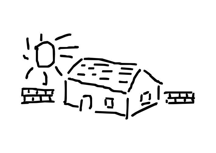
In around 2002 I produced Quest text, my first full alphabet font, using the Softy program. In 2005, by then using FontCreator, I started a new font using FontCreator and copied the artwork from the font that I had generated using the Softy program into the new font that I had generated using FontCreatoir. The font was last updated in 2008. The font is available on the web. https://www.users.globalnet.co.uk/~ngo/QUESTTXT.TTF In the Private Use Area of the font, at U+E701 through to U+E704 are four pictures that I produced, probably around 2002. They are each monochrome, and are influenced by the novel Don Quixote. The font has an indication to display them as white on a red background at 340 point. Here is a link to a PDF document that I produced long ago. http://www.users.globalnet.co.uk/~ngo/quest.PDF So today I decided to use one of those pictures, the one at U+E704 in the font, and keep the original picture, yet try to use Affinity Designer to produce a colourful A3 size print by colouring various parts of the picture and perhaps adding a background colour. So the picture above is as far as I have got. I started a Text Frame, inserted the picture from the font using the Glyph Browser, sized it at 288 point, then converted to curves, then with the Aspect ratio locked, I made the image 4000 pixels wide. The picture above is a one-seventh size png file of that result. Alas, I do not now how to go any further with this, as I am not able to change the colour of individual parts. I went to ungroup but it is greyed out. Is it possible to colour the various parts of the picture please? Readers who want to have a go are welcome to gather a copy of the font and use it. William
-
It is not only the intended output size, it is the size on which I design, as I use the transform panel to position and adjust the size of shapes precisely. So I can work in sizes of hundreds of pixels. William
-
Because I would have problems of the background moving. There may possibly be a way round that with layers but I am not aware of how to do it. William
-
Yes, I expect that you know which I had in mind! It was too much for one go though. I decided when continuing to construct the white parts in blue, then once complete change the blue parts all to white, then have a pale blue background so that the white would be noticeable. William
-
Oh, an equine variation of an episode from Star Trek The Original Series. Where is the other one? Perhaps the horses will be friendlier than the people! William
-
This picture designed as an A3 size picture, is made using Affinity Designer shapes. Four rectangles, three rounded rectangles, and a tear. The two smaller rounded rectangles at 90 degrees to each other, then grouped and rotated by -60 degrees. The tear rotated by 15 degrees. William
-
You might like to know that Viking Virtual Print House will print A3 size prints in colour on 350 gsm paper for around 60p each. They have a minimum order of £5 for the basket plus postage and packing. But the basket can be a mix of up to ten items - that is, this window would be one item regardless of how many prints you buy. https://viking-virtualprinthouse.co.uk/ I have bought prints of some of my artwork, typically two copies or five copies, and I like A3 size colour prints and they look quite spectacular to me. Please note that I am not connected with them in any way except as a paying customer and I am mentioning this as a post in the forum from a forum participant not as an advertising stunt. They print a bit larger then trim, so if one uses a PDF document with a bleed area, then one can have the colour to the edge of the paper. William
-
affinity designer Little Loaf & The Hockey Experience
William Overington replied to DonC123's topic in Share your work
The picture looks to me (as a hobbyist view, I am not an expert at using Affinity Designer) as being designed as a vector illustration using a combination of applying the preset shapes and some drawing of some sort. Is that correct? For my own attempts, thus far I seem to be good at constructing using shapes but not very good at all with the drawing parts. Could you say something about how you drew the people please? William -
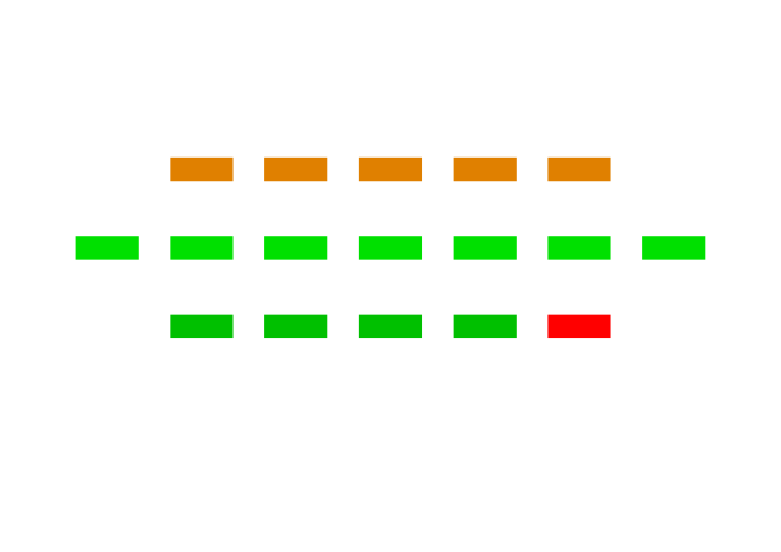
I produced the artwork for this picture as an A3 size picture in case I decide to try to buy a print. The picture is produced by starting with one filled rectangle with no border and then using copy and paste and locating each filled rectangle precisely using the transform panel and setting the colours as I chose them to be. Then all the rectangles were grouped and the group centred horizontally on the page, and that then adjusted to the nearest whole number of pixels. I have not included a description of what the picture is about as I am hoping that some readers will post about what they think it is, or may be, about. William
-
The original artwork is A3, in case I decide to try to buy a print. I set the measurement units to pixels. This picture is constructed from two rectangles and shows the use of the Affinity Designer opacity feature to show one item through a semi-opaque other item. The rectangle that represents the glass has the opacity of its colour set at 15%, so the pure orange juice is seen through the glass. William
-
Thank you both. William
-
Yes. Yes. William
-
So the angle would be specified by the artist and the percentage point would then be calculated and then set by the software, calculated using the height and the width of the trapezoid. William
-
A detail from the picture, with the filled trapezoids and the filled rectangle shown each in a colour different from the colours of the others, to show the construction used to avoid the possibility of a thin line of background in a display. William
-
I produced this picture using five filled rectangles, each sheared by -15 degrees, three filled trapezoids and a filled rectangle. For the trapezoids, the left point is at 0 per cent and the right point is at 75 per cent, and I made the trapezoid four times as long as wide so as to get a 45 degree slope. I then rotated the trapezoid through 90 degrees. I then made copies and placed them, using the pixel precision of the transform panel. The original is of size A3 and the above picture is a png exported at one seventh of the size. I set the measurement units as pixels, which is what I usually do, and I used the transform panel to position items precisely. I used the filled rectangle so that there would be no fine lines of background displayed between the trapezoids. I started with an A3 size as if I decide to try to obtain a print, then the artwork is already the right size to produce a PDF document for the printing. William
-
QR Code Tool
William Overington replied to Ash's topic in [ARCHIVE] 2.5, 2.4, 2.3, 2.2 & 2.1 Features and Improvements
Do QR codes of that size and complexity and that thus present small chunks to the camera, decode without problems? William,