outdoors
-
Posts
24 -
Joined
-
Last visited
Everything posted by outdoors
-
Hi, I have bought AP and been using the Beta before. Now with El Capitan I can not launch the Betas any more. "A purchased version must be installed", even tough I have that. However, I keep my apps in another folder than the standard "Applications" for backup purposes. Maybe that is the problem. Would be great to see a fix.

-
Poor Controls on Brushes
outdoors replied to junipermn's topic in [ARCHIVE] Photo beta on macOS threads
Junipernm; I do understand that you are eager to get quality features into AP, and it is a good thing that you are making yourself heard. If this can be done without a tone of demand and extensive use of "!!!", I think it will be more well received. Remember, photoshop and such had a decade to build their tools. AP is just getting started. :) -
There are three curves for pressure settings in the brush settings that make pressure a bit better. and workable. However, there should be a separate setting for adjusting pressure overall. As it is now; pressure settings for my wacom is the same across photoshop, illustrator, fire alpaca, gimp and others, but a bit wonky for AP. Hopefully this will get resolved :)
-
Z-Map blur - Beta Feedback
outdoors replied to outdoors's topic in [ARCHIVE] Photo beta on macOS threads
Done! It is in your mail box :) Looking forward to the next update. The field blur was a very nice addition BTW. Very practical until z-depth is resolved. -
I am stunned and amazed that you managed to add this feature in a matter of days. And it is already a great start. I have now tried it and have some feedback to make it fully usable (as it is now it really can't be used). Leveladjustments A z-depth map will always render from 3D-software as a kind of black/white fog according to the scene total depth starting at the camera lense; therefor the levels does not fall exactly where you want them in order to give the correct focus to your object. This is why the user must be able to tweak to black/white threshold of the map, much like a levels filter. If this is not available, the focus of the blur will always be at the very edge of the camera and thus blurring everything. This is not something you would be able to easily tweak in a separate document so these controls are necessary. Focus plane The idea of a z-depth map is to provide depth info about the scene, but the user should then be able to pinpoint the focus at whatever depth he/she wants by moving a small marker to the desired location/gray level. Or this could be done with a slider. The range of the map is then recalculated so if the user wants focus in the middle, the map will blur both in front and the back. IE. the map will be recaclulated as black-to the white focuspoint- to black, according to the preexisting levels. Think of the z-map as focus steps with a looping gradiant instead. Edges It is very important that the edges of each focus step bleed/or don't bleed correctly into whatever is behind it. A black point on white background, will give you a halo of the point event though it is in full focus. In the opposite way, sharp mask edges can be seen at the highest levels of blur. This is of course the hardest part to get right due to the way blurring works. Tif crashes When trying this feature, the app will crash when loading 16 bit z-dept map in tif.
-
Affinity Photo Public Beta (1.2.0.24974)
outdoors replied to Andy Somerfield's topic in [ARCHIVE] Photo beta on macOS threads
I am so impressed at the speed you guys manage to put in accepted features. Wow, is all I can say. -
Navigator box darkness should not be there
outdoors replied to outdoors's topic in [ARCHIVE] Photo beta on macOS threads
Thank you both for your replies and ideas. To open another view could be handy indeed, but not as practical as using the navigator. I do understand that you designed it this way to be easy to see the zoom area, but allow me to explain a little bit further. Below are two images. One has the original darkened down navigator, and one is a mockup where the zoomed area is lightened instead. In the original/first image, the navigator is only showing a very small area with the correct brightness, when that small area doesn't have to be that accurate since it is also filling the entire screen. In the second image I have instead made the whole image in the correct brightness while the tiny zoom box instead is brightened. This way I get an overview of the whole image, that is correct, while the tiny zoom area is already showing correctly on the main screen, thus allowing me to view both the zoomed in view and the whole correctly. To me that seems like the most optimal way. Either way, I think your suggestion of a navigator option for how it is displayed would be a wonderful solution, and it is that mentality and those details that really set AP apart. /Andreas
-
The navigator is super useful to give you an overview when for example drawing details at 3-400% zoom.Many use it to see the look and feel of the over all picture when working on details. In AP however, the navigator will darken down everything and only show the correct brightness inside the zoom box marker. I understand that this is meant to "highlight" the zoomed area, but it also means it is no longer as useful as a navigator since the overall picture now is way darker. I would suggest that you keep the brightness consistent in the navigator and make the box as "invisible" as possible. Or if you absolutely must do something that visible, then please instead brighten the content inside the zoom box and leave the outside untouched. Because when you think about it, what you need to see correctly in the navigator is those areas that you can't see while zoomed in. It would also be super useful to be able to color pick (alt+click) in the navigator without moving the zoom postition. Here is how a pure white document looks when darkened in the navigator
-
Thank you for clearing that up. I am sure you guys do your best keeping up with everyones ideas and I'm not expecting you main focus to be on anything other than software dev at the moment. If possible though, it would be great for a post that has been read by staff but not replied to for any reson, would be somehow marked as "read by staff" or "discarded" or "under consideration" or "delegated" or something along those lines if it saves you time when you are unable to move it to the regular channels. I am happy that this was not intentional and I will for sure keep beta testing and posting ideas and bugs.
-
As a AD Customer I try hard to help by finding bugs and usability issues in AD and (mainly) AP. While one post was accepted, none of my other posts gets a single reply or gets moved to accepted/implemented. Instead they are stuck in limbo. I wonder why that is. Possibly the reason is that it is something the team has already thought about, or it has already been posten by someone; (even though I have searched to make sure I am not double posting about a feature/bug). It could also be because the idea was bad or misunderstood. I understand that the team is busy building this awesome software, but it would be nice if you could write, even a single word or smily , as status feedback to a feature or bug report. Because as it is now I am hesitant to pledge my time to bring further feedback that will (seemingly) only end up being ignored or perhaps even laughed at. With that said; I think the team is doing a great job and look forward to seeing all that AP will bring in the future.
-
Affinity Designer Customer Beta (1.2.0.24606)
outdoors replied to MattP's topic in [ARCHIVE] Designer beta on macOS threads
Hi, I made a point in the photo beta forum which is marked as accepted and implemented for the next beta. It is the same with designer so I thought I should mention it here as well for continuity sake. If you right click the top toolbar and choose "hide toolbar"; to save space on small screens; then there is no way to switch personas at all which is quite limiting. Se original thread, screens and possible solutions https://forum.affinity.serif.com/index.php?/topic/7541-switch-persona-menu-item/ -
Regarding the color picker delay; it actually works instantaneously even if the actual color picker doesn't show. So if you hold Alt and click it will in fact sample that color in a millisecond, there is no need to wait for the color picker to show. With that said; it would be nice if the color picker was shown straight away so you could color pick more precise. Also; it seems like the color picker will only show up once you move. So the delay you experience is probably because you are holding you mouse still. Try moving it while doing the Alt click. Usually this is not the preferred way a color picker should work, but it seems to be how this one does :)
-
Many pixelbased drawing apps, (sadly not photoshop), have the ability to correct and smooth out brush strokes. It is sometimes called correction, lasermouse, magnetic among others things. The effect is the same: correcting and smoothing the strokes while drawing them by a chosen amount. It is really one of those things that could put AP over PS featurewise. This could either be added to the brush settings as a "Line correction"- slider 0-100. Or it could be added to the magnetic snapping options. Included is a screenshot showing the drastic difference line correction can have.
-
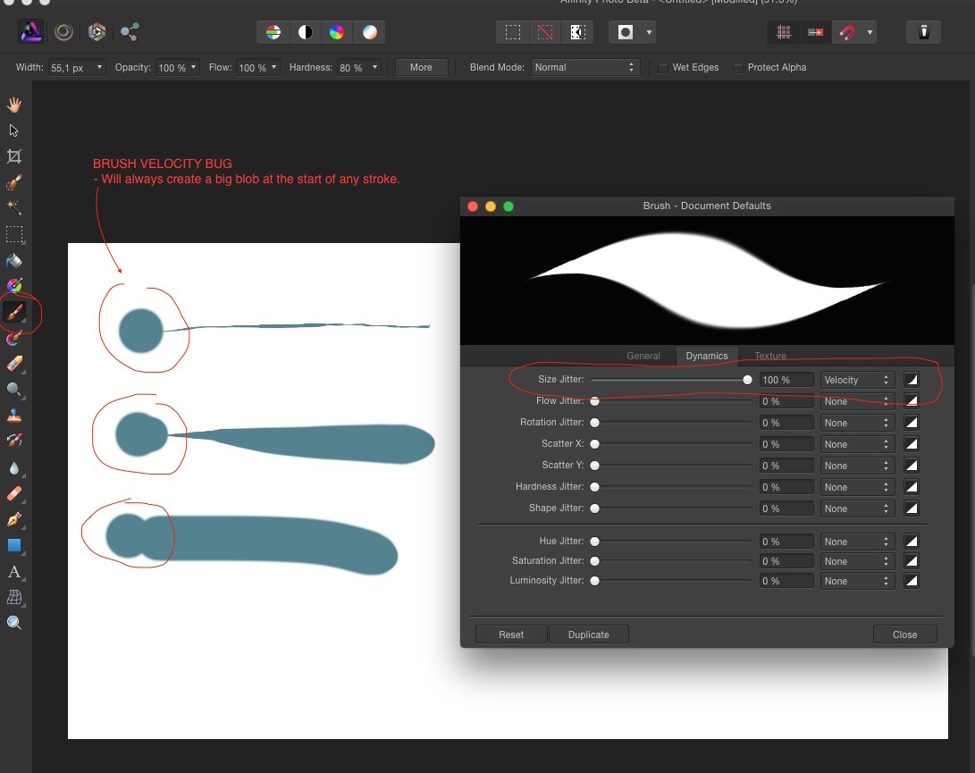
I mention this partly in an earlier post, but here are some screens of the bug using the latest (yesterdays) beta. Using 27" imac 2013. Latest yosemite. Wacom intous. BUG FLOW The mixer brush will not respond to any flow brush setting. (neither pressure, random, velocity etc). Not with wacom or mouse. In the image I compared both the regular brush and mixer so you can see the difference. BUG VELOCITY If velocity is set in brush settings, the brush will always create a blob at the beginning. Both with wacom and mouse.
-
Affinity Photo Public Beta (1.1.2.24216)
outdoors replied to Andy Somerfield's topic in [ARCHIVE] Photo beta on macOS threads
I agree that support for 16-bit OpenEXR is a must, since all 3D-renders spit out that format. 32-bit HDRI not as important IMO. -
Hi again, - Stabilise stroke One thing that makes Krita, fireAlpaca and many others so good is the ability to stabilise brush strokes. When you draw it will smooth out any jittering. Not only is this good for painting but also writing signatures and such things. It could be as simple as having a checkbox in the brush settings or a slider with the amount of "help" needed. - Wacom Pressure in mixer brush Pressure for flow seems not to be working for the brush. In fact, the setting for flow is not doing anything at all for me. It does work for the normal brush and size with pressure etc is working for both of them. - Brush velocity This feature is awesome, but no matter how hard I try it will always produce a big (high velocity) blob when starting a stroke. Hopefully that is an easy fix - Inverted brush settings I love the fact that you have velocity as normal and inverted in brush settings; perhaps that could be done with pressure as well? Also; it would be nice if things like luminosity jitter in the brush settings could be inverted as well.