seannymurrs
-
Posts
10 -
Joined
-
Last visited
-
 Hangman reacted to a post in a topic:
Best/easiest way to accomplish this?
Hangman reacted to a post in a topic:
Best/easiest way to accomplish this?
-
Best/easiest way to accomplish this?
seannymurrs replied to seannymurrs's topic in Desktop Questions (macOS and Windows)
Perfect! Thank you! -
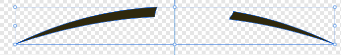
I feel like there has to be a relatively simple way of accomplishing what I'm trying to do, but I don't know what that is. Essentially, I'm trying to fill in the missing piece of the object in the attached screenshot. The object originally has the gap to make room for another object, but I'm removing that part from the overall image. I'd like this arch to be one continuous object, and have the missing section match the overall curve of what's already there.

-
Perfect; thank you!
-
I'm trying to create a specific effect on a design I'm making, but I'm not actually sure if it's possible within the app. What I'm looking to do is apply a gradient affect to an object, but without any blending/fading between the colors. To be more specific, I'm hoping to specify the six colors of the LGBT flag and have the object I've selected be divided into six even segments (one per color). I can do this with the gradient effect, but it blends the colors into one another. I'm looking for the end result to have six distinct segments (like the LGBT flag). Does anyone know if there's a relatively easy way to accomplish this without recreating the object from scratch in six different segments? Thanks in advance to anyone who can assist with this.
-
walt.farrell reacted to a post in a topic:
Help "centering" an oddly shaped object
-
Wosven reacted to a post in a topic:
Help "centering" an oddly shaped object
-
I played around with things a little more, and I think I may have figured out a way to do what I was looking for. I used the pen tool to create a straight line connecting to two tips of the tail of the arrow. Then I duplicated that line and put it at the tip of the arrow as well. When I included those two lines in my selection, I think it adjusted the overall center point of the image to be where I was looking to put it. I'm attaching another screenshot to show what I did.
-
Thanks for the reply. That's what I've been attempting to do so far. I just thought there might be a way I was missing (using guides or something else) to ensure it was spaced "evenly".
-
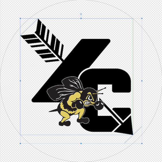
I've been fumbling my way through teaching myself how to use Affinity Designer, and I am struggling with something that I'm guessing has a really simple solution that I'm just not seeing. I'm working on a logo for the cross country team that I coach, and I'm trying to get the image centered within a circle shape (since a lot of social media sites put account logos in a circle). Using the snapping feature, I can center the image directly in the center of the document. The issue is the shape of the image makes it visually look off center if I do this. This is due to the tip of the arrow in the bottom right corner going all the way to bottom right edge of the selection, but the tail of the arrow in the top left doesn't extend that far. What I'd like to do is get it aligned so there's an equal amount of space between the tip of the arrow and the circle and the tail of the arrow and the circle. I know this won't actually make it centered, but I'd like to see if it looks better that way. I know I can "eyeball it" to get it roughly in that spot, but I'm hoping there's a more exact way to get it done. I'm attaching a screenshot of the document in question to hopefully help show what it is I'm working with. Thanks in advance to anyone who can help me out with this.
-
Alfred reacted to a post in a topic:
Possible to achieve desired effect? (see post for details)
-
This worked perfectly! Thank you so much, I never would have figured that out on my own.
-
I am designing an image that is going to be printed onto a t-shirt for the track & field team that I coach. The design has multiple overlapping layers, and I'm looking for a way to achieve a specific effect where the layers overlap. Basically, I want the layer in the rearmost position to end slightly before it touches the layer on top. I know I'm not doing a great job explaining this, so I'm attaching some images that will hopefully show what I mean. For the moment, I've simulated the effect by having a black background on the image and giving the top layer a slight black outline. When we actually get the shirts printed, however, we don't really want the black outline printed. What we want is for the area shown in the closeup image attached to be the plain black t-shirt showing through (no ink printed there). Again, I'm sorry for not doing a better job explaining things. I'm brand new to this, and I don't know official terminology for anything. Thanks in advance to anyone who can assist.
-
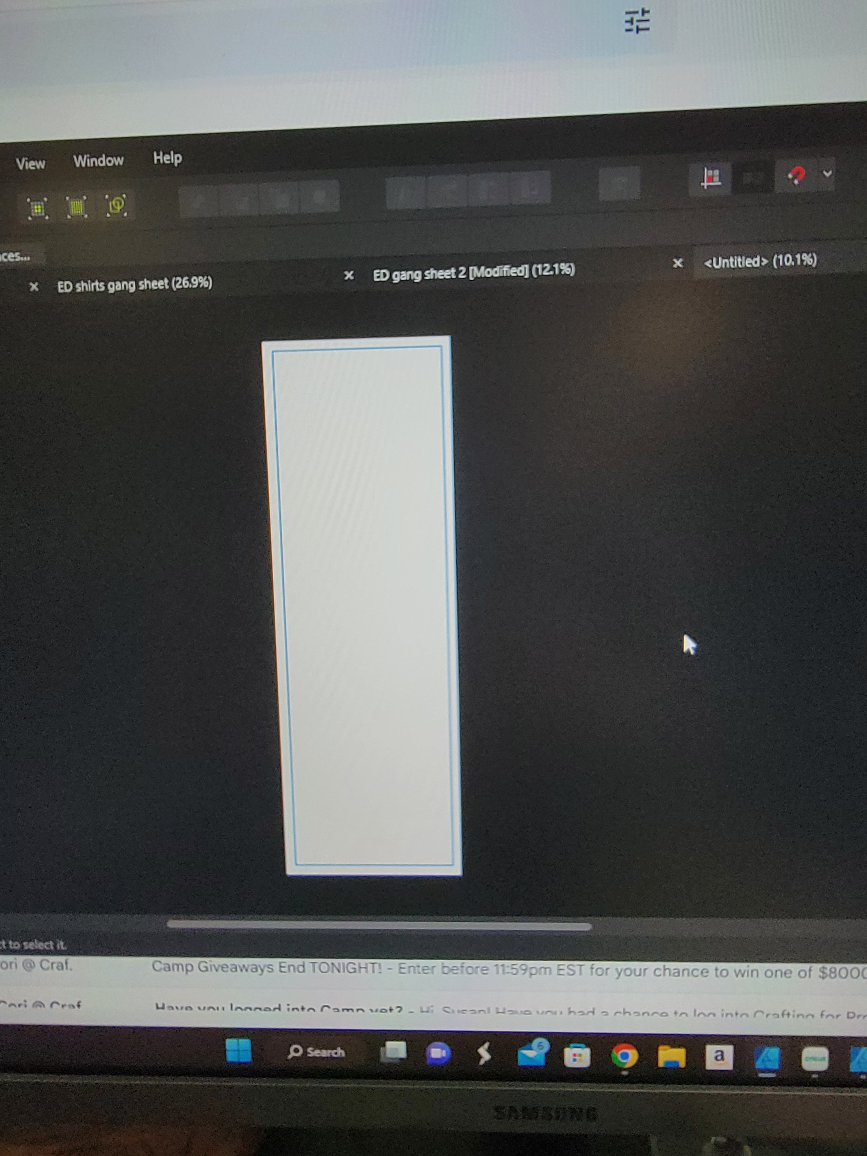
I'm using Affinity Designer (macOS) to create a t-shirt design. I need to send the design to the printing company as an EPS file. Some of the text in my design has an outline that I created using the "Effects" tab down by the layers. It looks great in my original .afdesign file. When I export it as an .eps file, however, the text becomes blurry. It only happens to the text that has an outline. I'm guessing there's some incompatibility with the way it is creating the outline effect and the .eps file format. Is there any way to correct this? I don't want to send a blurry design to the printers. Attached are screenshots comparing the two pieces of text. Both are blown up to 800% to show the blurriness of the .eps version.