TomGerritzen
Members-
Posts
52 -
Joined
-
Last visited
Everything posted by TomGerritzen
-
Page numbers with section names
TomGerritzen replied to TomGerritzen's topic in Feedback for Affinity Publisher V1 on Desktop
@walt.farrell No need! I should have been clearer. And I will: I have a series of documents labelled with Roman numerals: I, II, III and IV. Each document contains a number of sections labelled with capital letters starting with A (which is a marker or name of the section). Every section has at least 2 pages, but some much more. Within each section page numbering starts with 1. In these documents I want to number the pages accordingly: <<Document number>><<dash>><<Section marker>><<dash>><<Page number>>. This way a randomly chosen page will be labelled II-C-4. This is the second document, third section, page 4. In each document I add a table of contents that should contain those page labels (for lack of a better word). It would be okay to see the part "II-C-" as a compound section marker that is prefixed to the actual page number. That way I eliminate the need for the document label. The first half of a simple solution would be to add "II-C-" to the footer text to make the page number on each page look okay. To make the table of contents reflect those labelsI need the following second half of the solution: In the Table of Contents tab is a box where I can insert characters between headings and page numbers. If I could add the section name (compounded to "II-C-") after the tab character it would be fine. And then there is a third half: the page numbers that are actually in a resulting PDF... but I can live without those. -
Page numbers with section names
TomGerritzen replied to TomGerritzen's topic in Feedback for Affinity Publisher V1 on Desktop
@walt.farrell I know I can in plain text, but I would like to do it like in InDesign, or possibly here as well: -
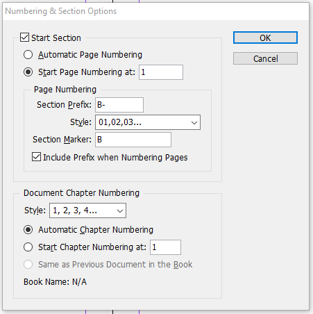
I like the way I can restart page numbering with each new section. However, that would be much more useful if I'd be able to "add" the section name or marker to the page number. For example: <<section name>>-<<page number>> would give a numbering scheme like A-1 to A-8 and B-1 to B-15 et cetera. I can of course manually add the prefix "A-" and "B-" in my footer text with the page numbers, but then the table of contents doesn't reflect those "engineered numbers". Manually adding the prefixes to the table of contents can be done, but is a very theoretical option because they disappear with every refresh. In a publication with a few hundred pages and several dozen sections where each section starts with page 1 I will probably never be able to find the right page 17. This is probably why InDesign offers combining page numbers with section markers with its Numbering & Section Options dialog:
-
Ligatures in lists
TomGerritzen replied to TomGerritzen's topic in [ARCHIVE] Publisher beta on Windows threads
No need to apologize @MikeW. I could easily have been something I did wrong, or didn't do at all. Catching bugs is a joint effort. -
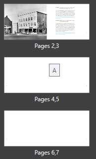
I like the way Affinity shows the applied master as a hovering little text block. It's just that the position of those blocks is quiet random: The middle picture show 'A', but God knows to which page that may apply! (Unless Publisher is somehow foreseeing me adding a page after page 8..., but still.)
-
Page Numbering Auto addto new pages
TomGerritzen replied to John T's topic in [ARCHIVE] Publisher beta on Windows threads
You're right, @walt.farrell. Sorry for mistyping your name, and, yes, I'll start another topic. -
Ligatures in lists
TomGerritzen replied to TomGerritzen's topic in [ARCHIVE] Publisher beta on Windows threads
@MikeW Why is there a cursor between the 'n'and 'g'? You shouldn''t be able to edit that piece of text. Maybe I wasn't clear on what I did? -
Ligatures in lists
TomGerritzen replied to TomGerritzen's topic in [ARCHIVE] Publisher beta on Windows threads
And here it is. Gerritzen 1912-2018Z.afpub -
Page Numbering Auto addto new pages
TomGerritzen replied to John T's topic in [ARCHIVE] Publisher beta on Windows threads
@walt how do you feel about the randomness with which the hovering master name is shown? Try moving around a bit with your mouse around the page manager. The master names are displayed in a strange way, and are sometimes not displayed at all. -
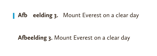
With the latest version of Affinity Publisher certain problems with ligatures and character widths were solved. Great job! However, the added logic apparently doesn't apply to numbered lists with text, as used in captions for tables, images or formulae. The first line in this example is a numbered list with text "Afbeelding <#1>.<tab>". (The word afbeelding is Dutch for image, in case anyone wonders.) The second line is simply body text with the same font (Calluna Sans). If I don't use bold style the result is still not good. And I tried the same with Minion Pro as it has the same f_b ligature, but that didn't change a bit.
-
Visual communication
TomGerritzen replied to richardtomkins's topic in [ARCHIVE] Publisher beta on Windows threads
Well, there is of course the statusbar that clearly shows something like "2,3 of 8", because I am working on the spread consisting of pages 2 and 3, and there are 8 pages in my publication. -
Superscript minus sign etal
TomGerritzen replied to Eileen's topic in [ARCHIVE] Publisher beta on Windows threads
To make it clear: the dropdown marked '1' is for synthesized superscript and subscript; glyphs become smaller and are placed further up or down. The buttons marked '2' are for OpenType subscript and superscript. These only work when the font has these glyphs AND the corresponding font features. Some fonts have these OpenType variants, but very few have variants for every letter, digit and mark. I actually have a font (Calluna) that offers OpenType superscripts but no subscripts. So I use the synthetic versions to keep them visually the same. -
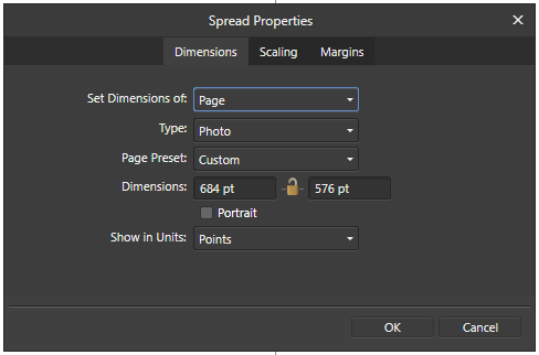
I have create a master spread with type Print (Press-Ready). When I open the Spread Properties dialog the type keeps going back to Photo. I don't really understand why that drop-down is even there, because I told Publisher that I wanted a Print (Press-Ready) document, and I'd think that would mean that all the pages and spreads will be of that kind. If a document would be a mixture of Photo-pages and Web-spreads and some Device-pages I wonder what the output will be...
-
CMYK document RGB text
TomGerritzen replied to TomGerritzen's topic in [ARCHIVE] Publisher beta on Windows threads
Hm. Although I cannot recall starting out with an RGB document, I just might have done that. Because when I explicitly create a new document with CMYK/8 colour this doesn't happen. Either way, I am not amused. Once I change the intent of the document (type Pre-Press instead of Print), or simply change the Colour Format to CMYK I expect colours to be in CMYK format. I understand that everything before that point must be converted and therefore will not be the same, but it's strange that I get to stick with RGB colours. Although once I output a PDF/X everything will turn into CMYK, so it might not be such a problem. -
OpenType support missing
TomGerritzen replied to Fahneflycht's topic in [ARCHIVE] Publisher beta on Windows threads
I just tried to open the original font in FontLab VI and export it as an OpenType PS font without altering anything. The resulting font works as it should, whereas the original font doesn't. I then exported the features from both the original and the newly exported font. In both the languagesystem definitions are present. The difference is just a few extra substitutions: sub s by longs; sub longs by s; sub f_f by f f; sub fl by f i; sub l_l by l l; sub t_z by t z; FontLab added these at the beginning of the GSUB table. These lines correspond to the 6 lookups, that are only referenced in chain substitution rules. Inside of FontLab the original font is working as it should. My guess is that the font is okay.- 8 replies
-
- typography
- opentype
-
(and 1 more)
Tagged with:
-
OpenType support missing
TomGerritzen replied to Fahneflycht's topic in [ARCHIVE] Publisher beta on Windows threads
Hm. I believe the Adobe documentation is rather clear on declaring scripts and languages in an OpenType font. It is highly recommended to add at least the first of the following two lines. The second is optional, but very common in latin fonts. languagesystem DFLT dflt; # Default default languagesystem latn dflt; # Latin default The first line is there to tell the application that anything that's not declared as language-dependant is valid for those cases. The second line defines that everything marked as valid for the Latin script is to be used regardless of language. After that one can define further, for instance: languagesystem latn DEU ; # Latin German This way the German language can be used in a feature to get a localized form of a letter or to NOT get a certain substitution. I think these declarations should not result in a font not functioning properly.- 8 replies
-
- typography
- opentype
-
(and 1 more)
Tagged with:
-
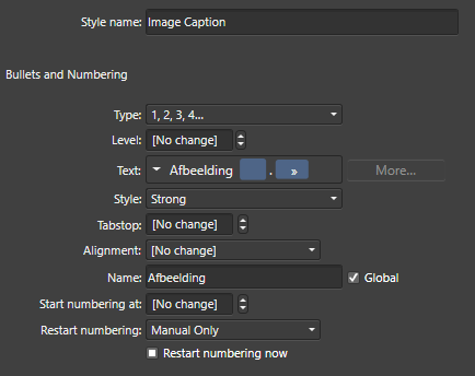
With a numbered list the same occurs. Just worse. The number (or a placeholder such as \#) doesn't appear in the blue box. Switching to Type: No List empties the edit box (which it should), and switching back to Type: 1,2,3,4... makes the text reappear but still wrong. The screenshot is of the Edit Text Style dialog, but the Paragraph panel shows the same.
-
This functionality is available in Publisher. In the Text Style dialog under the heading Typography > Alternates (for ligatures, historical forms and others), Typography > Variants (for specific Stylistic Sets), Typography > Figures (for lining figures, old style figures et cetera) and Typography > Capitals (for anything related to capitals). In the Character panel under the Typography heading are a few buttons for ligatures, ordinals, mathematic type settings and more. The last button (the one with the ellipsis) opens a dialog with everything you want for manual adjustments in one-off situations.
-
When I define or redefine a Paragraph Style one of the options is the colour of the font used. When I choose white (C0M0Y0K0) with the CMYK sliders the Style settings turn those values into RGB. My document is definitely set up to be a CMYK document.
-
Zoom to fit
TomGerritzen replied to TomGerritzen's topic in [ARCHIVE] Publisher beta on Windows threads
Hi Sean, Sure. The document is in the attachment. My screen has 1920x1080 pixels and my Windows zoom level is at 100%. Both are "recommended" settings. I do have a dual monitor setup (maybe that could be an issue, but I doubt it). Gerritzen 1912-2018A.afpub -
Gradient fill
TomGerritzen replied to Typo998's topic in [ARCHIVE] Publisher beta on Windows threads
Right, found it. No elliptical and radial are not the same. In radial mode there's just one axis, in elliptical mode there are two. The axes show on the object with handles and all. -
Gradient fill
TomGerritzen replied to Typo998's topic in [ARCHIVE] Publisher beta on Windows threads
Are you sure this is about Affinity Publisher? -
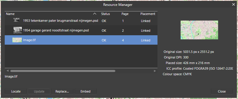
I placed a rather large PDF into an Affinity Publisher page. The PDF was created with Affinity Designer. After placing it I decided to use the original Designer document, and replaced the PDF with the original. The Resource Manager now tells me it's a TIF image. See: At first I thought Publisher turned the complex vector document into a bitmap for efficiency reasons, but zooming in excessively made it very clear that it still was a vector image. After cropping it, I tried to move the content around within the frame, but double-clicking the image opened a new tab with an Embedded Document. Apparently moving around an image in a frame is only possible when you first create the frame and then place the image inside it. To summarize: (1) there's something wrong with the replacing-an-image functionality, and (2) Cropping an image should -- in my very humble opinion -- result in the same as placing an image in a predrawn frame.
-
If there is a counter I have yet to find it. Shouldn't be too hard to add, of course. On the other hand Publisher is primarily a desktop publishing program, not a word processor.


