BARBAKANE
-
Posts
24 -
Joined
-
Last visited
-
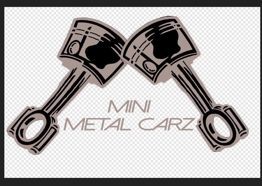
I'm creating a logo for my IG posts. I created a new document with a transparent background, added the logo and lettering, then saved it. (The logo is black and white...white meaning "white" and not a shade of grey.) Upon exporting in jpg format to transfer to my phone, AD added the background. There is no flood erase tool in AD, (interesting why it's not there), so I tried doing the same thing in APhoto, and it adds the background. Also the invert function doesn't work. THere are numerous posts about it, but when I try to invert, the parts that are supposed to be white are a medium grey color, not white. I'm hoping the community can explain what I'm doing wrong, and if there is a way to fix it that's not a 15 step process. Invert should mean invert, not maybe invert then do 3 adjustment layers, bake a cake, jump thru a few flaming hoops while juggling chainsaws and dancing on one foot. I really don't want to fire up my windows XP machine and do this in Photoshop CS4, but I will if needed. Below is the "inverted" logo. The grey areas should by stark white, so they should up on photos with a dark background.THanks in advance.

-
 jmwellborn reacted to a post in a topic:
Affinity Designer-things that make you go hmmmm..
jmwellborn reacted to a post in a topic:
Affinity Designer-things that make you go hmmmm..
-
No Xzenor....I'm bitchin about the fact that nothing is intuitive. I've watched video after video. And sorry I'm not living up to YOUR expectations about what I should do. I'll say it yet AGAIN, after seven hours of trying to get my head around it, not the mention the time spent watching videos, it's frustrating. I'm sorry I'm not an expert like YOU apparently are, but I gotta move on. Peace out. To everyone else, thanks for the pointers but AD is not for me.
-
OK, so ANOTHER 2 hrs and I still have nothing to show for it. AD is SO HARD TO USE. I simply want to trace something, but it seems I can't even do that. I find not a single thing is intuitive. My frustration level is thru the roof right now, and it seems my only alternative is to delete it and find something easier to use. I have absolutely no intention on trying to create stunning pieces of art. I'm simply trying to create a logo.
-
Why so seperate forums?
BARBAKANE replied to BARBAKANE's topic in Pre-V2 Archive of Desktop Questions (macOS and Windows)
So if there is "significant disagreement", then Serif is intentionally not listening to it's own user base? Something else that makes me go "hmmmm..." Guess we'll just have to struggle along, slightly hobbled of course. Sorry if this sounds harsh but I tend to think there is always a better way. -
 NotMyFault reacted to a post in a topic:
Why so seperate forums?
NotMyFault reacted to a post in a topic:
Why so seperate forums?
-
I've been using AP for quite a while now & I love it. So I decided to try AD, cuz I figured for 1/2 price now you can't go wrong. I d/l'd the demo, and I'm REALLY trying to like AD. After 5 hrs (!!!!) of trying to use it, I really have gotten nowhere. Cases in point... 1. The pen tool is not the pen tool. When I select a pen tool, I expect it to act like a pen..ya know, draw a line. 2. Why can't I erase something in the designer persona. I should be able to erase anything at anytime. That seems like too many added steps. One click sky replacement is possible nowadays, I figure erasing whenever you want should be possible. 3.Why can't I add text in Pixel mode.....see #2 4. When I use a certain brush, then edit something else on that same page, then select what I created with that original brush, the system doesn't tell me what brush I originally used. So it would seem, if I use three different brushes, one three different days, creating something in the same document, is it possible for AD to tell me which brush I used? 5. Why is there a "cat" tool? 6.I created another thread concerning the lack of separate forums for AD, AP, and Publisher. Makes searching extremely hard. These are the most glaring things I've come across. This is not a criticism (ok, maybe it is), just trying to understand some things I kinda took for granted would be easy.
-
With more than 293,000 threads in the Affinity for Windows forum, why are there no sub-forums for Designer, Photo, and Publisher. I'm a member of DPReview, and it would be like them bunching all the camera makers into one forum. If seperated, it would make it easier to use, since keywords are similar between programs and you need to sift thru the posts that don't pertain to you. If there is a separate way to search, then I haven't found it, PLUS it adds to the difficulty of searching.
-
I always ignore the update screen for about a month after the updates show up....just to avoid this situation. I probably don't really need the update since I use about 20% of what AP can do. I don't heavily edit my shots, trying to keep everything in camera as much as possible. If I take more than ten minutes editing an image I feel I have failed in getting the right image to begin with.
-
Trying to fix a 43 yr old
BARBAKANE replied to BARBAKANE's topic in Pre-V2 Archive of Desktop Questions (macOS and Windows)
I'm expecting an offer today or early next week. Thanks for asking. Will post updates on job and post the picture as asap. Have a great weekend. -
Trying to fix a 43 yr old
BARBAKANE replied to BARBAKANE's topic in Pre-V2 Archive of Desktop Questions (macOS and Windows)
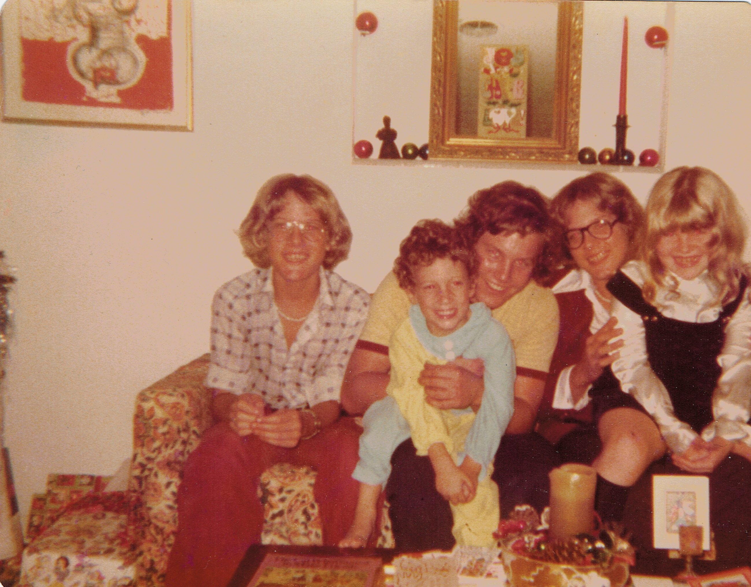
Thanks for all the replies and pointers. This is turning into a great learning experience for me since this is one of the worst pictures I've tried to restore. I'm mostly concerned with "grain"...the color cast and color restoration is straight-forward. CARL123 is the only person to really answer my query. Again, GRAIN is the worst culprit here. I'll try the Denoise feature..I wasn't getting the results I wanted when i first used it, but then my mind was probably on my upcoming job interview the next day. I haven't worked full time in almost a year due to "that which shall not be named". THanks again for all the tips. -
My brother's 60th bday is coming up next week, and this is one of the last photo's I'm trying to fix. I know it's pretty roached, and I'm trying to restore it to a somewhat usable shot. The grain is the biggest culprit, and I'm using gaussian blur to soften it up a little. To fix the colors is fairly straight-forward, but the grain is killin' me. It's a scan of the original 4x6 photo. I don;t have the original, and my other brother is using affinity to work on it to. Question being: Is it too far gone? The little blemishes here and there aren't a biggie. Just the overall noise/grain. Any help would do. I've watched several of Olivio's video's, since he breaks everything down nicely. Attached is the file. Anyone up for a major challenge? Or maybe share a link to how to get the results I need? Thanks for any help...Dave
-
thanks for the tip. I don't use keyboard shortcuts much, so I guess I gotta start. Ya know, once you get into a work flow you just put it on autopilot sometimes. But I still think it would be a cool function to be able to put the options into whatever order you want. Thanks again, and if anyone else knows of a way to do it, pls let me know
-
I'm using AP with W10, and I want to change the order of the selections when I click on the dropdown box. I use Curves on a lot of photos, and hardly ever use white balance. I'd like to change the order of the selections...move the Curves selection to where the white balance selection is. It's a pain to scroll to the middle of the selections to pick curves every time I use it. It would nice to be able to put them in the workflow order I am most productive with. Is it possible? Thanks for any help.
-
Dan C reacted to a post in a topic:
Affinity photo pastes layer as black and white
-
Oh...I seem to have got it. I went into the b+w layer and converted it. It was in greyscale...I converted it into RGB/16 and it behaves as it should. THat's weird that I haven't encountered that before.
- 1 reply
-
- 1
-
-
I have a picture that I have applied graffiti-type colors to and saved that file. When I paste that picture as a solo layer into a new document the colors are present. see example. Now when I try to import that file and place it as a layer above a cement wall picture, the car file gets changed to black and white...not as color. I read somewhere that AP may convert the file as it imports, but his is the 1st time I've encountered this, and I've been using AP for almost 2 years. I've tried importing the car layer both as a jpg file and as an AP file, but both come out black and white. Any way around this? Thanks for any tips and help you can guide me thru....Dave car logo graffiti colors.afphoto
-
Hey all...don't know if there is anyone else experiencing this anomaly. I did a quick search but didn't find any obvious threads, so here goes: I'm running AP in Windows 10 on my laptop, and I'm trying to create a watermark using my signature. I've created the PNG file, then loaded it using new intensity brush. I created an 8x10 inch background to experiment using the brush. Here's the weird part. When I place my cursor to use the brush, the resulting "stroke" is always offset from where the cursor actually is. If I set the brush size to 500 pixels, the brush stroke (signature) is offset by 1/8" above. I change the brush to another preset style that comes with AP, and everything works fine..the resulting brush strokes appear exactly where my cursor is. Does anyone else experience this? Is there a fix or reported bug anyone knows about? Any help would be appreciated. Thanx in advance. I could attach a screenshot but for some reason the screen won't capture the outline of my signature as a brush...it only captures the image if I actually USE the brush on the background. (Hopefully I'm explaining this enough for someone to figure out. If a scrrenshot is needed I'll use my cellphone to upload an image.