
TonyO
-
Posts
371 -
Joined
-
Last visited
Everything posted by TonyO
-

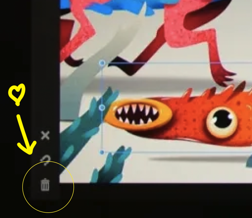
Missing Trash Icon? Harder to delete objects.
TonyO replied to TonyO's topic in V2 Bugs found on iPad
Swipe to delete works, it's not a hard gesture to get used to, but a app-wide "delete" inconsistency is starting to form. So here's how you delete different things: Object: 3 finger swipe menu OR swipe the up deselect button (no context icon) Node Tool Editing Nodes: Context menu Trash Can Icon Pen Tool Editing Nodes: Context menu Trash Can Icon Gradient Fill Steps: Context menu Trash Can Icon Transparency Gradient: 3 finger swipe menu OR swipe the up deselect button (no context icon) Vector Crop (when editing with the tool): No trash in context menu / trash can in 3 finger menu deletes object inside of the crop I suggest adopting the trash can in the top context menu bar for any tool that can select an object, node, or otherwise while using the tool. Having multiple on-screen locations for what would be otherwise the equivalent of the single "delete" key on a keyboard can get a bit confusing. Also, the new swipe to delete function isn't documented on the popup help menu, the label should probably read "deselect / swipe up to delete". Just my 2c. I can get used to the new action, but the option to revert in the settings menu would still be really appreciated. I'm not the only person who never, ever uses the deselect function, you can tap anywhere on the document with the select tool to deselect, adobe has trained us for years to do that on the desktop. If there's only room for one icon in that spot, an option to switch it to a static delete button would be super desirable to a large user base. Thanks again! -
Missing Trash Icon? Harder to delete objects.
TonyO replied to TonyO's topic in V2 Bugs found on iPad
@MEB If the devs are set on the new dual function button, I'm pretty sure adding this toggle in the settings would make everyone happy. Can you suggest this please? Thanks so much for talking with us, we appreciate that you guys value our feedback!
-
Missing Trash Icon? Harder to delete objects.
TonyO replied to TonyO's topic in V2 Bugs found on iPad
OR if they are also planning on adding the trash can to the Select Tool's context menu at the top, similar to how the Node Tool has a delete icon, that would be fine. As long as there is somewhere on the screen that we can just delete with without any action that's more complicated than a tap. -
Missing Trash Icon? Harder to delete objects.
TonyO replied to TonyO's topic in V2 Bugs found on iPad
@MEB I get that, and for a newcomer that is likely a better function. But at the same time, taking away a super easy-to-access function that many of us have engrained deep into our muscle memory is a hard change to get used to, especially for us 40+ year-olds who have been using Affinty since the very beginning and are hard coded to the old layout, haha. I'm all for progress when it comes to UI, but a removing the one-tap delete function is so basic that a lack of it will jar alot of users. I would like to ask for us old hats if we could at least have a toggle in the settings menu to just add a simple trash icon back in it's original location. The UNDO/REDO buttons have a toggle, i think a check box for "enable quick delete button" would be a great checkbox to add under it. Pleeeeeaaase? hahahhah. Love u guys! Thanks for considering! -
Missing Trash Icon? Harder to delete objects.
TonyO replied to TonyO's topic in V2 Bugs found on iPad
@MEB Can you suggest to the team to make deleting the default function (tap) and deselect swipe up? Or allow u the option to swap? Its the simplicity of tapping to delete an object that is missing here, adding another non-intuitive step to deleting is undesirable, I think everyone on this thread just wants to tap the pencil on an icon to delete. It shouldnt be something we need to think about. Also, when deleting, Affinity usually defaults to selecting the next layer in the stack, which is useful if you want to delete a few shapes in succession by tapping the icon quickly, which I personally do often. A swipe gesture would slow this down, I personally think the original layout with 2 separate buttons wasn't broken in any way. This new dual function isn't necessary since that whole left tool bar is basically empty staring half way down, there is plenty of room for both. The concept of deselecting is already built into the pasteboard just by tapping on the white area already, I personally have never even used the deselect icon. -
Missing Trash Icon? Harder to delete objects.
TonyO replied to TonyO's topic in V2 Bugs found on iPad
I had thought of this and put in a feature request, didn't get alot of views, but yes double tapping the pencil to bring up that menu would be a godsend. -
Missing Trash Icon? Harder to delete objects.
TonyO replied to TonyO's topic in V2 Bugs found on iPad
Hi @MEB The trash can is missing from the select tool on the context menu, so even if you can scroll, it's not there. It's there on the node tool though, looked like an unintentional omission, there's currently no trash can anywhere in the UI when the select tool is enabled unless you do the 3 finger swipe down for the pop up menu. -
I Vote to lock the thread, nothing productive is happening here.
-
Comments on v2 - a real disappointment
TonyO replied to Didge's topic in Feedback for the Affinity V2 Suite of Products
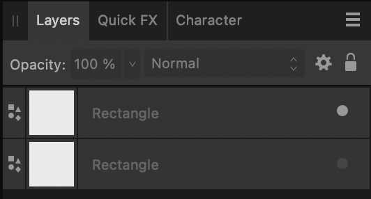
This looks clear, does yours not look like this? if you only see gray it might be a bug that the Devs would want to look into.
-
Comments on v2 - a real disappointment
TonyO replied to Didge's topic in Feedback for the Affinity V2 Suite of Products
Ok, now show us some that are off along with the ones that are on, so we can see a COMPARISON -
Comments on v2 - a real disappointment
TonyO replied to Didge's topic in Feedback for the Affinity V2 Suite of Products
Those layers are obviously off because if you have them on, they are white, unless there's something wrong with the rending of the UI on computer. The difference is pretty obvious as shown below. Why don't you show us your on-vs-off comparison so we can see the difference in contrast on your system. Showing 3 of the same thing offers no point of comparison.
-
Comments on v2 - a real disappointment
TonyO replied to Didge's topic in Feedback for the Affinity V2 Suite of Products
yes, they're off because the dot is gray, not bright white. This is not hard. -
If professional software costing $100 is too much to spend on your business or side hustle, then you probably need to find a different business or side hustle. You get the entire suite forever for half the cost of a single month of Adobe, quit complaining and pay for your tools. Cheapskates.
-
You're the confident one. I'd like to see this theory for sure. Have you considered the idea that some of us hold our pencil in our right hand, and use our left hands to interact with UI elements? Even if the original location is not the most convenient according to a yet undisclosed UI theory, the original poster's workflow along with mine (regardless of how you may judge them) are still being interrupted by the absence of this button. Adding it back to where it has been for years will not hurt the experience for those who do not want to use it. Open your mind a bit, kid.
-
OK, so hear me out. The option to double tap the apple pencil is available in the settings. Currently it allows you to set double tap actions per tool. Could you add the option to universally activate the 3 finger swipe menu with a Pencil double tap? This would negate the need to raise your pencil and change you hand orientation to activate this menu, since double tapping the pencil is such an easy action. Thoughts?
-
Adobe's implementation creates onscreen menu clutter that may cover smaller objects located below the currently selected object, making them hard to interact with and breaking up workflow. Adobe's implementation is a neat idea, but is more obtrusive than useful in practice. In the new UI, the node tool has the trash icon in the top context menu when the tool is selected (a confirmed missing feature from the selection tool that will likely be fixed in 2.1). I agree lower left is a bit of a reach, but icons hovering over the work area at all times is not the solution. The top context bar is an easy-to-reach place for functions such as this. Though personally, my muscle memory is so used to the bottom left that I don't find it inconvenient, and since there's room, adding it back can't hurt.
-
I put in a bug report about the missing trash icon, they said it should probably be there and they're looking into it. It most certainly needs to be there, deleting should be a one tap process and not under a sub menu.
-
It used to be on the bottom left, I put in a request to get it back and they said they weren't sure why it wasn't there. Likely an unintentional omission.
-
I like compact mode, i can leave it open and it doesn't take up as much horizontal space on the workflow.
-
A more robust cat tool would definitely be appreciated, haha!
-
I don't like the new UI design
TonyO replied to Zaxonov's topic in Feedback for the Affinity V2 Suite of Products
Hmm, I kinda like the flat UI design in the side panels, but I miss the color a bit. Though I see what people are saying about the icons feeling a bit more childish. Honestly, I'm kind of torn on the UI icons. I think some of the icons look better and some look worse: - Pen, pencil, knife, ruler, transparency - these look good - Contour, round corner, zoom - A bit of a step down but not too intrusive - Gradient - better shape but vibrant color would be nice like the old one - Dropper Tool - really hate it, should be redone -
Missing Trash Icon? Harder to delete objects.
TonyO replied to TonyO's topic in V2 Bugs found on iPad
Seriously, I think the responsiveness of Affinity's development and support team is one of the primary reasons i use this software! You guys are amazing! -
Missing Trash Icon? Harder to delete objects.
TonyO replied to TonyO's topic in V2 Bugs found on iPad
Upon further inspection, I found that the trash Icon DOES appear on the top context menu, but only when using the NODE tool. When you are using the selection tool, the trash icon is missing, leaving no apple pencil-based way to delete selected items. Moving the trash icon to the context bar from the bottom left corner does make sense (though not ideal for MY muscle memory, haha)... but it definitely needs to appear while using the selection arrow tool. -
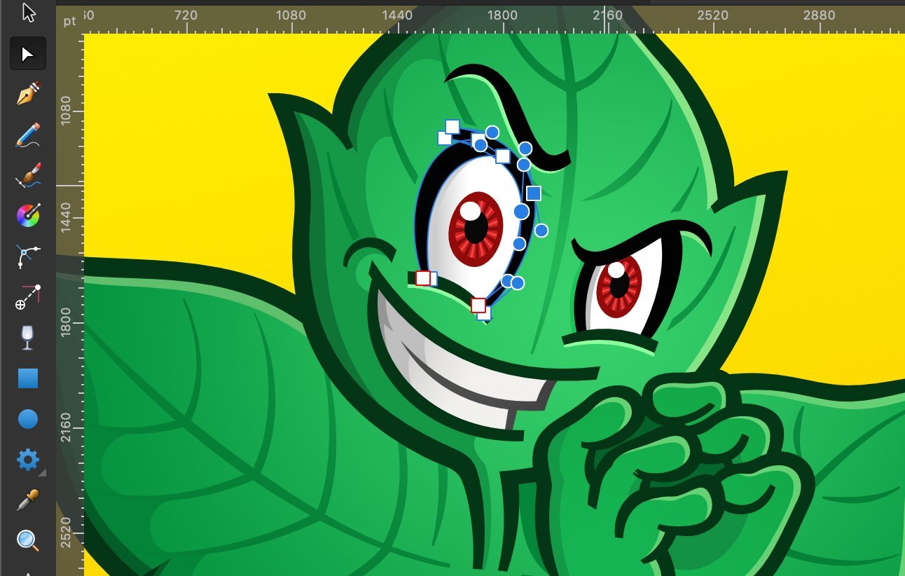
Hi! Version 2.0 is amazing! The new context items at the top are so much easier to use... but there is one missing function that is already causing me a bit of grief. This probably isn't a bug, but it kinda feels like an unintentional omission. On V1, there was a trash icon on the bottom left that made for an easy way to quickly delete anything selected. On V2, it appears to be missing, and the only way to delete an object is to pick up the pencil and three-finger swipe down for the new menu, which throws off the fluidity of the fast illustration style I've become accustomed to. If I ask really nicely, can this be put back? Pleeeaaassseee? haha. Thanks so much!
-
Yes, works as in your video on the pop-out menu only. The same "space vertical/space horizontal" buttons are still grayed out when added to the toolbar. Seems like a bug.