

jepho
-
Posts
67 -
Joined
-
Last visited
Everything posted by jepho
-
Nice! It made me laugh.
- 23 replies
-
- 1
-

-
- colorization
- colorize
- (and 1 more)
-
The UK media has a predilection for using unguarded moments to hold their chosen subject up to ridicule. While I agree that a public display of an unguarded moment may do nothing to reveal much about the owner's personality, their inherent nature can prevent the personality from obfuscating some personal character traits which the subject would rather remain hidden. All photographs are lies in one sense. We are used to hearing the aphorism that the camera never lies and in one context (it records what is in front of the lens) the proposition is accurate. What is often overlooked is that the subject viewpoint (where the photographer stands or sits while capturing the image and the lens focal length) is a deliberate choice made by the photographer. Other choices include, image crop, exposure, subject placement in the frame, highlight and shadow detail, colour &c. All of these choices are tantamount to an intentional manipulation of the final image. It could be argued that the photographer's intention is to deceive the observer in order to make them believe or conclude something. Unguarded moments, when captured unintentionally (honestly?) usually reveal an aspect of the subject which has not been seen or considered previously. They are frequently free from the photographer's intentional meddling with the observer's perception. For that reason they appear to be more valuable happenstances to my mind. http://www.documentingmedicine.com/wp-content/uploads/2011/10/williameugenesmith1971minamata.jpg This dark and yet tender image is from a series of images made by Eugene W. Smith. He was very severely beaten, to the point of almost losing the sight in one eye, by employees of Chisso because of his portrayal of the mercury poisoning scandal at Minimata. Is the impact of this image of Tomoko Uemura in her bath less in value because the picture was deliberately posed? https://en.wikipedia.org/wiki/Tomoko_Uemura_in_Her_Bath Was the image made with an honest intention to inform a wider public or was Smith's intention to bend the truth? The veracity of this recorded image (arguably Smith's finest work) is in doubt and it becomes little more than an advertisement for one point of view regarding mercury poisoning attributed to Chisso. This underlines my preference for the darker image of Karsh's Churchill. The manipulative trick of removing his cigar (deliberate act) provided another view of the man. It feels like an honest attempt by Karsh to penetrate a mystery and show what was beneath Churchill's skin. Whether the knowledge of trickery devalues the image is a different discussion. It is interesting to note how quickly we burn famous people once they have become human and smashed our mental image of them. A case in point is Aung San Suu Kyi. For many years she was a people's hero and a symbol of the struggle for freedom in Burma/Myanmar. http://4.bp.blogspot.com/-upQ5MDBY13M/T9SqvJAYcuI/AAAAAAAADt4/CP0EdX2XgDM/s1600/aung.jpg Somehow while in power (a position that was unexpected by all) she seems to have slipped. The linked image does not show a freedom fighter. It shows a besieged leader and asks the question; could Aung San Suu Kyi face charges of genocide in the case of oppression of the Rohingya. https://ichef-1.bbci.co.uk/news/660/cpsprodpb/99D2/production/_99187393_c7e1ef0f-74af-4504-87b7-23988ad4f08e.jpg I did not know that quote. Thank you. Our own government is all too easy to substitute for law. The very public debacle over moats, duck houses and Mars bars, purchased as legitimate expenses of too many of our MPs; resulted in no widespread overhaul of the 'rules' which all MPs claimed to be obeying while emptying the public purse for their own grubby purposes. There were also no widespread prosecutions or jail sentences for the miscreants. A few weeks ago, during an interview on a TV show concerned with political issues of the day, our foreign secretary freely admitted to being paid £160,000 for a game of tennis. The purchase was made by the wife of an ex-minister of the Russian president. https://www.independent.co.uk/news/uk/politics/boris-johnson-tennis-russian-billionaire-putin-minister-tory-donation-a8261871.html It demonstrated Boris Johnson's propensity for malfeasance and I was incredulous that he was not summarily sacked and prosecuted. My work includes reviewing radiographic images of bones and applying treatments on the evidence of injury. I never read the reports of the experts (radiologists) which accompany each image because it will pre-prejudice what I observe (and the manner in which I survey the radiographic evidence) and can deduce from the evidence. Despite the fact that radiologists are clearly 'giants' and I don't hesitate to ask their advice when I am in doubt, I need to think for myself. I am sure that innovation based upon past knowledge is the way that humanity progresses. We don't usually propose completely new ideas and concepts from nowhere. Yes, agreed. Yes, the original work remains unsullied so its existence is not in doubt. While my photography tutors were scathing about the deliberate copying of the work of others (photographing a photograph for example) and passing it off as a genuine attempt to produce work with artistic merit, they were delighted if one had made an honest attempt to replicate the artistic work of another person; from scratch. Degas is reputed to have said "Art is not what you see, but what you make others see." I prefer monochrome photography because it allows more time (and the space) to give one's attention to the graphical elements which help to make a good photographic composition.
-
Another valid interpretation: Karsh was looking for the extraordinary moment when his strategy was applied. He caught Churchill's expression in a moment which may have been familiar to those around him but rarely seen by the wider public. In my opinion it was an inspired move which drew Churchill's portrait out of the formal and expected arena into the intimately superb image that justly became famous. All good points made well. If you were on the panel with whom Churchill was being interviewed for the job of national leader, and all you had to assist you to decide were the two images under discussion; I am curious as to which one would sway you. I am a fan of Karsh's interpretations and I like both images very much. Side by side, the less jovial image appeals to me more because it is an unguarded moment of Churchillian time so I judge it to be the better image. It also reveals for me precisely what the regular image hides. Mythical or not, Churchill was regarded as a 'giant' by many. He was clearly the right man in the right job at the right time. The leader who shows a human face may well presage trouble for themselves. While we may fondly imagine that we want our leaders to be human, when they show normal human failings we pillory them and remove them. Our current PM is caught between trying to be popular and taking a tough and workable approach to many seemingly insoluble issues. The net result is that she constantly appears weak, ineffective and rudderless. Wearing the mantle of humanity while leading a nation appears to weaken the leader. Had Churchill been known for his skill at compromise and vacillation, he probably would not have earned the gratitude of a nation. When we see it for what it is... a harmless pursuit which pleases the person who applies the colour and possibly helps them hone their skills with digital imaging, I have no complaint about the act of skill development. I think I get off that particular bus when work which falls into the art category, by dint of public acclaim and respectful regard, is altered and potentially trivialised by our endeavours; ostensibly to make it more amenable to our tastes. Undoubtedly! Who would gainsay the notion that more information is better than less?
-
Nearly correct. The photographer has the freedom of choice to place a tone wherever it appeals the most. Arguing an opinion is futile because either or makes no difference. Opinions can be anything we choose them to be. The image painting we are discussing was very well executed. It may not be possible to revisit an original artwork for many reasons. In my photographic course work no student was allowed to produce derivative work. e.g. photographing a beautiful sculpture with excellent lighting and exposure. Such work always and instantly earned 100 demerits. The rationale behind this seemingly harsh approach from the tutors was that the work produced was merely a simulacrum and therefore inadmissible as original art work. A photo of a sculpture created by another artist is just a copy of the sculptors work. In the same way... when we copy an image and try to rework it, all we are doing is demonstrating that on that particular occasion we failed to create our own work. It is at this point that I find the derived Churchill hand coloured piece to be less than inspirational although I admire the diligence in colouring the whole piece..
-
The photographer always decides where to place the exposure for every subject matter imaged. Ansel Adams devised the zone system of exposure and could place any part of an image on any zone, depending upon the image and its intended purpose. The concept of "exposure setting is right" is a form of limitation for the photographer. Without being pedantic, the photographer exposes the image to draw attention to parts of the total subject matter. Karsh's Churchill does not follow the dictum that you have laid down... "Even blacks have detail if the exposure setting is right". The reason is not hard to discern. His exposure was designed to place the image mainly on the shoulder of the characteristic curve for the film he was using. Inevitably, this leads to blocked shadows but the intention was to work like this so as not to overly compress the important tonal image values. In digital terms; with high dynamic range tricks and a seemingly endless range of manipulative techniques, it is possible that interpretations of the work of Karsh may well emerge with highly detailed blacks. Shadow and highlight exposures are infinitely variable for the same image. If you like an image, it is ok. If you dislike an image, that is also ok. Imposing your worldview of photographic exposure on people who may not agree with you is one way to become unhappy. Hope this helps.
-
It is a pity that people think that the image is improved by adding colour. It is a very useful practice of skills but improving upon another person's vision is impossible. Dorothea Lange was a serious documentary photographer who was commissioned for about 4 years by the Farm Security Administration to document the great dustbowl disaster during the depression years. She believed that creating the image was an act of love and that the observers returned that love by the act of seeing the image. I don't know any artists who would attempt to paint a better Mona Lisa.
-
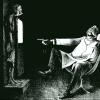
Hmmm... Hi GabrielM. I like the care you have taken to add the colour. In the dim and distant past I used to hand paint photographic dyes onto monochrome 8 x 10 inch film negatives. The subjects were often bridal or family portraits, during a time when large format monochrome negatives required slow imaging techniques which often resulted in studio images. Take a look at the famous image below; by Yousuf Karsh. As a photographer with a keen interest in documentary photography, it is difficult to avoid seeing and knowing about the documentary images produced by Yousuf Karsh, Don McCullin, Eugene W Smith, Dorothea Lange, Henri Cartier Bresson, Robert Doisneau et al. One could categorise Karsh's image in different ways but the techniques used to create his image below could be described as chiaroscuro. The depiction and interplay of highlight and shadow detail is crucial to the image formation. Chiaroscuro photography is a powerful and sparse technique which is frequently seen as being difficult to master. It is an unforgiving technique that uses light and dark as the principle graphic elements to describe the subject matter and remove any unnecessary detail from the gaze of the observer. The attached image catches the subject at a moment in time which portrays power, alertness and strength. These qualities lend Churchill a gravitas which suits the image and says much about him. The shadow detail has been suppressed and only a small amount of back light has been allowed to outline the main subject. The important detail of the face has been given the maximum opportunity to describe the person/man/statesman/Churchill. The observer has nowhere else to look and we are in no doubt about what the image portrays and says about this great leader of men. For me, in contradistinction to Karsh's image below, your image created an ambiguity that looks a little false. The increased shadow detail added little to the man. The colour distracted me from the person. The following apposite quotation is ascribed to the documentary photographer, Ted Grant. “When you photograph people in color, you photograph their clothes. But when you photograph people in Black and white, you photograph their souls!” Your careful colouring work is excellent. I thought that the subject was ill-chosen because it detracted from much of what is known about the person. Possibly history has been written and re-written about Churchill for so long, we are all used to the idea that he was a strong and ideal leader. It does not dwell on his bad temper nor his taste for alcohol. Had WWII turned out differently, we may have had another image to absorb and feel over many decades. I guess that my take on your image overall is the small cautionary note: you could try to choose the subject with a view to how the additional colour affects the image portrayed. Keep on colouring images and look at as many as you can. Better yet, take as many as you can and view them in colour and monochrome and extract the essence of what is portrayed when you view the same image in colour and monochrome side by side. Well known documentary images that probably will never work in colour: https://karsh.org/wordpress/wp-content/uploads/2017/03/Yousuf-Karsh-George-Bernard-Shaw-1943-1561x1960.jpg https://d5wt70d4gnm1t.cloudfront.net/media/dorthea_lange/migrant_mother_nipomo_california/dorthea_lange_migrant_mother_nipomo_california_1024x768.jpg https://karsh.org/wordpress/wp-content/uploads/2016/10/Yousuf-Karsh-Ernest-Hemingway-1957-779x980.jpg https://www.artfund.org/gallery/800x450/assets/what-to-see/artist-rooms/2014/don-mccullin/ar01184-dmc.jpg http://www.documentingmedicine.com/wp-content/uploads/2011/10/williameugenesmith1971minamata.jpg
- 23 replies
-
- 4
-
-
- colorization
- colorize
- (and 1 more)
-
Congratulations to all at Serif. The Affinity Photo update to 1.5 is massive and very welcome. Thank you Serif!
-
I had the same issue. ⌘R while on the app store update page did not refresh the updates showing. A restart selected from the menu was all that was needed. The next visit to the app store showed the waiting updates correctly.
-
Hello All. I wanted to use Affinity Photo (AP) to replicate watermarking images in the following style: http://photoshop-tutorial.org/photo-effects/watermark-your-photos/ My reasons for wanting to use this particular style of watermark are because it is a less intrusive method for the viewer because it permits the image under the watermark to be seen and also it is not that easy for the casual observer to remove the watermark. Method: 1. Select and open the image to be watermarked in AP 2. Press ⌘J to duplicate the background layer 3. Type the desired copyright text in black using the Artistic text tool 4. Resize and move the text to the desired location 5. Open the layer effects dialogue box with the text layer selected 6. Tick the Bevel/Emboss checkbox 7. Select Emboss in the Type drop down box at the top of the dialogue box 8. Click on the link symbol between radius and depth value to make setting the depth possible 9. Click in the profile box (empty) to select your profile from the four visible at the bottom of the dialogue box 10. Tick scale with object box and reduce fill opacity to 0% A bonus is that you can edit the text and change its style until you flatten the image. Layers effects dialogue box image and example watermarked image attached for clarity. layer fx dialogue box.pdf watermarked image .pdf
-
 Thank you both. :) I will now see which method I prefer.
 -
Despite being a longtime user (since version 5.0) I have recently dropped Photoshop in favour of Affinity Photo. I love its visual and ultra nimble approach to editing images via adjustment layers. The outstanding in-house video tutorials expose many simple and smart ways to work. Affinity Photo is destined to be great software and I look forward to version 1.5. The ease with which one can stack images is just fantastic and the Inpainting brush is truly amazing. I have found the GUI easy on the eye and the interface is always informative. What a great effort from the team at Serif! I hope to soon be able to use the iPad version of Affinity Photo when away from my desk. Thank you.
-
Hello. Having consigned my CC account to the trash can, I am now learning to use Affinity Photo and Affinity Designer. My question concerns the addition of a stroke to the selection marquee. I have searched the forums and cannot find any answer and wonder if a more experienced user of Affinity Photo can help me. Photoshop had a very simple method by which a stroke could be applied to any selection marquee. This was a really useful feature and I used it regularly for highlighting salient features of images which I had included in presentations, where the images would be included to illustrate important points in the discussion. I would like to know what sequence of events I should follow in Affinity Photo when applying a coloured stroke to a selection marquee. Thank you for your assistance.
-
Hi, I'm Jeff. I am a professional photographer (both film and the digital era) and I am a long time Photoshop user. I was intrigued to see that Serif are taking on image editing for the professional market, just as Apple are dropping support for Aperture. I expect logical menu structures, ease of use, multiple methods of achieving an endpoint from anywhere within the software, plugin acceptance, CMYK, Pantone and hexachrome compliance, separations and pre-press capabilities including traps and knockouts within my professional image editing software. I will be watching the development of Affinity Photo with great interest.