

abarkalo
-
Posts
240 -
Joined
-
Last visited
Posts posted by abarkalo
-
-
Hi Affinity, I can't select fonts from left pane drop down list in this latest beta. I am able to scroll down the list and select a font, but then the font reverts to Arial once I start typing. The only way I can ultimately select the font is first typing in Arial and then selecting the type and then going back to the font list and selecting again. The MAS version doesn't have this issue.
-
On 3/21/2019 at 10:10 AM, hubob said:
The pinch zoom on my trackpad (MacBook Pro mid 2018, 13", Mojave 10.14.2) seems to stop working frequently when using Affinity Designer. Sometimes I can re-enable it by de-activating/activating it in systems preferences, but often I need to put the laptop to sleep for it to work again. Is anyone else experiencing this issue, too?
yes this happens to me often. Is this an Affinity issue? I thought it might have been a Mac firmware issue.
-
There is a bit of a momentary jaggedness when typing on a font in the Metal GPU mode. This goes away after a second or two. I don't know if anyone is experiencing the same but I fixed by switching to OpenGL.
-
Yes I believe that Affinity can make a much better DAM than what exists right now. Adobe's Bridge handles Adobe files very well but it doesn't preview anything from Affinity - of course by design. Also, it is a slow beast and working with tags, especially hierarchical tags is a nightmare. I avoid this thing if I want my laptop not to run hot. Pixave is a super elegant DAM and beautiful and it supports Affinity very well. But its tagging system is a bit strange, and finally I let it go because there wasn't any universal search (no searching by tags or notes - what's the point?). So I just use basic Finder on the Mac is it's doing a good job but I wish thumbnails worked like they do in Pixave or Bridge.
As for comparing Lightroom, that's only for photos but I would like the DAM to work with Designer and Publisher files (bound document modes also like PDFs). I do like the tagging and thumbnail UI in Lightroom, but again it's only for photos. And it seems slow where Affinity's DAM would be lightning fast.
-
I've had that happen and it's caused by activating too many fonts or running too many font managers or having one bad font that messes with your system. It is not an Affinity issue. Please follow the steps in this article and it will instantly fix the problem: http://osxdaily.com/2015/01/08/clear-font-caches-databases-mac-os-x/
-
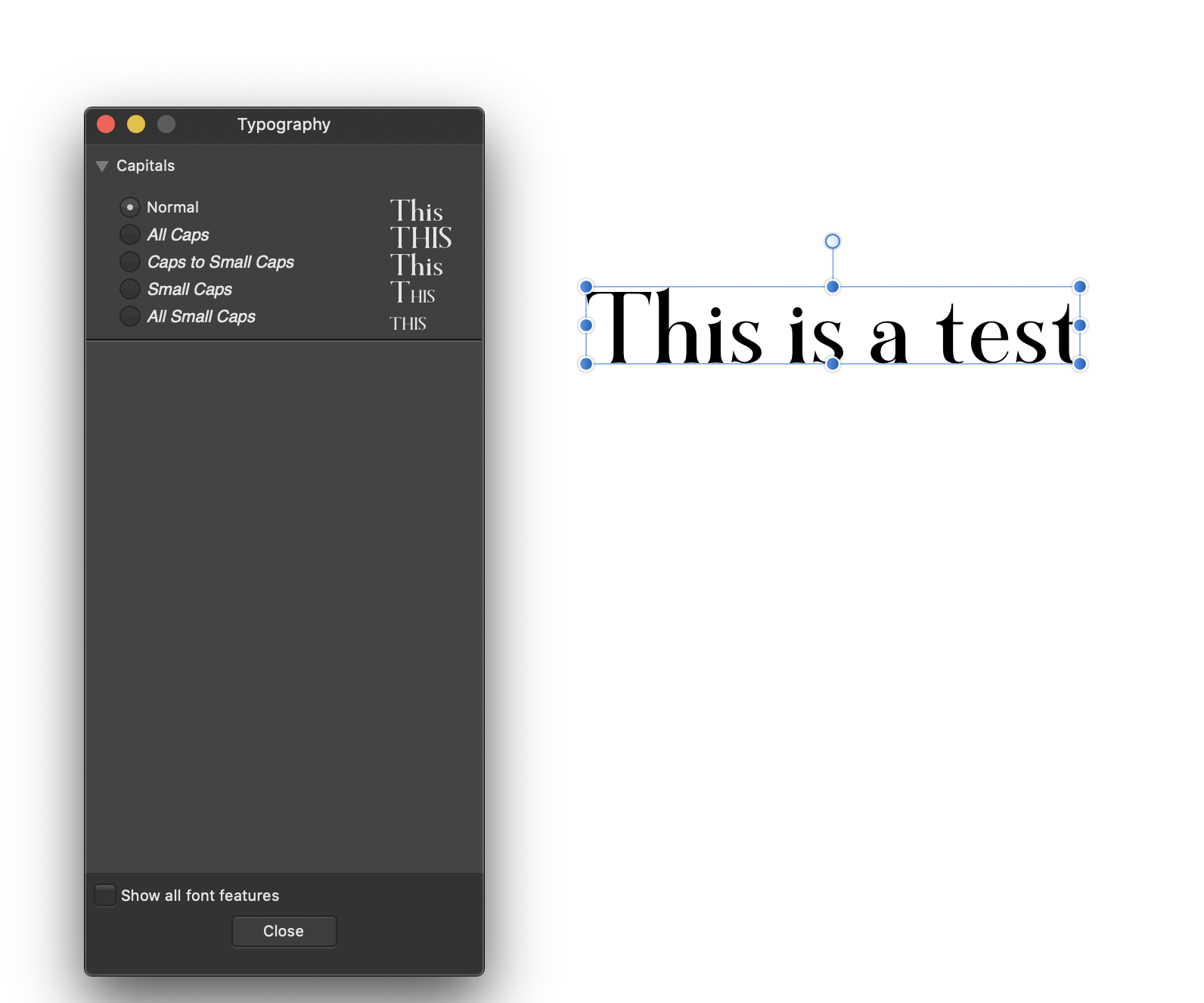
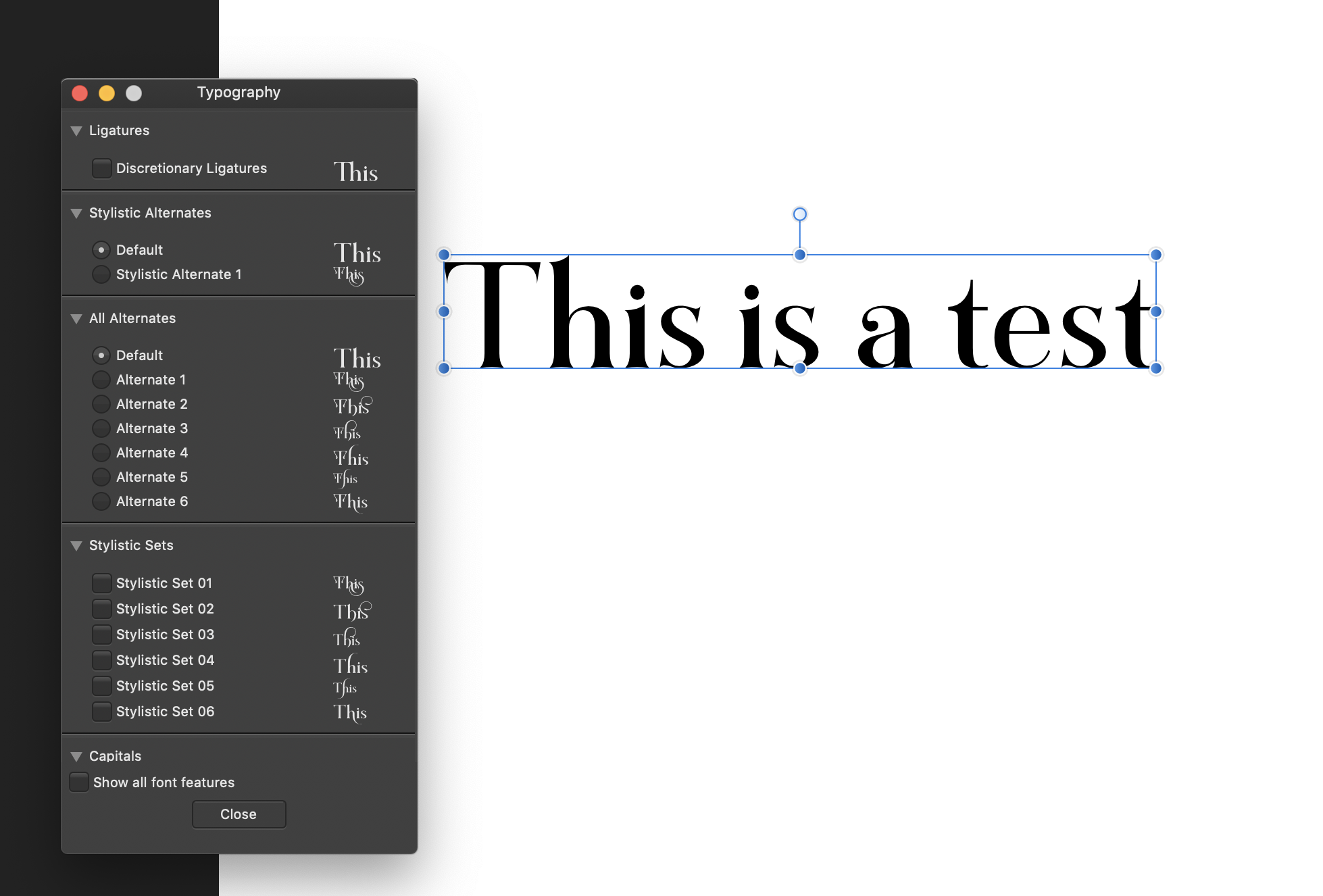
I encountered a problem today that affects the beta version of Designer and Publisher. There is no issue with the Mac App Store version of Designer - all works well there. The issue is that with a certain font there are no stylistic sets in the beta versions - let me know. Please see the images attached. The font in question is Marschel Pro by Zeune. I could send the font but maybe that would create licensing issues. I don't know if this problem is with other fonts, and maybe I'm not getting all the stylistic sets without knowing it. But with this one font I can show at least.

-
Wonderful new beta. Thank you.
There is still an ongoing text glitch. When using the full justify text setting, the last line in a paragraph often stretches so that the letters spread with wide spaces across the line. When I try and use option-left left to tighten then only the spaces between the letters in a word tighten, and the large gaps between the words are left alone (they are conforming to fill the whole line). In a full justify setting, the last line should be shorter than the preceding lines, obviously, but this odd behavior often happens, not in every instance.
-
Are you using Mojave 10.14.1? I have exactly the same issue on a laptop but it is not related to Affinity Designer in my case. Try to see that the pinch/zoom does or does not work with other apps, even Safari. (Also triple check that your trackpad settings enable pinch zoom). The really unfortunate but effective solution for now is to I close the laptop lid, wait a few seconds and then open again. Many people have reported this issue and I hope Apple fixes in the next version. If you are on a PC then I think it's another issue.
-
I think there is a bug when creating a text frame by drawing a shape with the pen tool, then converting to a text frame. There is a visible line around the polygon text box and can't seem to get rid of it. I first thought that I had a stroke on the text box itself, but there is no stroke. This doesn't happen when I create a normal text frame box.
-
OK I am and I'm literally having so much fun. If I were to place a very complex vector object in InDesign even with my super high end laptop (i9) the program would be so incredibly laggy that I was forced to make a PNG file out of it and then work with that only. Here with AP + Metal I am pinching and zooming a VERY complex vector object and I get zero lag. Absolutely amazing. With OpenGL it was also sort of fast but there was blurriness and a very slight lag while the screen was redrawing. Also fonts would slightly blur when zooming - not anymore. Thank you for fixing this.
-
In terms of GPU acceleration should we stick to Open GL or is it possible to use Metal now. I remember there were issues using Metal in Affinity Designer but Metal is so much faster. But if it's safer to stick to Open GL then I will do that.
-
13 hours ago, fde101 said:
You can do this using Font Book on the Mac; the "collections" can be used to filter fonts on the Character studio panel in the Affinity apps.
It would be nice if the selected collection was applied to the font menus in the context toolbar as well... then you could leave the system fonts out of your collection and they would be hidden by nature of having the appropriate collection selected.
OK I see this now. But then again I don't use Font Book for my massive font library collection - only system fonts in there. And the lists that I make in Suitcase or Typeface 2 don't correspond, obviously - otherwise that would be perfect.
-
1 hour ago, fde101 said:
It does for me, including some fonts I added to a Font Book category that are activated through FontBase (a font manager) and are not installed on the system when that is not running.
yes I have deactivated the ones I could. Still many remain
-
1 hour ago, Old Bruce said:
Yes! Hey Apple, give me two groups of system fonts, the necessary ones and all the others which can then be turned off if I don't need/want them.
yes I have deactivated those but there's 522 fonts that one cannot deactivate. Anyway a lot of people want to use system fonts - OK but I just want to be able to hide them. I don't need Times New Roman, a single font of Futura, or Zapf Dingbats etc in my design work. For Word or Pages or Excel - sure - but not for Affinity.
Suitcase, Typeface, Rightfont are able to separate out system fonts. Maybe there's metadata or other technique but it works well.
-
Yes I agree with your cosmetic ideas on the font search bar.
As for system fonts I agree that these fonts are good quality fonts but they are not designer fonts. The reason to use any design program, especially Affinity Designer or Publisher, is to make some truly outstanding poster art or artwork, as well as business layouts etc. This is not going to happen with ANY of these fonts (I apologize for my snobbery). I spend thousands of dollars each year to get the latest stylistic fonts and this has been a good commercial decision. What I do, as many designers do, is assign a set of fonts per color just as I would a custom color swatch group and a specific raw artwork folder. If I try to install all my fonts into Font Book my system would crash. So I have used Suitcase but now using Typeface 2 to manage and activate/deactivate group, per project name. Typically a design layout can have one to five fonts - that's it. So having to scroll up and down a list to find my own - each time - makes as much sense as having a thousand tool buttons on the app's UI.
As for grouping, whatever you group in Font Book doesn't match what shows up in Affinity. But by the way, why not group all system fonts together - they're still there but perhaps you could be able to collapse them so they don't get in the way. I could live with that in case the idea to hide/unhide system fonts isn't accepted.
I just need Publisher, and Designer, to streamline to creative workflow and help me work more quickly. It does a great job now, but this is my wishlist as well as the idea of sorting by stretch or font weight.
-
I think we went off topic here. I just wanted to suggest new font listing ideas that would surpass InDesign etc. Currently Affinity apps list fonts by weight ascending order. That's fine when dealing with a family that have 12 fonts or less. But when you have activated a family that has compressed, extended, normal, semiextended (let's call it stretch) etc all in the same family then things really get messy and by that I mean that it's really hard to scan for the font that you are looking for. When I compare with InDesign, it seems they organize by stretch then sub sort by weight. That makes the list very clean. But it's not the only way to do things.
I want to use Affinity apps for everything I do, and their ease of use and amazing power surpass Adobe. But in the font department there are a few suggestions that I can make to surpass in that area as well:
1. Option/switch to hide system fonts. Not a good idea to deactivate them but why see them at all in Affinity? They are not design fonts, or should I say they interfere with my high quality design fonts. This is my single biggest request here.
2. Sort options. Why just limit to one sorting technique - let's go to town. For instance, sort by weight or stretch, or stretch and sub sort by weight, or weight and subsort by stretch. If you use a font like Mercury Text with different contrast options (G1 through G4) then it's very nice to just scroll up and down with Affinity's live preview at the Roman G1 or Roman G2 or G3 or G4 and just focus on those contrast options - sort by weight and then subsort by stretch in this case. If those fonts are not close together then it's hard to see the difference and that is crucial for making the right decisions. Or if you just want to focus or a particular stretch group, say just the condensed types, then it's nice to scroll up and down on only those.
3. Grouping. If you use some FontFont or other font maker families then you are using some pretty massive families - some as large as 164 fonts. This is where you really need some filtering or grouping. What if I only want to work with the normal or condensed or perhaps only the semibolds in any given stretch? Then it would be nice to filter or group and not have to scroll up and down such a long list.
4. Pinning. I was slow to figure out that the grayed out area was recently used fonts (looked like a visual glitch to me since this is new in Affinity!). But I think to kick it up a notch it would be wonderful to pin something that I've filtered. For instance I may want to pin only the condensed types in a given family. Sure I can favorite them but I want to see this in the main list. Just an optional idea but something to think about.
-
OK sure but same issue. I thought further about this issue and even spoke with one of the major font designers. Might be interesting to have a sort button (perhaps in preferences). InDesign sorts by stretch (cond, normal, ext) and Affinity by weight (reg, med, bold)
-
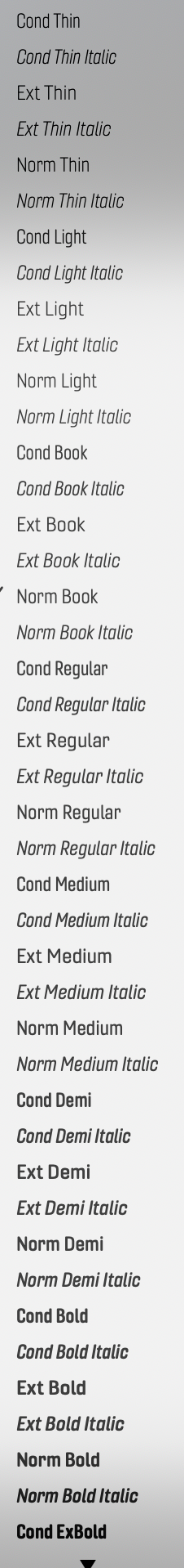
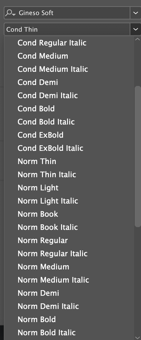
Also fonts don't lay out nicely in Affinity (Designer or Publisher) as they do in InDesign. Here are screenshots from both InDesign (the dark image) and Affinity Publisher. I'm using one font that I have that has lots of typefaces.
-
I guess I've been living too long in the Affinity universe - Designer and Photo don't have that right now, except for the betas that I haven't gotten around to testing. I noticed that Adobe Photoshop does but I use that only for serious compositing and not for any type work whatsoever. You're right that InDesign does that as well but I stopped using that a while ago. So it was a surprise for me in Affinity.
-
I don't know why the Affinity app wasn't updating. It was before. Also I went to the main download link and it gave me an old version. But now I have 0.174. It's great.
-
The latest one I downloaded (from the main download site) manually says 1.7.0.162, which is the same version I have installed. Is there a newer version and how may I get it.
As for recently used fonts I see that now. I selected a few and they are at the top of the list. Nice feature but looked like a glitch at first. Maybe some slight labeling for those not in the know.
-
I realize that you can't deactivate Mac system fonts but I really don't need those fonts in my design documents. I need only my designer fonts of which I have many. Since no one can't activate thousands and thousands of fonts all at once, on any powerful system, I activate and deactivate only what I need per project. So it would be very nice to have a clean list of fonts - only see my designer fonts that are currently active. In other words, just hide not deactivate. Can there be a switch to turn the visibility of fonts on or off? That would be so great to not have to mentally block out STIX and all those other fonts that I never use and don't need and really make it difficult for me to scroll through the list.
-
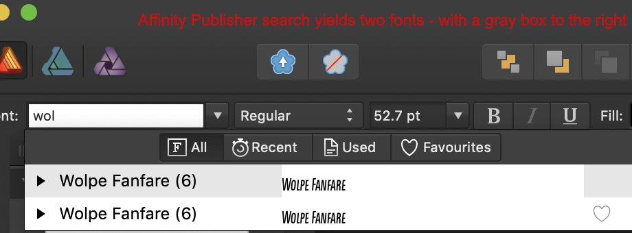
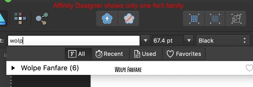
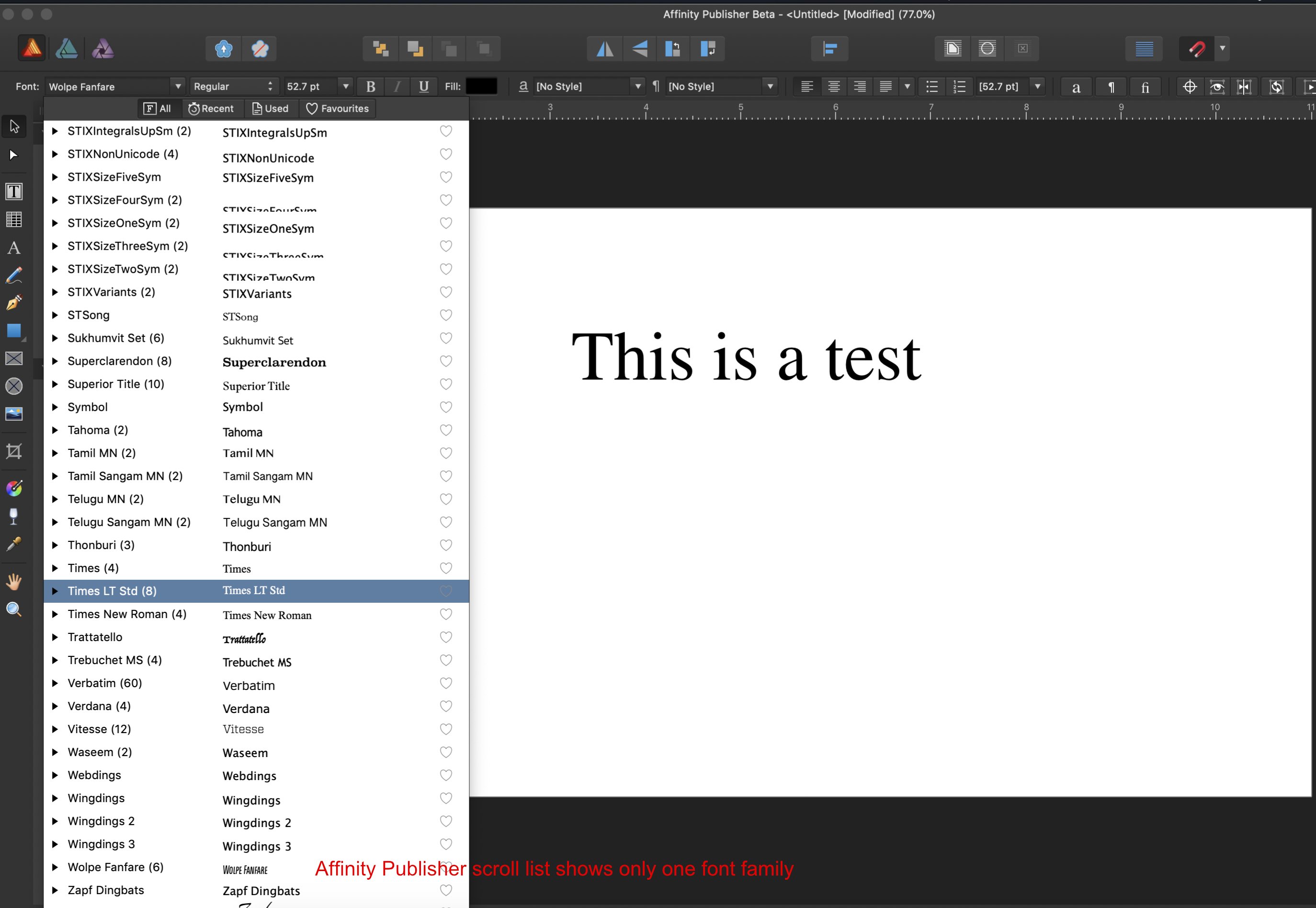
I notice that this is a bit of glitchiness on the font display in Affinity Publisher 1.7.0.162. When you select a font there is a shaded area on top. I didn't really care about that before but not it shows duplicates of files that are activated. I checked to see if there was a problem with the font but in Designer it works perfectly - only one font family is listed. Please see images of Affinity Designer with that single font. Also please see that Affinity Publisher top list shows the duplicate while the scroll list on Publisher shows only one listing on the font. Hard to really explain. Please see images. The font in question here is Wolpe Fanfare but I have seen this issue with a few other fonts (and they are correctly installed and work perfectly in Designer).
-
On 3/27/2018 at 5:09 AM, A_B_C said:
I would say, this is the way to go …
(Unfortunately, not all “unwanted” fonts can be disabled this way. Some of them are said to be required for the system. Well …)
The idea is not to disable the system fonts - they are used in all sorts of Mac system apps. But in Affinity Designer I want to see my design fonts, not my system fonts. If there could be a way to disable/enable system (more so disable) then the font list would be clean and only contain fonts that are activated in Right Font, Suitcase, Skyfonts or Adobe Fonts. Right now it's a pain to navigate through.


Affinity Publisher Public Beta - 1.7.0.292
in [ARCHIVE] Publisher beta on Windows threads
Posted
It's a small bug but please fix - if I select the text tool (art of text frame) then go and select a font what happens is that no matter what my selection is my font reverts to Arial. If I start typing in Arial and then select a font again then the font changes to my desired selection. Although this is not a Designer forum, I need to mention that the same thing happens in Designer Beta.This glitch/bug is not present in any MAS version.