Rivka
-
Posts
23 -
Joined
-
Last visited
Everything posted by Rivka
-

Snapping problems
Rivka replied to FolioGraphic's topic in Pre-V2 Archive of Desktop Questions (macOS and Windows)
did you ever get anywhere in a better work flow for this? it comes up for me often as well -
merge pixel layers in Designer
Rivka replied to retrograde's topic in Pre-V2 Archive of Desktop Questions (macOS and Windows)
If you notice, they are asking about Pixel Layers, which are already raster images, even within the Vector Program. -
crap i hate that program. i got it and learned how to deal with its cranky ass to use it for expand stroke and envelope distort features and wow its sucks. mind you it is insanely powerful, amazingly so. but wow talk about slow, unintuitive, inconsistent. literally everything that Designer is not. its amazing how my very mood and mental health changed the afternoon i had to use it. i will keep it in my arsenal and im glad its there for when nothing else works, but yuck. and while i have no doubt it does 1000 cool things every day, the example you show above is not the same as i am asking for. that is a rectangular that has symmetrical corner fillets and then has been warped, its still symmetrical fillets. and the point is that i need to do the fillets to shaped after they are created, i can be off warping them.
-
Yep, that is exactly what i used to have in 2D and would like.
-
good question, i had something like this in a cad program way back when and you set it one way of the other (very similar to landscape or portrait orientation in the document set up) and could go and swap any corners back and forth fairly easy.
-
fun work around, wanna come over to my desk and do it on 57 polar rotated letter shaped curves, with a few hundred corners?
-
ah but this does exactly what i don't want it to do. it makes them circular rounded corners. i need oval rounded corners.
-
ahahaahhahha that's funny. Funny the way showing a empty water glass to a person lost in a desert is funny.
-
yeah i totally know how to do it the long way around like that, but with each letter having many corners, and in my case the letters are often rotated and doing it for inner and outer lines, a simple graphic can have a few hundred of these corners, and god forbid you decide you want them "just a tiny bit less". but year, ill write up a feature request, though honestly they need to work on way way more important things first (expand stroke anyone??)
-
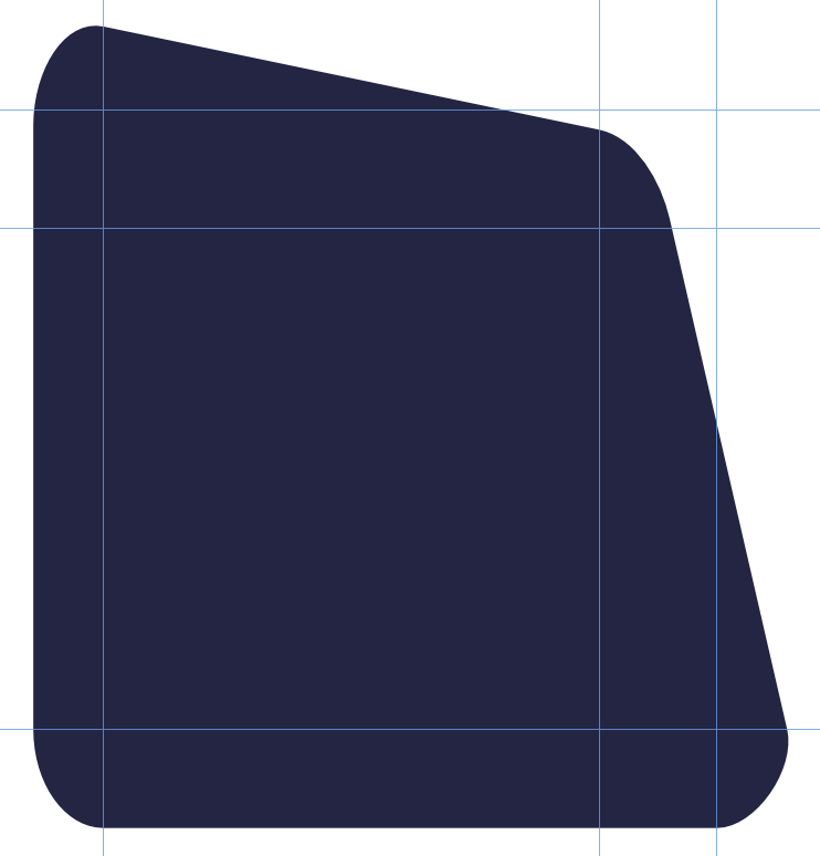
I have a need to round a lot of corners that i need a ovaloid fillet (1mm down one side of the corner and .6mm down the other) Is there a way to do this that is not painstakingly by hand? (the shapes being rounded vary a lot, they used to be text that are now curves that I'm customizing) I either need something like the corner tool were I get to pick HxW rather that simply R. the image below shows the kind of corner shape im after. i know how to do it manually, however this would be completely unrealistic and frankly sloppy, i have hundreds to do and im sure it will come up again and again.

-
ah its the guides i can't get to snap to intersections! i can get my curser to, and therefor an object to, but the guides only want to snap to pretty random things that don't seem to have much of a pattern.
-
hmmm actually just got it to work, so back to the inconsistenty i keep seeing. ill look into it more again tomorrow with fresh eyes, gn
-
An awful lot and really mix results. Can you show me what your snapping settings are when you did this, because i set up the very same thing and it did not work like that with any setting i could test. In general i feel quite proficient in AD as i did in .ai and freehand before that, but this is one of the small list of things that is making me pull out hair.
-
So it's 2019, any word on snapping to intersections?
-
Designer: Expand stroke is completely broken
Rivka replied to footof's topic in V1 Bugs found on macOS
I spent 4 days doing by hand what should have been a 3 minute operation. Now they want it 0.1mm smaller stroke, this would be nothing at all if the program worked the way it should. In its current state, this is the stuff of nightmares. don't even get me started with the translated version they suggested! off to go look for another program to do this step on, how stupid. -
Designer: Expand stroke is completely broken
Rivka replied to footof's topic in V1 Bugs found on macOS
I would like to suggest in the future that prioritizing new programs and projects over critical functionality of existing products is a very poor choice. It makes it seem that the company wants new customers and more money over loyal satisfied professional. I don't think that Serif feels that way at all, so please don't act that way in the future. I know you folks have taken a sad beating in this thread over the years, it's very flustering I'm sure on that end of things too. Please understand that for many of us, this function is so at the core of our work flow that it was (and is) hard to understand how anything else was ever getting worked on while it was still broken. Please assign the correct folks to this right away if it has not already happened. Let us know that it is not on "the list" but actually on the "workbench". Please focus on being the responsive agile company that drew us all in in the first place.- 124 replies
-
- 4
-

-

-
- bug
- expand stroke
- (and 2 more)
-
Stylistic Alternates not working
Rivka replied to Rivka's topic in [ARCHIVE] Designer beta on macOS threads
How did things go with this? I see the company is promoting the exact fonts i was talking about on the site (which is awesome, he is amazing) , so i assume the issue has been sorted out? -
Stylistic Alternates not working
Rivka replied to Rivka's topic in [ARCHIVE] Designer beta on macOS threads
Nice to know i wanted just crazy, looking forward to hearing what comes of it. Let me know if you need any info from the font designer. Rivka -
Stylistic Alternates not working
Rivka replied to Rivka's topic in [ARCHIVE] Designer beta on macOS threads
uploaded, looking forward to sorting out what is up, the font designer is super curious as well -
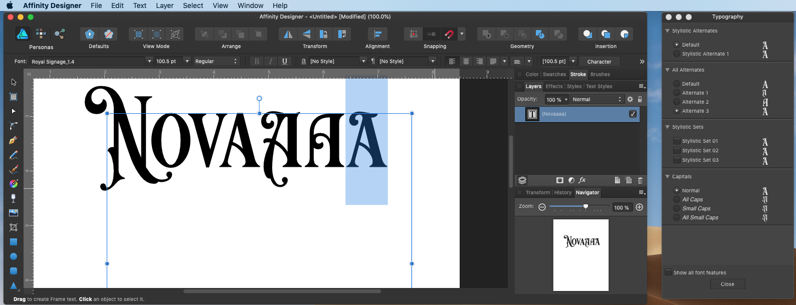
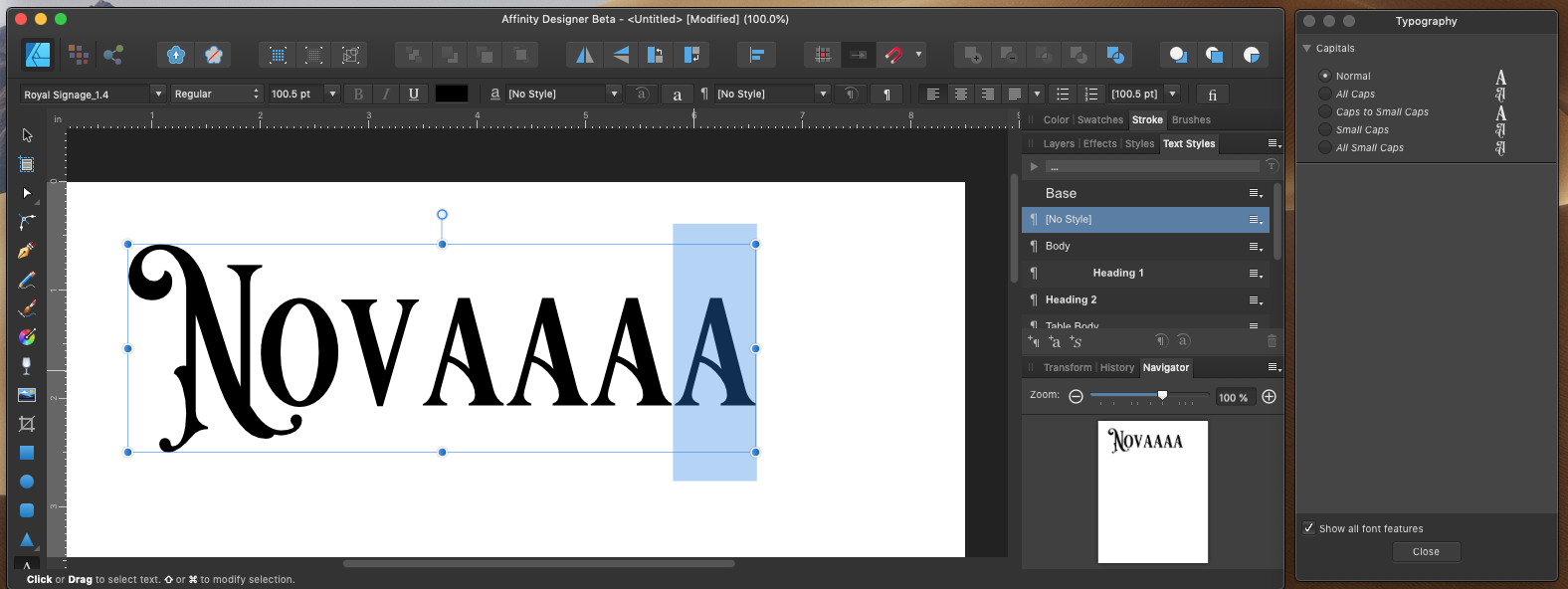
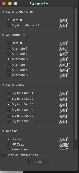
I have had this issue thru all builds of the Beta, I am currently updated to 1.7.0.9. I'm running MacOSX 10.14.3 but have had it on the last two OS versions as well and on a second computer (also Mac) I have spoken to the Font Creator (a well regarded pro) and he sees no reason why this should be happening. He has agreed to let me share his paid font with the Beta team for testing. As you can see in the screen shots, his font have numerous alternates that work perfectly in Designer 1.6.1 However the same text (copy pasted or retyped) does not have this same choices in 1.7.0.9 If someone would like to contact me with an email address i can send the font for you to reproduce the issue.
-
Affinity Designer Customer Beta (1.7.0.4)
Rivka replied to MattP's topic in [ARCHIVE] Designer beta on macOS threads
the font is a paid font that i use extensively and is the font selected on both examples i posted, it has a large library of alternates as shown in the 1.6.1 window. Since it is a paid font i likely can not share it with you, but here is a link to it if you are wanting to check it out. https://creativemarket.com/TobiasSaul/1810175-ROYAL-SIGNAGE-ORNAMENTS the example i posted was from two documents each created in their own version, but i have now tested it creating it in 1.6.1 and opening it in 1.7.0.4 with the same outcome, as did another one of this persons fonts. However i did test it with a unrelated font that had some minor ligatures and it seem to be mostly the same. So the question begs to be asked, what is different between font designers, that some of them don't work in 1.7 and other do? I'm going to send a note to the font designer as well, he is highly regarded and his fonts are top notch, he will want to look into this.
-
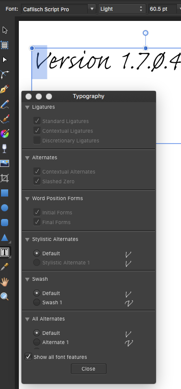
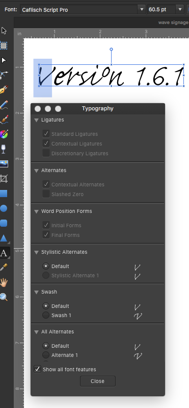
Affinity Designer Customer Beta (1.7.0.4)
Rivka replied to MattP's topic in [ARCHIVE] Designer beta on macOS threads
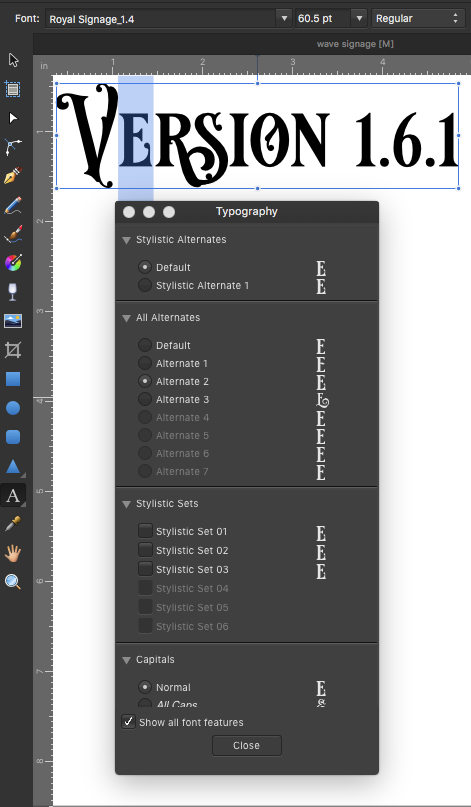
Enjoying the beta for the most part. Question, Topography panel is a lot more limited, are you going to put that function back in soon? this is when using the same font in the same situation, the one on the left is the Beta 1.7.0.4, the one on the right is 1.6.1 Thanks
-
Curved Text
Rivka replied to Tom De Poorter's topic in Pre-V2 Archive of Desktop Questions (macOS and Windows)
Has these operations gotten any more straight forward in the past year? I'm working on a bunch of Signage and this warping comes up all the time. I currently use Baseline and Vertical Scale tools in the Character pallet