

ncJohn
-
Posts
166 -
Joined
-
Last visited
Posts posted by ncJohn
-
-
So is it normal to have to do this when working with images with a large number of layers?
-
This solves the problem of how to print it, but does anyone have any idea why it's taking so long otherwise?
-
2 hours ago, >|< said:
Since the document has a "merge visible" layer (presumably at top of stack), group the underlying layers and hide the group. Does that print quickly?
Yes. With the group showing it's the same as before, but with the group hidden, it's pretty much instant.
-
I've been using AP for quite some time and have never had any problems printing and I'm not sure what's relevant to this problem so I'm just going to post as much info as I can about what's going on.
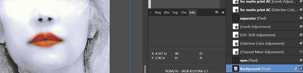
The bottom line is it's taking so long to print this image that it seems to be freezing up, and during the process it's taking up 50-60% of my total RAM and up to 100% of my CPU, with no other programs running. (I have a core i7 CPU and 24 GB of RAM.) There are 20 layers active in AP, plus the "merge visible" layer recommended in the printing tutorial video. Total file size of the image on the disk is 447MB and on the info line above the image in AP it shows 6.47MP and approximate 3000x2000px.
I've tried this over and over with the same result. I tried restarting the pc to free up RAM and it doesn't make any difference.
When I flatten the image it prints just fine, no hesitation at all, but I don't understand why it won't print if I don't flatten it. I keep thinking it has something to do with the size of the file but that's not based on anything, it's just a guess.
-
Okay, I see! This is really very cool! That's very helpful "info" in that panel. It's so much more than I knew. Thanks a lot guys.
Now, I do have another question about the info panel, but it's just a curiosity thing:
What is "memory efficiency"? It changes as I open or close images but always hovers around 500%, even with 6 images open at once. If I got ridiculous and opened 20 at once (Which I don't want to do.
") ) would it drop drastically?
) would it drop drastically?
Edit: I thought of another question: Why do most images have samplers automatically but some don't?
-
8 hours ago, R C-R said:
Have you tried clicking on the 4 line 'burger' menu at the top of the Info panel & choosing "Add New Sampler"?
Yes. It doesn't seem to do anything but it's possible I'm just missing it because I can't figure out what "sampler" and "target" even are. Affinity Photo Help doesn't shed any light on it for me; it seems to assume that I'm already familiar with those terms. The way I've always used the "info" panel in Adobe is just to put the cursor on the image and it shows the colors in my image at that spot. Do you know of a place where they explain "sampler" and "target"?
Thanks
-
I'm curious why the "info" panel or palette sometimes will show color values for the cursor location and sometimes will only show the x/y coordinates of the cursor. I've tried changing the source selection, the layer, and the size of the cursor (well, actually, I've tried changing everything I can think of) and it works fine on some images and not at all on other images. What am I doing wrong?
-
14 hours ago, αℓƒяє∂ said:
This pretty much sums it all up for me.
-
25 minutes ago, Medical Officer Bones said:
Well, you did mention that there's a whole lot of noise relating to ppi and dpi on the web. I just wanted to clarify things a bit more.
By the way, you wrote that you have a Canon printer? If it is a newer model (last few years) it may very well support 600ppi prints as well at high quality settings on quality glossy paper. In that case you might want to feed it 600ppi images instead of 300ppi ones. That is another point I made: know (the hardware limits of) you output device.
Apparently it's hard to know whether the Pro-100 supports 300 or 600. The actual driver only specifies fast, standard, or high quality (or, if you go into the custom dialog, it's standard, high, or fine). And a search online turns up a lot of people who say it's 300 and a lot of people who says it's 600. But I didn't see any who say how they know that. But thanks for the idea; maybe somebody who knows will speak up.
-
27 minutes ago, toltec said:
No.
The Appli iPad ‘retina’ display has a very high resolution of 2048 by 1536 which works out at 264 ppi.
Your 300 pixel image would occupy (1.136 ish) of an inch.
A typical 24 inch HD monitor (1920 x 1080) has around 92 pixels per inch, so 300 pixels would occupy about 3.26 of an inch.
A big screen 50 inch HD TV (also 1920 x 1080) has about 44 pixels per inch, on which your 300 pixels would measure 6.8 inches.
So, based on a 300 pixels per inch image, an inch could be anything from just over one inch, to just under seven inches.
Thanks... sigh
-
A lot of the responses here refer to there being different sizes of screens. So, just to clarify...
On any device with any size screen, if I display a 300PPI image at 1:1, could I hold a ruler up to the screen and count 300 dots in an inch (If my eyes were capable)?
-
1 hour ago, Medical Officer Bones said:
That depends. I am going to amend Toltec's answer here.
Well, I appreciate your (very comprehensive
) response, but in my original post, my question was how to print at 300 DPI. That's what Toltec was replying to.
-
7 minutes ago, toltec said:
Right.
It's the only time inches actually are inches.
Okay, thanks a lot.
-
6 hours ago, toltec said:
If your image is going to be two inches x two inches on the design and the printed page, it needs to be 600 x 600 pixels. If four inches by four inches, 1200 x 1200 pixels. 300 pixels per inch
which equates to dots per inch for your purpose.
So you're saying that I was doing it right all along: Resizing my files to 300 PPI before saving. Right?
It's funny that EVERY thread I've seen about this subject does exactly what this one has done: it explodes with further questions and opinions, with the occasional unrelated tangent.
-
Like many people, I've struggled with PPI/DPI and how they affect print quality. The discussions I've seen here are usually actually about PPI and include the advice, "You don't need to worry about DPI unless you're talking about printing," and then they don't mention printing again. But printing is exactly what I'm interested in.
I think I have a grasp of the fact that AP says DPI when it means PPI, and that I don't need to worry about what DPI AP says my image has until I'm ready to print. But when I am ready to print, I don't see anyplace to specify what DPI I'd like in my print. It's not in the Canon printer driver and I don't see it in AP's print dialogue.
When I was using Adobe, I saved every image I worked with at 300 (DPI? PPI?) and then when I printed I didn't even think about it. But all the discussions here (and the video tutorial Understanding DPI) make me feel really sure that I have absolutely no idea what DPI I'm printing at. (My prints look good, but I'd still like to be clear about this; maybe they could be better.)
So how does one properly print at 300 DPI?
-
5 hours ago, photophart said:
You might want to see this post: https://forum.affinity.serif.com/index.php?/topic/61355-possible-to-increase-number-of-open-recent-files/
I saw that thread last night, but the gist of it seems to be that the registry hack suggested doesn't work. Did I miss something?
-
On 11/3/2017 at 11:21 AM, Frameshifter said:
This is a great work around. Being on Win10 I am still related to the limit of 12 unfortunately. I'll check out a registry hack for this. Thanks for the reply.
Frameshifter, if you're still around, did you ever find that registry hack?
-
3 hours ago, RobinMcL said:
I'm very new to all this and still, more or less, at the stage where I am trying to put my environment together. Of late, I have been giving a lot of thought to soft-proofing. I have spent time using the feature in Photo and have discovered the following.
It is great to see how things will look and have the power to nudge things a bit. However, after I have made a few "nudges" I have lost the visual image of what it was I wanted in the first place. Surely, there must be a way to have two copies on the screen at the same time but only be editing one. Can someone please tell me how I can do this?
Robin, I can answer this part but I have to leave the rest to someone else.
With your unedited original open, under the Document menu, click "Add snapshot." Then from your Snapshots palette select your snapshot and click "New Document from Snapshot." (If your snapshots palette isn't open, you can open it from the View menu>Studio.) This will give you an untitled copy of your original, which you can edit. This isn't as elegant as the PS method of just duplicating your active image but it works.
-
Just now, R C-R said:
Funny or not, it is true that printing a digital photo 'distorts' the colors somewhat, even if the monitor is perfectly calibrated & adjusted using soft proofing to get the best possible match to the printer, paper, & inks. So it is not quite true that by using soft proofing you will know exactly how the print will look.
Oh, I know; I've been printing for a long time. I've just never had a tool like AP that makes it so easy to see what's out of gamut and bring it back in. (To a distortion that makes me happy.) (Which still makes me laugh.)
-
17 minutes ago, R C-R said:
If you shoot or edit in a wide gamut color space it is entirely possible that printing in a narrower gamut color space will result very different looking results. If you don't use soft proofing, the only way you will know if this is true is by 'hard' proofing -- IOW to waste paper & ink by actually printing the photo.
Actually I use only sRGB, but these particular photos all have reds that are pretty saturated, and the results I got by bringing them back into gamut are no better than what I got by letting the printer do it. (No worse, but no better.) But I definitely use soft-proofing; the first time I ever read about it I knew that was the way to go. And I really like how they incorporated it as an adjustment layer in AP; I like that a lot better than the PS approach.
-
1 hour ago, walt.farrell said:
The advantage of doing the adjustments using soft proofing is that you know how the photo will look. You get to choose a color distortion that you're happy with. Otherwise you're just taking a chance on whatever the printer decides to do, and maybe its version won't be as good as what you could come up with.
Yeah, I can see this.
I don't know if the part about choosing a color distortion you're happy with is supposed to be funny, but it kind of is.
Thanks
-
I really enjoyed James Ritson's video tutorial on soft-proofing, but there's one thing I don't understand. He showed how to alter areas of a photo that are out-of-gamut by using curves or HSL to alter those areas so that they'll be in-gamut and will print accordingly.
I had some photos where there were red areas that were out-of-gamut but I printed them anyway (just to see what I'd get) and the out-of-gamut areas printed a little bit differently than they looked on-screen (predictably) but they weren't terribly different.
My confusion is: either way you wind up with areas that are a little bit different than they would have been if everything had been in-gamut. So why bother with adjusting the photo before printing? If you make the adjustments you have colors that are a little bit different from what you wanted, and if you don't make the adjustment you get colors that are a little bit different from what you wanted.
-
3 hours ago, R C-R said:
As a mouse user, are you aware that you can use a mouse scroll wheel to change numeric field values by placing the pointer over the field & moving the wheel? You might find that easier than dragging the slider.
Well, I did not know that! That's pretty cool! (Not as good as a double-click reset, but still pretty cool.) Thanks.
-


taking extremely long time to print
in Pre-V2 Archive of Desktop Questions (macOS and Windows)
Posted
Exporting is interesting. Exporting as PNG, JPG, or TIFF is fine. It refuses to export as PSD; takes an unspecified error after a too-long time of trying.