Arthug
-
Posts
15 -
Joined
Everything posted by Arthug
-
UI - some buttons too small
Arthug replied to 000's topic in Feedback for the Affinity V2 Suite of Products
I rarely use those buttons, just in case you missed it: - In the Character panel: You can click on the labels (before value boxes) and start dragging right/left to adjust the value. This concept applies to similar parameter setups like those in the Transform panel. - On the contextual toolbar, where labels are not available, you can hover the mouse over the values and scroll up/down to adjust them. Tip: Holding Shift while doing above dragging and scrolling will increase the value adjusting speed. But I agree sniping those buttons is a pain, even having them there already makes a mess of a UI. -
All I wish for this Black Friday is a bigger discount and a high res, unedited picture of everybody's face.
-
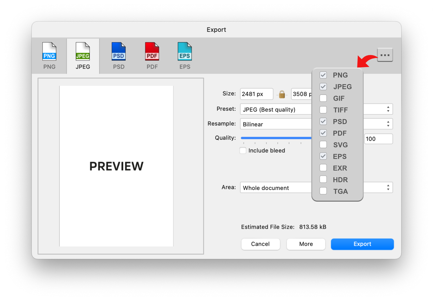
How about this? You can pin frequently used formats, and more supported formats can be added to the list without punching your eyes.

-
An object being warped too farther away from its origin can be frustrating to select as showed below: I don't have suggestion. Wish there were a hint of some sort.
-
I don't like the new UI design
Arthug replied to Zaxonov's topic in Feedback for the Affinity V2 Suite of Products
What I dislike most about new UI is the increase of negative space around UI elements. I immediately see a loss in some frequently use elements despite of minimizing every studio windows. Still remember there were requests to reduce the space in v1 years ago. Now they add even more space, urg... On the contrary I like the new icon set. Removing fill color of primary shapes really help silent the Tools panel for me, meanwhile other icons distinguish themselves from others better in v1 imo. They pop out so well that I understand why some of your feel a thorn or 2 in your eyes, if you leave them there forever. My working screen doesn't have Toolbar and Tools panels. I hotkey most used features, only leave less used ones on those panels. Then I have a hotkey to pop panels up and choose elements with mouse. I also make sure no cluttered icons on the Tools panel, everything should be 1 click away. In my case those icons sting my eyes when I need them most, that's a plus. I do this because I'm still on an 22" FHD monitor. If you are luckier with a bigger screen and want those panels always on, I still recommend removing icons that you already hotkey and use frequently enough not to forget them, no real reason to have them there. -
When I open Layer Effects panel (found under Layer menu, not the Effects studio), AD loses focus on the main window and I can't hold Space to hide object bounding box for reviewing. I need to click somewhere on the main window to do so. This doesn't happen on the Windows version so pretty much a bug on Mac.
-
I made a mistake while asking, the functionality in question is the Add boolean, not the convert to curves itself. I often use Add on single object to permanently reset its bounding box after skewing/rotating, which also converts the object to curves during the process (guess that's why I confused).
-
Is there a way to keep a corner editable when you convert the shape to curves? No new nodes created, just keep the current nodes and their corner fx (by Corner tool) .
-
It would be nice to have a button to isolate the current object so only objects inside can be selected. This is similar to selecting all other objects you dont need in the Layer panel and lock them.
-
AD/AP can be 1 time purchase, but you can't say anything about AD/AP Pro, AD/AP Extra or such... MS Office has both models, for whatever purposes. I do all drawing stuffs in Clip Studio Paint, it's 1 time purchase on desktop, but asks for a subscription on ipad . That's business for you. It all depends on how the company visualizes their future, and whether or not they have enough power to swing their sword.
-
Around 70% of the times I try to move an object, my finger hits a resize node instead . How do you make sure you are selecting to drag move?
-
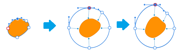
For small objects, the cage can transform to reflect the adjustments on nodes and handler, but returns the some default forms (a circle in this case) when being activated again, depending on the shape: For large objects, we only need to offset the control from object a bit: Not the brightest example here, the whole point is in the future I hope AD dev consider inventing less intrusive ways to work with objects. These current way of distributing controls right on objects (Move, Node tool etc.) have been around for ages, I believe they can be changed in a better way. Let's try assuming the best case when you editing an object: 1. The controls should not interfere with the view on object. There are indicators to know what you're working on, but the object remains intact in term of color, shape, stroke etc. 2. User should not lose perpective on the object. It stays at the same place on the screen , no need to move/zoom in/out document for the sake of handling some controls. On the ipad version, there's a preview displayed when holding nodes, my thought is what if we switch the role by allowing controls on the preview and see the object transforms instead?
-
In the ipad version, i'm able to: - Select 2 objects => open Stroke studio and adjust stroke width for both. In desktop, i have to do it 1 by 1. - Adjust the pressure for the stroke separately between the beginning node and the ending node. In desktop, when I change 1 of them, the other will follow. So how can I do the same thing on desktop or there are really differences between 2 versions? Thanks.
-
I like the idea, but I can image the checking will be teadious and buggy. Replacing the current object with the symbol (at that position) is much more simple.