matisso
-
Posts
109 -
Joined
-
Last visited
Everything posted by matisso
-

Publisher: Data merge to separate files
matisso replied to max1josef's topic in Desktop Questions (macOS and Windows)
It’s called “Merge” for a reason… (the above quote is from the help file). Now, you might export the resulting .afpub to separate PDF files, if only Affinity supported that… 🙄 There were some explorations about that being done here… Workarounds yet again. -
Affinity PHOTO export to .bmp *HELP*
matisso replied to Max Mitty's topic in Desktop Questions (macOS and Windows)
There are still numerous systems that accept files in quite dated formats (even this thread provides an example) for backwards compatibility, legacy or other reasons. Plenty of banking systems are still running on COBOL, despite the fact it’s a 66 year-old programming language (!) – costs of rewriting complex transactional systems and risks associated are very high, so there is little incentive to move to more modern solutions. Let’s keep in mind we aren’t really talking about some truly exotic file format, after all. Downplaying the needs of some users (I wonder what was the exact phrase stated by an Affinity member) means flipping a finger at them and pushing them to competing products (more on that below). As always, not possible to satisfy everyone but let’s face it, it’s quite a standard format. Then again, it’s not the first standard feature absent in Affinity… Huh. Except you just did… 🙃 Right? People want reliable tools that answer their needs. It’s that simple. Also: I just happened to start a new job for a global company of quite a huge scale (talk about over 100k people around the globe). Something that most people miss is that in scenarios where your equipment is managed by an IT department, you might simply not be able to install new software just like that. You could try talk to the IT people, but in cases of tight security and strict policies this may just be out of the question. Let’s be real though – chances that Affinity in its current state is going to actually be used in such places is nearly non-existent. So is the notion, that there’s a will to improve the Affinity line to reach such a level, even if that meant increase in the price (wild guess, because their policy is as non-transparent as it gets). Still, if claims of a “complete package” are being made, ideas of having external software for still a basic feature like .bmp export are a bad joke. -
Not to hijack the thread (I actually wonder if I should create a new topic for it, the reason for hesitation is that I am currently on 2.5.7, will it be looked into?), but this got me wondering if it might be the case with the inexplicable problems I've been trying to deal with since just a few days. Publisher just started to crash with a particular file for no apparent reason. I did not install anything at all. I don't even need to do anything with the program either, the file is just opened and if I let it sit for long enough – which is really just a few minutes – the program crashes. Now, the file in question is in the Dropbox folder, which is stored locally but being synced. Out of curiosity @bbrother, what would be the alternative to the binary format that you had mentioned?
-
This is a great tip. Thank you!
-
Seems true, but only superficially. I can (and do) check what software is capable of before deciding to buy it. But there’s always a limit of how deep you can go with this kind of explorations. Imagine you’re buying a house (far fetched, but bear with me). You can ask about just anything prior to the decision, but there is no way of really knowing how it’s going to be living there, other than living there. You need to take an (informed) leap of faith at some point. You make this look so simple but then again, the the proof is in the pudding and no amount of reading the ingredients list will substitute buying it. Do you really test each and every feature for literally every possible scenario? I know that trials are made for testing. Still, if you do, I think that either the number of your scenarios is rather limited, or you have insane amounts of time on your hands. A subjective selection of stuff that’s actually on the Affinity’s tin, as opposed to imagined by me that it will be there some day: Regular expressions – except neither you can elevate paragraph styles with them, nor you can even bloody save your custom expressions. Once the recent list gets long enough, you can’t reuse ones that you created before if you haven’t saved them in another place. Automated column / row guides, that you can customize to your heart’s content… as long as the gutter stays the same. Incidentally, Data Merge Layout has the same flaw. So-called “vector” brushes that are really just bitmaps with a vector backbone. This name is as misleading as it can get. RAW development that doesn’t let you simply clone adjustments from one photo to another, something that is found in pretty much every other development tool. Neither of the above was something new invented from scratch by Affinity and it only makes sense to expect comparable experience with competing products, per the marketing division. The irony: all they really needed to do was to implement these features the right way (to get your work done efficiently). The icing on the cake is that the requests to improve the above have been out there for really long. Yet they remain crutches and Affinity have the nerve to claim the suite has “all the tools you need” and is ”fully featured”. I call b/s. Sure, in the end it’s the matter of who their target group is, as these are subjective terms as well. Huh. Exactly where had I said the stuff you wrote? 😵💫 Read the part above for a refresher. I couldn’t care less about the OP, honestly. After I had read it, I thought it’s nobody I would like to interact with. It’s the comment by @wonderings that I thought was worth answering. And I’m not trying to pigeonhole anyone who’s not critical, either. In limited cases, it really can be a great product. Paraphrasing what I had said previously, feel free to be as enthusiastic about it as you want, people. Who am I to be telling you to stop? But again, you stop telling me to use something else and go some place else, just because you’re unhappy with me being unhappy. 🙄 Apologies for any ruffled feathers, but this is exactly what makes you tribal and fanboyish. Not the enthusiasm, or support. It’s just a tool, yet some seem like there’s a very personal statement behind using it… For those who choose to feel offended: when you hover over a user’s name, there are three buttons on the tooltip that appears, left to right: [Message] [Find Content] [Ignore]. I’ll leave you with that. 🙂
-
I’m sorry but I’m not going take this bait and waste my time. In a similar vein, I could ask you what value is in the fact, that you personally don’t know of any such person and how many people do you know of, in general? This really goes nowhere. I believe you’re quite wrong here. Maybe you can’t define these needs, that’s ok. But no professional dabbles in any of the software of their choice just for the sheer sake of of dabbling in it. They may, if they choose to, but at the end of the day this software is not in a vacuum. There’s a quite well defined set of core features for professional programs like this suite to produce e.g. a reliable print-ready output file, or a solid design that can be quickly adapted when the project changes its scope as it often happens, etc. They are tools of the trade after all, and neither graphic design, nor printing, nor photography were invented ten years ago. So what these trades need has been known for quite a while and Affinity still don’t deliver a full package. One person can be an expert in illustration, another one in newspaper design, and so on. But if Affinity call their product line “professional” then the majority of professionals should be able to make effective use of it. Meanwhile, until now I have known literally one person using Designer professionally (Tomasz Biernat) and quite many professionals, whom I look up to, that remain with the big A – because it simply delivers and makes earning your living as a creative much easier, unlike Affinity. Then again, it’s only my words, right?
-
Look into the Paragraph Tab settings in the help file.
-
I did not say that, @R C-R. But there’s a great deal of people claiming Affinity has it all, and you can ditch Adobe just like that. Heck, even their marketing does that, albeit not that explicitly. Or people defending or turning a blind eye on obvious faults because “Affinity are doing their thing and are not Adobe copycats!”. Well guess what, Adobe were here first (sure not just them, but let’s keep that aside) and they have set a great deal of standards, whether you like it or not. So, yes, experienced users do want industry standard features, not Adobe features. It’s the framing of such issues that makes these people look like fanboys.
-
I’ll tell you what they get salty about. The promise of getting a professional package on par with competing applications, which remains unfulfilled, and likely will never be. This software offers some professional features sprinkled around the fundamentally lacking base and it has been like this for way too long. When I bought V1, I was aware of the limitations (certainly not about each and every one) but bought several licenses not even looking for return on the investment, but still happy to fund what I then regarded as the Adobe competition. Oh, and Affinity still try to position their product line like this, but nobody in their right mind and enough experience (it’s important to stress this, because if you’re looking to up your game starting somewhere from an office suite level, certainly Affinity will feel a different league and perhaps tick all your boxes) treat it so anymore. V1 definitely felt refreshing but also a lot was missing. When V2 was launched, I had a lot of doubts and eventually passed, because it no longer seemed as if it could keep the momentum. New features and improvements were there, but still too many things were still missing (and are to this day). I bought it only after it got discounted because then it seemed like fair value compared to the original price and feature set. My gut feeling was right though and it still turned out to be the same terrible mixture, only with a handful of additions. Some implemented so badly they are more crutches than features. So if I spent the money I feel I have every right to voice my expectations of what professional suite should offer – I simply expect Affinity to walk the talk. If someone else’s choice is to be a fanboy and claim Affinity is the Holy Graal of creative software, so be it. But neither it’s my right to try to silence them, nor it’s their right to silence those of us who don’t join the cheering, but expect our definition of “professional” and genuine “focus on customer experience and community” instead – which attempts I have seen too many times here. 🤮
-
Linking Text Frames to Newly Added Pages
matisso replied to snackdaddygaming's topic in Desktop Questions (macOS and Windows)
Isn’t it? That’s what you get when using quasi-professional software marketed as professional. The excerpt below comes from InDesign documentation: You can use the Smart Text Reflow feature to add or remove pages when you’re typing or editing text. This feature is useful when you’re using InDesign as a text editor and you want a new page to be added whenever you type more text than can fit on the current page. Having said that, @hatGuy’s suggestion is also a very good workaround – thanks! – and it can take just a few moments if you use shortcuts. But that’s the whole thing with using Affinity – you constantly have to find workarounds for a great deal of things that can be done in other apps in a jiffy. Monies saved. Your time? Not so much. -
Yeah, no overprint was pretty much obvious here (if you know how printing works, that is). Incidentally, it was also a very nice illustration why exactly overprinting is needed – you could get away without it only if printers are aligned perfectly, which hardly ever happens, and I’m not even starting on paper issues. 😉 Besides, pure black will look somewhat bland without it. One more check that could have also been tried to troubleshoot this – kind of bypassing proper overprint – would be to simply add the underlying ink values to the text ink that sits on top of these backgrounds. Effectively this means manually doing what the software does while handling overprinted inks. So as an example in this case, assuming the tan at the top is CMYK 0/0/24/42, the text would have to be CMYK 0/0/24/100 (Y:24 is what gets added, black is already there at 100, other channels are empty). Or, more in general, assuming the text is K:100 on top of any solid colour, you add whatever CMY values are underneath to it. It’s not a proper way of preparing production-ready files, but could also serve as a test where the problem is, without worrying whether the export / print pipeline handles the overprint settings or not.
-
Whoa! If this is in the help file? I must have missed this. Either way, thanks a lot for that.
-
@kathy-Upnorth there’s still no auto-trace in Affinity. @GarryP:

-
So-called vector brushes in Affinity have just a vector spine but the actual stroke is bitmap based. So the answer to your question at this point is “never” – unless they rewrite brushes significantly. I feel bad for you having fallen for this. Maybe you still have time to get a refund. Just recently Figma announced true vector brushes in their Draw and you can define custom ones as well. So you might use Figma for that as well, but in general this sucks big, doesn’t it?
-
Copy that. I should have watched your yesterday’s video, but it was late when I read that thread somewhat diagonally. By ‘manual work’, you mean deciding which dot gain profile to apply to each of said images, is that right? Or is there something more to it? Thanks.
-
I digressed quite a bit there. Bottom line, by all means use professional, industry standard ICC profiles, and if they include dot gain, so be it! They are tailored to provide the best possible reproduction. Of course, talk to the printer or whoever handles the technical side as well. They should know the best how to prepare the output files. Whenever I ask about colour management and get a response such as ‘oh we don’t do profiles, just send us a plain CMYK PDF with no profiles embedded’ I look elsewhere, or make it absolutely sure that whoever is paying for a print run, understands the consequences (including me not responsible for whatever comes out of the press, colour wise).
-
You are providing insanely useful and detailed information, but I think you are wrong here. Dot gain happens primarily (for CTP process, exclusively) during printing, when ink is absorbed by paper and it slightly spreads at the inked area edges (for anyone who needs to picture this, imagine making a dotted line with a fountain pen on a napkin – you will end up with a vastly different result than using the same pen and a quality notebook). This ink spread, expressed as additional area coverage in print (averaged, see the Wikipedia link for details), is what dot gain value actually means. E.g. 40% K in the digital file ends up in print with dot gain of 20% as 60% K, if not addressed. Now, that gain depends on several printing conditions, paper stock being the primary factor. On a side note, Matthew Carter’s Bell Centennial typeface is a prime example of taking these factors (namely high speed printing on low-quality paper) into account in type design, even though we’re talking about something far bigger than a halftone dot. Come to think of it – in CTF (computer-to-film, as opposed to direct computer-to-plate) days, if there was any distortion of halftone dots, it would have been inherent to the photographic process regardless of printing, which happens further down the pipeline. So, even assuming this needed to be accounted for, I suppose it would be handled by RIP rather than an ICC profile. Dot gain on Wikipedia. Last but certainly not least… I believe know my way around these issues pretty well, but I still feel I have to carefully read what you’ve posted in this thread, @lacerto and @Ldina. Very resourceful input there. Chapeau bas!
-
You appear to be dropping some real gold nuggets there. Thanks! Could you please elaborate a little more on the restrictions you mentioned, @lacerto?
-
@Stadicus, actually, Affinity is among these vendors. The installers for the previous versions can be found here (the last accordion on the page). It doesn’t apply to Microsoft Store purchases though.
-
@NathanC, is there somewhere a list of all known issues that have been logged? It would be pretty helpful to have that readily available when running into an obstacle
-
There’s a nice hack to work around this awkward Data Merge layout limitation (I’m talking about overflown text being cropped) – you can use separate DM layouts being simply 1×1 containers. If you make several copies (which of course you can resize independently), each consecutive one gets filled from another record upon merge, starting from the bottom one in the layer stack. With this, you could get creative with just a simple text frame with two columns and a bit of carefully adjusted decorations and paragraph spacing. My example is a single text frame. So each “faux table” could fetch data from a separate record (you’d have to work on the source documents first, I guess), and if you work with 2.6.3 then it can properly handle line breaks in the merged data if I recall correctly. 2.5.7 has it broken and needs workarounds, don’t know about other versions. Things that would need to be to ironed out is manually adding line breaks so paragraph line decorations in two columns line up. Also middle vertical alignment in the 1st column would require a bit of tinkering. Just a quick-ish idea to explore
-
More options with baselines and guides
matisso replied to Josh H's topic in Feedback for the Affinity V2 Suite of Products
It kind of baffles me to see this described as “the only difference”, as if it was a minor, insignificant one. It’s quite huge, actually. Columns and rows are a backbone of a well designed document. While we’re at it – InDesign additionally lets you modify individual columns' width – by default they are uniformly distributed, but there‘s a “Lock column guides” setting which can be unchecked and then you are free to alter them individually. Really powerful. 💪 But I digress. For anyone who wants to lay out a more advanced grid, Affinity offers the following choice: pick either automated rows or columns and do the other part of your grid manually, using ruler guides (for clarity, I'm referring to a ‘grid’ as a layout of columns and rows, not about the document grid, which is a separate feature). This is a nightmare when you're trying to build a more serious layout, want to explore various possible options etc, or simply the specification has to be changed mid-project. This feature in its current implementation is really a crutch. Attempting to solve this with nested masters (i.e. using a parent master applied to child masters) doesn’t work either – altering the column guides on the child master overrides the ones inherited from the parent one, they aren’t applied independently (as I hoped). So: Since you can also specify multiple rows for column guides (it's quite a misnomer, isn’t it), independent gutters for columns and rows are a must. But this horse has been beaten for quite long (see this thread: Independent gutter sizes for rows and column guides) and nothing has yet been done about it – that I know of, at least. 😔 Then there is a whole separate ability to automatically set up ruler guides in a custom layout. You still might need additional guides layout on top of your basic column(-and-row) guides. (If you can’t wrap your head around this concept, I wholeheartedly recommend reading Grid systems in graphic design by Josef Müller-Brockmann. It’s canonical if you’re serious about design.) Affinity offers no way of setting up such a layout automatically. You have to tediously do it by hand, guide by guide, and in case you want to change things – you‘re forced to do it all over again. Closely related is another issue with ruler guides – the ones already on a page or artboard can't be selected like regular objects. So they can’t be edited, duplicated numerically and / or in bulk (nor rotated). The only way to edit or copy them is to either drag them, again, one by one by hand or via Guides window. Yes, snapping and displaying delta values somewhat alleviate the pain but only to a degree. However, this is far less critical than #1 and #2. I saw @NathanC quite active today, which is great. 👍 It would be great if you, or someone else from the staff could say whether Serif looks into these areas in any way. They feel really neglected. -
User interface Text contrast has only partial effect
matisso replied to abra100pro's topic in V2 Bugs found on macOS
Repeat after me: • For creatives, by creatives • Pro-grade tools • Embedded in our ethos is a focus on customer experience and community (this even sits on the front-page) 🤡
-
Affinity Designer Snapping Feature
matisso replied to P_Nog's topic in Desktop Questions (macOS and Windows)
Good luck with that request. All the people responding on this forum are really doing Serif’s support, for free… It seems to be working for Serif so except for new announcements or very occasional “will pass that to the development” there’s hardly any involvement from them at this point. 😠- 13 replies
-
- 1
-

-
- snapping settings
- snappingobjects
- (and 2 more)
-
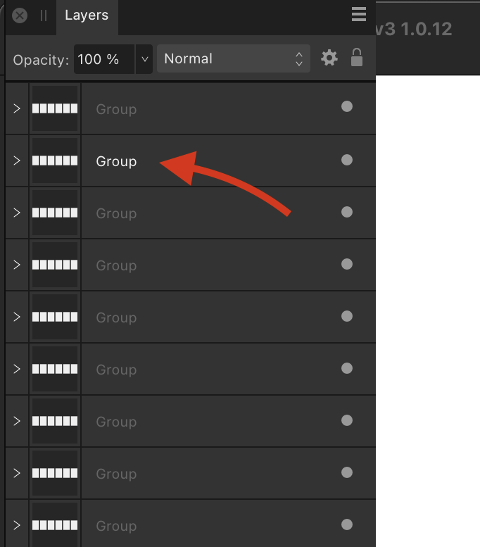
User interface Text contrast has only partial effect
matisso replied to abra100pro's topic in V2 Bugs found on macOS
That’s because the good people at Serif decided that for some reason default named layers would have their names displayed as “inactive” (or whatever their internal token is called). Now, if you rename a layer manually its name is then displayed with more prominence and follows the contrast setting… But hey, we’re told it’s a professional tool, right? 🙄