eluengo
-
Posts
132 -
Joined
-
Last visited
Everything posted by eluengo
-
In my case, the slow-launch problem occurs only after upgrading macOS to 11.1, and only in one of my Macs, unfortunately in the most used and most powerful. It occurs with 1.8.x and with the new 1.9. Neither with older macOSes, nor with less powerful Macs this awsome problem happens. I'm now thinking the problem could be the system configuration, not only the app.configuration. I wait for my new MacM1 to see if there also occurs, and also have time and a new Mac to erase completely my slow-launching-Mac, and reinstalling all to see if this can be te problem (the jump from 11.0 to 11.1 macOS version was full of problems, even with lost information in iCloud!) Is an annoying problem, but is really not a severe one, since it only happens the first launch on an app after reset/restart, or after a long inactivity period. Apparently AFFINITY is aware of the problem, it will have a solution, even when after a long time.
-
Version 1.9 (not beta) has the same slow-launch problem: all the apps: Photo, Designer, Publisher (from both Affinity Store, and from the Apple Store) 🤷🏻♂️
-
Very curious.... In my MBPro with i7 and a lot of RAM and disk the SLOW apps launch occurs, but NOT in an old MBAir with only a i3 and half RAM and half disk.... why is it so????
-
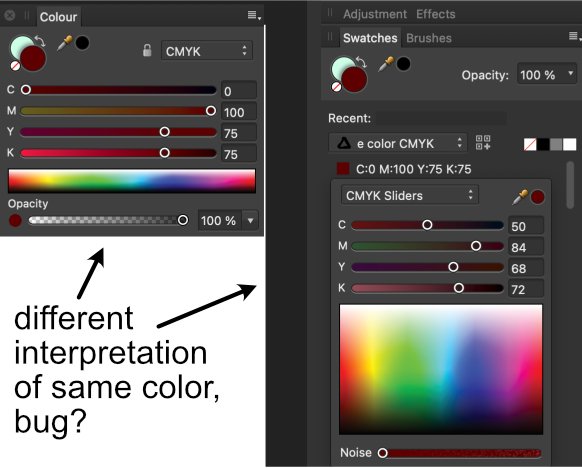
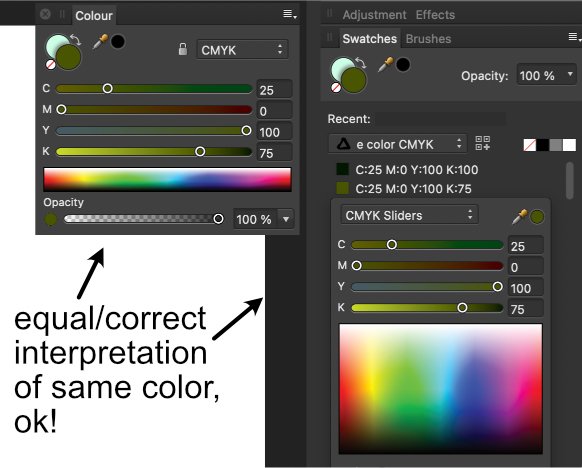
Hi Not always, but randomly, the little panel to "Edit Fill..." from the pop-up menu on the color swatches shows a wrong interpretation of the color components. (color swatch created in the color palette) I send two examples, one with error, another without... Is this a bug?

-
Thnx Sean !!
-
Designer and Publisher (apparently not Photo) launches slowly since MacOS Big Sur 11.1 (i.e. 45 dock icon bumps) in its first launch after Mac reset or after a while closed (versus 4 icon bumps when recently launched). Why?, is it normal?, is OS guilty or the app?, Apple Silicon Macs will solve it? Emilio
- 62 replies
-
- 2
-

-
- affinity publisher
- affinity designer
- (and 2 more)
-
 Sorry a second time, but ergonomics and GUI is the key, not the discipline to a common behavior. The GUI should serve to better and speedier use and understanding of the relation of the app with the user. We all love the three apps, but this don't necessarily makes to be 'always' satisfied with 'all' their characteristics. This forums are not only interesting to discuss and solve problems, are also a pool of ideas and details that could be, eventually, important to designers of successive version of the apps.
 -
text overstrike-overline
eluengo replied to eluengo's topic in Pre-V2 Archive of Desktop Questions (macOS and Windows)
Thanx to all Discussion very interesting, the capability isn't yet installed in AFPUB but it will surely be in any future. Both solutions are interesting, I'll try overstrike glyph and pinned line solutions (this last can be also interesting in certain applications like drawing obtuse angle over letters, or also old style abbreviature details like in icons and hand-written religious texts) Emilio -
text overstrike-overline
eluengo replied to eluengo's topic in Pre-V2 Archive of Desktop Questions (macOS and Windows)
No, no, I don’t mean strikethrough ! What I mean is a line ON TOP of the characters/glyphs/letters, not through the middle or under those. Like the example I send. Emilio
-
Is there any method to make an overstrike or overline on (a) word(s) or character(s)? == a line like underlining but on top of the words instead of under the words (as the normal underline) (to make certain mathematical expressions in Affinity Designer and/or Publisher) Emilio
-
Bug in zoom % refresh in context.bar ... I send a little video It occurs with or w/o scrubby zoom It occurs in Photo, but also in Designer and Publisher (videos for all three), is seems to be the same bug in the same procedure Emilio error_afphoto.mp4 error_zoom_afdesign.mp4 error_zoom_afpub.mp4
-
Sorry, but ergonomics and graphic user interface is the key
-
Yes I said this also. I only asked if adding those labels could be a good idea.... sic: Title In modern informatics, the GUI/Ergonomics is the key Thnx Walt
-
Hi for those people that don't have a BIG screen or our visual capability isn't exceptional.... screen real estate is not so big; when items doesn't have enough space in the contextual toolbar the exceeding are in a pop-up menu at the end of the bar under a double angle "»" in this menu, as seen in the screen copy I send, the buttons exist, but most of them with no indication of what they mean. I'm sure it's well done, as is the same procedure as in the toolbar, but .... could be interesting to have labels near the buttons? probably helpful (or waiting a time to let the pop-up help label appear, 🤷🏻♂️) Thnx Emilio
-
Clean install of Big Sur (MBPi7.16MBRAM.1TSSD) No problems with designer-photo-publisher when quitting apps. Apps possibly speedier with Big Sur than with previous OSs Emilio
-
Problems with TOCs and their styles....
eluengo replied to eluengo's topic in V1 Bugs found on macOS
Dear Walt I've tried to reproduce the conditions that made my afpub behave crazy.... but oops, now works OK!!!, so I don't understand its previous madness. Sorry 🤷🏻♂️ Emilio -
Problems with TOCs and their styles....
eluengo replied to eluengo's topic in V1 Bugs found on macOS
mmmm, i’ll try to recreate the circumstances, but as I discovered the “solution” (putting TOC in an independent text frame) I began tu put more and more text of a long manual, for which I have to complete text and recreate all the graphics (all that in my free time, as I’m physician). I’ll try and send U the file. Thanx !!- 4 replies
-
- 1
-
-
- toc
- text styles
- (and 2 more)
-
When creating (and refreshing) a TOC in a text frame inherited in a page from one created in a master page, afpub goes crazy with the text styles defined for the TOC. Including if the text frame isn't connected with the rest of the text flow. Moreover, the app behaves strangely when trying to correct the style errors. Only apparent solution is to create the TOC in an independent text frame, not from an inherited. Is this a bug? If not so the app should say that this is not possible (dialog or something similar). 😐
-
pagesetting involves using definite sizes and typesetting details etc .... so this automatics has nothing to do with . this capability y more near to some word processors...
-
Value Inputs UI quirks
eluengo replied to prophet's topic in Feedback for Affinity Publisher V1 on Desktop
yes clicking on a numerical field and using up-dwn arrow keys works ok, but.... it is generally necessary to confirm value change with enter/return to see effects. it would be welcome.... inmediate effect to be seen also, pls, for font size! -
interactive pdf with form fields
eluengo replied to patbaer's topic in Feedback for the Affinity V2 Suite of Products
it would be very wellcome.... using one only tool (AFPUB) instead of two (AFPUB+pdfFormCreatingApp) with the advantages of fine tuning design all in one. please, if possible, put it in AFPUB roadmap (and not too late....) thnx -
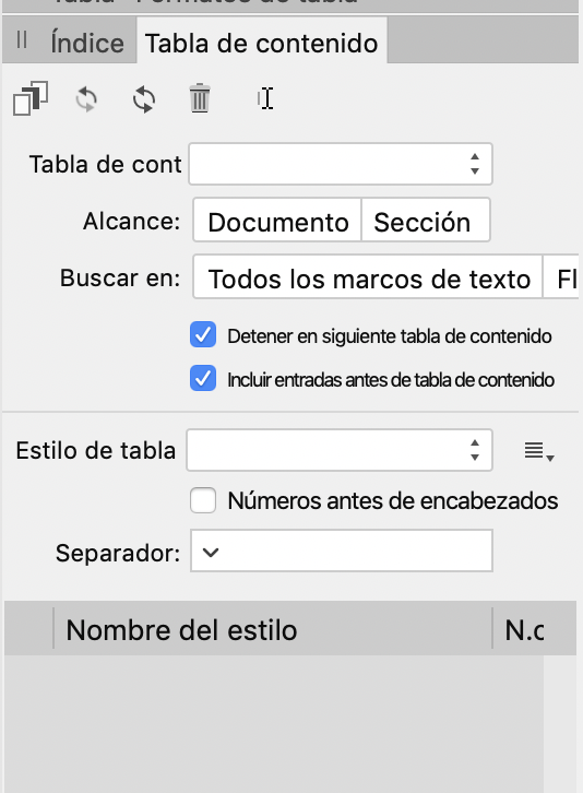
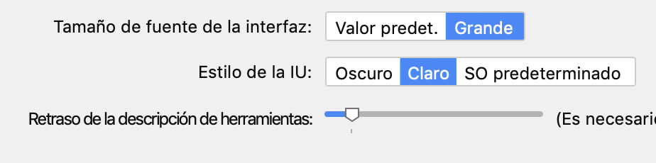
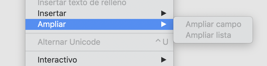
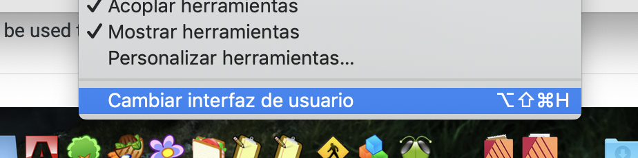
Hi Some problems in spanish localization (Otherwise, a good translation into spanish!!) (1) Texts too long..." Alcance: Documento"->Doc. || "Buscar en: Todos marcos de texto" ->Todos marcos txt || The second half of the conmuting button is not to be seen, but "Text Flow" in english version can be "Flujo de txt" || texts in next two checkboxes is too long and too compact and small... difficult to read: probably simply changing "tabla de contenido" to "TabCont" or "TabDeCont" (ie. "Detener en siguiente TabCont") (2) Propiedades button.... either button a bit longer or abbreviate Propiedades... with "Propiedades" (without "..."), or with "Props..." (3) Too long and difficult to understand "Retraso de la descripción de herramientas", can be abbreviated with "Retraso de ayuda herramientas" (4) Instead of "Ampliar" in this menu, better could be "Expandir" (5) Instead of "Cambiar interfaz de usuario" (difficult to understand what the command does, better could be "Ver/Ocultar interfase" or "Conmutar interfase" (6) In this pop-up menu change "Valor Predet." with "Predeterminado", and also could be a polite image that all language options are capitalized, and not only both Englishes (GB and American) and German.... "Español, Italiano, Português, Français, Русский" (I apologize for the big screenshots.... has to do with retina screen capture, surely) Emilio (1) (2) (3) (4) (5) (6)
-
Hi all I prepared a special colour swatches CMYK palette in AfPub, to use same colours everywhere between AfPub, AfDesign and AfPhoto (on same or different projects). But the palette file (.afpalette) doesn't open neither in AfDesign nor in AfPhoto Is a bug?, have I something done wrong?, or would be interesting having interchangeable colour palettes for the whole Af suite?
-
another little bug in Studio panels
eluengo replied to eluengo's topic in [ARCHIVE] Publisher beta on macOS threads
Hi Jon P The newest update behaves exactly as I told in my first comment Having received the communication of the definitive AfPub version for june 19th, i'll await to see if in this not-beta is this bug corrected, or not. Is not a very annoying one, but user interface is nowadays a special plus in quality of software.... rapid learning curve, simple and foolproof access to functions, adequate visibility of interface objects, and, surely, certain style and elegance.... With regard Emilio PD.. my Mac is a MBPro 13" end 2018, 16GBRAM, 1TBHDD, i7processor -
I’m not an expert, but preparing a document in RGB that is an light composing process (i.e. a projection, presentation), but a document that has to be printed should be prepared in CMYK that is a method of adding inks to obtain a colour. In CMYK a pure black has (in order to avoid an excess of ink that deteriorates paper) C0M0Y0K100, or a bit of C if texture should be cold, or a bit MY if texture should be warm. And black ink is frequently printed on top of the other inks. So a good practice is to see where your document will be used, and what for, and prepare it with the adequate procedure or colour space. Sure, techniques/colour spaces like LAB are general solutions, but if your product will be printed, is better to use CMYK whenever possible.