Bhikkhu Pesala
-
Posts
282 -
Joined
-
Last visited
Everything posted by Bhikkhu Pesala
-

Serious issue with drop caps
Bhikkhu Pesala replied to FlatCat's topic in Feedback for Affinity Publisher V1 on Desktop
Has this bug been fixed yet? -
Support Colour Fonts
Bhikkhu Pesala replied to prochurchmedia's topic in Feedback for Affinity Publisher V1 on Desktop
Colour fonts work in web browsers. How hard can it be to implement? Anyone who wants to test this can find some coloured fonts on my website. Odana is an example with multi-coloured glyphs. If I remember rightly, they use the COLR format, not SVG. -
Intelligent Ligature Settings
Bhikkhu Pesala replied to Archangel's topic in Feedback for Affinity Publisher V1 on Desktop
I downloaded the Linux font pack from Source Forge. I did not find a Linux Biolinum Caps font The Linux Libertine Initials font contains small capitals, but no lowercase. I got the desired result by applying small capitals to Linux Biolinum and using Linux Libertine lowercase with Linux Libertine Initials. I use PagePlus X9, but Publisher would do the same.
-
Serious issue with drop caps
Bhikkhu Pesala replied to FlatCat's topic in Feedback for Affinity Publisher V1 on Desktop
The issue has been logged. -
Importing Downloaded/Google Fonts
Bhikkhu Pesala replied to RMCB's topic in Feedback for Affinity Publisher V1 on Desktop
All installed fonts are available to Affinity Publisher. There is no need for it to do anything to make them available. What you need to do is download and install them. I presume that MacOS is no different to Windows regarding this. -
I see. I was not aware that the program was called Office Publisher. I thought it was called Microsoft Publisher.
-
What is an Open Office publisher file? Do you mean an OpenOffice *.odt document or a MS Publisher file?
-
Paragraph Styles
Bhikkhu Pesala replied to mahoye's topic in Feedback for Affinity Publisher V1 on Desktop
Is this font really so important to your work that you cannot find a better one? Find and Replace might be used to select the punctuation and apply a character style, a different point size, or a different font, but this kludge will surely cause problems. -
Super/Subcript position
Bhikkhu Pesala replied to Headway's topic in [ARCHIVE] Publisher beta on Windows threads
My free fonts have superscripts and subscripts. Superscripts are aligned with top of Cap Height Subscripts are aligned with the baseline Scientific inferiors bisect the baseline -
Drop Capitals Misaligned
Bhikkhu Pesala replied to Bhikkhu Pesala's topic in [ARCHIVE] Publisher beta on Windows threads
Clearly a bug in Affinity Publisher. CapHeight is a metric that is known and line-spacing is known for any font. The Drop Capital size is incorrectly calculated. -
Viewing the master pages and changing the margins there fixed the problem. I was somewhat surprised to see that the master page was still set to A4, after I hand changed the page to A5. This could be made more user-friendly, e.g. a checkbox to change spreads for master pages when changing them for the page.
-
Just set another ordinary left aligned tab stop Type Name, Tab, Tab, Type Next name, Tab, Tab Type Anschrift, Tab, Tab Type Anschrift, Tab, Tab Tab, Tab, Tab, Tab for the third line with just empty lines.
-
I changed it for the All spreads (but it's only a one page document).
-
The proper way to do this is to set a dot leader tab, not by using underscores.
-
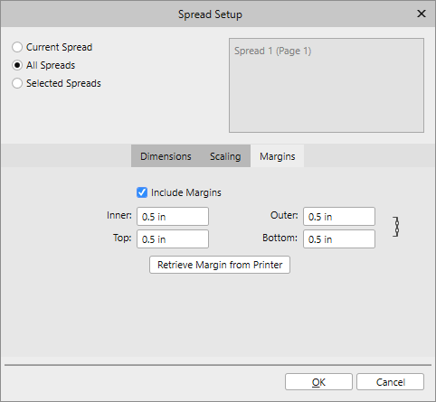
I changed the default margins for the attached publication to 0.5" Flowing the story with Shift+Click on the link icon flows it to 126 pages, but the margins are not carried over. Dependent Origination.afpub
-
Excesive document size
Bhikkhu Pesala replied to Daedin's topic in [ARCHIVE] Publisher beta on Windows threads
I see no change after using Save as. I do see a huge difference between before and after flowing the story to 126 pages. 1 page = 172 Kbytes 126 pages = 14.41 Mbytes -
Accessibility Issues
Bhikkhu Pesala replied to Bhikkhu Pesala's topic in [ARCHIVE] Publisher beta on Windows threads
Yes, I am using the latest beta. Try with the light interface, and you will see what the problem is. Pressing Tab does not highlight the next field for input. -
When setting margins in the spread setup dialogue, the Tab key does not navigate between fields.
-
The text on the startup screen “Show this panel on startup,” is now fine. The About Affinity Publisher splash screen text is unchanged.
-
In Affinity Publisher, the top of CapHeight of the Drop Capital is below the top of CapHeight of the Initial Word in All Caps. In PagePlus X9 the alignment is just about spot-on.
-
Why not simply point out that Affinity Designer uses per mille instead of percent? That clarifies without being a sarcastic PITA.
-
I don't understand what your problem is with always fault-finding. In PagePlus 1% condensed = -8% of tightening in Affinity Designer. Maybe that would be -10% if the frames were exactly the same width. I did not measure it, I just resized it to get the same line breaks.
-
Affinity Designer seems to use a different measuring system. I am not sure I am comparing like with like, but I can get the desired result with -8.0% of tightening.
-
Agreed. The current steps are far too large. In PagePlus X9, the default stop is 1% for Alt+Left, and 0.1% for Ctrl+Alt+Left. I frequently use the latter for fine control applying it to the entire paragraph to prevent widows and orphans. Any negative kern value exceeding -3% is too tight, and should be avoided as far as possible. Often, I can reduce a paragraph by one line with just 0.1-0.5% of negative kerning. Default Spacing 1% Condensed 3% Condensed (Too tight)
-
Drag Guides
Bhikkhu Pesala replied to Peg11's topic in Feedback for Affinity Publisher V1 on Desktop
I see the double-headed arrow cursor as soon as I click on the ruler. If I hold down Alt then click the horizontal ruler, a vertical guide is created at once.