Nivrams
-
Posts
65 -
Joined
-
Last visited
Everything posted by Nivrams
-
RevTim, Interesting tutorial. But my Live Procedure Texture panel ha no drop down list of presets. I have to open the Manage Presets panel to see them. I created a new category: Tutorial Textures. I dragged Checkered into it but I can't get it into the Live Procedure Textures panel in any form. When I click on the Drop Down Menu of the procedures panel I get 1 listing— Reset to empty So I appear to be stuck, unable to apply your techniques.
-
Good catch. Running text around an object is not the same as wrapping. I'm up for that tutorial.
-
Thank you, markw. This most likely means there is something wrong with my copy of Designer. May have to reinstall. I am not sure as to how to go about this.
-
I attempted to open up a (Designer) file and the Anna ITC sc font was not recognized. I had to open the file in Publisher to edit the text. Apparently, the Designer function in Publisher worked. But not in Designer. I will attach the problem file and a PDF which show what it should look like. The correction was made… 2006 replaced "Gala" at the bottom. The numerals were distorted to appear the same size as the letters. I have only the Publisher file now because of the correction. But Designer still does not see Anna. Opening the Publisher version in Designer is the same as opening the Designer file with Designer was.. The font is Anna ITC sc (small caps) I invested in Quark Xpress because Publisher is not yet usable as a page layout app. Objects developed in Designer (and Publisher) can be arranged in Xpress. Type handling and color management are still too challenging and erratic in Affinity apps. Most things can be accomplished, but they can pose a challenge. 2020 Gala only logo K+032U.afpub 2020 Gala only logo K+032U.pdf
-
Ihave the original Designer and Photo workbooks. Would LOVE iPad versions that are updated.
-
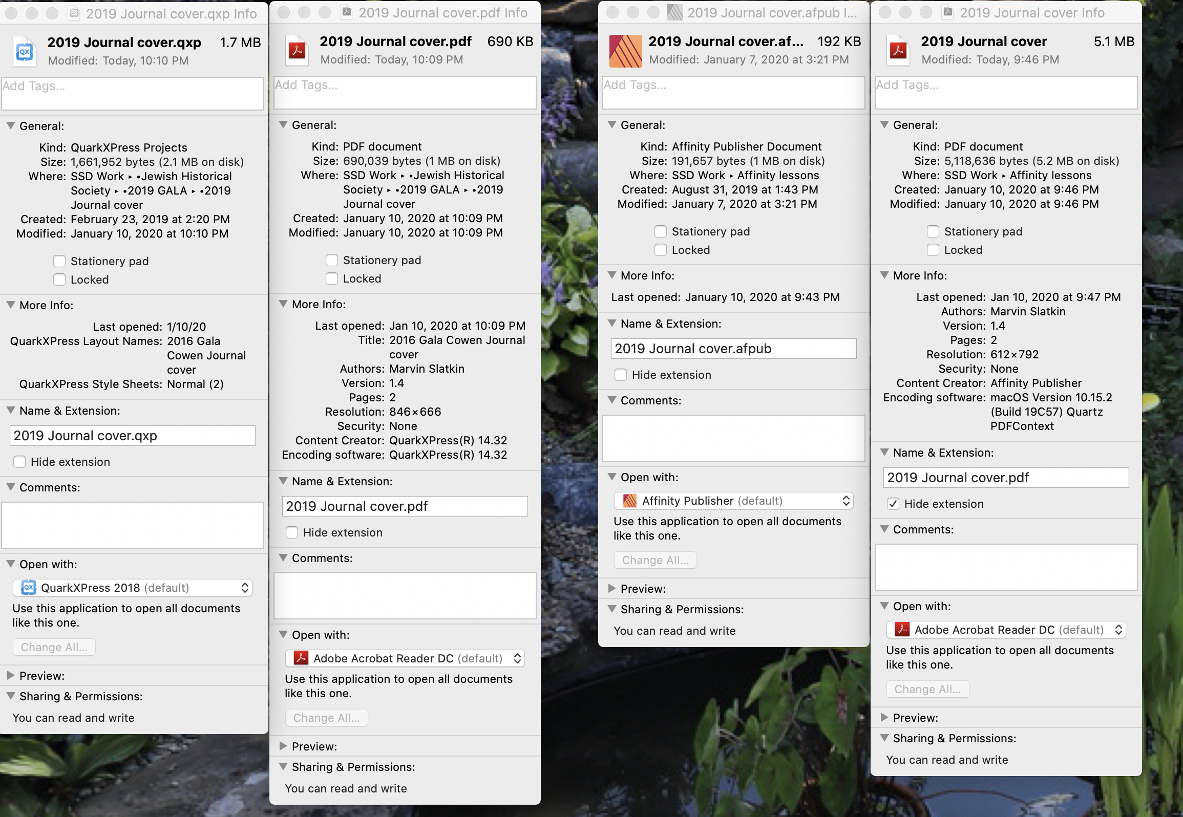
It is really remarkable that so many knowledgeable forum members took time to analyze my problem. It still remains that a 1.7 MB .qxp file becomes a 690 KB PDF, while a 192 KB .afpub file becomes a 5.1 MB PDF. The artwork is virtually identical… done with the same placed images. The original Publisher filer is slimmer than the Quark file. So something besides my execution is at play. I think it's that quark has a superior PDF generator. Thanks for your help. Much of this was over my head, but I did learn a lot.

-
It is my experience that PDFs generated by Publisher are significantly larger than those generated by Quark Xpress. This can be an issue in longer documents with many photos.2019 Journal cover.pdf2019 Journal cover.pdf2019 Journal cover.pdf2019 Journal cover.pdf2019 Journal cover.pdf2019 Journal cover.pdf Is this a fact, or am I doing something wrong? I am attaching two similar examples. The large file is of a Publisher file, the smaller from Quark. 2019 Journal cover.pdf
-
Is it possible to specify a grayscale image (tiff, jpg, affinity photo) to print in a spot color. I know that duotones or tri-tones are not available, but it would be desireable to be able to specify and display a halftone in a match color. Adobe does it all, of course, but Quark Xpress, while not supporting duotones, allows graycale images to be specified as a spot color and be overprinted or not. I have not seen a reference to this capability one way or another in Affinity applications. I am not referring to duotones. Just assigning a spot color to a photo file. In any of the Affinity applications.
-
Artwork slides under pasteboard rather than resting on top. When it happened in Publisher, restarting the app corrected the problem. In designer, so far, the situation persists. see attached. Anyone kno what's happening? iMac 5K running Catalina 10.15.1 Lots of RAM, memory & disk space
-
Yeah, Adobe bought its way into web and vector design while placing tolls or tearing down bridges behind. Affinity had to re-invent lots of wheels to create their suite of apps. Probably a misuse of metaphor, but you get the idea. The vector blend/ morph wheel is just another barrier. I would like this ability, plus the ability to handle spot color duotones, tri-tones, etc.. I live in hope.
-
Thank you, Bryce, the Resource Manager would have revealed my errors. Perhaps even informing me of the 2 copies of the same oversized halftone that were inflating the size of the file. I now know how to do this. I replaced all photos with what I knew were .jpgs and ended up with a reasonable 3.5 megabite file that loaded rapidly. Perhaps the "sandwich" file was the Affinity Photo file with layers. Resource Manager would have revealed this. I always check the links to make sure the process photos are CMYK. Now I know where to do it in Publisher. Thanks, again. MarvS
-
Hi, BofG, I did revisit the file, and even though I couldn't find the source of the stacked halftones, I replaced all the halftones with what I knew to be Jpgs. The result was a 3.5 megabit file which was the equivalent of the Xpress one. Is there a "Usage" window that list the document's elements and links, with descriptions, such as Xpress & Indesign have? Adobe takes PSFs and makes compact PDFs. I wish affinity could do the same with their files. Must be tough getting around Adobe's copyrights. Thanks for your insight. MarvS
-
I produce a 2-side mailer in Publisher that generated a huge PDF. I recreated the job in Xpress and generated a PDF 1/7th the size. There are other things that I don't like in Publisher (too many layers are generated, for instance) but they usually have work arounds & learning curves. Bloated PDFs are another thing. They are slow to load and quickly get too large for conventional email. In this case the Publisher file was 4 times the size of the Xpress file. The art in both files are the same. There are fewer options, as far as PDF creation goes, in Publisher than in Xpress. Both these PDFs are intended for print. The point is that if Publisher generates bloated PDFs, then it is not yet a pro application. Or have I done something wrong. Viera Mailer #4 APub.pdf Vieira Mailer #4.pdf
-
Walt, thanks for your patience. I revisited my problem, and I don't know how I got all my problems, but I did discover how to set point size and leading. Once I discovered the identity of the proper icon, I no longer had difficulty setting the proper leadings, which is a function of paragraph settings (like Quark). I am amazed how good publisher is. I just have to adapt to the UI which, I know, can't violate the "look and feel" of the established applications. I am already using Designer and Photo with Quark Xpress. The printers have been able to use my PDFs. I will now finish with Publisher and see how that goes. Process work will not be a problem. Black and one or more spot colors may be. Duotones are not possible with anything but process colors. I think. I hope I am wrong about this this matter too. Again, I thank you for your generosity in sharing your knowledge.
-
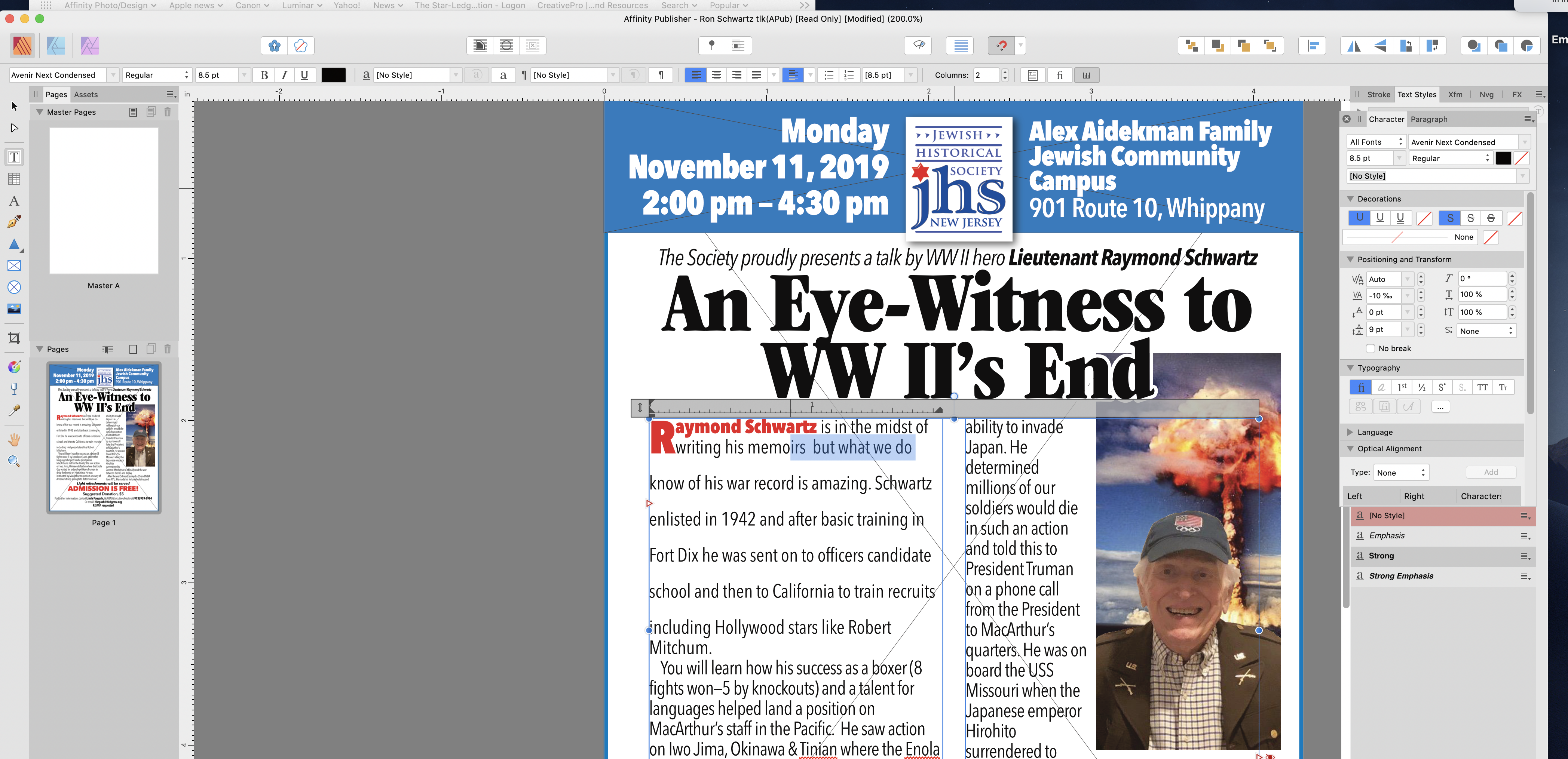
I haven't gotten into the Styles Panels, yet.My problem is being able to spec type directly into a layout, without deciding to set up style sheets.I just want to adjust the text in a two column box to result in two (approx.) equal columns.For this I select a readable size and adjust to fit (leading, spacing, hyphenation, etc..) I have sent a screen shot of an example. The text in the sample is 8.5 point Aveneer condensed with minimum leadings. I can't say how much leading, because there is no indication on the Character Panel or the horizontal bar above. The highlighted text reads 8.5 pt, even though it clearly isn't. The "Leading Override" box reads 9 pt… whatever that means. 9 points more? Than what? The Style Sheets are used in long or multiple documents for replication. Not for one-off application. So my question is: Can I spec a column of text in 8.5 Point on 9.5 pt. leading? And then make adjustments if necessary? Right now, the answer seems to be "no." I'll have to stick with Quark Xpress ( I no longer use Indesign.) I hope you guys show me otherwise because I think AP is almost there!
-
Activating is not one of my font problems. I am having problems specifying a font by size AND leading. I don't see anyway of doing this in any Affinity app. In Publisher it's vital. Affinity is very strong on handling objects, but typography as text— not so much. There should also be some way to duplicate font formats on the fly, since it is difficult to determine actual leading and spacing. AP makes it difficult to even know what you are using. In AP, the eyeball is King
-
Walt. Opening worked perfectly. Thanks so much. (I work on a Mac, I see you are a Windows guy. Good to see it works the same on both platforms.) Now, if I can figure out how to handle the fonts…
-
I have tried to use a 2-page (Xpress) PDF as a template as I explore Affinity Publisher. Page one was no trouble, it was placed as expected. When I attempted to place page 2, page one was again placed. In the pull-down "place" menu, I had moved to the second page. It was there. But all I could get was the original page 1. I ended up taking a screen shot and scaling it to fit. This works for a template, but not for a placed PDF to be printed. What am I missing?
-
I'm new to Publisher, as are most others. I am finding specking and manipulating type very difficult. For instance, I have found no way to set 14 point Walbaum (or anything else) with 16pt leading. There are two locations that indicate size, the horizontal tool (Menu?) bar and the character box. Only the horizontal tool bar affect a change in size. Changing the font size in the character box does nothing. There is no control labeled leading as such, just something called "Leading override" in the box, whatever that means. Leading is a hard number in points, regardless of font size. Auto leading is the default number of points allowed to a specific size. If this is what gets overridden, then the results should be in the total amount of points, not just the amounts added or subtracted. In any case the default leading appears huge, with no supporting data that I can see. Font layout is a trial-and-error eyeballing process. Unless I'm missing something, there is no way of controlling leading in the tool (Menu?) bar. The glyphs window for Bodoni ornaments resulted in a blank box, necessitating a trial and error search for the desired glyph. I don't yet know if this is generally the case or just with this font, or non-alpha numeric fonts. In any case the glyphs panel is needed in for searching through graphic fonts. Have I missed something?
-
Global Colors and Color Chords
Nivrams replied to Petar Petrenko's topic in Feedback for the V1 Affinity Suite of Products
If I understand Petar's request #1, it's that all Global colors be labeled with their respective color components (CMK or RGB.) That's a minimum. I would prefer ALL swatches be thus labeled… and possibly editable to give the color a reference… all leaves, all pencils, etc.. In addition there must be a way to select a spot PMS color by typing its reference#. And the document swatch file must be available in list form with labels at all times. Color overprinting should be on an object-by-object basis. Or the object selection should override the swatch designation. Or both. Full-color printing or video art are not as demanding as spot color or flexographic art where every object is a specific ink or combination. AD should be as suitable as Illustrator. I would like AD to do simple jobs accurately. Affinity photo does a good job at refining photos, but right now, I find Affinity Designer makes simple print jobs more challenging than necessary. I would love vector blending and envelope distortion, but Designer has to handle color(s) better. Or at least let me know where I can find out what I'm missing. This is not in criticism of Perar's observations. His are more sophisticated and include things that Adobe has recently made available -
Not yet in Affinity. Illustrator is a monster! Just about anything you can imagine can be done. Affinity does almost everything you need get done. Vector blending will be a welcome addition.
-
A really clear demo.It will still take me several times to get straight. But the information is all here.
-
A beautiful software but,
Nivrams replied to QasimMGM's topic in Feedback for Affinity Designer V1 on Desktop
I would add support for spot color duotones. I don't believe a photo can be printed in, lets say, metallic gold much less gold and black. This is a necessity in packaging, flexographic printing, or high-end graphics. Not everything is just cmyk or rgb.