ichier
-
Posts
10 -
Joined
-
Last visited
-
 Intuos5 reacted to a post in a topic:
Let's see some ideas for the Export Window! :)
Intuos5 reacted to a post in a topic:
Let's see some ideas for the Export Window! :)
-
brunoczech reacted to a post in a topic:
Let's see some ideas for the Export Window! :)
-
yeah sure, stuff like that (see the suggestion with the ellipsis as well), would be nice. but that's something you will probably never have in a drop-down first: fix what turned worse and what is little work! second: put in fancy automation/options-stuff. right now i really don't care bout that, since ... oh c'mon stop trolling! go click some drop downs if you need to waste some energy and time this mockup has around double the formats than affinity currently supports. so thoughts like this are pretty much pointless. and i doubt, that its ever gonna be more than what would fit in here! for real icons would be centered with some space left and right. this scrolling-option here is just a fallback for cases where this window gets super small! edit: the export windows is resizable, and i started the mockup with just a screenshot of mine, wich is bigger than default. /edit and even if it would be 40 formats: still be way faster than anything else... that's what its about, remember? a fast workflow that doesn't annoy you! as opposed to right now. seriously, if affinity will support lots of export-formats in the future, those need to be pre-selected (as suggested above), in order to provide a proper workflow. and because you seem to have missed it: you can see v1-mockups above. i did that one only because of my feature wishes, since it became clear to me, what would be best about the preset-list being no drop-down as well. that'd be super neat. in the end there would be one nasty unnecessary time-stealing drop-down eliminated instead of one added.
-
rbenj reacted to a post in a topic:
Let's see some ideas for the Export Window! :)
-
 loukash reacted to a post in a topic:
Let's see some ideas for the Export Window! :)
loukash reacted to a post in a topic:
Let's see some ideas for the Export Window! :)
-
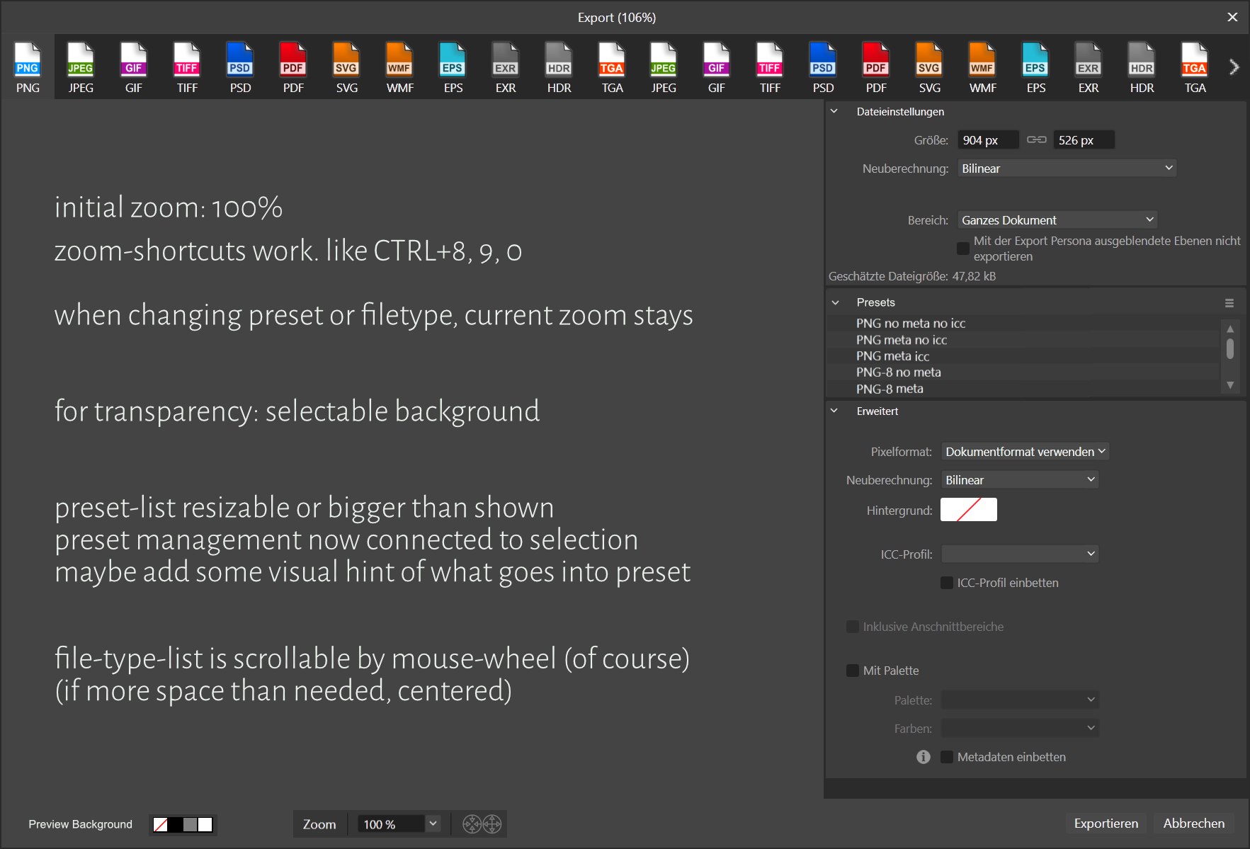
okay, quick mock-up. my idea of how workflow would be fastest: consider mouse-movements: first select file-type, then preset. one direction. that's why a vertical list, consistent with the welcome screen (which i don't use at all), on the far left is bad: it's always far and you'd go up and down. did i mention, that i'm an ergonomics-nazi? preview is useful when using compression, but a button to open/close|on/off the preview would be fine for avoiding the machine doing unnecessary calculations.

-
yes sure, for forms, handling a lot of data this can be superiour, but not the case here, where you can have a one-click-solution.
-
sounds like you're never switching file-type? this is not at all about how it looks, but about getting actual work done: unhindered every-day-tasks using this software. it used to be one click to switch file-type now it's two, probably additional scrolling, and waaay too much time to find, what you are looking for. changes to the worse like this one are like torture (to me). it's great though that "more" is gone, but i mostly use presets. a drop-down-menu is the worst UI-element you can think of, in terms of ergonomics, workflow, speed. horizontal vs vertical: what are you talking about? there's lots of space! now with preview shown, horizontal at top makes more sense, since more images are landscape than portrait, so you'd free space for that. and ergonomics again: it's the first you need to click when switching file-type. left o right of the window would be too much mouse-movement, and not really a first area to hook your eyes to, within export-settings-panel vertically next to the other settings would be kinda insane. also our eyes are next to each other (if you still have two of em) not on top of each other: you find things faster on screen when listed horizontally; your eyes don't have to move, you just instantly see it and click it! try it yourself with a mockup, if you don't believe. ergonomics! the horizontal icons on-top solution has been just superior for this use-case. period. (still not sure if your post is just some trolling...)
-
brunoczech reacted to a post in a topic:
Let's see some ideas for the Export Window! :)
-
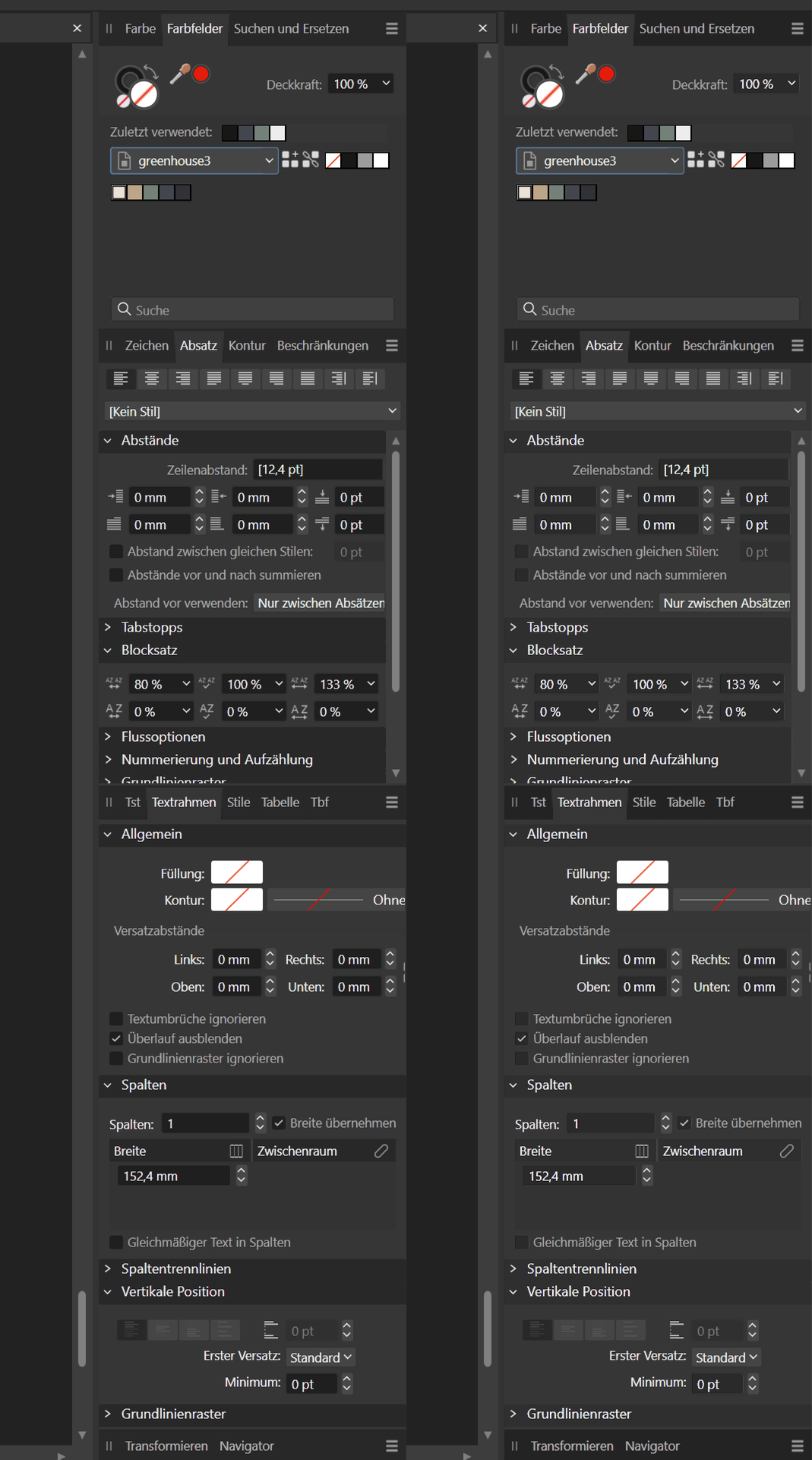
okay, don't just criticize; provide solutions. while i was playing with those new masks, i did this quick mock-up. its just a quick-n-dirty pixel-mask on a shrunken screenshot, and i believe it could be done better, but i think it's clear that there comes in some structure and orientation and less mess when you adjust those colours to sane grades. so, affinity, imho, it is obvious, that you need to just change that. that'd be easiest. but it'd also be okay, if the different grades become adjustable in the settings. fyi: i changed 3 things individually: darkened panel-headings, brightened subheadings, brightened value-fields. i forgot: slightly darken some of those white controls. (all those angles: open close of sub-headers, drop-down, adjust values - angles are more distracting than the triangles that were used before.) it's not much, but it's impact is huge. suddenly you can spot the panels again! 😱 which is important, if you don't want your customers end in an asylum. besides: i just saw, that the panel-headers got bigger now. while i love UI/layouts with looots of space, i believe that in this case this is space which is better used for all those controls - the key of being able to see where a panel starts and ends, of finding stuff, is colour-hierarchy. cheers
-
yes. as i wrote, this affects only some text, but this issue is about the overall UI-contrast and colour-decisions. see this, text-contrast default vs lowest (unfortunately that's counter-helpful): i didn't notice everything exactly in the first place myself (and probably still don't see a lot of problems of the new UI). i'm not a designer, although i learnt some stuff over the years. but: immediately the UI felt disturbing, less calm. i don't know the exact designer-terms for that in english. But i guess everybody understands, that a UI can be a mess or a peace of zen (even if t has a lot of stuff packed in there). RawTherapee, blender or Affinity v1 are good examples for high complex UIs that you can actually work with without going crazy, unfortunately v2 is not. the new contrasts and colours make it a battlefield. opening up those packed panels is just a crowded mess, while it wasn't before. i instantly felt, this had gone wrong, but couldn't spot why. this screenshot(OP) makes it easier to spot some. many people only feel this unconsciously. but an experienced designer wouldn't deliver something like this, those details - of achieving peace but chaos - are crucial in a software that people may stare at their whole day. right now you can tweak it to high contrast, which is important for bad devices and impaired folks, but right now you can't make it quiet. brighten up makes some details worse. nevertheless i did that. but i prefer it darker!.. see here, while contrast between value-fields and surrounding is acceptable on full brightness, there still is a big difference between them. overall it gets more peacefully but also worse (imho). and: it's way too bright too suit me. while this might seem like overreacting to some, such detail _really_ makes a difference while staring at screens using software! no matter if you consciously realize the difference or not: it effects your stress-level, it simply does. our brains are wired that way. i can see where the dark colours in the value-fields come from, removing 3d but remain understandable. but: nope, too much. yes sure, but as you can see in the OP-screenshot: they did that in v1 too, but with proper hierarchy. probably they wanted to achieve clarity and structure with those dark headings or it became necessary due to the darker value-fields - unfortunately it turns out the opposite due to now reversed hierarchy, while the solution imho would be brighter value-fields, and (obviously) darker headings in the panel-headings then in their sub-groups. in general i really need to say there's a lot of sloppiness in the new UI. see those up and down-arrows? they are badly aligned. there's quite some of that stuff here and there. see those two buttons with the fi-ligature? these are not even (instantly notable) a ligature. c'mon!.. that's not how icon-metaphors work? probably they switched from graphics to css (or such) and the coder didn't have a clue or enough time? while i can totally live with that sloppiness, the overall uncomfortability of the new UI due to contrast and colour just made me unpin v2 and pin v1 after one day. that's sad. i don't regret upgrading, but hope this gets fixed real soon, so that i'll use v2... and yes! v2 seems damn stable and such! but bringing messiness into the UI by neglecting issues as contrast and colour, feels somewhat unprofessional to me, that extra-time for finishing everything should be taken before delivery.
-
while i like the new colour-tone and in darkness of the interface, it becomes distracting due to more contrast when on the default app-contrast. please bring back the gamma-slider for the ui, it's been a great feature! (brightness without gamma, is not so useful. when i use the new brightness to match v1, it gets worse) i didn't need to adjust gamma on v1, but now i would tweak it, UI needs to be calm! (i'm on a high contrast 10bit monitor.) note that changing text-contrast only affects some text, but this is also about icons and stuff. and if you look at my picture - gamma only might not be it. like those value-backgrounds and header-backgrounds are way darker than they need to be. this brings in a lot of discomfort while readability is just fine in v1! and just now i see what makes it very distracting too: anti-guidance due to darker headings inside those panels opposed to panel-headers. pleeease give those details an overhaul! i mean: really? Were the UI-designers sleeping, did some CEO mess it up? the more you look at it, the left one is just right, while the right one is something a coder (like me) would come up with, to be beaten up by the designers... please bring in contrasts that suite a UI to stare at a whole day without getting ptsd give our eyes some peace! to end positively: the new ui in general is cleaner and thats nice.
-
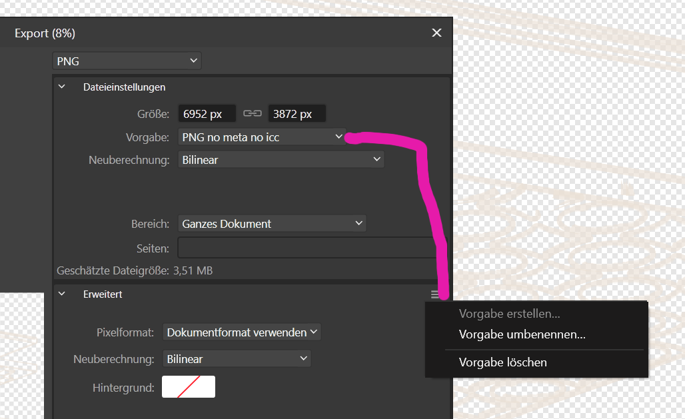
Yes please lets get the export right again! I must admit: when i first saw the affinity export-window with those icons some years ago, my impression was: okay, this is also for noobs. but actually those icons are great UI! i'm an ergonomics-nazi and right now i'm dying. not only it is more clicks now, it also is way harder to find what you are looking for! additionally i'd suggest: give presets more space and love! i use them, i customize them. drop down-menus are always the worst option, when designing an interface. the only reason to ever use them is: no space. (or little space plus not so important option to select here. but we've got space and an reasonably important option. (at least for power-users.)) this should be a list, at least 6 rows deep. this way its one click, or scroll + click. or even an extra window left or right, like suggested above, but in context to the format - no openclose-thing. Why? because most of the time, last preset per format is what you need in a session. -> change file-format, press enter. preview - makes sense for compressed bitmaps. but only when it is shown 100% in display-size. i'm unable to zoom to 100%. so initial zoom should be 100% by default and then you add a button to scale to preview window. also standard zoom-shortcuts would be helpful. for files with transparency i'd like to see a preview on solid background. should be switchable, at least dark/bright or so but keep it simple: id go for a palette like [ui -background, black, white, some greyscale, r, g, b, c, m, y] - might already be too much... yes! file-naming-variables would be great for some cases! values stored in document and/or presets. i'd add an incremental counter (for versioning - although i personally use date for that). pleeease add AVIF - every reasonable browser supports it https://caniuse.com/avif, all of the web-guys need it (they probably don't know yet). right now preset-selection and preset management is not even connected, that's quite confusing:
-
ichier reacted to a post in a topic:
Let's see some ideas for the Export Window! :)
-
ichier reacted to a post in a topic:
Let's see some ideas for the Export Window! :)
-
ichier reacted to a post in a topic:
No .exe, no interest
-
ichier reacted to a post in a topic:
No .exe, no interest
-
ichier reacted to a post in a topic:
No .exe, no interest
-
oh - true, didn't read carefully enough, sorry! though: the original topic is about export. and there it is proven - at least for my stuff. didn't try studio-presets either, since i did that by hand yesterday in a terrible waste of time, and YES please close the apps before and make backups! (sorry, things that are common sense to me, are not for everyone... thanks for clarification!)
-
1) My first thought, while i saw the same answer yesterday according to studio-arrangement, was: now this can't be true, since this is not a UI-thing, those settings stay the same, when UI changes. Of course some little details might have changed, but it is your job then to convert those, even if the format of storing options changes! 2) i found the according preset-files, copied them and they work. this doesn't proof 1) completely but everything i had presets for is 100% right! (i didn't check pdf in publisher yet, which might be more tricky.) 3) i'm on windows and i'm careful, so i don't copy everything: you need to copy c:\Users\~\AppData\Roaming\Affinity\Photo\1.0\user\file_export_options.dat to c:\Users\~\.affinity\Photo\2.0\user\file_export_options.dat and c:\Users\~\AppData\Roaming\Affinity\Photo\1.0\Settings\Export.xml to c:\Users\~\.affinity\Photo\2.0\Settings\Export.xml where ~ is your username repeat this for Designer and Publisher by replacing Photo accordingly. EDIT: okay, found out the following (so far): the Export.xml is just your last selected Preset per Format. So the user/*/.dat is all u need. And: this doesn't work on preflight_presets.propcol but those can be exported and imported. /EDIT so my final thought is - sorry to say - this is some laziness in delivery, as well as here in forum-moderation. and on a developer-standpoint: this should not happen! reconfiguring all your details in settings of a complex and powerful tool costs a HELL of time. i spent one o two hours yesterday to rebuilt studio-panels for all personas in all apps in order to continue working without breaking workflow. this is really unnecessary, and i'm damn sure, that its minimum settings translation-work that has to be done here! even if it'd be two but one hours for the dev and a week for testing. this something that should not be left out. and it happened before during the last upgrade.