

MoonaticDestiny
-
Posts
476 -
Joined
-
Last visited
Everything posted by MoonaticDestiny
-
Sigh. The button issue. I dont want to explain myself again because its too much logic and justification for this problem. Pretty much you have your buttons active when they should be inactive. I explain it all here in this forum post. Most of the buttons in v2 are active. They appear like someone pressed them and theyve been left on and its confusing the user. You need to make them inactive by using a darker shade of gray. Not a light gray.
-
Oh my god. Theres so many outlined icons in the app.
-
Do you want to know why the icons for cap, join, and align were bad in v2 and why users were complaining about them? Because your using "outlined" icons. Icons that are designed as only strokes. Please dont. Dont use these stroke icons. Outlined icons are like half baked icons. They dont translate to the user. Theyre hard to identify. A great example is the folder icon button in the layer studio. What even is that? So many users didnt even know it was a folder. If you just put fully filled in icons it will work. Turning the cap, join, and align icons into fully filled icons works! Im so happy you made this change. I can now identify these icons. Thank you. Since we're on the topic of outline icons, the trash icon at the bottom left corner of the UI needs to be changed to a filled in trash can icon and the folder and trash icon in the layers studio needs to be changed as well. Just do it how it was in v1. Go back to v1 and look at the trash icon. Its filled it. Easy to identify. No outlines. Just a simple filled in icon. And for the folder icon, just use a filled in folder icon. Its simple. None of these biohazard outlined stroke icons. They dont work. And then you have all these icons in 2 different styles. One filled and the other outlined and the app now has 2 styles of icons and it gets to the point where the app doesnt look appealing design wise because of all these icon styles. Just look at the icons for the buttons in the layer studio. That top row of buttons have outlined icons. And then look at the icons around them. theyre all filled in and you can see the 2 styles of icons.
-
So I noticed the stroke pressure box was moved down in the stroke studio and the cap, join, align were put above it. Is it possible you can put back the pressure box above cap, join, and align? How it was originally in v1 and v2. I say that because it just looked more visually and hierarchy appealing to the eye. I also feel pressure is more important than cap, join, align. Also, why was the pressure box extended in height? Its now a square. Not a rectangle like before.
-
Oh my gosh! Thank you so much for removing "Advanced" from the stroke studio. It was so unnecessary. Nothing about it was "advanced." Im so happy right now. I feel heard and validated. It should have never been there. It was hiding all our stroke properties. Thank you so much. 😭 Dont ever put it back.
-
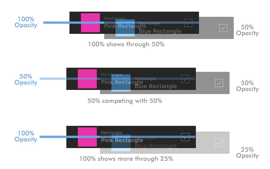
I was curious. When you move a layer to do a clipping mask or just to move it up/down that layer goes down in opacity. I think it goes down to 50% opacity. Could we try 25% opacity? I want to see how that looks. Im wondering if it would be better because the layer at 50% opacity does make it a little hard to see whats underneath. Juuuust a little hard so maybe lowering it to 25% opacity would work? Can we beta try that? I just want to try it. We can always go back to 50% opacity.

-
Im still playing with the beta, and Im honestly really liking the new drop zone indicator for dropping layers inside. The size difference really works. I can distinguish what Im doing when I move a layer now. 😀
-
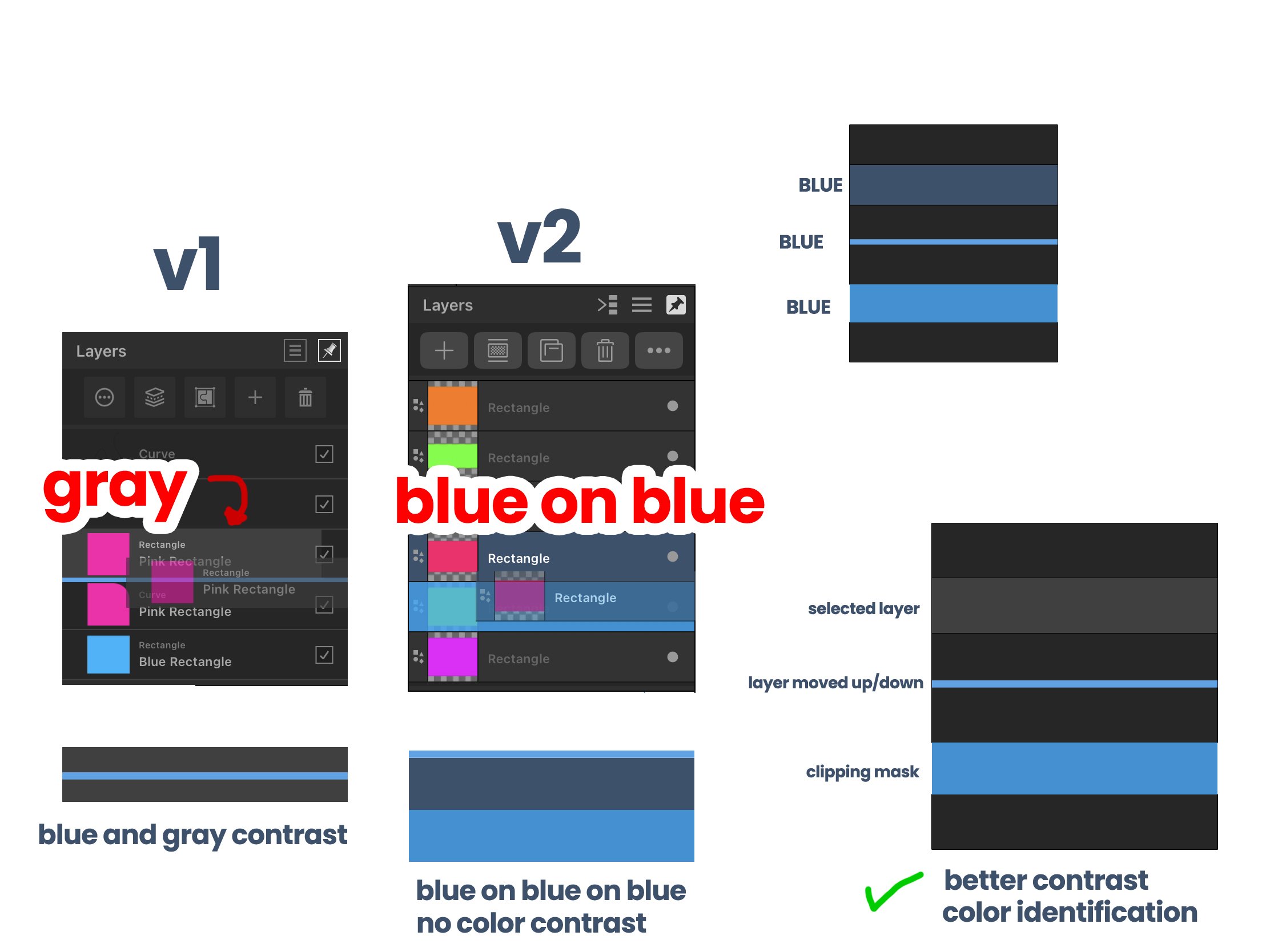
Pretty much the blue line drop zone lines were all the same size so to separate clipping mask from moving a layer up/down indicator size difference was used to make the clipping mask indicator thicker or the width size of a layer. Now, in the layers panel, since the new drop zone indicator for clipping mask will be the width of a layer in a bright blue color and selected layers are also blue color you need to introduce a color difference to fix this. to separate selected layers from a clipping mask drop zone
-
Okay. Im so happy. Like, really happy you made the blue drop zone line in the layers panel 100% opacity. Thats how it should be. I should be able to see a 100% opacity bright blue line in my layers contrasting with the dark gray UI. Thats how it was in v1. What you did in v2 was you guys took our blue drop zone line and lowered its opacity. You made it harder for us to see our indicator. There was no contrast. Now, youve fixed it by increasing its opacity to 100%. Thank you so much for that! This issue has been solved. Thank you. Dont EVER lower its opacity again. Please. The new drop zone inside layer..........I dont know what to think of it. It doesnt bother me. Its not an issue. it works. Its something new. It for sure is better than v2 because v2 doesnt even have an indication. I kind of miss the middle blue line drop zone indicator from v1. This is pretty much the same only my middle blue line has been expanded to be the whole width of the layer. Hmmmm 🤔if I really think about it and if I want to justify what you guys did.........my opinion is I think this is better. Better because you've introduced a size difference to our blue line indicator and thats going to help out users. Before a thin blue line indicator was used to show moving a layer up, down, or in the middle to create a clipping mask. They were all the same blue line size. I feel like this was possibly confusing for the user because it was hard to tell if you were moving your layer or creating a clipping mask. Now, with the size difference, we've taken moving a layer up or down to be a thin blue line indicator and any clipping mask drop zone inside layer is now a thick blue highlighted layer. Theres now an indicator "size difference" between these 2 actions(moving a layer up/down & clipping mask) and users will now be able to tell what theyre doing so I think this great. 👏 My only design issue is........ I wish selected layers in the layers panel were a light gray color like in v1 instead of this 50% opacity blue like in v2. I say this because right now you got blue, on blue, next to blue. Theres no contrast. Its too blue. Theres blue everywhere. I think when you select a layer in the layers panel it should be a light gray color and when you do a clipping mask the other layer should turn a bright blue and now youre going to have better contrast and better layer color indication for the user. So thats what needs to happen. Ill mock it up in a bit for you.
-
Exactly. I never wanted to see if on the UI. I wanted yall to remove it but I didnt say that because there are other users who use it. I dont use it and its something I wouldnt use constantly. I like that youve hidden it in the hamburger menu. I dont want to see it. I was just referencing v2 because thats how it currently is and I was just going by the UI placement of the command controller in v2.
-
So the issue with the command controller wasn't the placement of the white toggle on/off button at the bottom left corner. It was fine there. The issue was that even if you turned it off, exited the app, and came back to your document the command controller would still be on. So it would be on even after you turned it off. THAT was the issue. So now here in the beta, the white command controller button at the left bottom corner is no more. Its now been put in the document hamburger menu. Which is wrong and Ill tell you why in a bit but putting it there still doesnt solve the problem because even after toggling off the command control through the document hamburger menu it still stays on when I return back to my document. So the command controller issue has NOT been fixed. When the user toggles it off, it needs to stay off. It shouldnt turn on when we return. So the developers need to code it so that when the command controller is turned off, its stays off completely. Unless the user turns it on. This applies for every new document a user creates. It must stay off if they toggle it off. It stays on when they toggle it on. Im debating now if this should just be a setting in the preferences that you can toggle on/off and not in the document hamburger menu. Kind of like the undo/redo toggle on/off preference. You guys decide. So! The issue with putting the command controller button in the document hamburger menu is youve now made it harder for users to get to it. It was fine at the bottom left corner of the UI because users could toggle it on and off with 1 tap. Now users have to go to the document hamburger menu, tap it, go to the toggle command controller button, tap it, and now its taken 2 taps just to get to it when 1 tap was better. Its not quick anymore and youre all about being quick. 1 tap is good. More taps is bad. So it was better at the bottom left corner because it took users 1 tap to get to and 1 tap is good. But im not sure if this even matters if youre going to put this toggle command controller setting in the preferences. 1.) So thats why putting the toggle command controller button in the document hamburger menu is bad 2) the issue of turning the command controller off still hasnt been fixed becausse it still stays on. 3) I need serif to debate if this command controller setting should just be a setting in the preferences and not in the document button.
-
Wow. This is awesome. You guys ACTUALLY listened to your users and provided a monthly beta update with things you fixed. How amazing! 4 years it took you. That was so fast. You just release v2 about a month ago. Shout out to your developers. Seriously. Shout out to them. Look at this outline! Im excited to go through it. This is a step forward in restoring my faith in you, Serif. This does something to me emotionally in my heart. Im happy and excited to beta test and provide feedback.
-
Top Menu Bar Selection
MoonaticDestiny replied to helloiammary12's topic in Feedback for the Affinity V2 Suite of Products
Because having the buttons out on their own makes it quick and easy for the user to toggle into. Because adding the context toolbar to the top bar in v2 where theres already a lot of buttons is bad design so we have to take all those buttons, hide them from you by grouping them into 1 button, and then make it even harder for you to get to them by tapping on that button for a pop up menu to pop up that closes on you when an option is selected and repeat, repeat, repeat. Yes. By removing the context toolbar, putting it in its own bar below, and then turning the top bar into a customizable toolbar, what it should have been, allowing the user, you, to customize their toolbar to their preference, and having those buttons that youre wanting to go into on your customizable toolbar so you can easily tap into them quick and easy without having to press a button that opens up into a popup menu that makes you do even more taps to get to. -
So what are we doing?
MoonaticDestiny replied to MoonaticDestiny's topic in Feedback for the Affinity V2 Suite of Products
I forgot Christmas was coming. I guess because I dont celebrate it. New years is coming as well, so I guess nothing wont start till next year. That gives me time to prepare all the feedback. 🤔 -
So what are we doing? What are we doing right now? Im bored. I want to beta test affinity designer v2 for ipad already. I want to get to work and fix this app. I want to submit my feedback in the beta forums. Im not doing anything. I want to work. I have all the time in the world. I really want to fix this app design wise. The apps out. You got your money. You got your flowers. Lets get to work. Chapter 2. ✌️
-
So I started my 30 day trial for adobe illustrator on ipad, and I wanted to share my pros about the app. Specifically pros because the features that make it pro I really want to see some of them in affinity designer v2 for ipad. Not all of them. Theres not too many pros. Just some. This is NOT a feature request post. No. Im not trying to make a list of feature requests on one post. I will make a feature request of some of these request individually when the beta forums open up. I just want to talk about these pro features here because theyre related to AD and we should be talking about them. 1.) The Context Menu Widget - Ive talked about it here in the forums. It needs to happen for affinity designer v2 on ipad. Pretty much the context menu widget is a toolbar that appears under each object/stroke when you select the move tool where you have quick action buttons on a bar like move, delete, layer order, opacity, stroke width, duplicate, lock, etc. Its a bar that has everything you need and will help you in your building vector process. Serif was in the right step in making this move context toolbar. They were right there in making it BUT they badly messed up. They messed up by putting this move context toolbar inside the new quick menu. Its now inside the quick menu and all the quick action buttons are at the top (duplicate, cut, copy, paste style, delete). This move context toolbar is not a debate. It needs to happen because its going to help out users and it follows Fitts Law. We need to follow fitts law. 2) The Round Corner Widget - Every time you have a sharp point in your shape in Illustrator for ipad theres a round corner widget that you can easily pull to round your corner. Its so awesome and easy. In AD, theres specifically a round corner button and you have to press that button just to make your corner. Its too many steps and there shouldn't even be a corner button. Just offer that round corner widget where theres a sharp point to make vector building easier. 3) Smoothing - The smoothing feature is awesome in adobe illustrator for ipad. Its what the pencil tool in AD needs. You just increase the smoothing value and youre drawing THE smoothest lines. This is great for when you rough sketch something out and you just use your pencil to start vector building your illustration with smooth lines. 4) Freeform Gradient - A feature where you can add several color "annotators" to your object that blend color with each other. 5) The Pathfinder Thumbnail Preview - The previewing thumbnail of the different pathfinders shapes. Its VERY helpful to see the thumbnails of the patherfinder results youre looking for. Thats pretty much it. Yup. Its really not that pro. Nothing else stands out about illustrator for ipad. Im not really wowed. Im feeling mehhhh about it. I can honestly say it is NOT worth a subscription. Save your money. AD for ipad is beyond better. Be-yond better. AD for ipad has way more features and is ahead of the game. Illustrator for ipad is half baked. Its still baking. We really need to talk about that context menu widget though. It needs to happen in AD v2 or v3. Its really good. So good that even Apple has integrated it into their new Freeform productivity app. Now adobe, Apple, and vectornator are using this context menu widget.
-
Brush stabilization UX improvements
MoonaticDestiny replied to a topic in Feedback for the Affinity V2 Suite of Products
Yes again to everything you said. I get you. Youre right about everything with the layer gestures. The add to selection, delete, and blend modes were just added in v2. V1 didnt have any of these layer interactions. I hate that you have to tap the 3 dots to get to basic layer properties like the opacity slider and layer name rename. It takes like 4-6 steps just to rename a layer and they still havent made it easier. Its so angering. Its funny that you said this because you were the one who mentioned it in a forum post I made a while back. It was you! Im so happy it was you because it tells me that we're both on the same page! 😊 -
Brush stabilization UX improvements
MoonaticDestiny replied to a topic in Feedback for the Affinity V2 Suite of Products
I dont have adobe illustrator on ipad. I dont want to pay the subscription. I CANT relate to what youre saying here because I dont have the app, but this video helps me relate to what youre talking about and what youre feeling and OMG. I'm honestly AMAZED. I didnt know the adobe app did this. IM SO AMAZED right now! Everything is working with the pencil. Its truly amazing! Like, they thought about how the user should work and created a simple helpful workflow for them. This is awesome. Im honestly having second thoughts right now about paying for an adobe illustrator subscription. Its cool how theres smoothing. Which is what I requested and never got. Theres no silly rope like you say. You can stop to make a sharp edge and then continue on. This is super cool and then how the path closes by getting to the end of your line is awesome. Theres this light relieving feeling in my head right now where I feel like I can work and get stuff done and I feel excited and joy. I dont get that with AD. Im flustered with ADs UI. Im every where. I have to click several buttons to do basic actions.😫🤕 Something else I love is that corner widget in illustrator. Adobe provides you the corner widget on sharp points to make corners easily. Affinity makes a button for corners and then makes you active it to make a corner. Its so many steps. Sigh. @Bryan Riegerthank you for bring this to my attention, my friend. What youre feeling in this post of yours is how Im feeling too. -
Brush stabilization UX improvements
MoonaticDestiny replied to a topic in Feedback for the Affinity V2 Suite of Products
Yes, to everything you said, my friend. THIS! I dont know why values are in decimals in v1 and v2. Why are we working in decimal values? Its pisses me off. No one works this way. If someone needs THAT specific decimal value let them enter it in but dont make us work this way. I made a whole post about this in the v1 forums back in june but serif never implemented a setting in the preferences to turn it off. Im still waiting for this. How? I'd really like to hear your thoughts on this. -
Im not really sure. Pat just said a public beta version will be available "very soon." Ill just wait for the beta forums to open up to leave the feedback.
-
Oh. Ok. Thank you my friend. Good to know that this is how it works and that its not a bug.
-
I dont know whats going on. I dont know if Im not understanding it. Or maybe this is just an issue with the whole button active style. In the first photo below, the snapping button at the top right corner is turned ON so now my objects will snap to each other. However, the preview mode button next to it is not on but my grids and margins are showing. And then in the second photo, if I turn the preview mode button ON to look like my ON snap button, the grids and margin turn off. Shouldnt the grid and margin show when the preview mode button is turned ON? Not when its turned off? Is this a bug? or am I not understanding?
-
So I bought AD v2 for ipad when it was released. Played with it. Never opened it and then opened it again to play with it again. Yall.............this context toolbar is not it. Its not. Im letting you know right now that it is not it. Again, Im letting you know right now that it is NOT IT. The placement and the design of it is not it. Its not. Its just not. I dont want explain my self in full details right here in this forum post on why its not it because I want to wait for the beta forums to open up so I can go FULL critical design justification on this context toolbar but it really is not it. Shout out to the serif team for trying something new. Its always good to try new things but this isnt it. Again, I'll tell you why in MAX detail why this context toolbar isnt working when you start beta testing but we REALLY need to go back to the drawing board and figure this one out. Like, a UI change for v2 ipad HAS TO HAPPEN because of this context toolbar and you really have to listen this time around for this to work on improving the app. We gotta figure this out.
-
This "blue color" keeps popping up into users comments where they are saying its helping them. This is why the blue color in the AD v2 for ipad and all the other serif ipad apps should have never been taken out in v2. Its a good color for visual clues for the user. Also, not only are the shapes not blue but they're outlined. Which is wrong to do because users might think theyre going to create an outlined shape. They should be filled in like in v1 so that users know the shape theyre going to create will be a filled in shape. IDKY icons were a priority in v2 over fixing bugs. They should have just left the icons the way they were.
-
I literally made a whole post here on how this is an issue and how it can be solved. Its because they have unactive buttons as active buttons. They need to make all their active buttons, inactive buttons. Its this whole issue with the colors theyre using.