MoonaticDestiny
-
Posts
506 -
Joined
-
Last visited
Everything posted by MoonaticDestiny
-
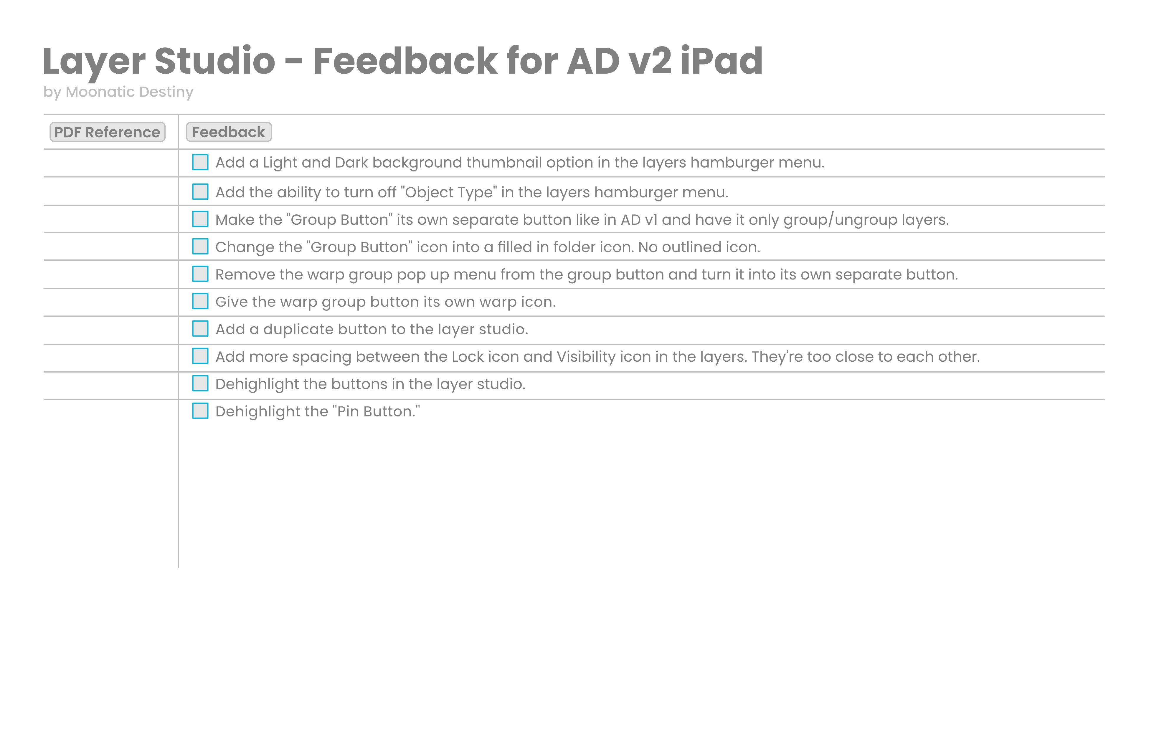
Im going to start a little roadmap/feedback list for the layer studio in AD v2 for ipad. I should have done this a long time ago for v1. I was just blurring it all out on here on the forums. I should have made a list of everything to keep everything organized and on track. Im only starting with the layer studio. Ill be adding more to it later.

-
V2 is a downgrade
MoonaticDestiny replied to shushustorm's topic in Feedback for the Affinity V2 Suite of Products
I agree but you can turn them off in the layer hamburger menu. Turn off object type. -
its really like that? 😱
-
😅😂👏 great britain 😅
-
I went to college for art and design and the number one lesson my professor taught me, and it still sticks me till this day after 10 years is, "Contact and Communication is key." If you just reach out and communicate the problem that you were so worried about will be easily solved and you can move forward.
-
V2 is a downgrade
MoonaticDestiny replied to shushustorm's topic in Feedback for the Affinity V2 Suite of Products
Well its a bad choice regardless of screen estate. Creating 2 buttons for users, one to group and one to warp group, is better for them. -
Ahhh. Yes. This solves my 1st issue. Thank you, my friend.
-
I just wanted to share this. I love that AD v2 on iPad now has these thin black lines to divide things in the layers studio. You can see how in v1 theres no division in the layers. Everything is together on a dark gray colored background layer. In v2, those thin black lines add contrast and separation. You can tell where things are now. It was very much needed. I have an issue though. My first issue is when performing a group action. I have a pink and blue square here in my layers that I’ve grouped together in v1 and v2 in the photo below. In v1, when they’re grouped, the thumbnail of the layer shows my pink and blue square grouped. I like that a lot because my layer thumbnail is showing me what I have on that layer thats now grouped. However, in v2, when they’re grouped, my thumbnail layer is a folder icon. I don’t like that because I don’t know whats in that layer. Its not showing me whats in my layer. Its just showing a big folder icon. I have to collapse that layer to see whats inside my group layer. So this is an issue because 1, I don’t know whats in my layer. I’d prefer v1s thumbnail because it shows me a thumbnail of my layer when its grouped and everything inside it. 2, that folder icon should not be there. That folder icon should have been to the far left side of my layer to tell me what type my layer is since that new feature was introduce that tells you what type of layer your layer is through these new icons. So my layer in v2 should be displaying a thumbnail of what inside my layer(pink and blue square) and this folder icon should be to the far left to indicate this layer is a “group” layer type. Thats my first issue. Look at example 1 for reference of how it should be in the photo below. My second issue is I don’t like that the collapse icons and these new layer type icons are on top of each other in this one tiny box. I think that goes against adding these thin black lines to show contrast and division. I think these 2 icons should be separated and be in their own little box because you got 2 icons in this very tiny, tiny little box. I have to look at both icons in the same box and do some extra thinking. I just think that they should be separated. Look at example 2 for reference. I don’t know if we can follow this new "layer formula" below for our layers. Collapse Icon ~ Layer type ~ Thumbnail ~ Layer Name ~ FX ~ Lock Icon ~ Visibility ~ Tags Also, can we add those thin black lines for the lock and FX icons in the layers. They are just way too close to each other and need some separation. There needs to be more spacing between these icons. Look at the photo below for reference.
-
V2 is a downgrade
MoonaticDestiny replied to shushustorm's topic in Feedback for the Affinity V2 Suite of Products
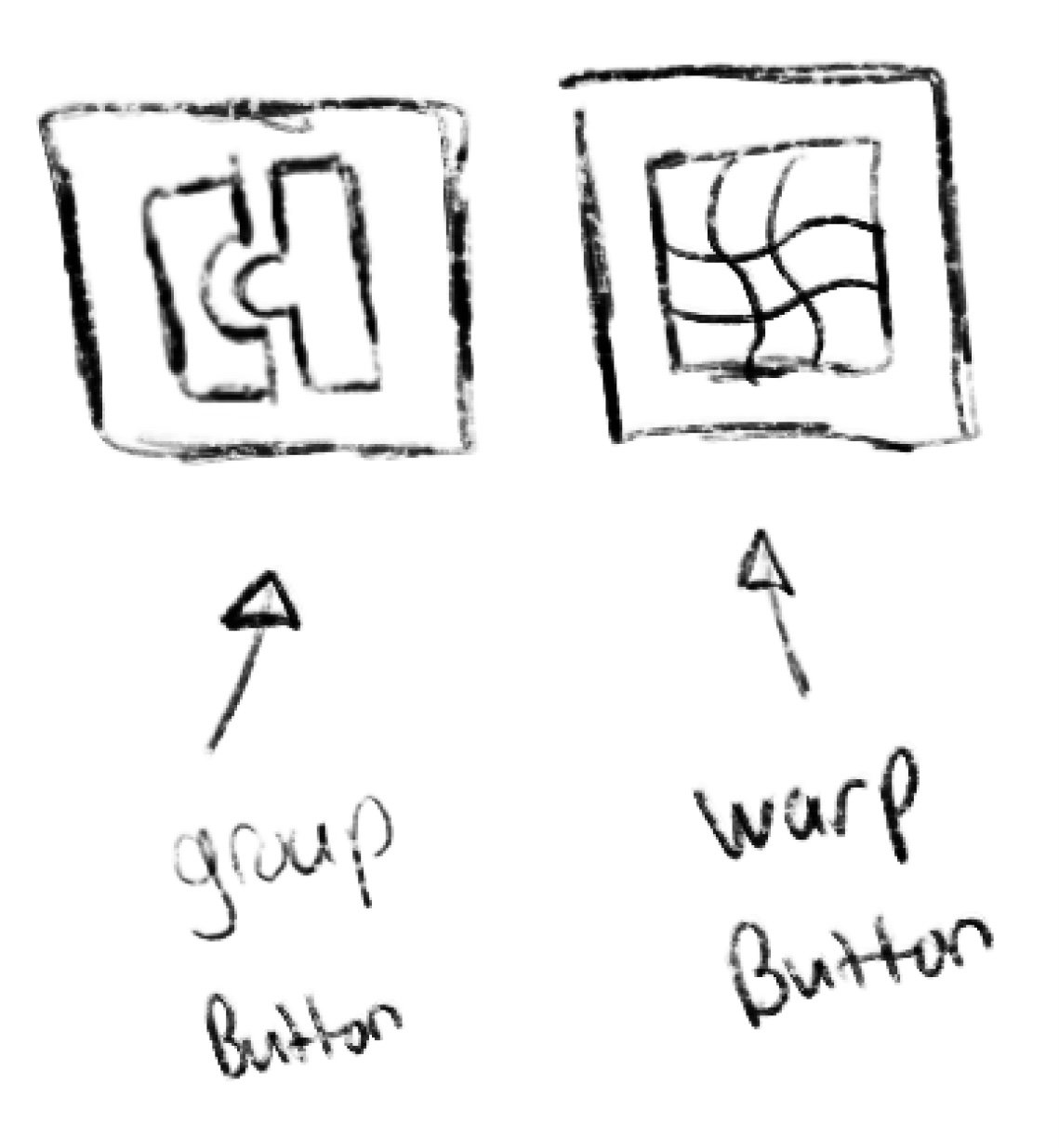
So theres actually a new warp group button on the desktop version of AD v2 in the layer studio but for some strange reason, and i dont know why its this hard, serif cant just take whats on the desktop version and simply transfer it over to the ipad version. They didnt create the same new warp group button on the desktop version for the ipad version of AD v2. Instead, they decided to put the warp group pop up menu into the group button and now the group button is the group/ungroup, warp group button. What a tongue twister. They are 2 different things. They shouldnt be grouped together. There should a group button and a warp group button. Like, "hey, if we made a separate warp group button in the desktop version then that same button needs to be in the ipad version." Nope. -
This is happening to me on AD v2 on ipad. The visibility icons vanish, and Im forced to close the whole app and reopen it. It happens once in a while.
-
V2 is a downgrade
MoonaticDestiny replied to shushustorm's topic in Feedback for the Affinity V2 Suite of Products
you can enable that status bar in the preferences. it tells you what the command controller will do. serif also provides a pdf gesture that tells you what the command controller can do. https://resources.serif.com/spotlight/learning/shortcuts/Affinity-Designer-2-Shortcuts-iPad.pdf -
V2 is a downgrade
MoonaticDestiny replied to shushustorm's topic in Feedback for the Affinity V2 Suite of Products
THIS! I hate it. Its so annoying. You turn it off. You leave the app or exit your file. You open the app and reopen your file and the command controller is enabled even though you disabled it. Its honestly annoying to disable it each time. -
V2 is a downgrade
MoonaticDestiny replied to shushustorm's topic in Feedback for the Affinity V2 Suite of Products
@walt.farrell I didnt really explain myself but what this user above said is how I feel. I think I said it shouldnt be there because I didnt like how they turned the group button into a pop up menu and added warp group to it. The group button was a solo button in v1 that you could hit to group and ungroup. I loved it. Super easy to group and ungroup. Now, in v2, you have to hit this new group button twice to ungroup since its now a pop up menu. So its more work for a simple action. What they should have done is kept the group button to group and undo as its own separate button and then create a new button that has a "warp" icon that when clicked on shows a pop up menu with all the warp groups. Thats what they should have done. Look at the photo below.
-
V2 is a downgrade
MoonaticDestiny replied to shushustorm's topic in Feedback for the Affinity V2 Suite of Products
@shushustorm I personally want to apologize to you. Ive seen you in the v1 forums asking for change and serif never gave you that. I even saw you in the vectornator forums. Im just sorry that youve been here for a long time and not much was ever delivered to you. Im sorry. -
V2 is a downgrade
MoonaticDestiny replied to shushustorm's topic in Feedback for the Affinity V2 Suite of Products
I dont know why they changed the group icon. I liked the puzzle piece icon for grouping. Now its this weird icon. -
V2 is a downgrade
MoonaticDestiny replied to shushustorm's topic in Feedback for the Affinity V2 Suite of Products
I dont even know why they would put it there. It honestly shouldnt go there. -
Delete Button
MoonaticDestiny replied to Tory123ed's topic in Feedback for the Affinity V2 Suite of Products
@TonyOI found it, my friend. Fitts Law. -
I just realized why this right to left gesture was removed for deselect. This gesture was removed and reserved for compact mode, the new feature that nobody asked for. When in compact mode, swiping right to left brings up some layer option buttons and now a pop up menu appears when your swipe right to left in the layer studio. I know you can deselect by swiping left to right again but its an easy concept to follow to swipe right to select and swipe left to deselect. Also, the options in that pop up menu shouldnt even be there. They shouldnt be there because theres already a delete button in the layer studio and serif was suppose to put the layer blending mode in the layer studio but they like to play hide and seek and hide it inside the "..." button.
-
Sigh. If you use AD on ipad theres a gesture to select layers and to deselect layers. The gesture to select a layer is to swipe left to right on that layer and to deselect a layer is to swipe right to left. Its always been like this. Its never been problematic. No one has been requesting these gestures to be changed. Its fine. Its the least of our problems. LEAVE THEM ALONE! Welp. I just found out right now in v2 of AD that if you swipe right to left to deselect your layer your layer will not be deselected. Instead, an unnecessary pop up menu will appear and ask you if you want to delete, add to selection, and change your layers blend mode. Like? WHY!! Im so upset right now! I dont know why this is happening. No one asked for this change. I dont know why youre fixing things that arent broken. I dont know who at serif is making these awful design changes and choices. This is why users are upset. Youre fixing things that dont need to be fixed. It just baffles me why you would need to make this change when it was perfectly fine. Its so simple and basic. left to right to select. right to left to deselect. thats it! its not a hard concept to grasp, serif. Now you want to change the right to left gesture and turn it into a pop up menu that shouldnt even be there!! it should not be there. this is why im upset. 6yrs for this unnecessary change,
-
Its always been left to right to select and right to left to deselect but in v2 deselect has been removed. Now, a new pop up menu appears when the right to left gesture is performed. I dont like this. Our deselect is gone. Im just figuring this out and sad about it.
-
Can we please bring back the checkmark boxes for the layers. I dont know why they were changed to circles. Who asked for this? No one told serif to change this. Nobody requested this. Dont fix whats not broken. Now we're having these debates about this new on/off circle icon that we shouldnt even be having. And theres bearly any contrast with this new circle on/off icon. When you turn off the layer its this dark gray circle on dark gray. Its just hard to see. Like, a checkmark is a good indicator to tell if a layer is on or off. Why change it? Theres also an issue on AD v2 on ipad where the new on/off circles in the layers vanish. Theres no button to turn your layer on or off. I have to close the app and reopen it. Ugh! Like, this seriously was the least of our problems. I go back to AD v1 on ipad and Im back to how it used to be. My problem is solved. I have my checkmark box in my layers but then I look up and realize that theres a bunch of affinity users debating about an on/off icon in v2. Why? Why are we debating over something that was never a problem? Now a problem has been creating for nothing and our energy is going towards it.
- 21 replies
-
- 10
-

-
Ive always said this but I've grown to love the checkmark box. I want it back.
-
Im aware. Thank you.
-
I made a post about this. The middle blue line indicator for a clipping mask is now gone. It now works like the desktop version. I hate the desktop version. Thats why I preferred the ipad app. Its better for the blue line to show in the middle of the layer to indicate a clipping mask is being performed. Now if you want to make a clipping mask the blue line becomes a little thicker and appears below the layer and moves a little to the right. Sigh. The visual clue has changed and its annoying.
-
Lol. Youre absolutely right though. You know why? Because the eraser tool looks like a pill from the Dr Mario game and the magic wand looks like a wand for a wizard. Im starting not to like them. I really like the icons from v1. They look dark, sleek, and cool. The touch of blue looks good on the gray icons. They need to go back to these v1 icons. Dont go color with these icons. Just keep it monochromatic with a touch of blue to go with affinity designers blue color theme.