kirkt
-
Posts
440 -
Joined
-
Last visited
Everything posted by kirkt
-
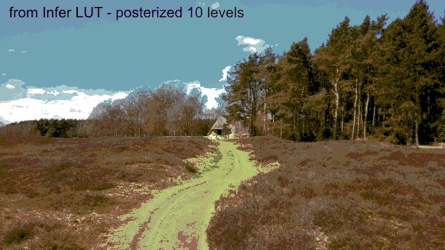
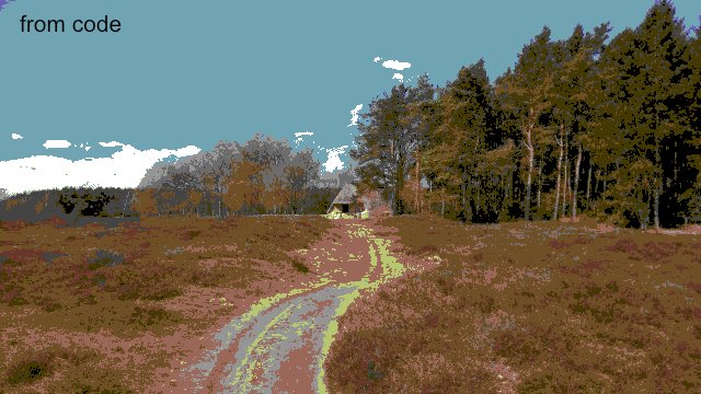
Here is the result of: 1) Running the test image from above through the Inferred LUT; 2) Running the test image through the Python code directly. Kirk

-
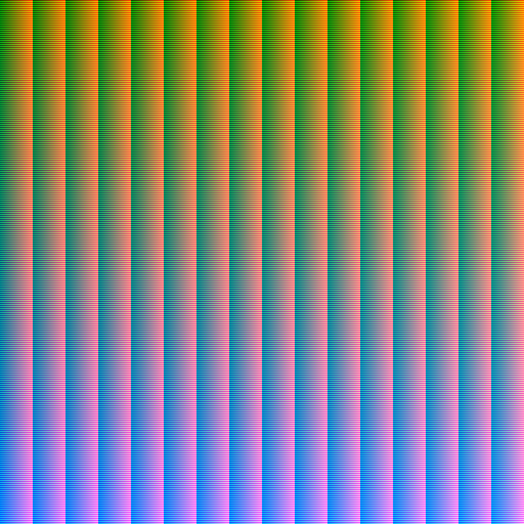
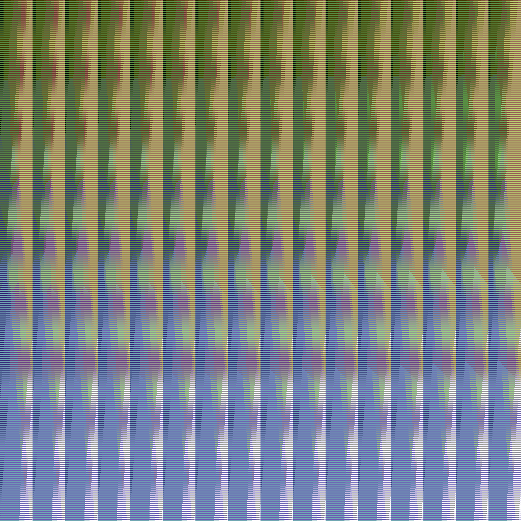
@Rongkongcoma - Here is a HALD Identity Image run through the Python code to which @R C-R linked. In AP, you can use the HALD identity image and its transformed mate as a pair of images in a LUT adjustment layer using "Infer LUT." Otherwise, you can run your image through the Python code and it will transform the image itself. To control the distribution of color, I would add a Posterize adjustment layer below the LUT layer. kirk Attached images: 1) "lookup1024.png" the identity image 2) "paletteC64_first.png" - the transformed identity image mapped to the C64 color palette. FYI - the code looks at the R, G and B values of each pixel and then figures out the distances from that color to the 16 colors in the C64 palette. It then sorts the list of distances and saves the C64 palette color associated with the closest distance to the pixel's color.
-
Here is a link to the palette of 16 colors that the C64 had available for display: and https://www.c64-wiki.com/wiki/Color You can use this to construct a custom palette in an application that supports such things and see if that works for you. I encountered the long-standing lack of a way to specify a custom palette for GIF export as well and got the same error as in the thread to which @Medical Officer Bones linked.
-
Live Filter Layer for Plugins
kirkt replied to GKrause's topic in Feedback for Affinity Photo V1 on Desktop
As a kludge, and obviously depending highly upon the edits you do in post to the rendering, you can bake a LUT that will replace all of the edits and can be stacked on top of the rendering that may change, subject to client feedback, etc. Because you cannot export a LUT from AP that is based on pixel operations (like using ColorEfex or something similar), you will need to export two images after your first editing session: 1) The original render 2) The edited render. Then you can open the original render, add a LUT adjustment layer and then use the Infer LUT option to infer the edits between the original and the post-production editing. Again, this will only work for global edits, like color grading and adjustments to global tone, as opposed to edits that change local portions of the image. Hey, it ain't pretty but it works. When the client needs changes made to the original render, you can make those changes, render the new image and replace the stale (background) image with the new render and all of the color grading and tonal changes made during the first post session will be applied via the LUT adjustment layer. If you make a bunch of edits in, for example, ColorEfex, you can also save them as recipes in ColorEfex and, while it will require you revisiting ColorEfex to apply the filters to the new render, they will be fully editable in ColorEfex. In this example, all a SmartObject is doing is saving the filter recipe in the SO instead of as a preset in ColorEfex. Kirk -
Lens profiles for professional lenses....
kirkt replied to vendryes's topic in Feedback for Affinity Photo V1 on Desktop
@vendryes - AP uses the Lensfun correction database. See: https://lensfun.github.io/calibration/ to help include your specific lenses. Kirk -
What Font is This?
kirkt replied to World View's topic in Pre-V2 Archive of Desktop Questions (macOS and Windows)
You can use the web application "WhatTheFont?" (or similar font ID web pages) and drop an image of the type (like the one you posted) into the web app and it will return suggested typefaces that resemble the image. Feed it a JPEG or PNG. https://lmgtfy.com/?q=what+the+font Kirk -
If you need your noise to be more noticeable in the final exported JPEG and you plan to resize (i.e., change the number of pixels) the JPEG export for final delivery, then reduce the JPEG in size first to the final output dimensions, and then add the noise. This way when you view the preview at 100%, you will be able to see the size and quality of the noise that will appear in the JPEG output at final dimensions. Kirk
-
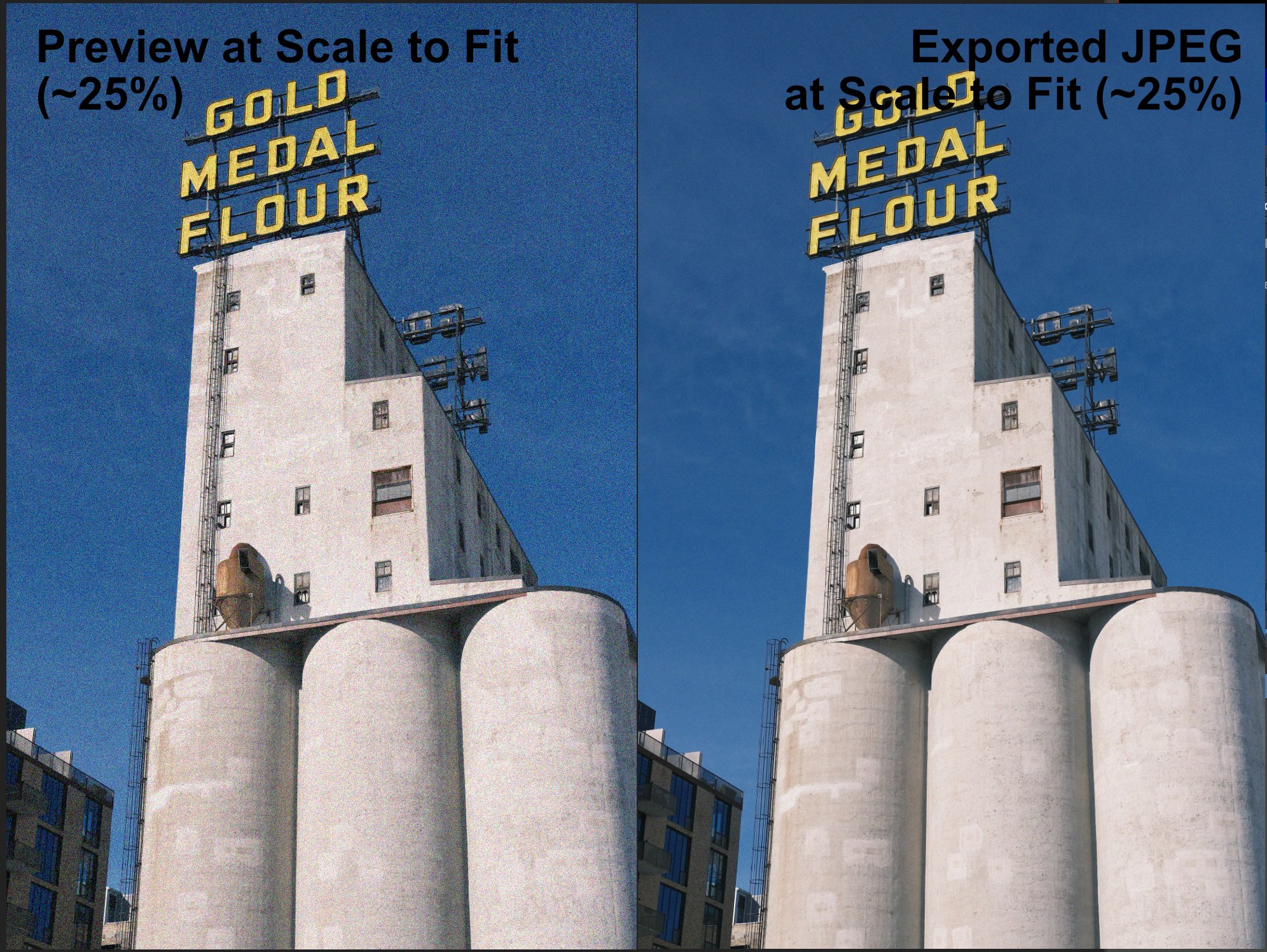
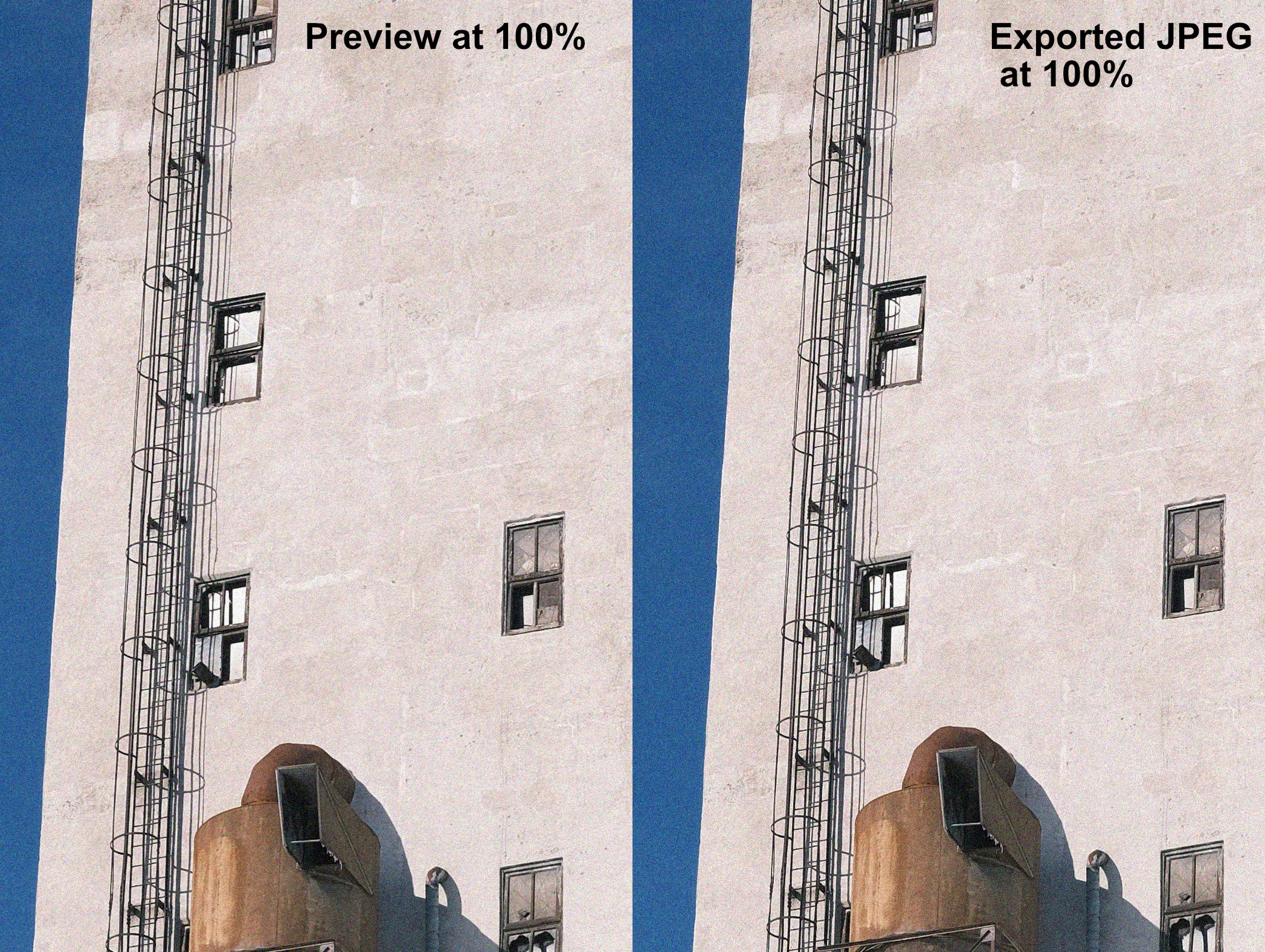
With some operations, like sharpening and noise, you need to examine the preview/result at 100% zoom. Otherwise, you will get a scaled, likely inaccurate, preview. Also, with images the contain fine detail, like noise, your JPEG export settings should be very high quality (like >90% or so - test the amount of compression you can get away with if file size is an issue). The attached images depict what the noise looks like in AP before you export and after you export - in the first attachment, the image is scaled to fit the display (about 25% zoom). In the second attachment, the image is being viewed at 100% zoom. The two images in each attachment are the preview in AP (left) and the resulting exported JPEG (right). As you can see, the versions that are not viewed at 100% look very different (as the OP suggests, the noise "disappears") but the images viewed at 100% look very similar. Kirk
-
Even Lighting on a Texture
kirkt replied to Al Edwards's topic in Pre-V2 Archive of Desktop Questions (macOS and Windows)
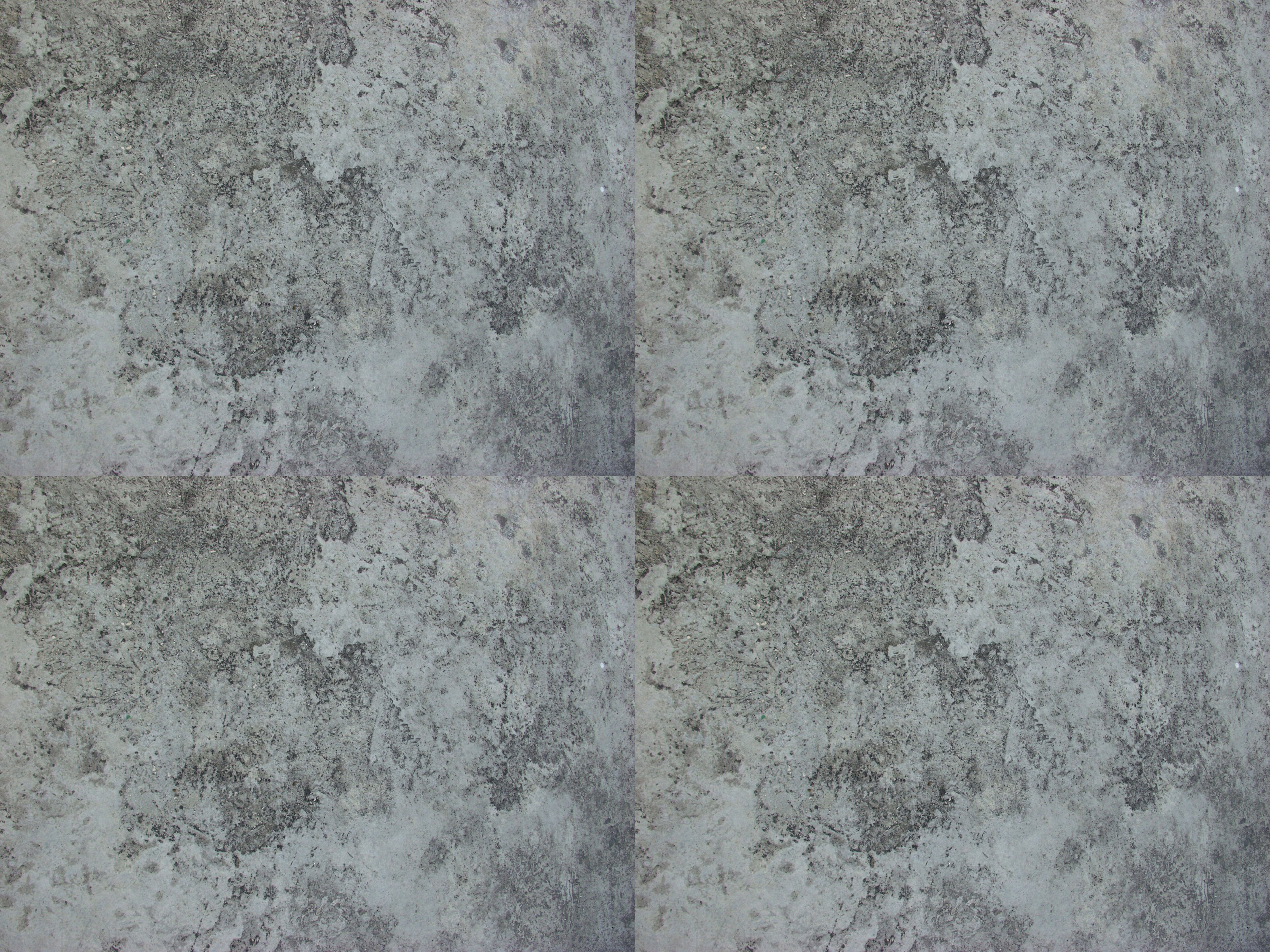
Here's what it would look like without the processing (just tiling the original image). Kirk
-
Even Lighting on a Texture
kirkt replied to Al Edwards's topic in Pre-V2 Archive of Desktop Questions (macOS and Windows)
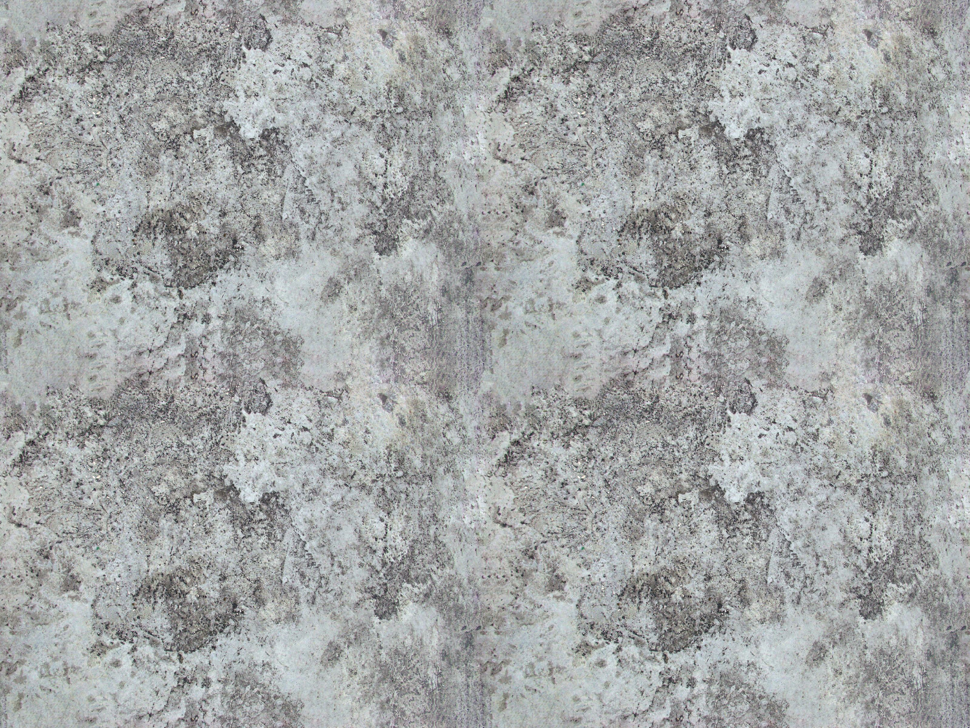
Here is th result of applying the above suggestions to the concrete tile the OP posted. The Affine transform makes the seams at the edges move to the middle of the tile. This makes them easy to blend/clone out. Then, when you are satisfied with the blending an removal of the seams at the edges of the original tile, you perform the same (reverse) affine transform to get back to the original tile, but now the edges are contiguous. Now you can tile this image seamlessly. Of course, it will repeat, and the repetition might be pretty obvious, but that depends on the application in which the texture is used. Kirk
-
Node-based UI for AP. Please?
kirkt replied to kirkt's topic in Feedback for Affinity Photo V1 on Desktop
@kirk23 - Also - I have noticed the increased number of CG/3D artists that are suggesting more and more features, or tweaking of existing elements of AP. This is great, in my opinion. I have dabbled in 3D rendering but I am primarily a photo/image processing person. I think the input from the 32bit, multi-channel, OCIO folks who deal with these things regularly in their workflow is solid gold. This is where image processing needs to go. Thank you! From someone who shot HDR mirror ball images and used Paul Debevec's HDRShop decades ago to light his CG scenes! Kirk -
Node-based UI for AP. Please?
kirkt replied to kirkt's topic in Feedback for Affinity Photo V1 on Desktop
Exactly. This is the model I would love to see Affinity follow. I have no problem with nodes that render the output to a low-res proxy throughout the node tree. This speeds up the editing process and gets you where you need to be so that you can then put a full res output node at the end of the tree. Blender is terrific for so many reasons and is an example of how an application can evolve with feedback from an incredibly diverse user base and a bunch of really talented designers and programmers who have support. I am also a fan of Photoline, for many reasons, but the interface can be klunky and a little obtuse, which adds to the learning curve. Kirk (t, not 23 - LOL - how many times does a Kirk run into another Kirk?! I've met three in my lifetime. Now, virtually, four.) -
@AlejandroJ - You're welcome. Have fun! Kirk
-
Even Lighting on a Texture
kirkt replied to Al Edwards's topic in Pre-V2 Archive of Desktop Questions (macOS and Windows)
You can try duplicating the original on a new layer above the original. Then apply a very large gaussian blur* to the image to obliterate the small details and leave the very large variations in tone (i.e., uneven lighting). Then invert the result and apply it to the original in screen, overlay or soft light blend mode. Adjust the black and white points of the composite to restore contrast and tonal range. Then you can apply an Affine transformation (Filters > Distort > Affine) and offset the image 50% in X and Y. Use this as the basis for your tile, cloning and inpainting the seams that intersect in the middle of the tile for a seamless tile. Kirk * Although the Gaussian blur slider in AP only goes to 100 pixels, you can enter larger values into the numerical radius field to get blur radii larger than 100 pixels. Try something like 300 for your image. -
Infer LUT confusion
kirkt replied to Claire_Marie's topic in Pre-V2 Archive of Desktop Questions (macOS and Windows)
@Claire_Marie - As @Lee D notes, the Infer LUT operation compares the before and after color of an image and tries to reverse engineer the color in the after image based on the before image. Some images that are used in the Infer LUT operation may not have a very wide variety of tone or color represented in them, so when inferring a LUT from them, the inferred LUT only captures part of the toning (the toning restricted to the colors present in the image). One way that LUTs are stored in a graphical format is to use a before and after version of a special color image called an Identity (ungraded, neutral) HALD CLUT (color lookup table) image like this one: As you can see, this special image is essentially a grid of colors with a wide range of tonal and hue variation. Copy this HALD image and run it through your filter and then use the before and after versions of it as your Infer LUT base images. The Identity HALD image contains a lot of colors and will capture your filter's color transform fully. As with all LUTs, the HALD images need to be in the color space of the image you are editing for the color transform of the LUT to work as expected. Here is link to a page of technical LUTs which includes the original HALD image I posted here: https://3dlutcreator.com/3d-lut-creator---materials-and-luts.html For example, here is a webpage that contains a link to several HALD CLUTs that capture color transforms for several film simulations. You can use these in AP to apply a film look to your image with a LUT adjustment layer and the Infer LUT feature. https://patdavid.net/2015/03/film-emulation-in-rawtherapee.html Kirk -
Copy/export what I see
kirkt replied to AndreKR's topic in Pre-V2 Archive of Desktop Questions (macOS and Windows)
I took a look at your file - the cat artwork is grayscale and you are essentially processing it to look like a bitmapped pixel line art drawing. In your file, you use a Levels adjustment layer to try to squeeze the white and black points together to get the antialiased (shades of gray) edges to go to black or white. Try using a Threshold adjustment layer instead. Also, flatten the artwork onto the white background before applying the Threshold adjustment. I was able to export a JPEG that looked identical to the preview in AP. I think the problem lies in using the Levels adjustment to force the gray around the edges of the line art to black or white. When it comes time to export, there are probably edge pixels that are not completely black or completely white, and the export file type makes decisions about what should be black or white that do not agree with your intentions. Threshold should cure the problem because it explicitly makes things either black or white. In PS, you could convert the artwork to "bitmapped", but that option does not exist in AP, so you have to use the Threshold tool to effectively do the same thing. I used a value of 72% in the threshold tool for my test. Kirk EDIT - I see @Old Bruce and I are on the same page. -
If you want to use the dodge and burn tools, then you need to work on a layer with pixel information (for example, a duplicate of the original background image layer, to preserve an unedited version of the original background image). This is a destructive operation on the pixels of the duplicate image layer. If you are going to dodge and burn on a new, empty pixel layer, you cannot use the dodge and burn tools, as there is no data for those tools to "see" and edit. To dodge and burn this way (non-destructively) you need to set the layer blend mode of the empty pixel layer to Overlay or Soft Light, and then use a regular brush (not the Dodge or Burn tools) set to a gray value as I posted previously. Then when you apply brush strokes, the composite image will get darker or lighter according to the gray value of the brush stroke and the opacity/flow of the brush. This operation is non-destructive (it does not affect the original pixels in the background image layer) and does not involve using the dodge and burn tools. Kirk
-
Filters in the Black and White tool
kirkt replied to marciomendonsa's topic in Feedback for Affinity Photo V1 on Desktop
@marciomendonsa You can model this with a Photo Filter adjustment layer placed under a Black and White adjustment layer. Set the Black and White adjustment to neutral and then dial in the color of the filter in the Photo Filter layer - uncheck "Preserve luminosity" to have the more optically dense color filter cut out more light, as a real filter would do. Kirk- 1 reply
-
- 1
-

-
@AlejandroJ - Take a look at the Serif-produced tutorials listed here: They are terrific and will help orient you. Kirk
-
Pasting Into An Alpha Channel
kirkt replied to WG48's topic in Pre-V2 Archive of Desktop Questions (macOS and Windows)
Here is a split (upper left to lower right) before and after. Kirk
-
Pasting Into An Alpha Channel
kirkt replied to WG48's topic in Pre-V2 Archive of Desktop Questions (macOS and Windows)
Here is a screenshot of the resulting Spare Channel (BLUEMASK) applied to a HSL adjustment to target the blue in the tarnish and shift its Hue to the sepia of the rest of the photo. To apply the BLUEMASK spare channel to the HSL adjustment layer, add the HSL layer and make sure it is the active layer. Then right-click on the BLUEMASK spare channel in the Channel palette and select "Load to HSL Shift adjustment Alpha" - this will load your spare channel to the inherent mask of the HSL adjustment layer. I would think there are other adjustments to contrast, etc., that will need to be made to combat the effects of the tarnish, but you get the idea. Because these other adjustments probably also involve the exact same area as the blue, you can reuse the mask to target the same area. Have fun! Kirk
-
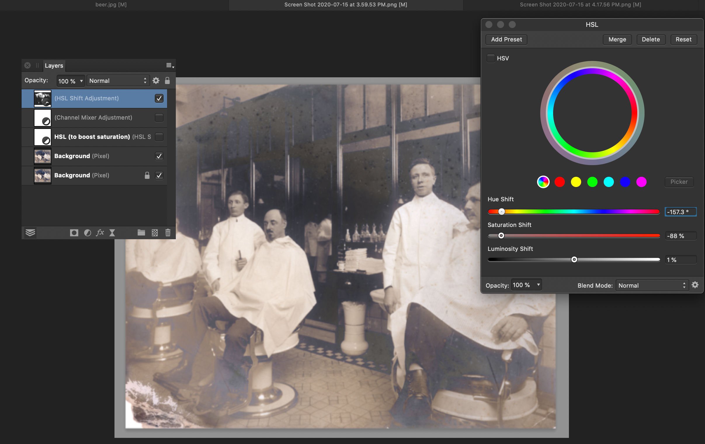
Pasting Into An Alpha Channel
kirkt replied to WG48's topic in Pre-V2 Archive of Desktop Questions (macOS and Windows)
@WG48 - In AP, you can emulate the effect of the monochrome checkbox that is in PS by: 0) - It looks like you added a HSL adjustment (A in the attached screenshot) to accentuate the blue of the tarnish. 1) Add a Channel Mixer adjustment layer (B) to the stack (this is where you will accentuate the tarnish by manipulating the R, G and B content in each channel) 2) The effects of the Channel Mixer (D) can be seen in monochrome by viewing just the targeted channel of the composite image. In this case, the blue area will be WHITE in the mask you ultimately want to create, and the rest of the image should be BLACK or dark, to avoid being affected by whatever adjustment you make. In other words, the adjustment you ultimately make will target the blue area in the image, which has been intensified by the HSL boost in step 0. In the Channels panel (C), click on the blue composite channel thumbnail to view just the blue channel, in grayscale. In the Channel Mixer adjustment, select the blue channel (D) and push the blue (dirty) channel slider up to 200% and the red (clean) channel down to 200% or so. The composite blue channel should look a lot like the mask you posted in the screenshot of the PS result. You can right-click on the blue channel and create a "Spare Channel" from the blue channel - this will be your mask (E - I renamed the Spare Channel "BLUEMASK"). Kirk
-
Which OS and version of AP? Are you using a pressure-sensitive stylus? The controls work as expected on my Mac, Catalina, v 1.8.3. Take a look at the brush options (in the context toolbar, click on the "More" button to examine the brush settings) and make sure your brush is not configured in something like Overlay mode or some other blend mode that is causing the brush to behave differently than a "normal" brush. Also make sure you are targeting the intended tonal range (highlights, midtones, shadows) properly with that dropdown menu. You can also dodge and burn on a separate layer with a regular brush and various shades of gray. Make a new pixel layer in Overlay or Soft Light blend mode and then paint with gray on it - anything lighter than 50% will dodge (lighten), darker than 50% will burn (darken). 50% gray will provide no effect, essentially erasing the previous effect on that layer (resetting the effect to nothing, locally with the brush). Good luck, Kirk
-
@AlejandroJ - The HSL adjustment layer does pretty much most of what the Color EQ tool appears to do (based on some ACDSee videos - I am not an ACDSee user). See if that works for you. Kirk
-
Cannot load LUT or Infer
kirkt replied to k.g.'s topic in Pre-V2 Archive of Desktop Questions (macOS and Windows)
Take a look at this tutorial as well. There are a couple of small things that might trip up the process, if what you are experiencing is not simply a bug: Kirk