aitte
-
Posts
147 -
Joined
-
Last visited
Everything posted by aitte
-

text on a path in photo?
aitte replied to safoster71's topic in [ARCHIVE] Photo beta on macOS threads
Yes, Photographers have to buy a freaking vector design program to be able to do something as basic as curving text. Meanwhile Adobe's baby-app for newbies, Adobe Photoshop Elements, has curved text and lots of other built-in modes. What is the most professional app in this case? Unfortunately not Affinity. :-( Flat text on a straight line.......... -
text on a path in photo?
aitte replied to safoster71's topic in [ARCHIVE] Photo beta on macOS threads
Please think about the photographers... -
text on a path in photo?
aitte replied to safoster71's topic in [ARCHIVE] Photo beta on macOS threads
Pleeeease reconsider this. Why not make Affinity Photo better than Photoshop in *every* way? Even Photoshop Elements, the cheap baby-version of Photoshop, has: https://helpx.adobe.com/photoshop-elements/using/add-text.html * Text on Shape * Text on Selection * Text on Path They're extremely useful tools and the lack of them is a huge limitation for adding creative text to photos in Affinity Photo. :-( Every time I go to add text in Photos, I wish the feature existed... And ironically, Photos is a place where creative text matters a lot. Imagine you're making a wallpaper from a family vacation or wedding, and you want to add a headline title to it. Do you really want the letters to be on a flat, boring, straight line, or do you want the text to have some fun flair? Or just look at the dog-example in the above Photoshop link, which shows a really fun use for text in creative photo editing, where they've wrapped the text around the dog. Creative text is insanely useful in photo editing to set the right mood. This is why Photoshop includes the feature in its photo editor (even in Elements), instead of just having it in Illustrator... Please don't artificially hold back an essential core text feature of Photo editing just to differentiate Designer and Photo. You can differentiate Designer in non-text-related ways (more smart shapes, bitmap to vector auto-conversion, being able to draw vectors as a paintbrush instead of just a pen tool, infinite zoom, vector outline "xray" view mode, pixel preview of vectors, etc)... Creative text is a basic feature of any editor out there except Affinity Photo... I'm sad now, and it's the first time I've been sad about Affinity... :-( Heh... edit: Hi to everyone giving this post a "like"! But it's probably better if you also post your opinions in the thread for more visibility. -
Jpeg Quality and file size issues
aitte replied to antoniolsampaio's topic in [ARCHIVE] Photo beta on macOS threads
Can anyone confirm this? Is Affinity's export JPG quality still bad compared to Photoshop? -
I agree 100%... The time that I hate it the most is when I want to align objects within the image and get a good overview of the composition. The massive, blue box with its handles is really distracting when doing that. In Photoshop, I liked that it didn't have any bounding box when moved with the keyboard. You could select the layer, hit V for move, then use shift+arrow keys to move it around without seeing any bounding box.
-
I posted a link to image examples for all common filters earlier in the thread.
-
Irident Developer is doing the right thing! Lanczos2 (smooth) = separable, 2 lobes Lanczos3 (sharp) = separable, 3 lobes Lanczos5 (sharper) = separable, 5 lobes The number of lobes = the sharpness. Common values are 2 (almost zero ringing artifacts) and 4 (best tradeoff between sharpness and ringing). Again, AFP is misimplementing Lanczos by having a pointless, slow non-separable mode and by not providing varying lobe (sharpness) settings. I wish we had Irident developer's menu. It's like an A-Z of all good scaling algorithms!
-
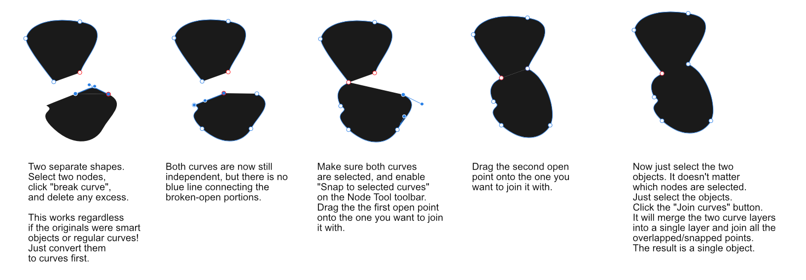
@A_B_C: Reload the page, hehe. I was editing the post while you read it, since I've spent nearly an hour writing this up... What you just considered has already been taken care of as follows (see the last line): (Copy-pasted from the post above, so someone who already read it doesn't have to re-read it...) * Break Curve : Split Node(s) = -- If 1 node is selected, split it into two disconnected parts. -- If 2 nodes are selected (on the same curve), disconnect them from each other (new behavior). -- If 3+ nodes are selected (on the same curve), do nothing (new behavior). Pop up a warning box saying something like "too many nodes selected on a curve, can't figure out which ones you want to disconnect from each other". ;-) -- Important: If you have multiple curves selected, you are allowed to select 1 or 2 nodes from each curve and it'll split them independently. That way you can independently select 1 or 2 points on a bunch of different curves, and split all those nodes on those curves independently with a single click of the button.
-
To summarize all of this analysis, here is my suggestion for improving all of the node/curve tools and making them more consistent, more logical, more powerful, and easier to work with. First of all, we need to clear something up for the reader: Node = The dots/control points on a curve. Curve = The line/shape caused by several connected nodes. Can be closed (all the nodes connect to each other so that it's a closed shape), or open (there's one or more disconnected nodes, which leaves a gap in the shape). Layer = A single layer can contain one or more independent curves. Usually there's only one curve per layer, but there can be more in certain cases, such as when you've used "Boolean Add" to join two layers into one layer. I have highlighted all three words below, to make it clearer. Alright, let's begin! This will perhaps be a bit wordy/techy, since I am mainly talking to the developers here. Old name : New Name = New Function * Break Curve : Split Node(s) = -- If 1 node is selected, split it into two disconnected parts. -- If 2 nodes are selected (on the same curve), disconnect them from each other (new behavior). -- If 3+ nodes are selected (on the same curve), do nothing (new behavior). Pop up a warning box saying something like "too many nodes selected on a curve, can't figure out which ones you want to disconnect from each other". ;-) -- Important: If you have multiple curves selected, you are allowed to select 1 or 2 nodes from each curve and it'll split them independently. That way you can independently select 1 or 2 points on a bunch of different curves, and split all those nodes on those curves independently with a single click of the button. * Close Curve : Close Curve = -- Look at the whole curve and detect any *disconnected* nodes that are snapped on top of each other, and merge those into a single node (new behavior). -- *Then* finish off by running its own "close curve" logic to see if any other disconnected nodes further apart needs regular closing (by connecting those nodes to each other with a line). -- Note: The fact that it only operates on disconnected nodes (ones with at least 1 disconnected handle) means it won't inadvertently merge *connected* nodes stacked on top of each other on valid lines. That's intentional, to avoid messing up your drawing. -- Important: If you have multiple curves selected, it will *independently* apply this "close curve" process to all of them, as if you had manually selected them one by one and used the command multiple times. * Smooth Curve : ??? = Its behavior is too inconsistent (described in another post above) to know what a good name would be. I'm sure it's *intended* to insert more nodes in a curve to make it smoother, but it doesn't work properly. Try it on the "Cloud" smart shape and you'll see what I mean... it only inserts extra nodes on a few of the cloud "arms", instead of all of them... * Join Curves : Unite Nodes (alternatively: Unite Two Nodes) = (All of the below is new behavior) -- If no nodes are selected, do nothing. -- If two curves are selected but *no nodes* are selected, do nothing. -- You must select *exactly two* nodes (no more, no less). Both of the nodes you select must *both* follow *one* of these sets of criteria: --- Uniting Criteria A: Both nodes must be disconnected on at least one side (such as the endpoint of an unfinished curve/line, or something disconnected via "Split Node(s)"). The two nodes you select can either be on the two different curves, or on the same curve. <-- This is the criteria you would use to merge/join two separate curves/layers *or* two disconnected endpoints on a single curve. --- Uniting Criteria B: Both nodes must already be connected *to each other*. <-- This is the criteria you would use to merge superfluous nodes and reduce shape complexity; more on that below. -- If the node selection is invalid for any of the reasons above, then pop up a warning box briefly explaining to the user how to use the function; the fact that they must select two disconnected nodes *or* two directly-connected nodes is the key part. === In Use/Behavior Combinations: === -- Criteria A, Two Layers: You must explicitly select both curves (they can be on different layers), select *one* valid *disconnected* node on *each* curve, and hit "Unite Nodes". It will then merge the two curves into a single curve (and in case the curves came from two different layers, they'll be merged into a single layer), and then it checks if the two selected nodes are snapped on top of each other. In that case, it merges those "stacked" nodes into a single node. Otherwise, it just connects the two selected nodes with a line. -- Criteria A, Single Layer: You must select two valid *disconnected* nodes on a single curve. If the two nodes you selected are snapped on top of each other, it merges them into a single node. Otherwise, it connects the two selected nodes with a line. <-- This behavior is nearly identical to the automatic "Close Curve" function described above, except that *you* manually control which nodes you want it to join. -- Criteria B, Single Layer: You must select two valid *connected* nodes on a single curve; the nodes must be directly connected to each other. If the two nodes you selected are snapped on top of each other, it merges them into a single node. Otherwise, it deletes the two nodes and replaces them with a *single* node at the *midpoint* of the line *between* where the two nodes used to sit. This basically "reduces the complexity" of the curve at that location, by replacing two points with a single point. It will often result in the shape changing slightly since a single node can't do all the shapes that two nodes could do, but that's intentional. The user wanted to unite two connected nodes, and they got that feature now! ;-) * Reverse Curves : Select Opposite Nodes = -- Looks at your current selection and number of selected nodes, and selects the same amount of nodes at what it considers the "nearest opposite mirror-side of that particular curve". (Old behavior; just a much, much, much clearer function name). -- You can select nodes from different curves, and it'll mirror the selection independently inside of each curve. So a curve with 2 selected nodes and one with 3 selected nodes will remain a 2 and a 3, respectively. It just mirrors the selection within each, and doesn't mirror *across* objects. Affinity and these curve tools are very young right now, but over time they'll get more and more difficult to change. So this is the right time to improve the tools. Otherwise we'll be stuck... Furthermore; my suggestions behave relatively similarly to the originals, but just improved with extra control, consistency and features, so hopefully the developers are open to considering these improvements.
-
Developers & Readers, go to this post for suggestions about improving the curve tools: https://forum.affinity.serif.com/index.php?/topic/4274-join-nodes/?p=54441 --- Hey Alex. Hehe, of course I am talking to the developers. And yes, you found yet another quirk! So the "Join CURVES" function (the "S" stands for multiple objects since it operates across multiple layers), actually also works on a single layer/single curve. The quirks just keep on showing up... Wow... I hope the talented developers read this whole thread and then go through these functions and make them behave more cleanly, more logically and more consistently. ;) Their behavior is somewhat okay when just using a single layer. It's when merging multiple layers that things go weird.
-
The original question was "what is the difference between lanzos separable and non-separable". The answer in all literature and discussions is "no visible difference", if properly implemented: http://forum.doom9.org/showthread.php?t=103167 Eliminating the non-separable version would be the right thing to do. Affinity's differences in sharpness between the two operating modes are due to misimplementation. There is no reason to keep the 10x slower non-separable version. Instead, provide a second separable preset with more lobes (more sharpness), and voila. Solved. "Lanczos" and "Lanczos (sharper)" in the menu instead of today's confusing setup. Both of those would use separable mode, but with different sharpness settings.
-
Developers & Readers, go to this post for suggestions about improving the curve tools: https://forum.affinity.serif.com/index.php?/topic/4274-join-nodes/?p=54441 --- Here is another video to demonstrate what Curves does internally. 00:00 - I select two nodes and click "Break Curve". It doesn't break the connection between those two nodes (that would be too logical); instead, it breaks ONE of the nodes. 00:13 - I undo all changes to get back to the original curve objects/layers. 00:17 - To demonstrate what "Join Curves" does, I select both layers and click "Join Curves". Since there are no open seams in either of the objects, they cannot be merged, so they remain two layers. This is logical. 00:24 - I deselect both objects, then select a SINGLE node from an object and click "Break Curve" to open it up. I then split it apart to show that it has turned that node into two unjoined nodes. (And before anyone asks: If you try "Join Curves" now, it still doesn't work, since we've only opened up ONE of the objects so far.) 00:30 - I do the same for the other object, and break open a node and split it apart. So now we've got two curve objects/layers, with a gap in each one. But instead of placing the nodes of the two objects on top of each other, I decide to let them stay separated to make the remaining steps clearer. 00:36 - I deselect both objects, then select both objects. I do not care what nodes I select, because the tools I am about to use don't care what nodes are selected. 00:39 - I click on "Join Curves". Since there are open holes in both curve objects/layers, it is able to join them. It creates a single curve object/layer, and joins *one* of the seams together. It is incapable of joining more than one seam, no matter how many open seams there are. 00:44 - I click on "Close Curve" so that it joins the remaining open seam. This demonstrates what I was saying earlier, about *why* it leaves two nodes even when they're on top of each other: It does that because it's not meant to be used with nodes on top of each other; it just closes any gaps in the object, but keeps all nodes intact. Lots of things can be improved here. Here are the main improvements that would make a *huge* difference: When the "Join Curves" tool is used, make it detect nodes that have been snapped on top of each other, and merge+close such seams *first*; before even trying its own seam-closing logic. This small change will ensure that "join curves" joins snapped objects properly, while still retaining its regular "join *one* open seam" fallback logic if the objects are further apart. Likewise, the "Close Curve" tool should do the exact same thing: Detect nodes on top of each other, merge them into a single node. *Then* finish off by running its own "close curve" logic to see if anything else that's further apart needs regular closing. Lastly, the "Break Curve" tool must be more intelligent: If you select a single node, break it into two nodes (the way it does things today). If you select multiple nodes, then break their connections to each other. These three improvements will probably be enough to fix the tools and make them actually usable. PS: The "Reverse Curves" tool is very badly named. It doesn't "reverse" any actual node locations. It just semi-inverts your *selection* (but it's not even an actual inversion). So if you select two nodes, clicking the button makes Affinity select the two nodes at what it considers the "nearest opposite mirror-side of the curve". That's okay and is a very useful feature, but the button is so badly labeled that it wasn't obvious what it did. Maybe something like "Mirror Node Selection" instead? (Also: The naming standard in your buttons is "Curve" for single curve and "Curves" for tools that do something when multiple curve objects are selected. But even the "Reverse CURVES" in the button label is mislabeled; the "reverse" tool has no special effect if you select multiple curve layers/objects; it still just reverses the selection within each object that you've selected something in. So if you select 2 nodes in one of the objects and 3 nodes in the other; then the "Reverse Curves" button will select 2 nodes in the 2-node object and 3 nodes in the 3-node object. It doesn't reverse across objects. So it doesn't deserve a "Reverse CURVES" label. At best, it could be "Reverse CURVE", but even better is "Mirror Node Selection" or "Select Opposite Nodes") And finally, what does "Smooth Curve" do? I tried it on all kinds of open and closed curves, sharp cornered and rounded corners, selecting one or more nodes, selecting just the whole curve objects, selecting multiple curve objects, selecting a few nodes from each object, etc, and it does nothing... Edit: It does something... If I make a more curved shape such as the "Cloud Shape" tool and convert it to curves, the "Smooth Curve" tool makes it insert a bunch of extra control points between *some* of the nodes, but not all of them. And like many other tools, it totally ignores your node selections and just acts on the entire object layer itself... This feature needs more explaining or a clearer name, and some clarification about why it only inserts extra control points at *some* of the node locations. What's it for?! ;-) What Curves Does Internally.mov
-
Developers & Readers, go to this post for suggestions about improving the curve tools: https://forum.affinity.serif.com/index.php?/topic/4274-join-nodes/?p=54441 --- I made a cool screen recording to demonstrate this. You need to turn on line stroke to be able to see this clearly, since the regular blue line is too thin to really see what is going on. Here's what happens in the video: - Two separate Curve layers. - Select a single dot/node on one of them and click "Break Curve". It turns the node into two and lets you spread them apart. - Do the same for the other curve. - Now turn on snapping and select both layers and drag the nodes on top of each other. - Deselect all nodes. It doesn't matter if you have any nodes selected though, since Affinity doesn't care *at all*. It doesn't use your node selection. It *only* uses your layer selection. Be sure that both of your curve layers are selected. Now Click "Join Curves" and it creates a single layer from them. Here is the inconsistency: One of the sides is merged, the other is 2 nodes on top of each other (still broken). I demonstrate this by pulling that side apart and showing that there's no line-stroke there. - Next, I *deselect all nodes* (because your selection yet again doesn't matter; I could have left them selected too!) and click the "close curve" button to make it detect the gap in the curve layer and close it. But notice how it still leaves TWO nodes/handles at that location that it closed, so I spread them apart and show that they're connected. Then I delete one and finally we're left with a closed object with zero extra nodes. I understand that it does that "extra node" because the "close curve" tool is also used when nodes are very far apart, so sometimes you want it to keep both nodes... But Affinity should detect when the node-gap that "Close Curve" is closing is on top of each other, and turn them into a single node. It's all so fiddly... so broken... so unobvious... Why does the join curves join one seam but not the other? (To be consistent, it should join *nothing* or *both*; not just one side!) Why doesn't the join curves tool care about what nodes are selected? Why doesn't the "close curve" tool care about what nodes are selected? Why doesn't the "close curve" tool detect when nodes are snapped/perfectly overlapping and delete the duplicate when it joins them? Why does the "break curve" tool break open a single node, but if I select TWO nodes it breaks ONE of them apart instead of doing the logical thing of breaking the connection between the two selected nodes?! Etc etc? It is so inconsistent and bad... To join two objects you need a rocket science degree in all of Affinity's quirks. ;P Curves_Kinda_Suck.mov
-
Developers & Readers, go to this post for suggestions about improving the curve tools: https://forum.affinity.serif.com/index.php?/topic/4274-join-nodes/?p=54441 and these two posts to see why the tools are deficient today: https://forum.affinity.serif.com/index.php?/topic/4274-join-nodes/?p=54355 & https://forum.affinity.serif.com/index.php?/topic/4274-join-nodes/?p=54357 Actually, Alex, your video turns out to be wrong too. In your last step, you select two dots (nodes), click Join Curves, and then try moving the nodes. You see them move as one object. But they're actually still separate. You didn't de-select after the Join Curves and try selecting again. So you've still got *both* selected and are moving them. Here are some of the problems I've seen with my method and your method: 1. The "Break Curve" tool is only meant to be used with a SINGLE node selected. (If you select multiple nodes, it acts as if only 1 of them was selected). It turns that node into 2 nodes on top of each other, that you can then move around independently if you first deselect them. So you have to select a single node, break it, deselect, select it again (to grab one of them), and then spread it apart. That is how you create an "opening" in a path. 2. The "Join Curves" tool joins two curve objects/layers together. It does NOT join nodes together the way you or I believed. However, it DOES merge ONE of the two seams. So only one side will still have the "split" we talk about. 3. To actually close the curves (the small gap we talk about), you have to first click Join Curves as above (and like I said: You do *not* have to care about what nodes are selected *at all*; it only merges the two layers!). Next, you MUST click the "Close Curve" button. And again, you do NOT have to care about what nodes are selected. It closes all open nodes to their nearest neighbor. Does anyone else think Affinity Designer/Photo has really badly implemented join/break/close curves? This was definitely not obvious and this behavior took a long time to analyze and figure out... You would *expect* that the commands operate on the selected nodes. But they don't. They operate on the whole selected objects/layers. It's a hugely confusing and inconsistent mess...
-
Scaling by Percentage
aitte replied to HairyDalek's topic in Pre-V2 Archive of Desktop Questions (macOS and Windows)
@Ben: Every resize/transform panel. But the resize document/resize canvas may be the most important place. It's quite common to make a document 200% as large. I used to do the math mentally on the pixel values until I saw this thread and the "*=200%" thing. The function multiplier approach is really cool but doesn't replace the need for a real percentage adjustment. Imagine that you have a 1040 pixel wide image, you "*=200%" to make it 2080px. But your transform/resize panel doesnt tell you that you have gone 200% larger. It just says 2080 pixels. You have to remember the original and do the math. Now imagine that you also do *=150%. If this was a proper percentage slider you could see that it's a total of 300% (50% extra on 200% is 300%) larger than the original and that you are doing an even multiplication. In the pixel display you have to do that math in your head to figure out if your scaling is an even percentage. The pixel display would show 3120 pixels... You would have to remember that the original was 1040 pixels and bring out a calculator to check if it's still an even multiple. So dedicated percentage display please... -
Developers & Readers, go to this post for suggestions about improving the curve tools: https://forum.affinity.serif.com/index.php?/topic/4274-join-nodes/?p=54441 and these two posts to see why the tools are deficient today: https://forum.affinity.serif.com/index.php?/topic/4274-join-nodes/?p=54355 & https://forum.affinity.serif.com/index.php?/topic/4274-join-nodes/?p=54357 EDIT: THE BELOW "TUTORIAL" IS WRONG. Due to the broken/inconsistent tools, the result wasn't correct either! Okay I found out how to do it and made a tutorial. See the attached image.

-
Developers & Readers, go to this post for suggestions about improving the curve tools: https://forum.affinity.serif.com/index.php?/topic/4274-join-nodes/?p=54441 and these two posts to see why the tools are deficient today: https://forum.affinity.serif.com/index.php?/topic/4274-join-nodes/?p=54355 & https://forum.affinity.serif.com/index.php?/topic/4274-join-nodes/?p=54357 Hmm, I did the following: - Create two smart object arrows. - Rotate them. - Right click each and Convert to Curves. - Select both layers and boolean add, so that they were one one object with two closed shapes far apart from each other. - I then used the node tool and "snap to node" in the toolbar, and dragged a corner of one arrow's base down to the other arrow. - Then I selected all nodes at that spot and clicked "Join Curves". So you're saying it refused to do it because both shapes were closed? In that case, maybe Affinity Designer could be smart and open the shapes so that they become mere lines again. Feature suggestion: When "Join curves" detects overlapping nodes, check if there are only two locations where the objects overlap, and in that case break open the curves and join them at those locations, ignoring the fact that they *were* closed curves... Also: Maybe there is a "break connection between the selected nodes" manual command where you select two nodes at the bottom of one of the arrows and break them open... Actually, I may have seen such a command... going to check now...
-
Developers & Readers, go to this post for suggestions about improving the curve tools: https://forum.affinity.serif.com/index.php?/topic/4274-join-nodes/?p=54441 and these two posts to see why the tools are deficient today: https://forum.affinity.serif.com/index.php?/topic/4274-join-nodes/?p=54355 & https://forum.affinity.serif.com/index.php?/topic/4274-join-nodes/?p=54357 This bug does indeed seem to related to transformation. I created two smart objects (arrows), rotated both, converted to curves, and the "join lines" tool refuses to join them. So the rotation (transformation) was probably the reason...
-
The names of these filters are well-established in software, precisely because they're the names of the algorithms. It's like when you go to apply an "Unsharp Mask" or a "Gaussian Blur". You have learned what those mean, and you know that they mean the same thing regardless of what application you use. It's not "sharpness" or "blur", which would be too vague and generic. Unfortunately, people are much less aware of how various scaling filters look. I mentioned the differences at the bottom of my post: "And if people are interested in the difference between nearest neighbor, bilinear, bicubic and lanczos for enlarging, it's basically as follows from worst to best: Nearest neighbor = jaggy pixels (extreme aliasing), Bilinear = smooth pixels (the values are blended together; produces no ringing), Bicubic = sharper but has visible ringing, Lanczos = sharper than bicubic and rounder handling of diagonal curves than bicubic (less aliasing), similar amount of ringing." (Ringing means "halos" around contrasting edges between colors, such as at the edges of objects.) I think the best thing Affinity could do is provide a graphical selection screen for beginners, with small, zoomed-in previews of each filter, all using the same test image (not the user's own image). They would then see that Nearest Neighbor = "big, ugly, square pixels; only useful for enlarging pixel art", "Bilinear" = "smoothed out pixels", "Bicubic" = sharp but has halos (ringing) around all contrasting outlines, "Lanczos" = even sharper *and* has smoother handling of diagonal curves (less aliasing/stair-stepping), and has a similar amount of ringing (halos). Anyone just doing general resizing will probably always want Lanczos. Its quality is very good. If you get too much ringing, use Bilinear resizing instead and manually apply an Unsharp Mask filter with a ringing-free Radius to make it sharp again. If the resize panel ever gets an "Advanced" mode, I'd also want to have access to 2-lobe, 3-lobe and 4-lobe versions of the filters so that I can choose how sharp or blurry the Lanczos resize should be. I still hope the "non-separable" (Slow, 2D) version of Lanczos is removed, if indeed proven superfluous (as it was claimed by all the reference books and material I looked through): https://forum.affinity.serif.com/index.php?/topic/9378-what-is-the-difference-between-lanczos-seperable-and-non-seperable/&p=53992
-
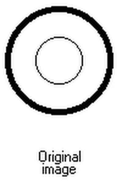
@Andy Somerfeld: Fantastic explanation. Visualizing the two filter modes gave me an "a-ha!" moment. Basically: In the faster, separable 1D mode (width first, then height), it applies the sharpening as a "+" shaped grid pattern over the image. The intensity of the center pixel affects the intensity of the pixels above, below, left and right of it. This will result in an extremely minor "waffle/grid" pattern ariound single contrasting pixels, which can be seen if the sharpening (lobes) is made strong enough that it becomes visible. But normally it won't be seen, so people almost always use separable (1D) lanczos for its speed benefits. In the slower, non-separable 2D mode (all dimensions at once), it applies the sharpening as an "o" shaped ring around the pixel. The intensity of the center pixel affects the intensity of the pixels in a ring around it. This looks a bit less jarring than having a "+" shaped grid. The resulting ringing is a bit smoother since there's an extra diagonal step in there between each pixel. Regardless of mode, both versions of Lanczos suffer from "ringing" artifacts, which is the "circle"/"+" shaped halo around contrasting pixels (such as edges of objects) in the images. So yep, the kernels are different. Since the slow 2D (non-separable) mode applies the sharpening as an "o" ring around the pixel, it will have a stronger effect and cause more sharpness in the image than the "+" pattern of the separable 1D mode. Andy: What's your lobe setting? The standard 2 lobes for the best tradeoff between ringing/sharpness, I assume? If you don't mind doing some tests, it may be possible to get rid of the non-separable by doing this: * Separable, lobes = 2, "normal sharpness" * Separable, lobes = 4, "extra sharpness" -- visibly it might be almost equivalent to the non-separable kernel's sharpness, but much faster; it remains to be seen if the amount of visible ringing is equal to non-separable; if it's worse, then keep the non-separable mode too... The reason I suggest this, is because every discussion and paper I read through while researching Lanczos filters said that the separable mode and non-separable modes are visibly almost identical. That makes sense, since the extra diagonal pixels of the "o" ring circle compared to the "+" shape don't really matter unless the image has very contrasting areas *and* the noise is amplified enough (such as via a high Lobe setting), so that the more aliased, "grid-like" diagonals become visible. Basically, the ringing of a 2D lanczos filter looks more "antialiased" than the ringing of a 1D lanczos filter, thanks to the extra diagonal steps, but the difference is so small that it shouldn't be noticeable either way (if the two filters use the same number of lobes and taps). Alternatively, if it turns out that separable with 4 lobes is worse (more ringing) than non-separable with 2 lobes, then why not have these settings: * Lanczos (separable; normal) * Lanczos (separable; sharper) * Lanczos (non-separable; higher quality; normal) * Lanczos (non-separable; higher quality; sharper) With 2 (normal) and 4 (sharper) lobes, respectively. ...And lastly, for those following along at home, I have attached two images; one showing the original, and one showing the 'ringing' artifacts of Lanczos (see the weird, gray outlines around the circle lines; that's the filter kernel's effect; remember to zoom in if reading this on mobile). In this case, the lanczos used in this image is a 1D version, which means the strange lines are in a "+" shape around the original pixels. You can confirm this if you zoom in to the left/right sides of the inner circle; there are faint 1 pixel gray dots above/below the black pixels, but not in their diagonals, so it confirms that a 1D lanczos was used. This test image is very unfair, since it's black on white; that means that all of the lanczos sharpening will be visible as tiny, gray dots, which is of course very noticeable. In normal images, and with a lobe count of 2, the ringing is very low. And if people are interested in the difference between nearest neighbor, bilinear, bicubic and lanczos for enlarging, it's basically as follows from worst to best: Nearest neighbor = jaggy pixels (extreme aliasing), Bilinear = smooth pixels (the values are blended together; produces no ringing), Bicubic = sharper but has visible ringing, Lanczos = sharper than bicubic and rounder handling of diagonal curves than bicubic (less aliasing), similar amount of ringing.
-
@JDW: I agree that we should have varying sharpness presets. I've edited my post above with more details about how to achieve that.
-
@JDW. No... Sharpness is a separate parameter of the filter, regardless of mode... You could have this: Lanczos (non-separable; smooth) Lanczos (non-separable; sharp) Lanczos (non-separable; very sharp) Lanczos (non-separable; extremely sharp) Lanczos (separable; smooth) Lanczos (separable; sharp) Lanczos (separable; very sharp) Lanczos (separable; extremely sharp) So it makes no sense to rename "non-separable" as "sharper". I guess what the devs *could* do, is to throw away the slow non-separable version (why is it even there?!), and instead tweak the sharpness parameter of the faster separable version to provide both a smooth and a sharp version of the fast 1D implementation. The sharpness of a Lanczos filter is defined by the number of "lobes". Further investigation showed that a Lanczos filter is fully separable, meaning that non-separable and separable are capable of identical output. The existence of the 10-15x slower "non-separable" mode means Affinity seem to have misimplemented Lanczos. There is no reason for the non-separable version of that filter to exist. If all of this is correct, then it would be best to delete the non-separable (slow 2D version). Keep the separable (fast 1D version). Tweak the number of lobes to provide a few presets with varying sharpness, as such: http://avisynth.nl/index.php/Lanczos_lobs/taps (Taps = affects the down/upscaling scale; Lobes = affects the sharpness; common values are 2 lobes = the best compromise between sharpness and low amount of ringing, and 4 lobes = more ringing but extra sharpness). Why non-separable filters are slower: Upscaling in 1D only requires two 4-tap filters. Upscaling in 2D requires a single 16-tap (4*4 taps) filter, which is an order of magnitude slower. There is no reason to have a non-separable version of a Lanczos filter.
-
Count me among the people who haven't coded resampling filters and didn't know what "separable/non-separable" meant. Here is the answer: * A separable filter is one that is capable of first running in the X axis (width) and then in the Y axis (height). This means it's applied in two steps; first the image is made wider, and then it's made taller. Separable filters are faster than non-separable, because their time usage is proportional to the width (and then the height) of the image, instead of the whole area of the image. * A non-separable filter is one that runs on both the X and Y axis at the same time. It's applied in a single step and the time usage is proportional to the whole area of the image. Basically: It's a lot faster to resize an image in two steps using 1-dimensional passes (width first, then height), than to do it all in one step using a 2-dimensional pass (width and height at the same time). Separable filters have to be specially written to support this two-step operation. So: Lanczos (non-separable) = slow Lanczos (separable) = fast, up to 10x faster PS: You guys proposing a rename to "sharp" / "sharper" don't get it. It's still the same algorithm. There's no "sharper" setting in one of them. If one of them *looks* sharper it's pure accident due to some algorithm differences between Affinity's 1-D (separable) and 2-D (non-separable) modes. So I don't know what the proper solution is. A dev would have to explain why they decided to show us both options.
-
Affinity Photo Customer Beta (1.3.4.26925)
aitte replied to MattP's topic in [ARCHIVE] Photo beta on macOS threads
@Jonas14: It says "New Lens Filter adjustment" so I checked the adjustment layers, and yep it's there... Lens Filter... Go to Layer > New Adjustment Layer > Lens Filter... -
Affinity Photo Customer Beta (1.3.4.26925)
aitte replied to MattP's topic in [ARCHIVE] Photo beta on macOS threads
Thanks for the alert. I've been waiting for 1.3.5 in the app store and last checked for it yesterday. Here is the announcement in english (see attachment). 1.3.5 includes all beta improvements (including this beta) PLUS some things that were fixed after this beta. So it's currently the most advanced version available... until the next beta. ;) Here is an example of a bug in this beta that is fixed in 1.3.5 MAS: https://forum.affinity.serif.com/index.php?/topic/12271-ap-beta-13426925-crashes-every-time-from-compound-paths/?p=53125