

AntiqueFlaneur
-
Posts
201 -
Joined
-
Last visited
Posts posted by AntiqueFlaneur
-
-
I'm hoping someone else will see this post and be able to help me. Still stuck with these distorted photos on export.
-
11 hours ago, Lagarto said:
As for washed out outlook (and possibly also distortion), it may be related to your having the Publisher document in Gray/16 color mode. I would change that to Gray/8. It may also be related to export settings since Grayscale images in a grayscale document will easily be converted to RGB/CMYK images when exporting. If you intend to print, you'd need to use these kinds of export settings to keep the output in grayscale:

I produced a PDF using the settings above and the results are attached. The images are a bit washed out, but they look similar as in the Publisher document, and as mentioned, without actual image sources it is not possible to examine this closer. Does the attached PDF look similar as you get (distorted and washed out)?
I've tried changing the document to Gray/8, with no difference at export. I used the export settings you specify.
-
Here is the PDF.
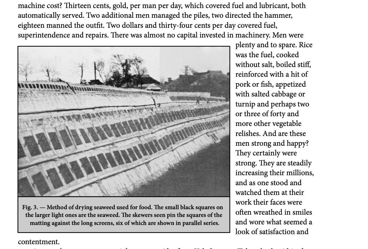
Also attached are screenshots of what figs 1 and 3 looks like inside Publisher.
-
When I export pdfs from publisher, the images in them consistently appear to have visual distortions. You can see this in Figs 1, 3, in the attached Screenshots. Fig 8 is not distorted, but appears to be washed out compared to how it looks in Publisher. There are many more like this in my manuscript.
I'm attaching a section of my manuscript as an afpub file.Anyone know why this is happening?
Thanks! -
14 hours ago, thomaso said:
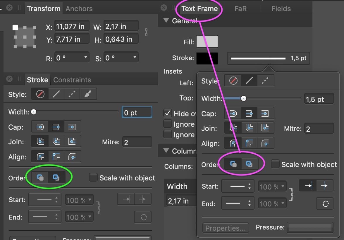
It's caused by two settings, while the thicker stroke is correct (1.5 pt) and the thinner is the rather "unexpected" one, for two reasons:
1. The image on top of a picture frame (not nested inside) is placed exactly on the picture frame. This has the stroke aligned to the center, so the image covers the inner half of the picture frame's stroke. – Suggestion: a.) move the image layer on the text "(Picture Frame)" to get it nested and not cover the border. b.) Alternative: move the picture frame layer above the image layer.
2. The text frames have their stroke order set to "behind". Since they have a fill, too, the fill covers the half of the stroke.
– Suggestion: change the stroke order to "Front".
3. If you prefer the currently thinner stroke appearance you should do the corrections 1. + 2. + reduce all stroke width values.That was super helpful. Thanks!
-
45 minutes ago, thomaso said:
One reason could be that the image has a border applied, too. If it is not cropped by the picture frame (as it appears from both layer thumbnails) then its border can be visible on all 4 edges.
If you can upload an .afpub with the related objects (picture frame + image + text frame) it will be easier to inspect and less guessing whats going on and which value isn't correct or modified by what cause.
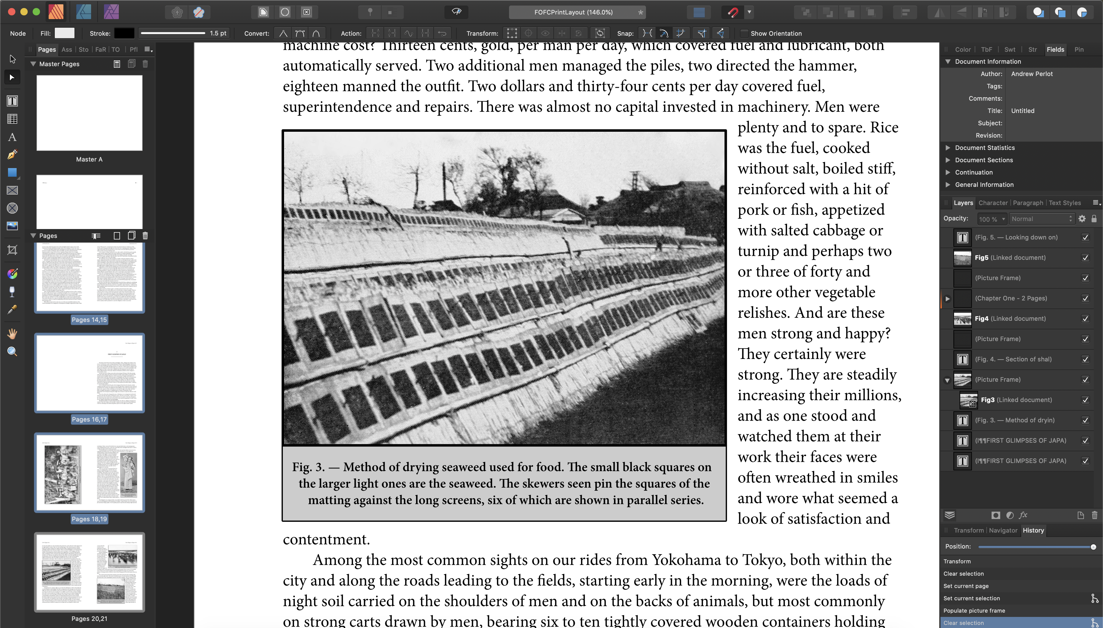
I've uploaded the .afpub file with images embedded. Hopefully that will work.
You can see the thicker border on Figs 1 and 3, which have images embedeed in picture frames. The other images with normal sized frames simply have the frames on top of the pics, but not embedded. However, I have found that when I try to lay out some of the pictures with the images merely on top and not embedded, strange image artifacts crop up. Let me know what you think.
-
In the pic below you can see a picture frame and a text frame, both with a 1.5 pt border. Why does the picture frame's border appear to be significantly thicker?
-
I'm using some asian characters in my text. They seem to display properly, but as you can see in the screenshot below, it tags them with preflight errors. What is Publisher trying to tell me?
-
50 minutes ago, walt.farrell said:
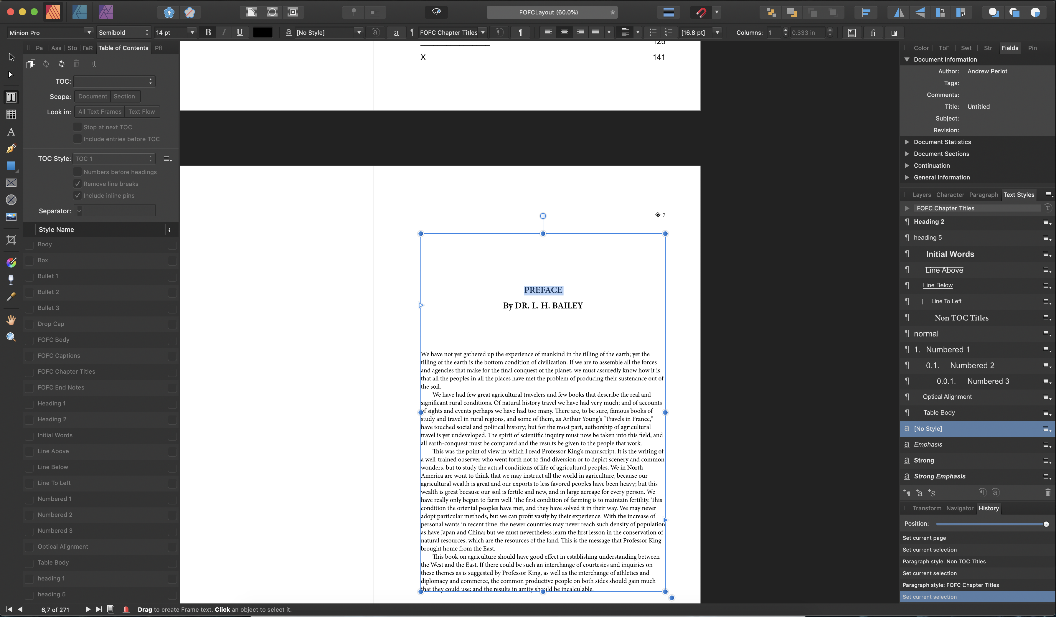
I'm a bit confused because I don't see any roman numeral above the chapter title. I see "PREFACE" (which I take to be the chapter title), "By DR. L. H. BAILEY", and the line.
It would also help if you had Text > Show Special Characters enabled, as it's important to know whether those 3 lines are part of one paragraph, or individual paragraphs. If they're all in one paragraph, because (for example) you used a line break (shift+enter) after "PREFACE" rather than a paragraph break (enter) then they are all in the same paragraph, and any change to the paragraph style would apply to all of them.
I was using the line breaks instead of the paragraph breaks, and switching those fixed my problem. Thanks so much for your help!
-
I'm making a table of contents and need to be able to assign a certain text style to the parts of my chapter titles I want included in my table of contents.
I find that I when I try to highlight and change the text styles of the roman numeral above the chapter title and the line below (so they are not included), the chapter titles in the middle get changed to, even though the text is not highlighted. So I end up with all three being caught up in whatever text style I select.
See pic below.
Any way to assign text styles without this happening?
Thanks -
6 minutes ago, Old Bruce said:
When you say stock photos inside Affinity Photo do you mean the sites from the various Stock photo companies, Unsplash, Pexels etc? You still have to read the rights from those sites. They are commercial in nature. That panel is included for convenience only, saves one from having to fire up a web browser.
What I am trying to say is you may not in fact have the rights to print them.
They're all from unsplash, which uses this license. It says that they are free for commercial or other uses.
-
1 hour ago, Blende21 said:
With the cover pictures, there are 2 strategies that are legally sound:
- Buy the exclusive rights to a picture (or a few of them), or take them yourself (which may be harder than it sounds), and be safe from others using the same one. It can still happen that other pictures are pretty similar.
- Use stock photos that come with a general license (free or paid) including commercial use. Here is may happen that the same picture shows up in another, if things go wrong in a conflicting or negative context. I would always make sure I have a copy of the license saved that show the legal fine print at the moment of the download.
I would decide about strategy based on the size and importance of the project.
All the photos come from the stock photos inside Affinity Photo, so I think I should have the rights to print them.
-
I think Cinzel is exactly the font I was looking for. Thanks!
-
This is my first attempt at a book cover, and I'd love some feedback on taking it up a notch. How can I make this look more professional?
I'm open to any suggestions, but I think my main issue with it is the central green area the text inside. It doesn't really look right to me. Something about the solid color and the faux Asian text. It's a book about agriculture in Asia, so I assumed the font made sense, but...
Anyway, I'm kind of stuck and looking for feedback.
Thanks!
Attached in .jpg and .Afphoto formats below.
-
-
I'd like to add a border around my text (artistic Text Tool), or an area of my photo that happens to have text in it. Example of what I'm talking about in the picture below. I can do this in Publisher, but can't seem to find how to do it in publisher. Suggestions?.
-
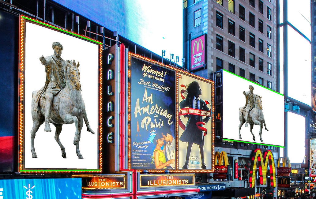
On 8/7/2020 at 4:38 PM, firstdefence said:
needs a realistic background, so something like this statue distorted using perspective tool to better fit the frame, rectangle made to fit the white area and used to clip the BG Image, which in turn was distorted with the perspective tool. Finally a few hoof shadows to ground the statue.
Ha ha! I loved the movie title. Thank you. BTW, what font did you use for that?.
-
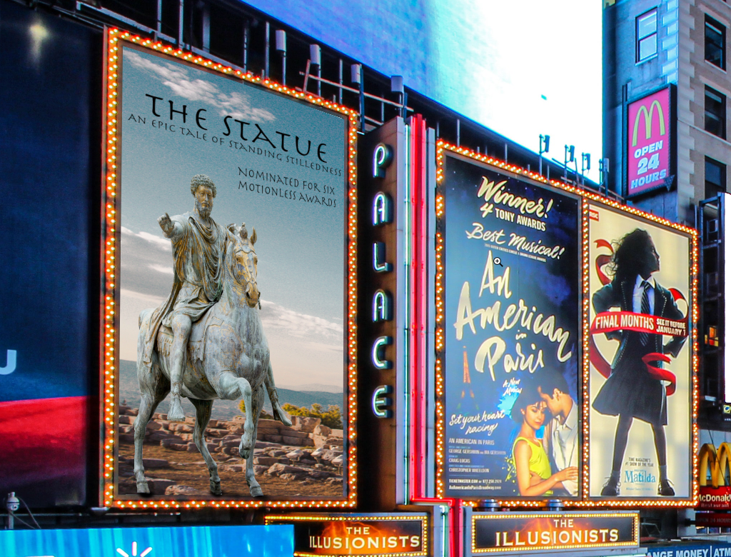
On 8/7/2020 at 10:12 AM, David in Яuislip said:
Try
Perspective tool
Show grid
Adjust nodes so that top & bottom guidelines are parallel with the lines of your frame which I've coloured green.
Adjust width/height as necessary
Thanks!
-
-
When I try to select an area of sky and use the HSL adjustment layer to turn the sky pink, I always seem to get these lighter splotches. Why are these showing up?
-
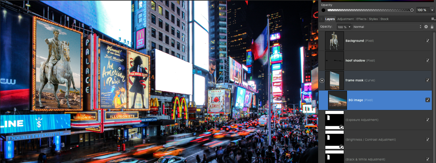
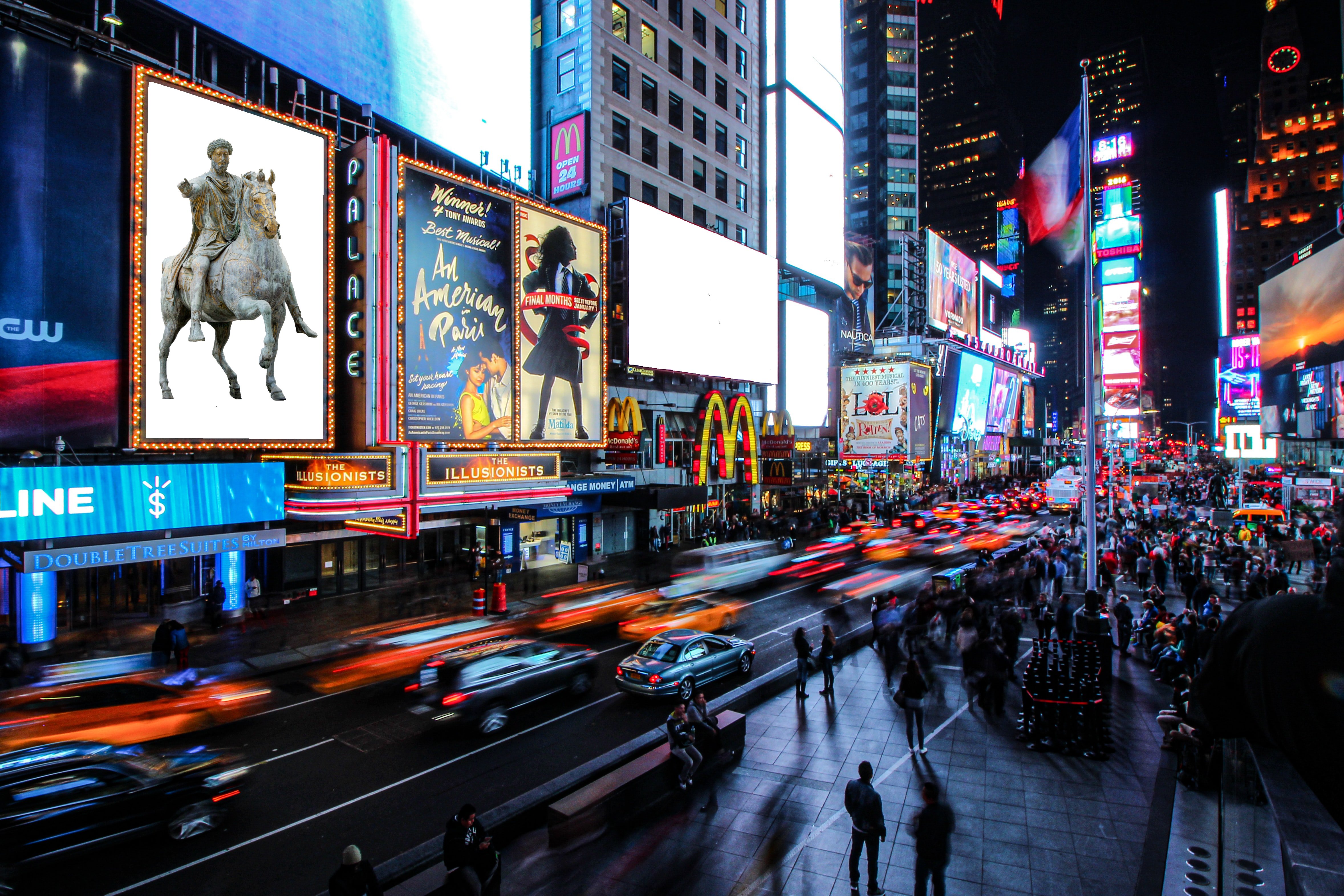
I've edited a picture of a statue onto a TV Screen in Times Square after first making the screen white.
It looks ok, but not totally convincing that it could be real. What would you suggest I do to make it look more realistic? I'm posting the .jpg and the Affinity file below.
-
7 minutes ago, markw said:
In the Menubar of AP go to; Select > Deselect
Or use cmd+D, the shortcut to dismiss a selection.Thanks!
-
After I've selected an area with the marquee/brush selection tools and used command J to take the selection to a new layer, how do I deselect the whole thing and just let it be? I keep looking for an enter/apply or whatever but the checkered blinking selection outline stays.
-
24 minutes ago, Old Bruce said:
The filter in your example will only have an effect on the layer called Fix. If it was on top of the layer it would affect the Fix layer and everything underneath that. You don't have anything under it. Try a quick resize and duplication of the Layer Fix then move the filter to the top of both and then nested as a child layer.
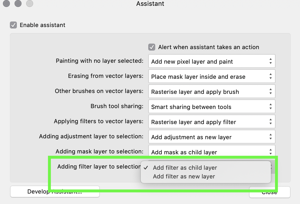
There is a 'preference' you can change in the Assistant go to View > Assistance Manager.
Thanks! Very helpful.


Why do these images look distorted after export? (Publisher)
in Pre-V2 Archive of Affinity on Desktop Questions (macOS and Windows)
Posted
Thanks for your replies @Lagarto, @markw, and @walt.farrell.
I'm attaching the image files below. I'm also attaching Fig 2, since it does not appear to have any distortions when exported.
I have been using images in .afphoto format throughout the manuscript. I did this to allow for easier editing. Does it make more sense to export .jpgs and add those to Publisher instead?
FG1.afphoto Fig3.afphoto Fig8.afphoto Fig2.afphoto