

Palatino
-
Posts
406 -
Joined
Posts posted by Palatino
-
-
4 minutes ago, laurent32 said:
hi, you could use "alt-." ("." that is on top of the space bar) to get "…" as one character.
Yes, typographically that is usually the right approach. But with some fonts, the distances between the dots are simply too small.
-
-
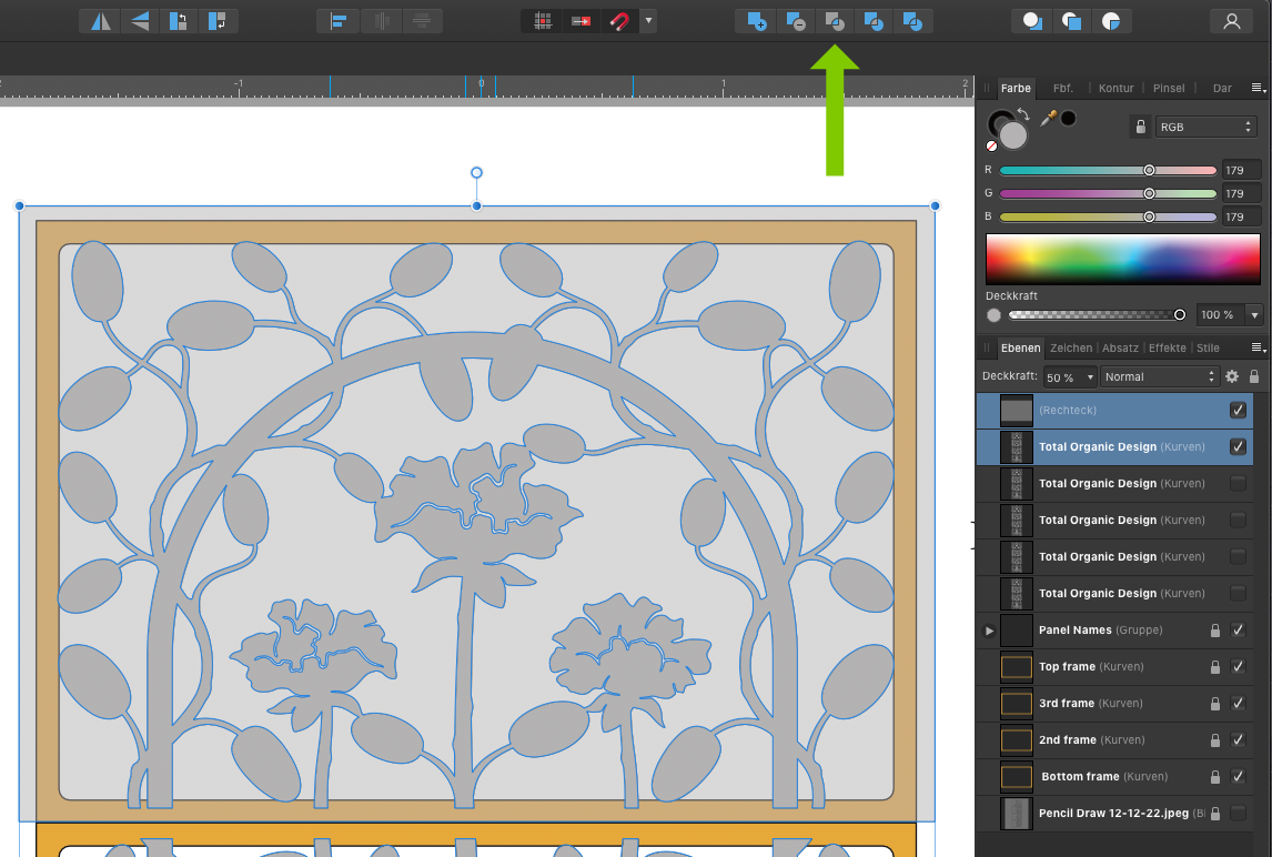
3 hours ago, GVsculptor said:
… except the four parts can only be selected as one thing, and I need four separate things.
Separating the "Total Organic Design" (and recombining) more often leads to unforeseen effects. I would do it like this:

-
There is colour for the screen (RGB) and there is colour for printing (cmyk).
There are greyscales for the screen (RGB: 100% is white) and there are greyscales for printing (K: 100% is black).
Affinity doesn't differentiate greyscale into screen and print, my old Photoshop does.
So much in the early morning. 😉 The topic is discussed here at least once every week. There is a lot to read and learn.
-
Image removed. I was surprised that this was still possible. Good forum. 😉
-
You can also try it with a little imagination. I create a hall plan for an exhibition/trade fair twice a year. I use this construct for dimensioning, which works both manually and numerically. Typing a number into the text field is no problem for me.
Of course, the group as a whole must be scaled.
-
7 hours ago, Doosits Ruminile said:
I opened Affinity Publisher > New Document > Document > Add Pages from File > Select Corrupt File
All the layers become visible in Affinity Publisher and thus can be passed into a new Affinity Designer documentGreat. That's exactly how I thought it would be.
-
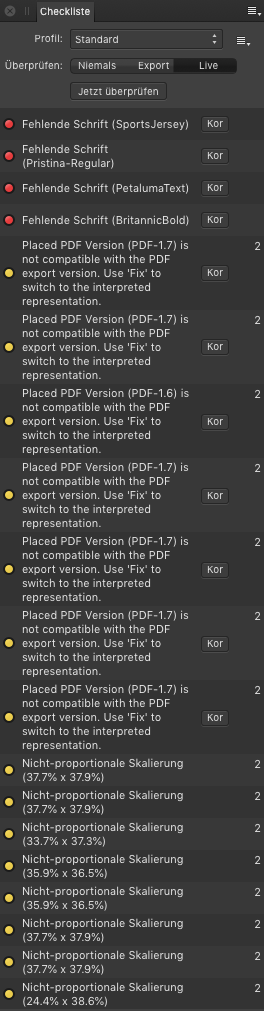
In Publisher I was able to import the file as another page, but I could not save it. After several attempts, a PDF export and import into Designer succeeded. File size 168 MB. There is also an error list.
-
-
-
20 minutes ago, Little Owl said:
SVG is vector format so it's not converting a vector to a bitmap from my understanding when exporting as SVG, simply converting a vector to a different type of vector?
Yes. Weren't you going to bed? 😉
-
Possible source of error - this selection would be wrong.
-
27 minutes ago, Little Owl said:
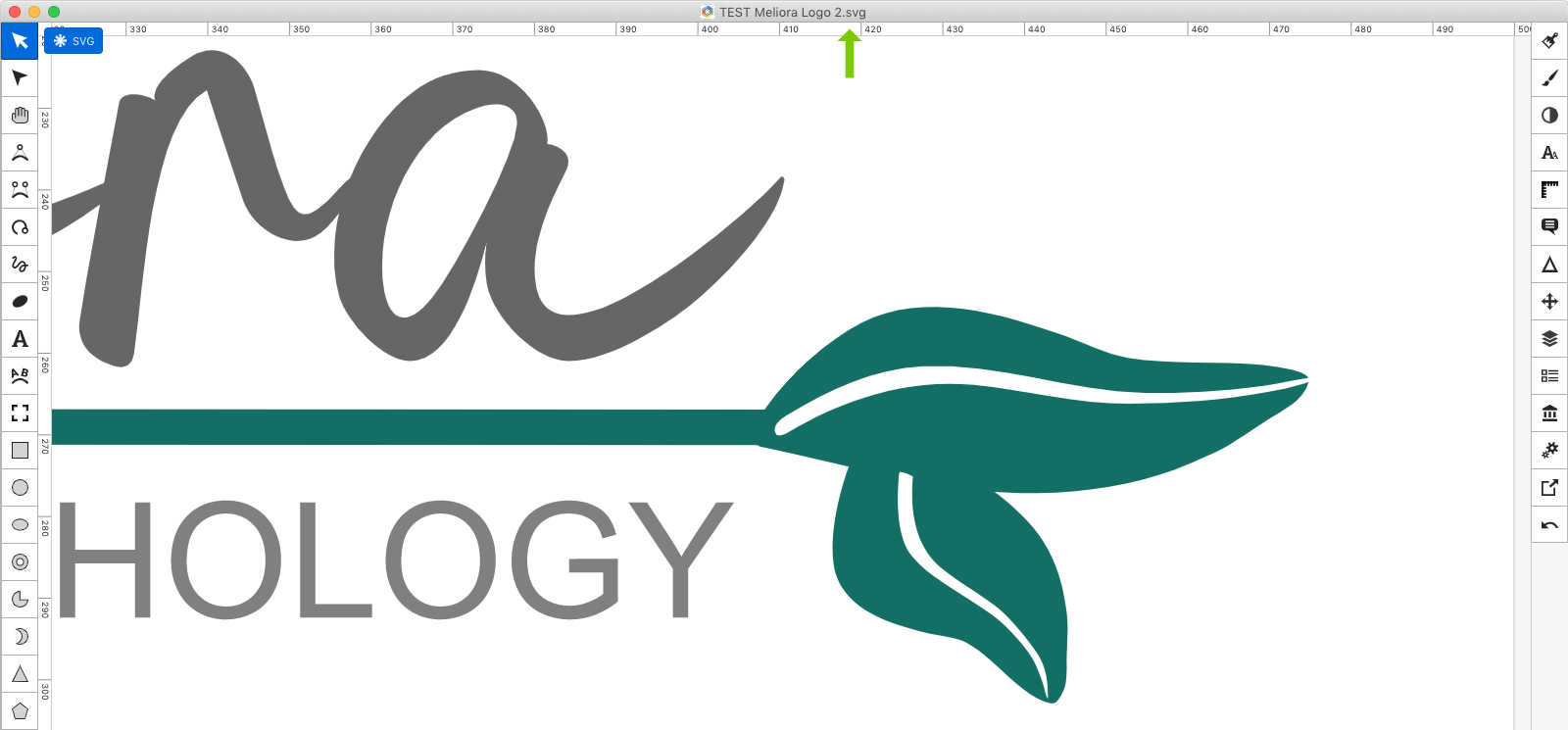
But SVG export is vector, so I don't understand why my leaf elements in the design are not clear when exported as SVG?
What's wrong with that?
-
13 minutes ago, Little Owl said:
I am still trying to find out why it is not clear.
Could you show me a graphic in a comparable size that you think is "good"? The graphic doesn't have to be yours, just to understand your claim to quality.
-
On 12/8/2022 at 2:28 AM, Little Owl said:
I thought maybe it was the font I used, but the leaf graphic I drew in designer is also exhibiting the same issues.
There is nothing wrong with the file.
-
-
10 minutes ago, GarryP said:
What is it about my response which was incorrect/inappropriate?
Your answer was self-evident. That's why I spared it. Everyone would have noticed that after the first press of the space bar at the latest. 😉
-
Please look at my quote.
-
8 hours ago, Petr Stanicek said:
Is there a shortcut or button to hide selection frame and text selection to quickly preview the edited object?
The button is under your hands and is called the space bar.
-
-
-
3 hours ago, dannyB said:
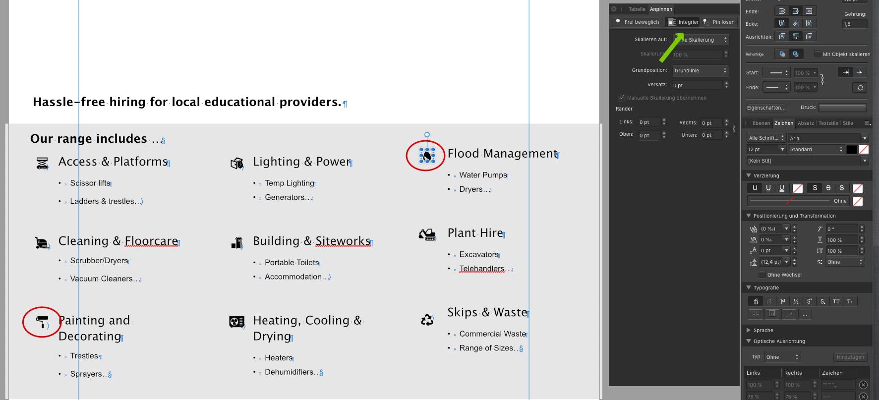
As a side issue while you have the file I have tried but can't seem to get the recycle icon (left of text "Skips and Waste") to line up to the top of the cell. I have tried altering the settings under table, paragraph and character but there is still a gap and I'm not sure what I'm doing wrong?
-
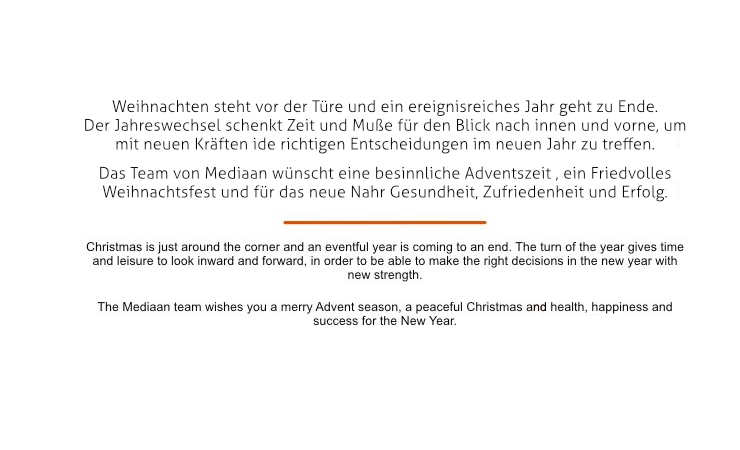
Das Zusammenspiel von Text, Fläche, Lesbarkeit und Ästhetik nennt man Typografie. 😉
–––––
The interplay of text, surface, legibility and aesthetics is called typography.
-
21 minutes ago, carlcengiz said:
oben 100
unten 50
rechts 50
links 80
Edit: In Rechtschreibung bin ich ziemlich sicher. Wenn ich Korrektur lese. 😉


Publisher: How to turn ". . ." into a "word" so that it won't split to the next line
in Affinity on Desktop Questions (macOS and Windows)
Posted
Very elegant solution. I understood "No Break" right away, I would not have suspected it under "Ohne Wechsel".