F_Kal
-
Posts
224 -
Joined
-
Last visited
Everything posted by F_Kal
-
 Likewise @Lee D! Thanks so much for the elegant solution! So simple! Thanks!
 -
I still haven't figured this out: When you break a curve, two nodes are created one atop the other. how can one access (select) the underlying one without moving away to top one (and losing the initial position)?
-
When I use the keyboard (arrow keys) to nudge a selected vertice/point for 50px, hitting cmd+Z to undo it, undoes 1px at a time (in need to run 50 times the same operation). Would be very neat if it would create clusters of such actions, and group them in history! Clipstudio Paint (Manga Studio) does this with strokes and it's very nice. eg. "if it's above 250ms then it's probably a different group of actions" For those who want the fine control, it would be nice if in the history panel such minuscule actions were put inside a group. Cmd+Z would allow you to step over it (and undo all of them at once) but you could also open/expand the respective group in the history panel and jump into a specific sub-action
-
- 1
-

-
Cmd+] allows you to move a layer/group up/forward one position. Cmd+Shift+] allows you to move it to the top of the stack (becomes foremost). But if this layer is inside a group (or underneath some other layer) Cmd+] and Cmd+Shift+] will not allow you to move outside the parent. On PS you can press it once more and it will escape the hierarchy. Would be great if you could add this Thanks!
-
Thank you @Lee D, I'll do that!
-
I remember this one since I first started using affinity designer almost a year ago: I use the magic mouse and the scrollbars are hidden by default. When I scroll slightly, they appear, but when they appear they fall on the layer sidepanel's checkboxes preventing me from being able to access them! Unfortunately growing the sidepanel's width, doesn't give more breathing space(right margin) to the checkboxes. In OSX's system Preferences there is the option to Always show the scrollbars, but it's a pity enabling the option for all applications and wasting this screen real estate given the fact that I never had a problem in any other application. I'd suggest either moving the checkboxes on the left,an option in the preferences, or simply adding a margin/padding on the right of the checkbox when the sidebar is bigger than a minimum width. Of course checking to see if on your OS the scrollbars are hidden by default and if they are hidden add a margin to the right of the checkbox, would be the most targeted solution!

-
Export layers to multiple files
F_Kal replied to johs's topic in Feedback for Affinity Photo V1 on Desktop
Any news regarding the "export untrimmed" feature? I was hoping to find it today, but I couldn't! Did I miss it somewhere? Cheers! -
Thank you @Alfred for the input! I'm using AD latest beta, on macOS. Very mind-bending! isn't it? I did quite a few tests, by dragging the sliders, typing into the inputboxes and using the UP/DOWN arrow keys inside the inputboxes. trying to see if they all produce different mapping/rounding results, and there is obviously something lossy in the conversion process. Not sure if this is intended or not though. I mean RGB to HSL conversion is a decimal conversion so there have to be rounding errors, but I didn't think they would be so big as to cause color shifting if you convert RGB 12,30,50 into HSL and then back to RGB. What is more, it's obvious that this numeric values in the inputboxes are rounded (and thus misleading us): If you expand the Colour panel (so that the sliders occupy more width and the marker has to move bigger distance for the same effect) it becomes more obvious that the sliders in HSL mode can rest in slightly different positions that all will get mapped to a single integer value in the corresponding inputbox. What is more, if I switch to 16bit RGB document, then the same applies for the RGB sliders: A slider can rest in numerous positions between two integer values! 16bit means 65536 different R,G and B values, all of which now have to be mapped into the range [0-255]. In other words, there are 256 floating point increments between 211 and 212 (ie. 211, 211.0039, 211.0078 etc), all of which correspond to a slightly different color. There is another strange phenomenon is using the colorpicker to pick an HSL value - sometimes it will pick another one that corresponds to the same 0-255 RGB value, but obviously doesn't match in HSL of the one that you colorpicked. As if it does a its rounding too, not just copying the value! Anyway, too many puzzles for this hour of the night, so I'll leave it at that for now :) Cheers!
-
That's a bit of a strange effect - I'm not even sure it's a bug. checking the color sliders, the RGB colors with values 12,30,50 and 11,29,48 have both the same HSL values of 211,62,12! Maybe this is unavoidable, but I just wanted to let you know in any case. PS. the document is in RGB/8bit - sRGB IEC61966-2.1
-
I stumbled on the same issue and I must agree with cekuhnen! It's not a huge deal now that I know where it is, but is not very intuitive. Of course the option for a transparent background should remain in the Document Settings. But nonetheless as a user I expect under the PNG export settings (More) the option to enable transparency (if not enabled by default). For the same reason that when I export an image I have to option to make it paletted or to flatten it. I'm not expected to flatten my composition or turn it to 256 colors in order for the exported image to become like that, the application does it for me but when I get back to the main window, it's neither flatter nor paletted.
-
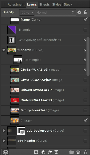
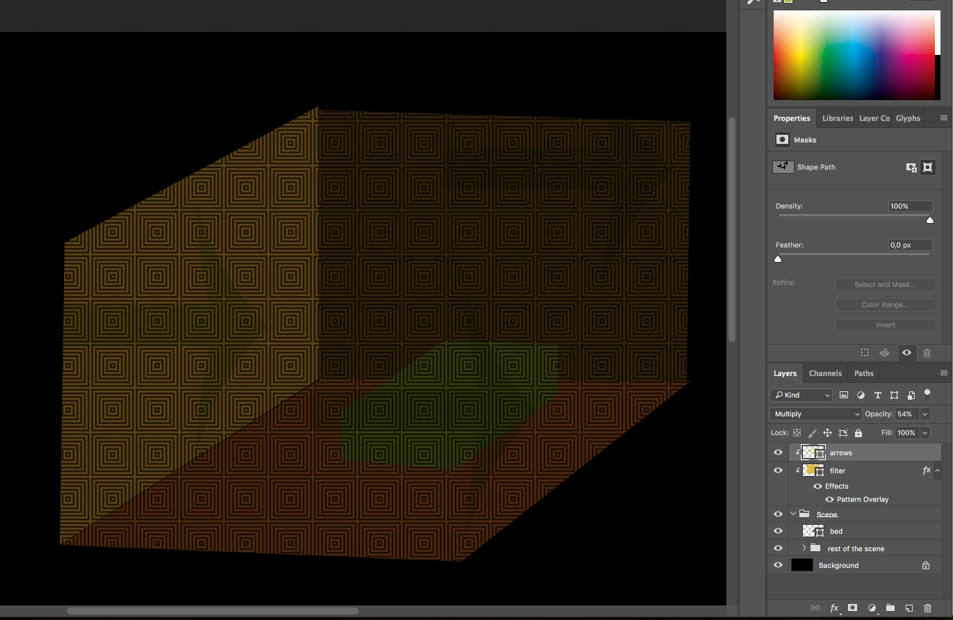
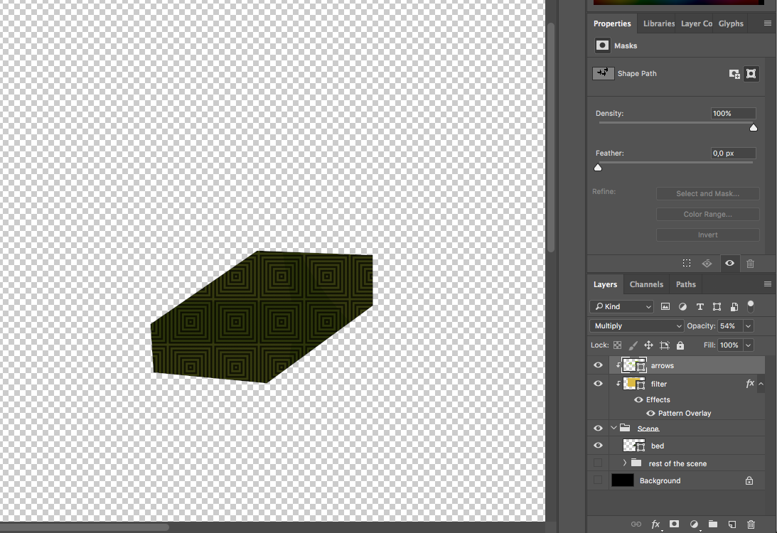
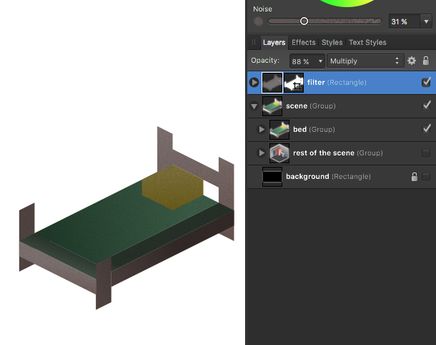
It's been bugging me for a long time now; but I can't seem to grasp how to properly "dynamically" blend with clipping. Let me show you an example - Assume the following bedroom. I have a bed and the room with the rest of the items. And I have an overlay (a layer that I call filter) but It could had been a bitmap or another group for all I care - it's something that enhances the appearance of the underlying layers. What I'd like to do now, is export the bed only with transparency and I'd like the "filter" layer's influence on the bed to be exported too. But I need it to be limited to the area of the bed, so that I can have the transparency around it. In photoshop (when working with vectors) I'd go and assign this overlay/filter as a clipping mask. In affinity this wouldn't work since when assigning a layer as a mask, only the path is retained. Blending modes and colors are being stripped. Here is what I'm trying to do as done in PS As seen on the next image, in AD I could duplicate the bed's outline in a new curve layer and use it as a mask on the filter layer, but what if I had dozens of objects that I wanted to export? What if I was adjusting the bed shape and had to rember to update all instances of this outline? There has to be some quick way of doing this blending without all this manual and tedious work. What I'm asking is "take this layer, and limit it's effect, on this group of layers". How would you do this? Thanks! -Fotis
-
+1 for being able to alt+click on the checkbox and toggle displaying (this/all other layers) being able to easily view layers in solo is very useful in animating!
-
I couldn't find a way to rasterize the effects(Fx) of a layer without mergin the effects to the parent layer; the rasterize... command gives the option to either merge the effects into the pixel data or retain it. But is there no way of creating a new layer that contains only the effect? (for instance when you wish to have multiple shadows or multiple strokes)
-
By no means am I an expert, but I'll try and summarize everything being said here and give some further suggestions regarding color sliders! What is expected? Let us agree that 1) if you work on a CMYK document, and choose via the CMYK sliders a CMYK value (eg. 0,0,0,100) and then save that document as a CMYK file, the file should contain the precise CMYK values you handpicked. 2) if you print a CMYK file with pure colors (eg cyan:100,0,0,0 or text-black: 0,0,0,100) and the printer treats it at face value, the pure colors should appear... pure with no halftoning. 3) The printer will decide on its own how it will print the CMYK values it gets though (some home printers will convert it to RGB first and the back to some different CMYK value if you are unlucky). 4) if unintentionally someplace in the creation process you switch to RGB, then some conversion will happen. RGB 0,0,0 is translated into CMYK 78,68,58,94 on Photoshop. It is translates to CMYK 72,68,67,88 on Affinity Designer. But this is because there is conversion from RGB to CMYK and conversion is something subjective so both pieces of software make a guess about what color this would be (in particular when there isn't an absolute RGB colorspace defined such as in the case when you are working on a CMYK document). What works - can you reproduce this? I've created a CMYK document in AD, created a rectangle, entered on the CMYK (color) slider 100,100,100,100, exported it as a PDF and imported it in InDesign. InDesign correctly reports a 400% ink coverage with 100% on each channel. I don't see a problem here. If you have a problem thus far, you've stumbled upon some bug that is not affecting everybody. Keep reading to determine if there is no omission on your part or an actual bug. What could be wrong if the color values inside the PDF file differ? If you use some RGB colorspace anywhere this imposes conversions and probably is the cause of your problems. Any of the following could be the culprit: 1) upon creation you chose a document type other than CMYK 2) you exported the file in some RGB colorspace 3) (this is a funny one, very annoying) you used the RGB (color) Hex sliders and/or the RGB (color) sliders(!) to adjust your color. You manually set a 100,100,100,100 CMYK value and then switched to the RGB or HEX sliders where it appears as 0,0,0/#000000. You think that you didn't change anything but when you go back to the CMYK sliders you realized that now the colors are 72,68,67,88! By using the hex/RGB sliders you were playing in the RGB field and there you are bound to have some conversions happen. Annoying, but easy to avoid if you keep it in mind (Photoshop suffers from that too) What could be wrong if the color values inside the PDF are correct, but the printed colors are obviously different "than expected"? Apparently one can not really expect the same colors on his RGB monitor and his CMYK print (unless monitor & printer are profiled, and you have a Soft Proofing layer for your paper type in affinity). Having said that pure colors should be pure and rich black should be deep (deeper than pure black) if this doesn't happen it apparently is the printer or the printer-driver's decision to render the color differently than our expectations. There may (or may not) be some way to force the printer to print it differently, but I wouldn't think it has to do anything with Affinity (maybe a different filetype or some PDF flags could force the driver to treat the file differently, but I have no idea) hope it helps!
-
Cmd+] allows you to move a layer/group up/forward one position. Cmd+Shift+] allows you to move it to the top of the stack (becomes foremost). But if this layer is inside a group (or underneath some other layer) Cmd+] and Cmd+Shift+] will not allow you to move outside the parent. On PS you can press it once more and it will escape the hierarchy. Is there perhaps some way of doing it in AP (other than using your mouse)? Thanks!
-
That's a good idea @R C-R, thank you! And you reminded me that at some point I need to backup my shortcuts too!
-
ah! Thank you all! @R C-R very good idea; I had forgotten that all menu items can have shortcuts - I assigned a shortcut to it and it works just fine now! Well, needless to say that the super combo for "previewing" (Cmd+; Cmd+Shift+; Cmd+R Cmd+Ctrl+F Tab Spacebar and then again release Spacebar, hit Tab, press Cmd+Ctrl+F Cmd+R Cmd+Shift+; Cmd+;) is a bit too much unless you are trying to kill the final boss, so maybe a proper(=one step) previewing functionality could be devised by the affinity people spacebar is a nice shortcut for hiding the bounding boxes, so maybe it could be extended to temporarily hide all else too? (just a thought) Thanks again! -Fotis PS. The default shortcut for Spelling Options... was Cmd+Shift+;
-
Thank you @MEB for the tip! Not the most simple way of doing it (for quick previewing), but definitely a useful option nonetheless!
-
Ah, yes that is good! Thank you for the feedback!
-
Thank you Petar_MK! But I was referring to Affinity Photo! (useful shortcuts though for next time I work with InDesign!)
-
aha, Spacebar hides the bounding boxes! But I haven't found a way to hide spelling errors so far
-
I've been wondering if it were possible to quickly hide all non artwork elements for previewing purposes? so far, I have to press Cmd+; to hide the guides Cmd+R hide the rulers Tab to hide the UI elements/panels (In PS you could press F a few time to go totally full screen) but how would one temporarily hide things such as spelling errors (the red underlines) and bounding boxes (around shapes)?
-
The title says it all :-) By default, Document -> Resize Canvas... (which is expanding the canvas, not scaling the existing pixel data) scales both dimensions proportionately (the lock is engaged). I believe this is unnecessary - in my experience, more often than not, you wish to expand one of the two dimensions (width or height) and not both at the same time - and even when you do, it's not because you want to retain the original aspect ratio. I can think very few cases where extending the canvas proportionately is useful. Alternatively, it should remember your last selection (locked/freeform). At the time (1.5.2 beta 4) it does not - it keeps reverting back to the locked every time you decide to extend your canvas a bit! Hope this helps PS. I'm not referring to rescaling the image (Document -> Resize Document..) - This of course should by default be proportional - no changes there!
-
+1! Would be a really neat feature, I was impressed when I saw PS do that (but to be honest, I lived the past 15 years just fine without it too)
-
@dasigna glad to hear that you made a newer thread about the CMYK issues - it seems that TonyB is on it, so I'm sure you (and along with you everybody else who has/will encounter a similar issue) will get to the bottom of this!