William Overington
-
Posts
2,394 -
Joined
-
Last visited
Everything posted by William Overington
-
affinity designer Artwork for greetings cards
William Overington replied to William Overington's topic in Share your work
So, try for a complete abstract emoji by using an upper part and a lower part together. Is it better with a pale yellow background to indicate that it all part of one glyph? William
-
I have just searched my inbox for the email address that you stated. One from 24 April 2021 hanks me for registering. There is one in March, 19 March 2021 which I had not noticed and is unread, entitled Spotlight: 50% off True Grit content packs on the Affinity Store One in February, which it appears I had read. Nothing else since November 2020 William
-
Well I just tried to sign up to the newsletter and I am told that I am already registered. Yet I do not seem to get the newsletters. Yes, I keep a check on purportedly spam emails. How often do these emails supposedly arrive please? Is there a glitch where part of the system thinks I am registered but another part does not and they don't communicate with each other? William
-
affinity designer Artwork for greetings cards
William Overington replied to William Overington's topic in Share your work
Manner, design influenced by -el Reason, design influenced by -al ` Possession, design influenced by -es William
-
affinity designer Artwork for greetings cards
William Overington replied to William Overington's topic in Share your work
Time, design influenced by -am Motion, design influenced by -om
-
affinity designer Artwork for greetings cards
William Overington replied to William Overington's topic in Share your work
Motion, design influenced by -en William
-
affinity designer Artwork for greetings cards
William Overington replied to William Overington's topic in Share your work
Here are two more. Here the design influence of the letter is not as strong, but is still there, given the design constraints. The upper part of a two level lowercase a, and the lower part of a lowercase e given my design choice to make the designs distinct from each other. KInd, design influenced by -a Place, design influenced by -e William
-
affinity designer Artwork for greetings cards
William Overington replied to William Overington's topic in Share your work
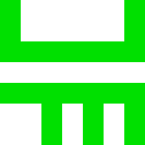
Now for the lower parts. I am hoping to produce them in the order of the rows in the table in the following linked document. http://literaturo.org/HARLOW-Don/Esperanto/correlatives.html Each design is influenced to a greater or lesser extent by the Esperanto ending. The designs are shown in grey. This is not the intended use colour. I am thinking that the colour used in an abstract emoji will be the same colour as the colour of the upper part of that abstract emoji. Here are the first two designs. The colourful part is five chunky pixels wide centred. My designs are that the single letter Esperanto endings are five chunky pixels wide and the two-letter Esperanto endings are seven chunky pixels wide. This is fine as each of the six upper part chunky pixel designs are seven chunky pixels wide, so the resulting abstract emoji character design will always be seven chunky pixels wide. Individual, designed influenced by -u Thing, design influenced by -o William
-
affinity designer Artwork for greetings cards
William Overington replied to William Overington's topic in Share your work
For the upper part of the 'some' group, here is my design. It is influenced by the letter i as it appears in some monospaced fonts. The design for the upper part of the question group was a bit of a problem. I had thought of a design influenced by the k of the question words of Esperanto. However, upon producing the design it did not seem to work well. So I produced a different design based upon a question mark. William
-
affinity designer Artwork for greetings cards
William Overington replied to William Overington's topic in Share your work
Here is my design for the upper part of the emoji for the pointer group, which start with a letter t in Esperanto. Here is my design for the close up versions of the pointer group (for example 'here' as the close up version of 'there'), which are in Esperanto two words, the pointer word preceded by the two-letter word spelled by c circumflex followed by i. I have produced this stylised design, which is influenced by the c from the c circumflex and the t. William
-
affinity designer Artwork for greetings cards
William Overington replied to William Overington's topic in Share your work
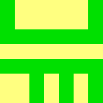
Here are the first two of the upper part designs. These are for the 'never' group and for the 'universal' group. never group This was the most straightforward. The n from the Esperanto, which is the n from never, nothing, no, not, non, ne, nein. universal group. Originally I was thinking of the c from the c circumflex used for the universal words in the Esperanto correlatives, but it seemed that it would need a horizontal line all the way across rows 1 and 3 counting from the top, with just column 1 filled in row 2. However, the design that I decided to use is both indicative or universal and has a sort of pure mathematics connection to the set theory symbol for union and is the inverse shape for the symbol used for the upper part for the negative group. So it seems a much better solution. William
-
affinity designer Artwork for greetings cards
William Overington replied to William Overington's topic in Share your work
I am not sure. I have just looked up the word 'erstwhile'. https://www.lexico.com/definition/erstwhile The word 'sometime' is listed under the synonyms for 'erstwhile'. However, https://www.lexico.com/definition/sometime has 'erstwhile' as a synonym of only one of the listed meanings of 'sometime'. William -
affinity designer Artwork for greetings cards
William Overington replied to William Overington's topic in Share your work
The following web page has a list of Esperanto correlatives http://literaturo.org/HARLOW-Don/Esperanto/correlatives.html I am thinking of how to design a language-independent emoji for each of them and to produce an image showing them all. I am thinking of double deck designs with the upper half indicative in some stylised way of the first part of the Esperanto correlative word and the lower half indicative in some stylised way of the second part of the Esperanto correlative word. Yet language-independent abstract bold designs. So my initial thoughts are to use a 7 by 7 chunky pixel grid (in an 8 x 8 cell) and have the upper part in three rows and the lower part in three rows with the middle row blank. I am thinking of also adding some designs such as a language-independent emoji for the English word 'here' which in Esperanto is 'ĉi tie' and is thus related. The designs need to be clearly distinguishable each from the others even if in monochrome, but I am thiking of colour-coding, so that, for example, the 'universal' ones are green and the 'negative' ones are red, with other colours for the others. Please note that the Esperanto word 'iam' is translated into English as 'sometime', the Esperanto word for the English word 'sometimes' is 'iafoje'. So I need to design an emoji for the English word 'sometimes' as well. William -
affinity designer Artwork for greetings cards
William Overington replied to William Overington's topic in Share your work
There are replies to the above issues in another thread. https://forum.affinity.serif.com/index.php?/topic/141333-colour-format-when-exporting-in-jpg-from-affinity-designer/ William -
Earlier today I posted two questions in the following thread, it is the first post on page 5. https://forum.affinity.serif.com/index.php?/topic/138654-artwork-for-greetings-cards/page/5/#comments I posted it there because the questions relate to something earlier n the thread on pages 3 and 4 of that thread. No replies there as yet so I am duplicating the post here. ---- Saturday 1 May 2021 Two issues that have been puzzling me. Can anyone help please? First issue. Papier (needs/prefers) CMYK at 300 dots per inch. Thinking back to when I produced the artwork for the card with the software unicorns I could not remember choosing CMYK, and checking now on a copy of the .afdesign file, I cannot find anywhere in the export facility that appears to give me a choice. Yet it is entirely possible that the original gif file was rgb colours - but I do not actually know. So is a jpg file automatically always by definition CMYK? The hardcopy print is fine. So whatever happened regarding the colours, either they were fine as sent or the Papier system did what was needed. Second issue. Also, I am wondering, if an rgb image file from outside is placed in an Affinity Designer document, and a CMYK output is requested in some format, does Affinity Designer do whatever is necessary, or is a placed image sent out as it was placed, or is the action selectable? William ---- The issue is that if one places a gif file, or a png, that is encoded using rgb and one no longer has access to the original source file, and one wishes to export a jpg from Affinity Designer, then is that possible and if so how please. The company Papier mentioned in the posts has various products, the product relevant to this question is the printing one off custom greetings card from user supplied artwork - they are high quality, I send them to myself and frame them as art. https://www.papier.com/ William
-
affinity designer Artwork for greetings cards
William Overington replied to William Overington's topic in Share your work
Saturday 1 May 2021 Two issues that have been puzzling me. Can anyone help please? First issue. Papier (needs/prefers) CMYK at 300 dots per inch. Thinking back to when I produced the artwork for the card with the software unicorns I could not remember choosing CMYK, and checking now on a copy of the .afdesign file, I cannot find anywhere in the export facility that appears to give me a choice. Yet it is entirely possible that the original gif file was rgb colours - but I do not actually know. So is a jpg file automatically always by definition CMYK? The hardcopy print is fine. So whatever happened regarding the colours, either they were fine as sent or the Papier system did what was needed. Second issue. Also, I am wondering, if an rgb image file from outside is placed in an Affinity Designer document, and a CMYK output is requested in some format, does Affinity Designer do whatever is necessary, or is a placed image sent out as it was placed, or is the action selectable? William -
Oh. Is it birth name aversion? William
-
affinity designer Artwork for greetings cards
William Overington replied to William Overington's topic in Share your work
Chloe and Phil are two characters, they are like peas in a pod! http://www.users.globalnet.co.uk/~ngo/cw000000.htm http://www.users.globalnet.co.uk/~ngo/de000000.htm http://www.users.globalnet.co.uk/~ngo/cpjs0001.htm http://www.users.globalnet.co.uk/~ngo/song1008.htm http://www.users.globalnet.co.uk/~ngo/song1011.htm http://www.users.globalnet.co.uk/~ngo/ast02400.htm I am now thinking that together the Papier facility, the availability of frames with the grocery, and Affinity Designer provide me with an opportunity to produce a high quality Chloe and Phil board game prototype. The theme is as follows. Chloe and Phil are helping their friend, Polka the pantomime horse, to travel from the theatre to the village fête, where she's a star of course. Chloe can move either one square to the right or one square to the left on a segment (0 .. (say 6) )of the horizontal axis. Chloe must move, not pass the move. Phil can move either one square up or down on a segment (0 .. (say 4) ) of the vertical axis. Phil must move, not pass the move. Polka moves automatically after each move by Chloe and after each move by Phil, such that Polka is on a grid of squares (for this example, 0 .. 6 on the horizontal axis and 0 .. 4 on the vertical axis. Polka starts at (0, 0). The theatre is at (0, 0). The village fête is at (for this example, at (6, 4). Either Chloe of Phil may be moved first. After that, Chloe and Phil move alternately. The purpose is to get Polka to the village fête. That is the basic game. However, for most actual games, there is a tree in each of one or more squares and Polka cannot go into a square that has a tree in it. So some games are more of a puzzle to solve than others. For example, what if there is a tree in the square (2, 2)? William -
affinity designer Artwork for greetings cards
William Overington replied to William Overington's topic in Share your work
The package containing the print of the hedgehog image has now arrived and is in the quarantine box for one week. I already have a frame for the card. William -
Ah, I think I understand the problem now. Thank you for explaining. William
-
So the question that occurs to me, is what font was the glyph browser using when you used the glyph browser to choose the glyphs please? William
-
When I make fonts I tend to make the .notdef character a very black, solid, custom shape that I designed years ago. It is bold and obvious. Unfortuantely the tiny thin black rectangle conventionally used in many fonts (often known as a 'tofu box') is very easily missed when glancing through pages of text. My solid .notdef glyph really stands out! For example, http://www.users.globalnet.co.uk/~ngo/QUESTTXT.TTF William
-
> I chose some glyphs (actually, Unicode code points), Yes. How did you choose them please? For example using the glyph browser or what? I am wondering how you got them in the first place/. > then inadvertently applied a style to them which specifies a font in which those glyphs (again, actually Unicode code points) are unsupported. Yes. Did you just get lots of black rectangles (that is the default glyph, .notdef, for the font, which the font sends if the font does not have a glyph for the character code that you specify? > I now face the problem of locating all those characters so I can reapply the correct style to them. I do not understand that part. When you chose some glyphs at the start, were they displayed? If so, Do you know in which font they were displayed? I am thinking that if you apply a different font to all those black rectangles that the underlying code points might still be there and, given a different font, might then diplay correctly. Or have I misundersttod? > Does that clarify the situation for you? Well, a bit but not entirely. I do not know whether you are a beginner with font technology and missing something basic or whether you are very experienced with font technology and this is a problem which I do not understand. Can you clarify please? William
-
Actually, I consider that I di not misread the original post, though maybe I did. I wondered if @sfriedberg woud like some help solving the underlying problem of finding out which characters would be needed. So I went from there. So, yes, you are correct that my post does not respond to the following statement. > So Publisher really needs a way to locate occurrences of "Unsupported character use". Yet does one just think, 'Fine, that is your opinion, I don't work for Serif, so I note what is stated, but I can do nothing about it.' and do nothing or does one think 'Fine, that is your opinion, I don't work for Serif, so I note what is stated, but I can do nothing about it. However, I can use my skills as an adviser to try to understand the underlying problem and try as best I can to help if I happen in the particular situation to be able to respond in some way in the hope that what I can say might be helpful'. I tend to go to for the second option. Some people (and I specifically do not mean you Alfred) take the former view. Certainly, sometimes my effort to help is unwelcome and I can get a sort of telling off, as happened in a thread in the other place yesterday in the thread referenced earlier in this thread, though not from the person whom I tried to help, but alas that is sometimes the price of trying to be helpful. William
-
I don't know if this helps support the underlying problem, but here are two suggestions just in case. There are code charts at the following place. https://www.unicode.org/charts/ The website is as follows. http://www.unicode.org/main.html I addition, the following forum thread may be helpful. https://community.serif.com/discussion/116117/a-quick-way-to-find-the-code-for-a-character-shape-catcher If you can send a print screen image showing the characters that you need please, maybe some of us will be able to try to find the answer for you. William