

SamSteele
-
Posts
180 -
Joined
-
Last visited
Posts posted by SamSteele
-
-
How do I copy part of a placed image in Publisher? I have two placed png scans on a single Publisher page. I want to copy part of one image over to the other image. When I do a freehand select of a part, copy it, and then paste it, what I get is the whole of the first image, not just the freehand selected section. This was done in the Photo Persona BTW, as I assumed I had to when working with a pixel image.
Do I need to get out of Publisher and do the copy/paste thing in Photo?
Publisher Win 7, V 1.8.5.703
-
You are right MikeK36, Corel Draw is far superior to anything for drawing text on a path. Also for drawing gradations. The Af publisher version 1.8.5.703 doesn't seem to connect well with AF Design. I can't even get handles to appear. Not a happy camper.
-
On 11/14/2020 at 1:33 AM, Eddie Aguirre said:
Any of you guys on a Mac looking for a way to convert your native InDesign files to Affinity Publisher (through IDML), IDMarkz, might be the tool you need.
If you had a Windows version of IDMarkz you would sell quite a lot to AFF Publisher users. Any movement in that direction?
-
On 11/3/2020 at 2:45 AM, aho said:
And lastly, another shortcut for freely rotating the view would be great. For example with the already existing shift key, like so: Space moves, Space+Ctrl zooms, Space+Shift rotates.
I am using Windows 7 and Affinity Photo 1.8.5.703
Yes, a keyboard shortcut so that you can view your brush rotation on screen over the image would be nice. Maybe use the wheel in a wheel mouse?
Windows 7 and Affinity Photo 1.8.5.703
-
I made F12 a keyboard on/off shortcut to "Customise Tools".
Much faster than "View > go to bottom of the list > click" and then "View > go to bottom of the list > click" to get rid of the Other Tools.
Have a nice day. 📦
-
11 hours ago, GarryP said:
Why was the Help no help at all?
...
...
The Help has its faults and omissions but it’s normally quite easy to find something that’s useful, even if it’s just a jumping-off-point.Lots of people have found the Workbook to be very useful but they probably used it for what it was meant to be used for.
It’s called a Workbook because that’s what it is meant to be, a book which takes you through various exercises, each of which shows you how to do a certain type of work.
It’s not a reference guide or user manual and was not meant to be one or used as one.If you find GIMP easier to use for the work you want to do then by all means use GIMP, but you may be missing out on some great functionality within Photo. You may need to do a little bit of work to find out how to use Photo, but that’s something you need to do with most software, so that’s not really an Affinity-specific issue.
I don't want to get into an argy-bargy here, I am, like you, just expressing my opinion.
"It's not a reference guide or user manual" is spot on. It's not. I bought it thinking it was. Hiding "Perspective" info under an HDR project, p. 241, or a Panorama project, p. 303, may work for you, it doesn't for me. I don't want to have to work through all the projects in the book just to lean how some of the major features operate.
I could riff on why "Customise Tools" is not the best nomenclature, but I will say that putting a link up front to all 116 tools would be very useful for occasional users. And regular users won't dissolve in a puddle of tears if the link was always available.
I use Publisher much more regularly than Photo and am very familiar with how it works. I shied away from Photo because the learning curve is daunting and I don't find the Help useful. I have only resorted to using photo in an effort to FORCE myself to learn Photo. As with any software, when it works it's very satisfying. But learning it has turned out to be a grind, IMHO.
It's a grind because of things like this: P. 241 under "Perspective Correction" "... select the Perspective Tool from the Tools Panel". Yet there is no Perspective Tool icon showing what the tool looks like. The user is supposed to know what all the 116 tool icons look like?
I rest my case.
-
2 hours ago, h_d said:
You've added the Gaussian Tool, the Affine Tool, and some horizontal separators, none of which is displayed by default. And you've adjusted the positions of quite a few of the default tools. So you must know what you're doing...
You're quite right, I do know what I am doing. What I don't know is what Affinity is doing. I also don't use Photo often so I don't remember what worked 6 months ago or what I changed from . I probably got rid of the mesh tool because I don't work with meshes, never thinking that it would contain the perspective tool.
That's why I suggest (I know, there is another forum for suggestions) an addition to the UI such as these which would QUICKLY take the user to the auxiliary tool box. It would also be helpful if the HELPs said: "if you don't see this tool look in "View > Customise tools". Yes, repeat it with each and every tool, especially the esoteric ones like Affine (whatever that is).

-
-
1 minute ago, walt.farrell said:
Here is the Help section for Perspective Tool, which starts with an image of what the tool looks like. At the end it references the Help for the Mesh Warp Tool, which also provides an image of what that tool looks like.
https://affinity.help/photo/en-US.lproj/pages/Tools/tools_perspective.html
Please see my tool box snip above.
-
My tools don't show it.
-
Where is the perspective tool in Photo? I see no mesh warp.
The Help was no help at all and the over-designed/under-informative 62 pound book is useless. It's a triumph of form over function.
Yes, I am frustrated by the poor documentation. I waste more time trying to find out where to find the tools to do things I already know how to do, than actually doing them. Frankly, I'd rather use GIMP.
-
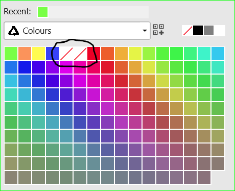
What I failed to mention is that your recently used colours appear above the swatches AND are saved with your document.
Of course, if you want to use the same colours in another document, you have to save them in an existing palette or your own custom palette. Then the above workaround of "No Colour" markers is handy.
Don't forget to rename them (rt click), e.g. "Iris purple R:84 G:0 B:248" keeping the RGB or CMYK values for documentary purposes in case the colours have to be transferred to another app or file.
-
17 hours ago, Carlos NZ said:
... I would like to have the ability to save my swathes under the standard palette but separated from the standard ones. That would be a lot easier to work with speeding up the work flow. I have attached some samples of how ti could be. It could be arranged by folders, or just simply separated.
I see what you meant.
My workaround: I add a couple of "No Fill" markers as colours which always pop up at the LH top corner of the Colours swatch palette and any custom colours I add come to the left of those markers. That separates my colours from the existing swatches. Inelegant but it works for me.
-
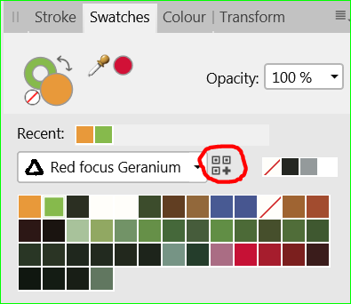
3 hours ago, Carlos NZ said:
... Would be great to have the ability to create folders and add your own swatches like in illustrator.
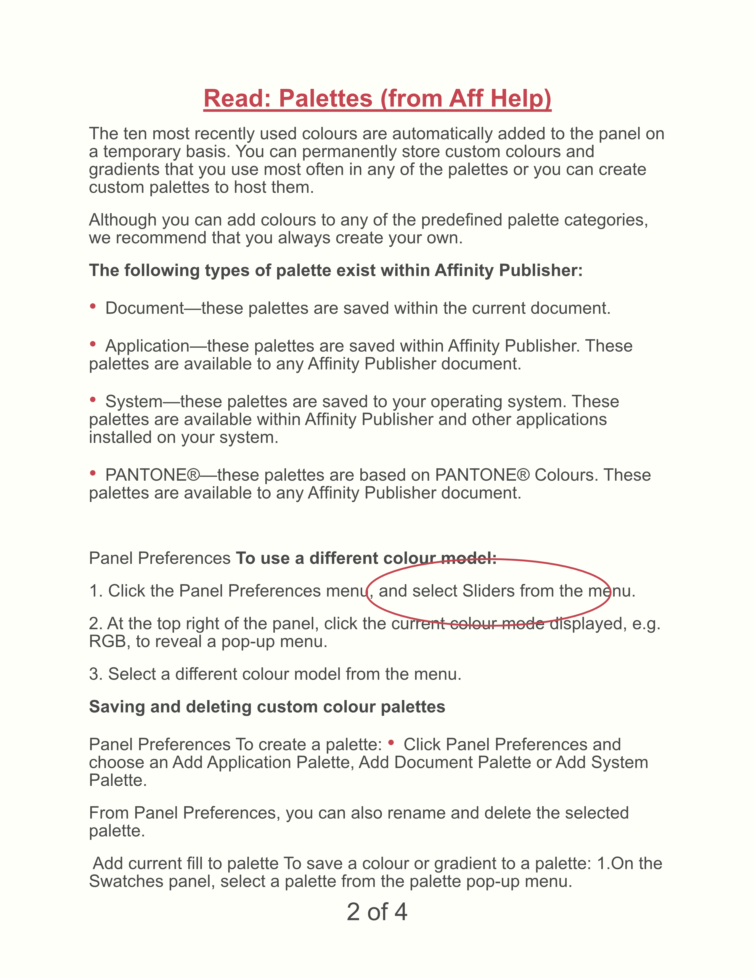
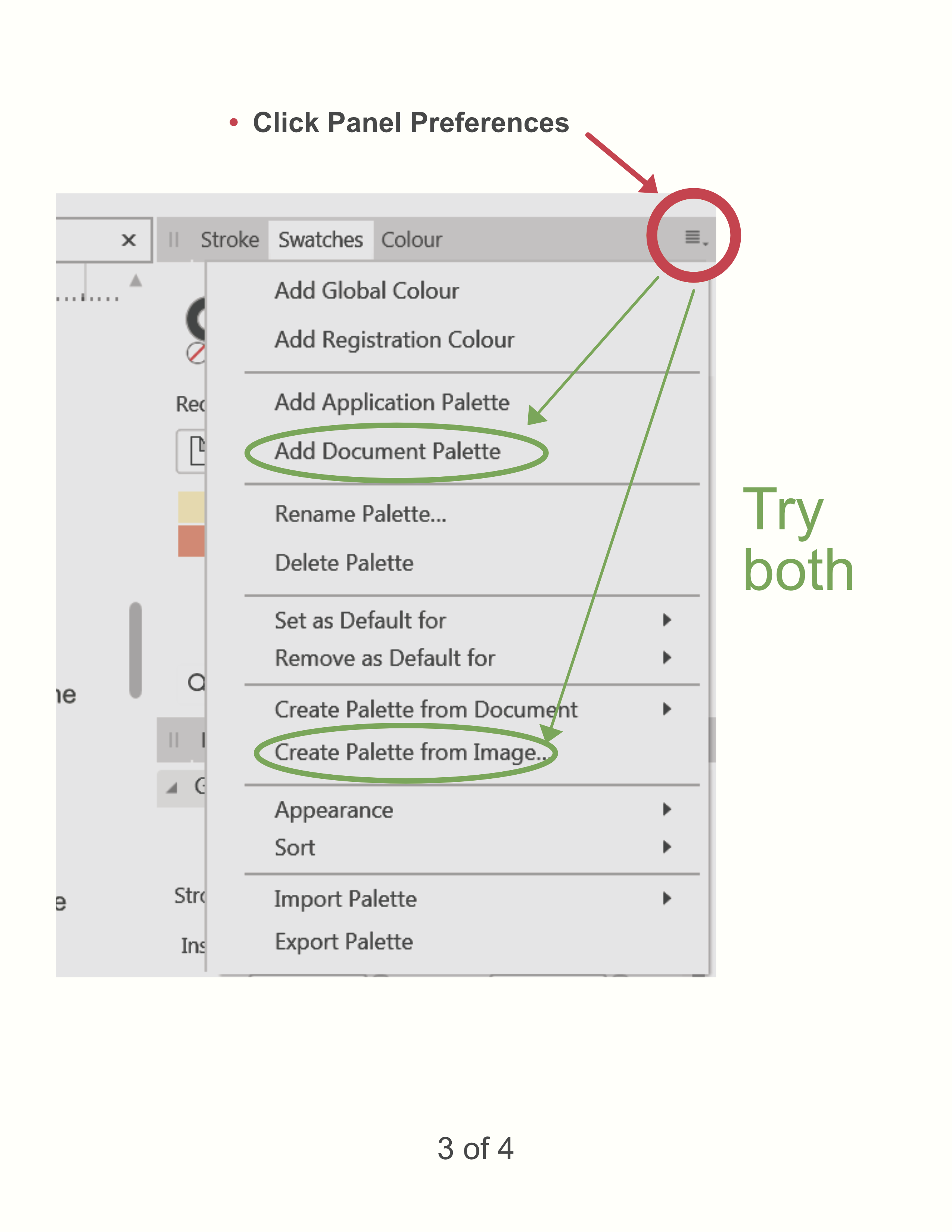
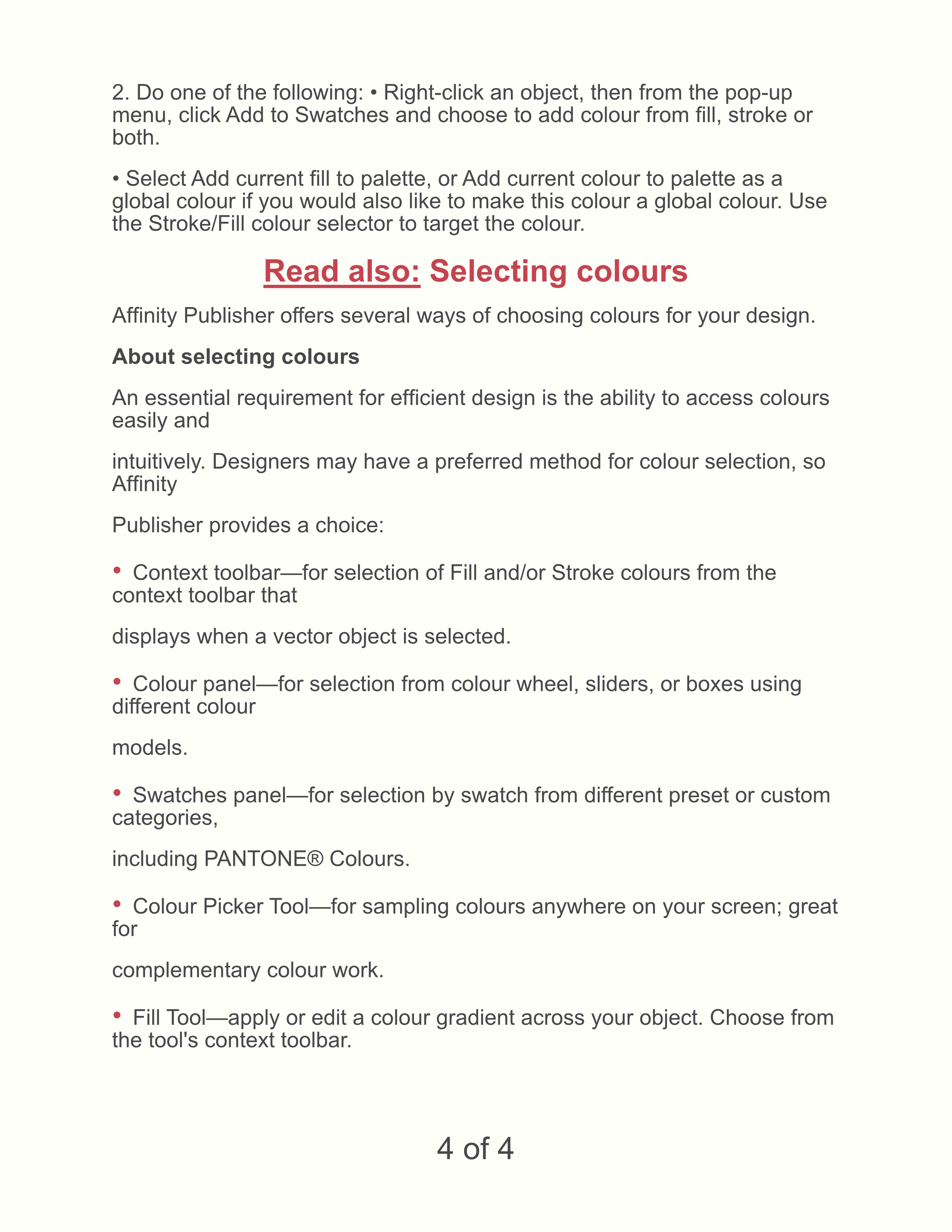
It's awkward but it can be done. Everything happens in the Swatch box. See "Colour palettes" in the Help and screenshot below.
To save a colour or gradient to a palette:.
- On the Swatches panel, select a palette from the palette pop-up menu. (You can also create Custom Palettes.)
-
Do one of the following:
- -click an object, then from the pop-up menu, click Add to Swatches and choose to add colour from fill, stroke or both.
- Select Add current fill to palette, or Add current colour to palette as a global colour if you would also like to make this colour a global colour. Use the Stroke/Fill colour selector to target the colour.
- Double-click a saved swatch.
• Right-click the swatch you want to remove and choose Delete Fill from the pop-up menu.
More follows in the Help.- Right-click the swatch you want to remove and choose Delete Fill from the pop-up menu.
-
On 9/16/2020 at 3:43 AM, ETC said:
I was never a super power user of InDesign, since I mostly used it one time a year for a calendar. But I could make the calendar with relative ease. Now I'm trying to do that with AfPub. So far it's not been an easy transition.
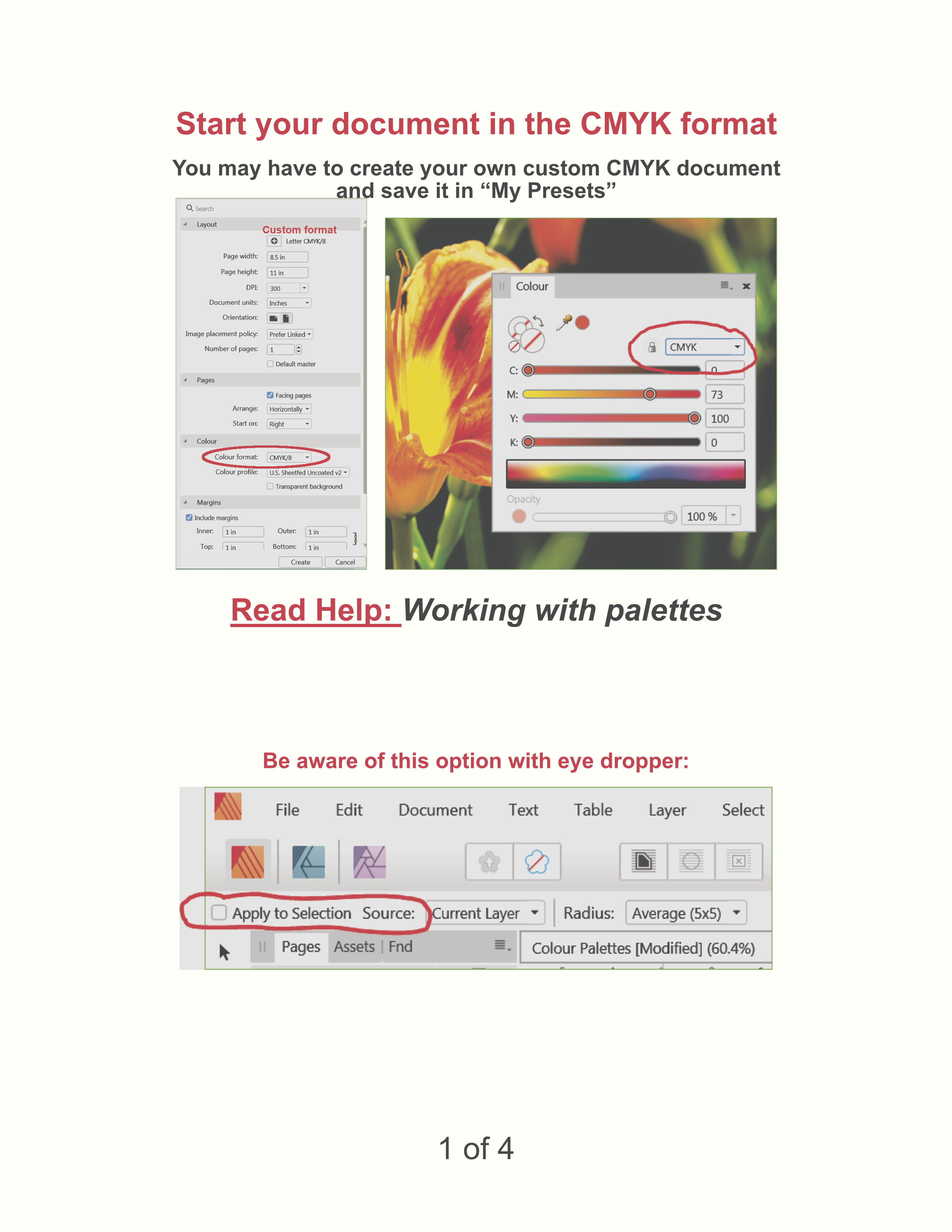
I typically like to set two or three colors (CMYK for offset printing in Europe) for each month which are used for text color, borders, and the background behind the calendar table. The color swatches I used to make in InDesign were created by means of the Color Picker Tool (dropper) from the nature picture used that month.
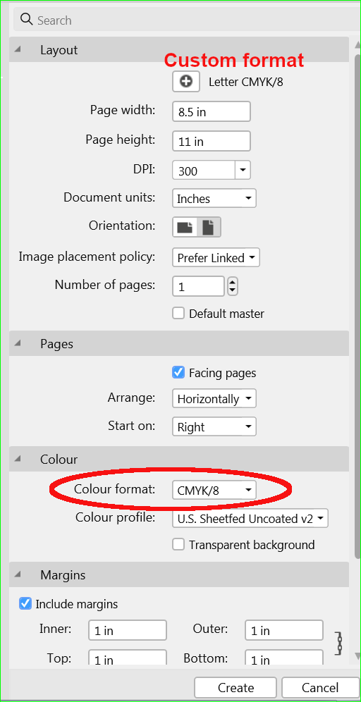
I can't even figure out how to change all colors in the document to CMYK. Can you help? Then I might have some more questions…
Thank you!
Just wondering ETC, was what I posted of any help? Not what you needed?
Cheers.
-
3 hours ago, Lagarto said:
... But they are horrible as they are now.
- Adobe users have the benefit of being offered most of the time step-by-step instructions ...
Gould be better, IMHO. The plethora of options in AFF leads me to keep going back to View > Studio >... repeatedly in a project. And why they separated leading from Character type size is beyond me. Specifying type was always 12/15, size/leading. Size and leading always go together.
I have to say I learned a lot from Adobe's good instructional material back in the day, but AFF does the job—eventually.
-
2 hours ago, SamSteele said:
Assuming you are using v. 1.8.5.703 (probably not much different in older versions), I attach a PDF with graphics and explanations. The text is all taken from the Affinity Publisher help files which I encourage you to read. Sometimes I find there are too many bells and whistles in Aff products so use what you need and skip the rest.
The PDF didn't upload so I'll try PNGs of each page.
-
11 hours ago, ETC said:
...
I typically like to set two or three colors (CMYK for offset printing in Europe) for each month which are used for text color, borders, and the background behind the calendar table. The color swatches I used to make in InDesign were created by means of the Color Picker Tool (dropper) from the nature picture used that month.
I can't even figure out how to change all colors in the document to CMYK. Can you help? Then I might have some more questions…
Thank you!
Assuming you are using v. 1.8.5.703 (probably not much different in older versions), I attach a PDF with graphics and explanations. The text is all taken from the Affinity Publisher help files which I encourage you to read. Sometimes I find there are too many bells and whistles in Aff products so use what you need and skip the rest.
-
Lighter grey works for me.
-
1 hour ago, fde101 said:
I absolutely agree with this, but it doesn't matter how quickly you can produce bad results.
The real problem with the colors in the surrounding UI is not how they look, but in how they change the way your document looks.
Too much contrast will do this as well.
The suggested changes as demonstrated in the sample images have the potential to cause the user to misjudge the colors of the document, and that would be a problem in an application whose primary function is design work, in which color perception commonly plays a big role.
Yes, the visibility of which tab is active should certainly be improved - I have struggled a bit with that one too so I do know what you are saying - but it needs to be done carefully, so as not to compromise the accuracy of the user's color perception.
I've never produced bad results. Designers got along for
yearsdecades without the trendy all-black surround so the introduction of a smidgen of colour outside of the actual file I'm working on doesn't throw me. I don't work in a perfectly black studio, either. Although, back in the day, I did squash the suggestion of an architect that a studio where I supervised graphic designers be painted orange because the hallways were orange and grey (true story). We went with off-white. Actually, the cat walking across my keyboard, and ambient window light, is much more of a distraction.It's probably simpler coding-wise to just make the 100% in the UI slider about 50% lighter grey than it currently is. Give us some real choice. Thank you for agreeing with the concept that an improvement is needed.
-
6 hours ago, fde101 said:
Yuck. The suggestions above look ugly.
I agree that it could definitely stand out better, but this is an application for design-oriented people - it should still look appealing.
Also, it should not stand out so well that it draws attention to itself (and thus away from your work).
@Jowday definitely is correct that the use of color here would be a big problem and needs to be avoided. Not only is it a potential distraction, but the whole point behind the neutral gray interface is to avoid throwing off your perception of the colors in the document you are working on. Colors in the user interface surrounding the document are likely to do that, particularly if as prominent as a tab just above it.
Sharp differences in brightness could similarly throw off perception so the whole near-black vs. near-white thing is a no-go as well.
Ah, the joy of elitism. Having been a professional graphic designer for over 30 years, which included introducing computer graphics to a teaching hospital, serving corporate and municipal clients and working my way over the years through a number of design software programs from Pagemaker and Corel Draw to the Adobe Suite, I have come to the conclusion that productivity is more important than bling.
Stay with shades of grey if you wish but at least make the brightest possible grey much lighter. Then the user has a true choice when using the UI slider. Give us the option of making the icons bigger, too. Productivity counts.
For an interesting discussion of "Form follows function" see https://en.wikipedia.org/wiki/Form_follows_function
Affinity is doing one thing very well and that is continuing to be in touch with its users.
Cheers.
-
So, make the file tab in use a significantly brighter shade of grey or, make it a colour.
One more thing to put on the To Do list, please.
Thanks.
-
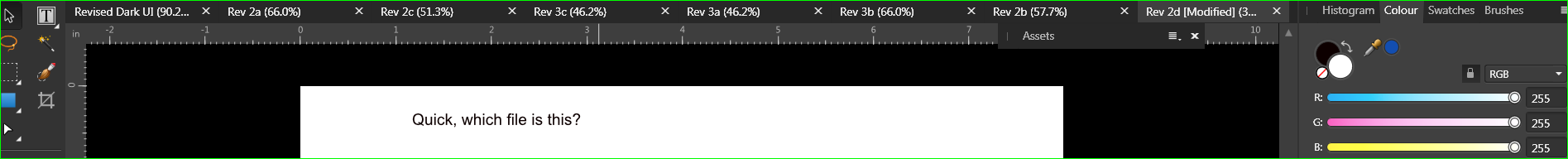
Here's a test. Find the Context UI tab for this file. Or, to put it another way: which file is up on the screen?
-
It seems that a lot of things in the Affinity suite were designed for people with young, perfect vision. Just sayin'...


 .
.
How to copy and paste part of a placed image in Publisher?
in Pre-V2 Archive of Affinity on Desktop Questions (macOS and Windows)
Posted
That worked. Thanks Walt. I hope Affinity has key man insurance on you.
Now, what do Rasterise & Trim and Rasterise to Mask mean? Searched Help but no luck.
Sam