Chris26
-
Posts
923 -
Joined
-
Last visited
Everything posted by Chris26
-

Publisher: The Stroke Panel
Chris26 replied to Chris26's topic in Pre-V2 Archive of Desktop Questions (macOS and Windows)
OK, Hooray, Got it. - I saw this pressure curve and had no idea what it really meant so never thought to mess with it. (I am not a designer and have very very basic knowledge of graphics, but I thought it was about time I tackeled the scary stuff in Publisher - it's long overdue). -
Appreciate this Walt and thankyou. Just discovered my own answer to the multi coloured gradient question I posted, just far too impatient with myself .....

-
Publisher: The Stroke Panel
Chris26 replied to Chris26's topic in Pre-V2 Archive of Desktop Questions (macOS and Windows)
Hallo Walt, nothing works, so I suppose it can only be accessed through designer, seems strange though to have this as though it can be accessed from within Publisher? -
Publisher: The Stroke Panel
Chris26 replied to Chris26's topic in Pre-V2 Archive of Desktop Questions (macOS and Windows)
Just a demonstartion of what is happening Walt.
-
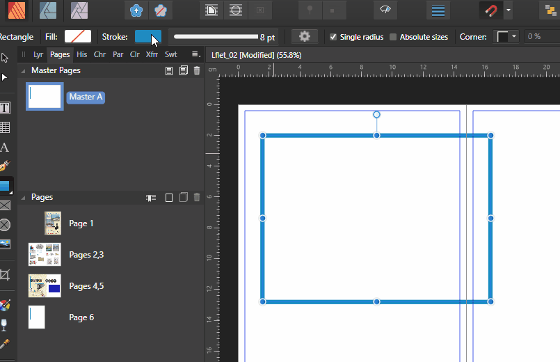
I am trying to get to grips with aspects of publisher that I never used before. I have watched many you tube video tutorials and they are very good, unfortunately I am experienting with things that I can not find in any tutorial to date. Unfortunately the Help documentation is silent on this particular tool under 'Stroke Panel". I am confused as to why the Blue stroke line has not changed according to the adjustments I made in the properties as seen here in the screen shot.
-
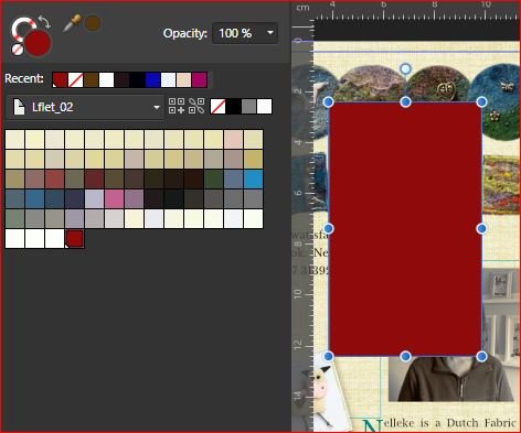
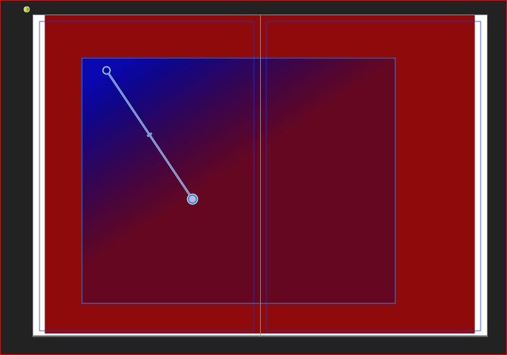
Two questions please: 1. The first screen shot shows when I simply clicked on Blue and filled the Square shape. The second screen shot shows when I clicked on a global colour as referenced by the last colour in the swatchs that has a littke white "thing" bottom left. QUESTION: When is a global colour not a global colour since both clicks produced the same result? Bit confused as to what defines a global colour here. 2. QUESTION, earlier on I used the Gradient fill tool (simply called "fill tool"): for one colour this makes sense when you drag out a box or fill a box and apply it, BUT, I also accidently managed somehow to create a gradient that went from bluish through to reddish without being able to fathom out how on earth I achieved this within that same square box. I remember clicking on one colour then another, but what happened in between I have no idea since I was practising things too quickly to take note. EDIT: Is this the way to create a gradient of two colours ormore by creating several boxes within each othe or is there a more professional way to do this?
-
Well, I wouldn't accuse him of complaining, it's just a wee litte moan, he'll get over it..he is just trying to be helpful...😁 but the good news is that this is normal, publisher is simply telling you that the fonts in the pdf are not on your system, this is normal.
-
Poor resolution for DNG files
Chris26 replied to Brolf's topic in Pre-V2 Archive of Desktop Questions (macOS and Windows)
Well I never noticed that, I have the free version and open all types that I need, have no need to open DNG in file viewer but yep, checked and you are right, only in the paid version, which is fair I suppose. What John John Rostron said above is a good sign that this is definitely not affinity, but rather a perception under different viewing conditions, the only absolute proof of Truth, f I may call it that, is to do an aesthetically pleasing global processing of your dng file, then a target edit in Photo, and print it out. Do not compare anything to anything, and do not compare screen to screen, this is all truly subjective and can never give an accurate portrayal of what actually exists in the image nor how it will look to a viewer who sees it in print. My camera images on the camera screen are always different when I take them into Bridge (I never bother looking at my preview images, waste of time, I alwys focus on where the Histogram begins nd ends, then at 200 or 300 percent comparing the bridge raw developed image with what I now see in photoshop often needs a littel more global adjustment than whhat I did in Bridge, they are often subtely different. I have once or twice seen my photoshopped end product on other screens and YUK is the only word I can think of. But my print is the ultimate judge. -
Font not joining up
Chris26 replied to Stacey85's topic in Pre-V2 Archive of Desktop Questions (macOS and Windows)
Ok out with the micro-fontascope...ah yes, thanks for p o in t i n g t h at ou t -
Font not joining up
Chris26 replied to Stacey85's topic in Pre-V2 Archive of Desktop Questions (macOS and Windows)
Hi Alfred, I don't get it at all. I am completely ignorant when it comes to the intricacies of font design and glyphs etc. I looked again but all I see is separation? -
Poor resolution for DNG files
Chris26 replied to Brolf's topic in Pre-V2 Archive of Desktop Questions (macOS and Windows)
Have a look at 'File Viewer Plus", it is a respectable and very efficient programme that can open literally hundreds of file extensions that even windows can not read. There is the free version and there is a paid version which allow you to convert also. You also get to see every bit of exif data about an image - a very detailed accoint about the image properties. Might this help?, As for your images above, you have obviously zoomed in to 100%, unless I am mistaken then I see a jpeg that has been sharpened and had contrats adjustments applied, and the DNG is just Raw, which is what I would expect. A digital negative is akin to the negative in a film camera before you develop it it has no processing applied to it, no, profile attached to it, it is literally that - A negative, a raw un-processed piece of meat that needs to be cooked to taste. Your JPEG is a packaged hamburger ready to eat.😁 -
Font not joining up
Chris26 replied to Stacey85's topic in Pre-V2 Archive of Desktop Questions (macOS and Windows)
Hallo Stacey, unfortunately this font does not join up. It is not like Lucidia for example. https://www.fontsquirrel.com/fonts/pecita -
Page set up
Chris26 replied to Donna Wolfe's topic in Pre-V2 Archive of Desktop Questions (macOS and Windows)
I actually had no trouble exporting it to PDF for digital print with ppi set to 72 for screen reading. I also noticed a ton of pre-flight errors that need correcting, perhaps you should do this. But unless you tell me what you were exporting to and what exactly the problem is I can not help you further. -
Color displayed incorrectly
Chris26 replied to Marius03's topic in Pre-V2 Archive of Desktop Questions (macOS and Windows)
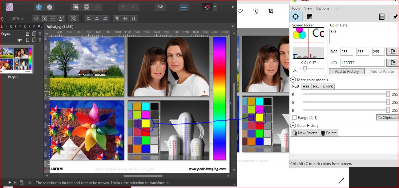
Then that explains quite a lot. I have here a screenshot of a test image from Fuji Film. loaded it into Affinity Publisher and also into Windows photo viewer They display colour and tone differently, barely visible with the naked eye, But I did see differences, although subtle. So I loaded my colour picker and there are different readings from both images. For One example The bright yellow in windows Photo viewer is more intense and that same yellow in Affinity is a little more flat, dull. Are you a photographer or just capturing for casual use on different screens and displays? If you are a photographer then Print it, that is the object of photography, not to try and get all these colours to display the same on different monitors, that will never happen, ever. Photo viewer Yellow is RGB 255 255 0 Affinity Yellow is : RGB 254 254 31 This is to be expected to be honest. This is just the viewing condition, the screen display if you like. I never put any confidence in comparing a photo viewer image with a dedicated photo editing programme. Edit according to taste and print, then compare the print to how it looks in Affinity. This is the only true way to do things. I assume you understand the principles of colour managing your images from start to finnish? 😉 Kind regards Chris
-
Just be aware that if you edit in ProPhotRGB on a monitor that does not display this wide gamut then you will not really see what is happening. And then you will need a high end 9 ink printer at least, to be able to print this gamut ok.
-
Answer to question 'One' is a Yes. Answer to question 2 is: Jpeg with s'RGB yes. BUT, other peoples' monitors and viewing screens and conditions will influence the colour they see, you will never be able to control this. Just be satisfied that you like what you have and upload it. why is it not better simply to use sRGB (with its more restricted colour range) throughout the editing process? It is always always best to edit your images in the wider colour spaces, even ProPhoto if you want because you never know what will happen 1 or 5 years down the road, someone may want a poster of it, a company may want it enlarged or something. If you have edited it in a small colour space and in 8 bit and saved it as such you are stuck. Edit in 16 bit in the widest colour space of your choice, copy it, re-name the copy to something like"SW_dogChaseCat" or "4x6DogChaseCat" I use codes such as SW to mean saved for web, and 4x6 means small image for personal print, the point here being that I have copied the original and altered their output and size so that they are specific for medium within which I am placing them, . But my main Large edited original will simply be named as DogChaseCat. OK? EDIT: Sorry forgot something: always always leave your original edited file with ALL layers in tact, save it with those layers. Never flatten. Duplicate the image and then flatten and do what you need to in order to prepare it for the web or a small print or something. I have come back to images that are 6 years old and been so thankful that I saved them with layers in tact.
-
If you have a printer capable of printing in ProPhotoRGB colour space then edit in this space. But that would be an expensive printer indeed. Most middle of the range printers print quite capably in AdobeRGB1998 and the littler s'RGB space, although there is often not much difference between these latter two spaces that will be noticeable in most images. Edit in adobeRGB1998 is a good idea and then convert a copy of your image to s"RGB to be used for the web. Your spyder calibrated screen is for the screen only, never assign this as a profile to anything. Remember, the whole point of calibrating a monitor screen is NOT to expect your images on the screen and in the print to be exactly the same, though this is the ideal goal; the purpose is to give you Consistency between what you see on the screen and the confidence that it will be printed out as expected. This sounds contradictory, allow me to explain: I know that although my monitor is calibrated some yellows and purples will not come out as I see them on my screen, I know that I need to adjust these particular colours for print purposes only, when I adjust them, they do not look exactly how I want them on my screen, but I know that they will print out exactly as I saw them before I adjusted them on my screen, . This is what I mean by consistency. I know that my screen display will always give me a consistent display of colour and tone and that some colour and tone will need to be adjusted exactly the same in all my images simply because my calibrated monitor will always be displaying the same tones and colours from month to month. ( As long as you re-calibrate at least monthly ). Hpe this helps a wee bit.
-
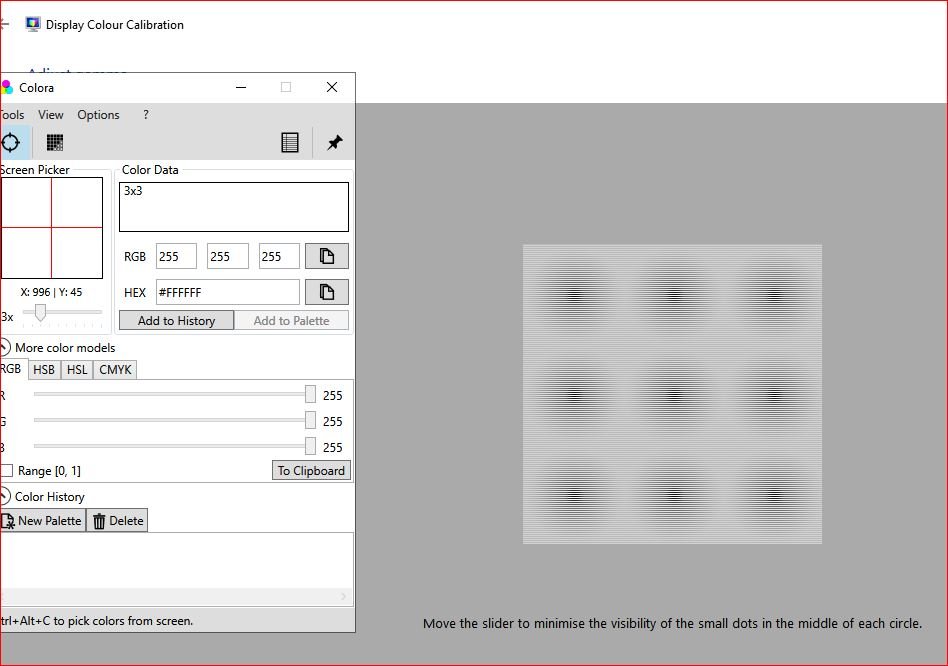
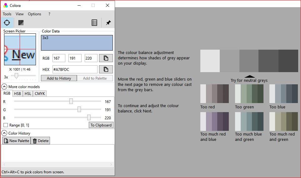
I have the luxury of Spyder calibration software for my apple mac, but not for my windows laptop. Something is better than nothing, so I decided, in light of many posts I read and have read in the past about discrepencies between viewing images in Affinity and final output, to offer this tip for those who may not be aware of windows very basic calibration tool. 1. Download a colour picker tool (similar to apple's "DigitalColor meter". I use Colora. 2. Type in Windows search:"Calibrate" 3. Here you will be guided through a series of steps as shown in just two screen shots. Keep the colour picker tool on top and you will need this to see the neutral gray when it appears, ideally at 128 128 128. Mine is a little off but has improved since adjusting. Unfortunately only special calibration software can correct this to its absolute values. If you run through these steps with the following in mind then you will have closer and less dissappointing results between WYSIWYG between the monitor and printer: a) Keep the brightness of the screen as low as possible b) Keep the dark areas as low as possible and if using the colour picker try to get as close as possible to around/between the 15 15 15 or 20 20 20, going below 12 12 12 has no benefits at all. c) Grey is always 128 128 128, so if you read 127 122 100 then you know that there not enogh Blue showing and that the grey has a yellow colour cast. I am hoping that for those who are just beginnng or perhaps are not too aware will find this information helpful. As I said, colour calibration software is the way to go but if you can not afford it then this is the only option, it is better than nothing at all. I use it for now and really have acceptably pleasing results in all my images. I hasten to add that I do not believe a photo editing program is ever to blame for colour or tonal inconsistencies, but please, I am open to hear to the contrary.
- 1 reply
-
- 2
-

-
Your monitor should be in the default monitor profile not in s'RGB. The photo editing software is ALWAYS device independent. This means that regardless of monitor profile A.photo, like photoshop displays images in the colour space assigned to it, in spite of monitor profile. However you change back to the default monitor space. If you are on a laptop, you should reduce the luminance, and I mean really turn it down. Laptops are notorious for their ridiculous default brightness levels. Where are you exporting them too, how, or on what device or in what programm are you viewing them in?
-
Color displayed incorrectly
Chris26 replied to Marius03's topic in Pre-V2 Archive of Desktop Questions (macOS and Windows)
Exported to where, I see a photo and an image in A.Photo. How are you viewing your exported image? The ones from the edited versions. -
Color displayed incorrectly
Chris26 replied to Marius03's topic in Pre-V2 Archive of Desktop Questions (macOS and Windows)
I had no idea it was shot from a drone, sorry. Please explain, the image on top is before or after editing? The image below is as seen in the drone footage? I am getting confused here. -
1. No, My advice is to always shoot in RAW. which is 16bit, REMEMBER, RAW does not have a colour profile, it is profile-less so to speak, it is Raw data waiting to be edited, your screen siply interprets intelligently what was captured in camera, it is for all intense and purposes a mish mash of colour and tone waiting to be cooked properly. You never know how you might want to come back to that image in a year or two.😀 2. Adobe RGB 1998 is a bit overated at times, although I always edit in this profile. Best to go from a slighly larger gamut to a smaller one in the final edit. The only Profiles you will ever need to use for photo printing are: s'RGB, Adobe RGB1998, and proPhotoRGB, but the latter is only applied if you have the printer to print in this colour space. Also it might be comforting to know that most colours and tonal ranges display equally well in both s'RGB and Adobe RGB1998, do not get hung up on this. Forget about Apple RGB, never used by photographers. 3. That Monitor colour profile is what comes with the monitor, it determines how colour is displayed on a monitor. Every monitor has something like this, if you calibrate your monitor with a colourimeter and special software then you get a new profile which you you name yourself, this is another subject though. 4. and now my exported image is EXACTLY like my edit! However now on my iPhone/iPad it doesnt seem to have changed. Ipad and Iphone will have different algorithms for interpreting colour I imagine, this would not concern me, I get the same results after I edit an image for the web and then see it displayed on a phone, I am ashamed of what I see, but that is the way things work digitally speaking. When you say your exported image now the same, you mean that the A.photo iage within that softwre on your screen is the same as seeing it where?
-
Color displayed incorrectly
Chris26 replied to Marius03's topic in Pre-V2 Archive of Desktop Questions (macOS and Windows)
Hallo Marius, welcome to the forum. Please allow me to emphasize that one can never compare a raw file with a jpeg,. A RAW file is exactly that, which is why it is known as a Digital Negative. The software has simply rendered the raw file in a sensible way. Raw can not be destroyed when edited, it is a mish mash of information ready to be manipulated, it is like comparing RAW meat with cooked meat, there is no comparison. How have you displayed it in Affinity Photo? Did you assign a colour profile when you took it into the photo editing stage? Again, please forget about converting to jpeg in camera, just wrecks everything and is certinly not an efficient way to ascertain colour or tonal accuracy. How colour is displayed in the raw image is simply how a camera decides it should be displayed according to in-camera software. The RAW development in A.photo is an overall, generalised edit similar to when one develops the out of camera nagatives of a complete film from a film camera. The photo editing software can pinpoint and target specific areas of that image similar to when we take our developed negative and transfer it to photographic paper which then goes through two chemicals. Each critical stage is about making creative decsions. How your image is displayed in camera, in RAW and then in Photo editing software will always be slightly different, because in each stage there have been conversions in the software. PRINTING is the only way to determine the accuracy of editing. And then if there is still a problem we must look to our colour management and possibly screen adjustments. Seldom if ever, is there a problem with the photo editing software unless green comes out yellow and black shadows come out as very light areas. The real and only true comparison in order to guage the accuracy of an edit is to Print it. -
TariqMK Is this perhaps a bug with Affinity Photo? Highly unlikely. You are comparing screen to screen. I also notice that you have the A.photo image in 16bit, only dedicated Photo software supports 16 bit otherwise it will automatically be compressed to 8 bit for viewing conditions. My personal choice would be to print the photo, this is the ONLY way to know the truth about your editing. The image on the left in your first post is quite flat, I actually prefer the right image. When I edit photos I often have to edit the main one for printing conditions, then copy the main one, throw it into 8 bit and s'RGB, and manually re-edit for screen which usually involves a little bit of a curve adjustment that's it. It far too much of an expectation to expect your lovely edited image to appear the same on all viewing devices. If it is too dark then lighten it for the screen . However if it is too dark on the print version then we have a seperate issue. As a final note, and I am wondering....are you comparing a CR2 image to the right hand one in your original post, or has the left one already been assigned the s'RGB or adobe 1998 profile and is no longer a raw?
-
Sorry I am a bit confused. You imported the image as camera raw 2 into A.photo. Edited it, took it to Publisher, exported as a jpeg to where? If you imported as cr2 and edited it then took it to publisher and then want to print it? I am confused over the work flow here. Going from CR2 to Jpeg would most certainly shift tones and colour slighltly by the way. I can definitley help you with this but it is hard fro me to visualise exactly what you are doing with the image. Plus markw has answered those questions you asked. so the more info the better.