lineweight
-
Posts
119 -
Joined
-
Last visited
Everything posted by lineweight
-
Fair enough. Thanks for comments. Yes I'm familiar with the audiophile world and the tendency to get caught up in some theoretical but totally imperceptible difference. I guess the fact that Affinity has these two Personas, and the ability to choose to do certain processes in one or the other, suggests to the user that this choice is of some significance.
-
So - it's generally considered ok to adjust the same thing twice, as it were? Say I get my white balance near-enough in Develop persona but then add another white balance adjustment on top in Photo. Intuitively, it feels like it ought to be better to do it in one place. It feels like saving something as a JPG, editing it, and saving it as a JPG again - ie bad in principle. But I guess this is not an analogous process.
-
Thanks - this matches my understanding of what happens, so it confirms that I am not missing anything. It seems that if I wanted to make all of my edits potentially reversable or adjustable then I would have to do everything in Photo persona. But, my understanding is that there are certain things that are better to do in Develop persona because of implications for final image quality. It seems hard to pin down exactly what those things are - I am yet to find a clear explanation. Some of it feels like a kind of superstition.
-
Thanks for the replies. With regard to this: Can I check that I'm not missing anything here - these kinds of edits to the image itself, they inevitably come undone if I subsequently go back and change things in the Develop persona - that is, I will have to repeat such edits, because they are based on the previous version of the RAW layer? Is that correct? It seems that the ability to have the RAW layer linked brings fairly limited benefits to any workflow that includes these kinds of pixel layer edits because if you are going to do such edits, you either a) effectively have to decide & bake in the Develop persona adjustments first or b) do the adjustments in Photo persona instead, if you want to make any changes to them after doing the pixel edits.
-
I'm going through a batch of photos which I have in RAW (DNG) format. These aren't taken with a super sophisticated camera - they are taken with a decent phone camera. But I do want to start from the RAW file rather than just accepting what my phone decides to do in order to create its JPG version. Basically I'll want to adjust: - Exposure and basic levels/curves - White balance - Rotation/straightening of images (a bit of perspective correction) - Sharpening On some images I'll want to do a bit of basic clean-up using the clone or inpainting tools. My question: For each of these adjustments, how much does it actually matter, whether I do it in Develop or Photo persona? I'd like to keep as much non-destructive as possible, so I can go back and change my mind about things. I realise that in V2 I can now save as "RAW layer embedded" meaning that stuff I do in the Develop persona can be non destructive. On the other hand, I've realised that if I use, for example, the clone tool on a separate clean-up layer (to avoid converting the main layer from RAW to pixel layer) then any subsequent adjustments applied in Develop persona won't apply to this clean-up layer. This seems to be an argument for making most of my adjustments in Photo persona. So, which adjustments really benefit from being done in Develop persona, and which are the adjustments where it doesn't actually matter than much?
-
Yes, I'm on mac. There is an online version here which I tried but it didn't do better than the filters in Affinity.
-
Thanks. "Descreen" is the search term I didn't know I needed. From those other threads ... the two methods that have been most effective on my image are the "box blur" filter and the "frequency separation" one - adjusting until image looks best then discarding the high frequency portion. These two methods seem to produce similar results. I'd still like to understand more, whether I should be worrying about applying the adjustment layers before/after the filters.
-
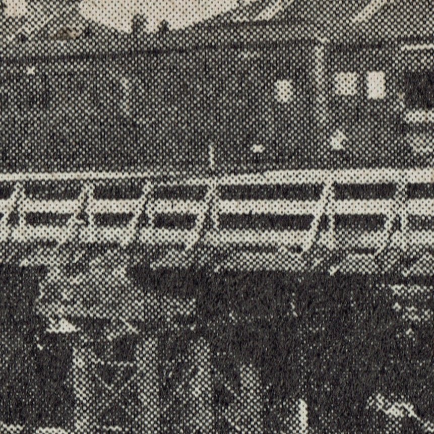
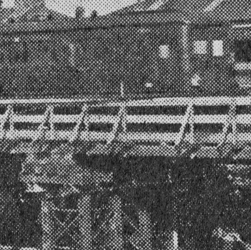
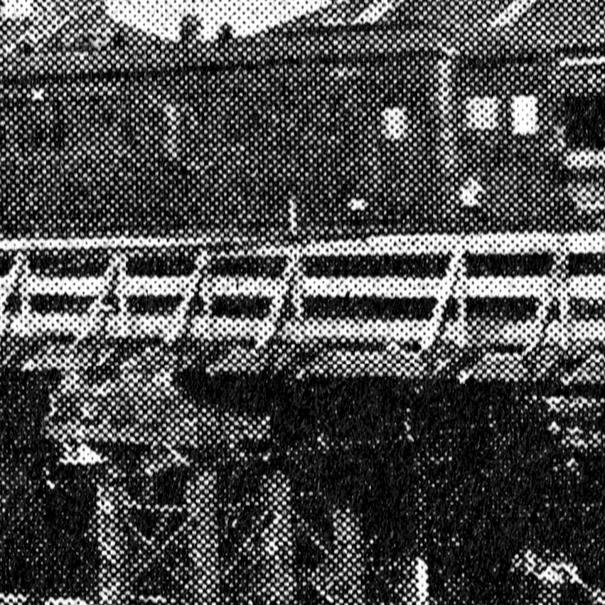
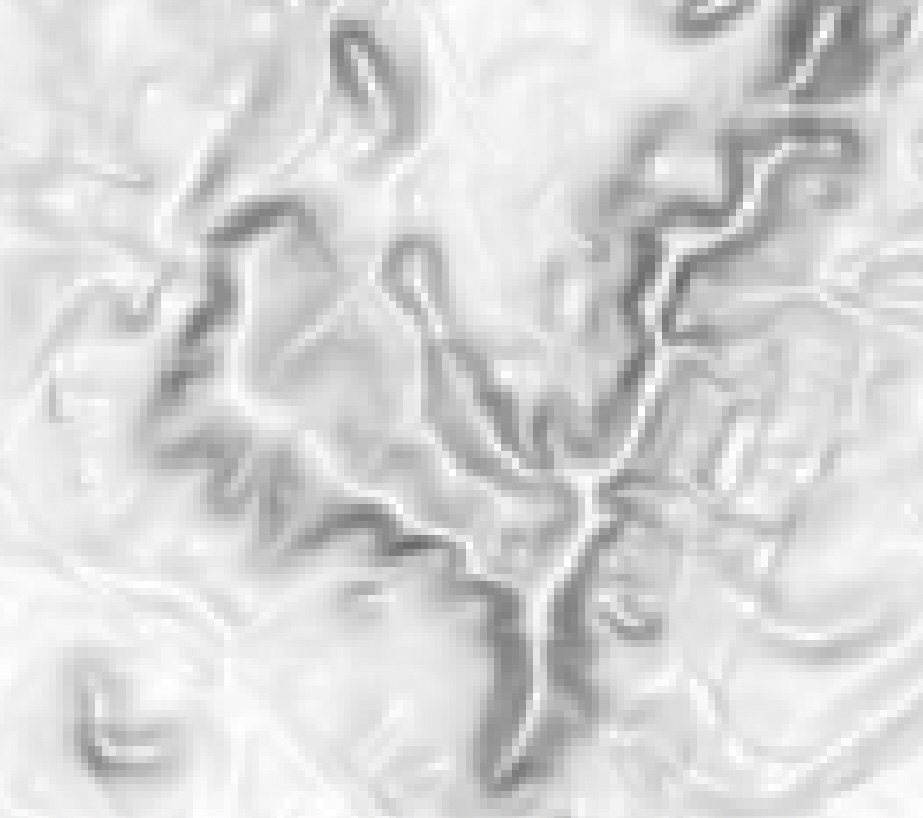
I want to take a scan of an old image and make it into something that works viewed on screen within a website. It's a historical image so I don't want to lose any more detail than is necessary. The main problem with the halftone pattern is that it creates moire effects when the image is viewed on screen at certain zoom levels. This is the main thing I want to improve. I'd be grateful if anyone could advise whether my method makes sense: Here is a portion of the original scan: First I used a "black and white adjustment" layer to make it properly greyscale: Then "levels adjustment" layer to try and make the whites pure white and the blacks pure black: Question 1: In theory of course, every point on a halftone print should be either black or white, with no greys in between, so I tried adjusting the levels rather agressively to get the image to that point, but I felt that in practice this may be losing some information so I went for a kind of compromise point, which is what the above is. Does this make sense? Question 2: The next stage is to use a filter to try and "blur" the halftone pattern to get rid of those moire effects when the image is zoomed out. Froma bit of looking around including this thread it seems my best bets in Affinity are probably "FFT Denoise" and "Gaussian Blur". Is that right or are there others that might be more effective? Question 3: Am I right to think that I should try and apply those filters "after" I have performed the adjustments for B&W and levels? Does it make any difference in what order I do things? At the moment I have my original layer and then the two adjustment ones. They can be turned on and off, so when I apply the filter I think it is applying it to the original image and then the adjustment layers are acting on the result. Is that right? Should I somehow be baking the adjustments into the image before I apply the filters? Thanks in advance for any help!

-
Best ways of de-pixelating this image?
lineweight replied to lineweight's topic in Desktop Questions (macOS and Windows)
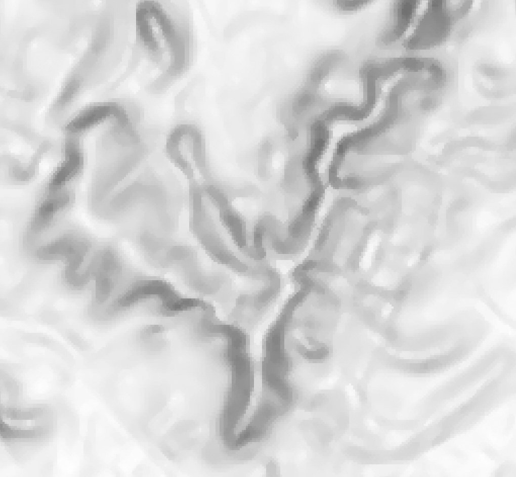
Thanks for all the suggestions! I'll try them all. This is an image I am using in a GIS application. I had hoped that I could use Affinity to edit the GeoTIFF files it uses but unfortunately it seems that Affinity is not able to do this without losing all the metadata. -
Best ways of de-pixelating this image?
lineweight replied to lineweight's topic in Desktop Questions (macOS and Windows)
Thanks - that has an interesting effect.
-
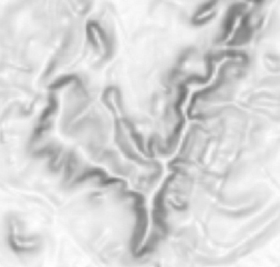
This is a portion of an image that I'd like to make look less pixelated: So far, I've found that I can get it to something like this using the "Guassian Blur" filter: Are there any other methods that I should investigate?
-
It's a bit hard to understand what's in it for Canva. Surely they haven't paid an enormous amount of money, to enable you to carry on making upgrades for existing users for free.
-
From the FAQ I bet V3 will come as a subscription model. I wonder if a cut-off date will come, after which if you haven't purchased the current software, there will be no further opportunity to buy a perpetual licence. That's what happened with the CAD/3D software I use. They try to make out they are being kind to long-time users as we can still buy a "perpetual" licence each year but the first year we don't buy one, we lose that, and are forced into a subscription only arrangement. The affordable cost and non-subscription pricing are Affinity's USPs, for me at least. Are the apps themselves amazing or unique? No, they are simply good and let you get the job done. Disappointing that this seems to happen to absolutely everything now.
-
Ok. Thanks. This works when the image is listed in the layers pane as "(image)" but not when it's listed as "(pixel)". I'm not sure why they are different as they are both tiff files placed into picture frames.
-
Thanks. I actually was looking at that thread before starting this one. These are the methods listed there 1) Go to Document > Colour Format > Greyscale. Although I never use this as it's destructive and removes the colour information permanently 2) Go to Layer > New Fill Layer, fill it with white and set the layer blend mode to 'Colour' 3) Add a Channel Mixer Adjustment Layer and change the Output Channel to 'Grey' 4) Add a Curves Adjustment Layer, set the layer blend mode to 'Colour', then drag the bottom-left corner point of the curve to the top-left corner (so that it's a horizontal line) 5) Add a HSL Adjustment Layer and drag the 'Saturation Shift' slider all the way to the left (-100%) 6) Add a Black & White Adjustment Layer 7) Add a Black & White Adjustment Layer, and change the default values from 100%, to the following values to mimic method 3 (adding a Channel Mixer Adjustment Layer). R=29.8%, Y=88.5%, G=58.9%, C=69.9%, B=11.4%, M=41.2% (for RGB 8-bit images only, the values will be different for RGB 16-bit images). You can record this as a macro. 😎 Add a Soft Proof Adjustment Layer and set the Proof Profile to 'Greyscale D50'. This will mimic method 1 (Document > Colour Format > Greyscale) 9) To do it via 'Layer Effects' for a layer or group. Open the 'Layer Effects' settings. Go to 'Colour Overlay' and set Blend Mode to Colour, Opacity to 100% and Colour to white or black. Method 1 wouldn't work for me as I don't want to change the whole document, just certain images. Methods 2-4 and 7-9 would be rather laborious to do individually for each image. Method 5 doesn't seem to work for me. I can do this on two images and they don't end up the same tonally. Method 6 does work. However, it does something to the image that I need to fix by adjusting levels. That's OK but it worries me it's introducing changes that don't need to happen. So, am wondering if there are any better approaches. If not, I'll go with this.
-
Realised I had to activate "show context toolbar" in the view menu. I don't seem to get the "K only" option though, when I select an image in a picture frame.
-
I've seen this mentioned in other threads but I can't seem to find it in my top toolbar. Do I need to be in a particular persona or have something turned on?
-
I have multiple B&W images in a Publisher document, some of which have actually been scanned in colour. So if I do no adjustment on them, they are all slightly different in tone (some of them have a sepia tone, some slightly blueish). I'd thought that using the HSL adjustment, simply moving the saturation slider right down to the minimum would make an image truly monochrome, but this does not seem to be the case. Is there a best-practice (or least complex) way of making all these images consistent in tone?
-
Can I ask why you'd do the adjustments before converting? Would it not be better to see the final results of what I'm going to get, while I'm actually doing the adjustments? Or is it that I can do the adjustments in RGB to get what I'd ideally like, and then leave the conversion process to give me the nearest best version within the limits of CMYK?
-
Hmm, as I thought might happen, two conflicting opinions. But I have asked the printer if they can recommend which profile I use and/or send me the one for their printer.
-
Can anyone give me any pointers here?
-
White line visible between objects
lineweight replied to Hans 49584's topic in V1 Bugs found on Windows
I am coming up against this problem too. So the only solution is to use a very thin stroke for the outline? Is 0.2p what works or would 0.1p work too? -
I'm reasonably comfortable making adjustments to RGB images in Affinity Photo. And usually the images are for display on screen or maybe in within documents to be viewed online, so I don't need to worry about converting to CMYK. Now however I am producing (in Affinity Publisher) some PDFs to be sent to a commercial printer, so the document is set up as CMYK. These PDFs will contain multiple photos that I am placing into the Affinity Publisher document, and because all these photos will be alongside each other I will want to do some tweaking to colours to make them reasonably consistent. Plus there are some that are scanned where I'll want to remove bits of colour cast and so on. My question is: where in my workflow should I make these colour adjustments? a) Get them all as good as possible, editing them in Affinity Photo still in RGB, and then import them into the Publisher document (at which point I assume Affinity does some kind of conversion on them)? or b) Import them all as they are into the Publisher document, so the RGB to CMYK conversion has already happened, and then do my tweaking and adjusting? If I use method (b) then when, say, I do a levels adjustment on the images, it all looks slightly different to what I'm used to, which is a little disconcerting but I'm not sure if I need to worry about it. But if there are no major downsides to that method, it's possibly what I'd prefer to do because it allows me to make the adjustments while the images are next to each other and in their final context.
-
Actually I have just discovered that I can, after all, include crop marks etc via the "Export" dialogue. Just have to press the "more" button at the bottom to access these options.
-
Yes, I will ask them. But even if I send them as single pages most of my questions remain. Ok, thanks. Ok. It seems surprising that what seems like quite basic functionality is missing from Publisher.