Lorox
-
Posts
395 -
Joined
-
Last visited
Everything posted by Lorox
-
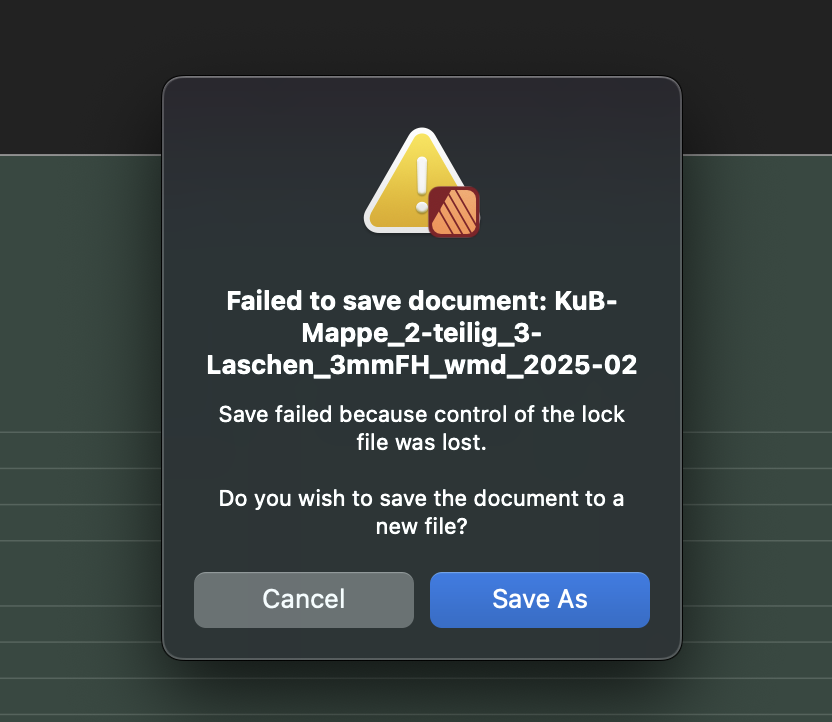
I forgot to add that "Save as" – after that alert had appeared – didn't actually work neither...
-
I've recently been working on two files (both originally InDesign resp IDML files) in Publisher 2.5.6 (on Mac with Monterey) and after some time of making several tweaks I then haven't been able to save them and instead got the alert as seen in the attached screenshot. I had been able to open the files from their IDML versions with no problems at all and they were looking faithful to the InDesign originals as well. While working on them I repeatedly saved them as to save changes made so far. After exporting preview PDFs for my client I I finally wanted to save and close the Publisher files for the day but actually couldn't and the alert you see attached popped up. I had saved quite frequently before and after relaunching Publisher the files could actually be opened normally and could be saved (and "saved as…“) again as well. So fortunately nothing has been really lost. But it's quite embarrassing, nevertheless, when after working for some time on a file you get that alert when you want to save the current state... I had never before encountered something like this and I'm quite a loss for possible explanations. What's that "lock file“ the "control" of which had allegedly been lost, anyway?

-
Dotted strokes are not expanded correctly
Lorox replied to Lorox's topic in Desktop Questions (macOS and Windows)
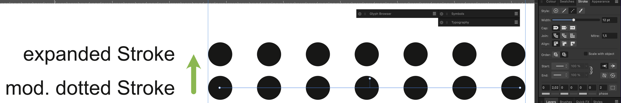
You got to tweak the lenght of the stroke (especially the end node) and you have deactivate the „Balanced Dash Pattern“ checkbox aside from setting the phase to 2 (see screenshot). But it’s almost easier to replace the mutilated circles by hand than to fiddle with the values until it sort of fits… Nevertheless, your idea is appreciated!
-
I just encountered a problem with expanding „dotted“ strokes as I wanted to convert a diagram I created to a „fills only“ version not having any elements which feature just strokes. It turns out that with dotted strokes which have dots at their ends these „end dots“ are not expanded correctly but end up as semi circles or even more or less weird shapes (see attached screenshot). Obviously these dotted strokes are made using settings like those seen on the screenshot (especially featuring round caps and zero length for the „on“ phase). You can actually experiment with the length of that „on“ phase (e.g. setting it to 0,05 or 0,02 – being very careful to not visibly distort the roundness of the dots too much; a value of 0,05 already produces slightly oval dots), but then either the number of dots on the stroke changes affecting the original design (while actually being expanded correctly but of course reflecting that visual change) or (with very small non-zero values) expanding still creates that mutilated dots an the ends of the stroke... Any ideas what can be done? (except actually replacing weird dots manually with circles, that is)
-
Absolutely correct: working/designing with "true“ vector brushes still is one of those things which – from time to time – get me back to using my old pre-subscription-era Illustrator... Also true: "Sometimes you may actually want exactly this kind of tool." (i.e. PNG brushes) – yeah, sometimes I, too, do. However, when dealing with a dedicated and more or lesss professional vector design tool (even if that "branch" is only one of Designer's "personas"), you'd actually want true vector brushes in the first place. Personally I see PNG brushes as some kind of add on that's nice to have but true vector brushes should be paramount here – keeping resolution independent vector "uncompromised". I wonder, though, if these will ever come to AD as well…
-
Convert a selection to a path
Lorox replied to peexel's topic in Feedback for the Affinity V2 Suite of Products
I really do object. I've been using Designer and Publisher for several years now and I've been able to create numerous layouts (mainly for print) that have turned out perfectly well having been produced by professional print services. The results have actually been excellent and they are definitely no worse than anything which I previously had been used to do in e.g. InDesign. Of course, there continue to be quite a few annoying shortcomings, quirks and possibly even straightforward bugs in the Affinity apps and I as well think the interface should be more intuitive and self explanatory in several of its "corners". And yeah, it's frustrating when you have to wait for features and improvements that are – given that competitors have these included in their apps for ages – have been requested over and over again for years by now. However, saying the apps are "completely useless and insufficient as production tools" is just not true and it doesn't help anybody. I for my part am perfectly happy that the Affinity apps have made it possible for me to generally leave Adobe behind (even if I admittedly – however rarely – have to come back to my decades old version of Illustrator now and then to do something special that's possible there, but (still) and regrettably not yet in Designer…) Certainly I'm usually "looking for smooth sailing“, too, but you always have to weigh your options and currently I'd rather give Affinity/Serif some more encouragement to finally listen more carefully to the more "professional“ members of their user base and keep improving and adding essential features than needlessly declaring the apps "useless" and going back to where I have been happy to escape... But then, that's a strictly personal view in respect to the things that I need the apps for – might be different for others. -
Corner rounding on expanded paths?
Lorox replied to Lorox's topic in Desktop Questions (macOS and Windows)
Indeed! It seems, though, that in both cases the final result will be the same: both radii will eventually – and regrettably – be set to same value… -
Corner rounding on expanded paths?
Lorox replied to Lorox's topic in Desktop Questions (macOS and Windows)
Yes, I have V 2.5.6 and this is how I observe it to work. The radius set for the corner node of the outer path in step 1 is kept and assigned to the corner node of the inner path immediately when entering step 2. There is no resetting to 0. -
Corner rounding on expanded paths?
Lorox replied to Lorox's topic in Desktop Questions (macOS and Windows)
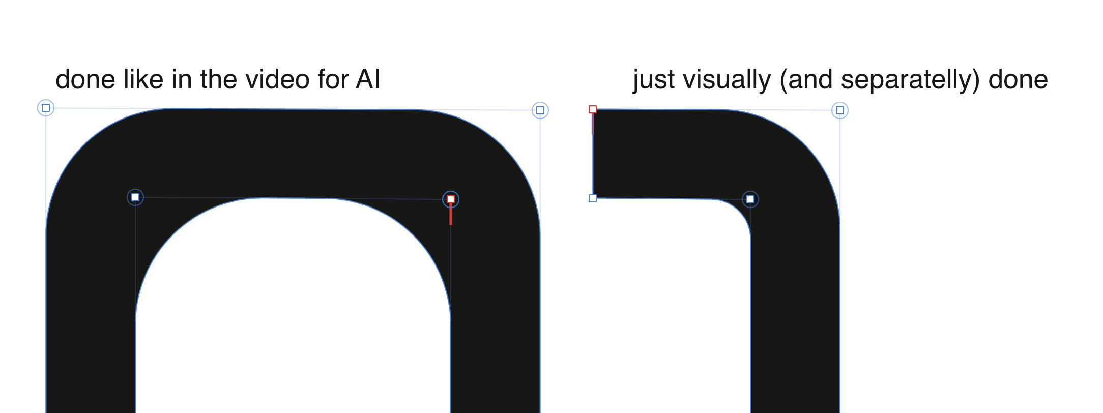
I guess so – and it can obviously be done real quickly with rectangular corners. As with non-rectangular cornes on more complicated forms it seems advisable, though, to wait with expanding until everything is actually shaped as it should finally appear while maintaining a "real" stroke. Keeping an expanded stroke of a more complex appearance in uniform width when making changes to individual anchor points of its inner and/or outer paths can really be a pain in the butt... As a matter of fact I try to not forget to keep "building forms" for construction with "regular" strokes on one or more separate layers and then work on duplicates of these forms for further elaborations including expanded versions. Always better to have something to come back to than possibly having to start from scratch. Nevertheless I wonder why that technique shown for Illustrator as shown in https://www.instagram.com/heyadamdesign/reel/DEaGGAhNbVd/ actually works in AI. Looks like in that case the radius applied to the outer path in the first step – say r1 – is sort of maintained before by dragging with the Corner Tool it is (just) increased by the same value as is set (by the very same dragging) for the radius for the inner path – say r2 – which in step 2 is starting at 0. (As it should be when considering the paths being/becoming parts of concentric circles) In Affinity, though, both of the radii seem to get the same value in step 2 (as GarryP pointed out) – to be precise: the inner radius does not start at 0 while dragging with the Corner Tool in step 2 but is immediately set to the value which has before (in step 1) been applied to the node of the outer path. This is effectively pushing inwards the center of the inner circle in relation to the position of the outer circle making them non-concentric and accordingly making the thickness of the expanded stroke vary… Did Adobe's developers just do the math better or why can't we do it in Affinity as easily (and correctly)? -
I just watched this https://www.instagram.com/heyadamdesign/reel/DEaGGAhNbVd/ short video showing a demonstration of how to easily round corners to appear visually correct on expanded objects in Illustrator – i.e. avoiding visually (obviously) clashing radii on outer and inner paths. Unfortunately this doesn't work in Affinity as it does in AI although you seemingly do corner rounding in quite the same way. Anybody got an idea how to do this correctly in Designer (or Publisher) as well? That is, of course, without doing all the math you theoretically could do to determine the proper radius to each of the paths according to the thickness of the (visual – here: black) outline...
-
Convert a selection to a path
Lorox replied to peexel's topic in Feedback for the Affinity V2 Suite of Products
I'm all with you, guys: for me it's quite a shame that this "selection to path" feature is still missing in Affinity Photo and Designer – but so is "Autotrace bitmaps“ (or whatever you want to call it) in general. I really can't get my head around it that such an essential feature/tool for professional graphic artwork hasn’t been included during all these years. It's been called for so often and by so many users, but still no sign of it on the horizon. Makes me sort of sad and contributes to making it harder than I'd actually wish to wholeheartedly defend or propagate the switch I took from the Adobe apps to Affinity years ago. I'd go so far and say that at least v3 (and on) just has to have it to finally be taken seriously by most professional designers. -
Well, I'll readily admit that these Brushes from Artifex Forge look nice and may be really welcome for designs when you go for that natural/organic touch with your contours. But – please correct me if I'm mistaken – I used to think that the concept of "true" vector brushes (as in AI) is just not there (yet) in Affinity Designer. By "true" I mean that the brush itself is truly vector based so you can eventually even "expand" a contour on which such a brush has been used to a "fill only shape" which then has that – say – "organic" appearance. As far as I know a "vector brush" in the Affinity apps is more or less just a pixel based brush that is applied to (or along) a vector path – something that has been possible in Photoshop for ages BTW... Accordingly those so called "vector brushes" in Affinity won't be resolution independent as "true" vector brushes (e.g. in AI) in fact are. Visually that possibly may not even a problem in many cases, provided that the pixel resolution of the original brush is sufficiently high. But then again there may be cases where you just have to have true vector output – e.g. if laser cutting is involved in the final output of your work. So what is it now about "vector" brushes in AD?
-
Vector 'Filters' and 'effects'
Lorox replied to Grayhem's topic in Older Feedback & Suggestion Posts
Even though I personally don't find myself going back to AI (CS5, as well…) with all of my vector work – as much of the "standard stuff" can be done quite well in AD – I DO still miss those filters and effects every now and then when I strive for that not-so-clean-but-rather-(pseudo)-natural look while keeping it strictly vector. Nevertheless it's actually more than a bit disillusioning that one STILL has to write in this vein after all these years of hoping for the better. This thread is more than 8 years old by now – certainly feels like eternity... -
Affinity Photo v2. Procedural Texture presets don't work.
Lorox replied to barnold84's topic in V2 Bugs found on macOS
OK, according to the mathematical operations applied here this will make sense, I guess – in Photoshop back in the day there also were certain things you could only do in RGB, so it's nothing new, actually. Nevertheless, I wish there would be some alert or help pop-up in Affinity Photo which tells you about it when – while working on a CMYK document – you’re trying to do something which is strictly RGB-only. The app just opening the panel for such a feature which is then showing "would be options" that cannot actually be applied, though, and so leaving the unsuspecting user initially clueless about what's going on here for a good while is not really great user interface style I'd say... it shouldn't be that hard to implement some kind of help function or tool tip for this, should it? -
Yeah, absolutely. As a look that's a bit "organic/handdrawn" seems so natural for so many styles of (even vector) graphics I really don’t understand why the Affinity guys have been neglecting this "vein" of doing things for so long now. The things Illustrator had to offer via its "Effects“ and/or "Filters“ (or the kind of corresponding tools) have been such a welcome extension to the basic tools of vector graphics for getting just the right look of "the line" that I, too, have to get back to my old computer with AI on it every once in a while... ("Real“ vector brushes being another)
-
@David in Mississippi As Carl123 has pointed out, the process that you describe is actually different from masking with a "normal" mask. The process decribed by you does not take into account the color of an object or pixels on that text layer but uses the opacity in that top layer instead. So white text on an otherwise transparent layer will work exactly like black text (or text or other elements of whatever color). In Photoshop there used to be some equivalent since I don't know when – it's called "Masking Group“ or "Clipping Group“ (I don't remember exactly, it's been a while...). It's main advantage over regular masks is that you can use "live" text (which remains editable) this way. With regular masks which are basically greyscale images (working the old "white reveals, black conceals" way) you cannot do this, when you assign one to a layer (as they are strictly pixel based). That being said, I have to confess that Affinity's way of handling the whole masking business has in fact left me (with 25+ years of Photoshop experience) baffled (and looking fo solutions online) more than once. Whereas in PS – after the initial learning phase, or course – it had been 100% clear to me how this works, there always seemed to be something in Affinity's way of doing it which felt strange and sort of counterintuitive. Nevertheless I won't give up and hope I'll finally find out what exactly causes this sort of "friction“...
-
No document-wide replace font?
Lorox replied to Jeremy Bohn's topic in Feedback for Affinity Publisher V1 on Desktop
@Alfred Well, yes – you may be right. I admit that I haven't really used the Find and Replace Panel as I probably should have... But I'm actually trusting your advice and I will try to do so in the future. So thanks a lot for pointing this out to me – just have to break my habit a bit, I guess...! -
No document-wide replace font?
Lorox replied to Jeremy Bohn's topic in Feedback for Affinity Publisher V1 on Desktop
Yes, but you have to do it manually one by one instance(!) (or maybe a bit more summarily via Find & Replace – but that's a bit of a detour for me). I was thinking of a general way of doing it documentwide in one go for any one font via the "Font Manager". That is, any specific (missing) font weight will need separate attention as specific replacement fonts may not have exactly the same font weights as the missing font. Meaning you cannot globally substitue/replace Helvetica by Futura as the available weights are quite different in each font family. -
No document-wide replace font?
Lorox replied to Jeremy Bohn's topic in Feedback for Affinity Publisher V1 on Desktop
Maybe – but honestly: this certainly isn't rocket science, is it? Why can't there be an option of alternatively choosing "(Temporarily) Substitute“ or "Replace (and keep replaced font)“ when dealing with missing fonts? To me it just seems to be a question of either saving this particular choice with the document or not. Temporary substitutions then would only be "remembered“ as long as the document is open and will be "forgotten“ once you close it while replacements will be saved just like any other regular changes you make in a document. I'm no software developer, but it seems quite straightforward (not to say easy), anyway. -
Indeed – it seems to be such a simple (yet helpful) thing that you really wonder why it is not implemented here. All the more as it works as you'd expect with other selection tools... Maybe they just forgot about it?
-
Having just done a bit of retouching work in Affinity Photo and using the Selection Brush tool a bit I'm finding myself wondering why there seems too be absolutely no indication – like a little "+" or "–" sign – showing the mode you're in while holding the appropriate modifier key (ALT resp. CTR). I find this really irritating – and for a while even thought you maybe couldn't toggle the mode at all using a mofifier key when using the Selection Brush... Obviously it isn't a problem with the regular Marquee Selection or the Lasso tool to give this reassuring little visual feedback – so why on earth has the Selection Brush have to do without?
-
New Document - set default-language
Lorox replied to Fritz_H's topic in Feedback for Affinity Publisher V1 on Desktop
Hi Mike, thanks a lot – this actually works! (I treated v2 first, but will extend it to my heritage v1 as well) BTW: as your PDF comprises of just one spread it stops a bit short at the end when dealing with the setting of the ”Base” style... In case anybody wonders how to end the procedure: when you look around a bit in the dropdowns in the Text Styles Studio/Panel, you will find you'll the option to ”Save styles as Default“, which you will have to do eventually. -
This seemed to worked at first, but only for the document I've done this in. Also initially when no document is open (like you said/wrote). However, as soon as I create a new document the setting in the Character Panel reverts to „English“ for the Language. I would have thought the (changed) „Defaults“ should apply to any new document created after the fact, but they obviously don't. P.S.: It's the „Edit“ menu where you find the „Defaults“ entry mentioned above, not the „File“ menu – so it took me some time to find it...
-
I just tried and maybe I have an explanation: If I create a new file of the original via "Save as…“ the Title (or the "Title" field) of the PDF gets updated – just like you wrote. However, if I copy/duplicate a Publisher file in the Finder and then subsequently change its file name in the Finder, the PDF Title (or the content of the "Title" field) of the original file is actually preserved! I guess that my "new" file (as mentionend above in my original post) had been created by just duplicating it in the Finder and I then used it for the new project – most likely the Title will eventually update if I "Save as…" this new file under an even newer name..
-
I just found the place – but it's so well hidden! WIndow > References > Fields