

All Media Lab
-
Posts
473 -
Joined
-
Last visited
Everything posted by All Media Lab
-
WebP in Affinity Photo
All Media Lab replied to Burndog's topic in Pre-V2 Archive of Desktop Questions (macOS and Windows)
Me too! -
WebP in Affinity Photo
All Media Lab replied to Burndog's topic in Pre-V2 Archive of Desktop Questions (macOS and Windows)
Hi @NoSi, Yes of course they can and you don't need the fancy JavaScript like I use or imagekit/cloudinary. Just the plain HTML you see here is one image of a Bootstrap image slider or you could use this code for an image header on any device including portrait mode on a mobile phone: <picture> <source media="(min-width: 36em)" srcset="assets/Responsive-Images/nieuws/header-news/header-info-webp/header-info-1000px.webp 1000w,assets/Responsive-Images/nieuws/header-news/header-info-webp/header-info-2000px.webp 2000w" type="image/webp"> <source media="(max-width: 36em)" srcset="assets/Responsive-Images/nieuws/header-news/header-info-webp/header-info-phone-800px.webp 800w, assets/Responsive-Images/nieuws/header-news/header-info-webp/header-info-phone-1250px.webp 1250w" type="image/webp"> <source media="(min-width: 36em)" srcset="assets/Responsive-Images/nieuws/header-news/header-info-jpg/header-info-1000px.jpg 1000w, assets/Responsive-Images/nieuws/header-news/header-info-jpg/header-info-2000px.jpg 2000w" type="image/jpeg"> <source media="(max-width: 36em)" srcset="assets/Responsive-Images/nieuws/header-news/header-info-jpg/header-info-phone-800px.jpg 800w, assets/Responsive-Images/nieuws/header-news/header-info-jpg/header-info-phone-1250px.jpg 1250w" type="image/jpeg"> <img src="assets/Responsive-Images/nieuws/header-news/header-info-jpg/header-info-2000px.jpg" class="img-fluid"/> </picture> The jpg's are created in a custom Affinity Photo export preset and unfortunately the webp's are converted in XnConvert! If more applications would support webp it will get more populair. -
WebP in Affinity Photo
All Media Lab replied to Burndog's topic in Pre-V2 Archive of Desktop Questions (macOS and Windows)
Hi @Oval, Yes you have a point! It was more ment to show the image system working with webp and jpg fallback. The link was an old Bootstrap 3 example from 4 years ago, this new link provides the latest version of our full screen image system with the images coming from https://www.imagekit.io . You can do the same test if you want. The optimization is done automatically on the imagekit server and jpg is set on 80% optimization. Notice that the webp's are first recognized as jpg's, but correctly named webp in network of the def tools. THE NEW LINK TO TEST WEBp VS JPG Regards, David -
WebP in Affinity Photo
All Media Lab replied to Burndog's topic in Pre-V2 Archive of Desktop Questions (macOS and Windows)
Nobody said that webp solves all SEO problems, only that it's an important part of SEO nowadays! https://growthhackers.com/articles/why-is-google-s-new-image-format-webp-so-critical-to-seo https://inboundjunction.com/why-webp-is-critical-to-seo#:~:text=Google Knows SEO&text=WebP is no exception.,providing the same quality experience. https://insanelab.com/blog/web-development/webp-web-design-vs-jpeg-gif-png/ Yes the people of inbound junction don't know what they are talking about! You know it better! They make money with implementing webp everyday like my self. And a question: Why do you think webp is implemented in all browsers except for Safari? To make nobody using it? -
WebP in Affinity Photo
All Media Lab replied to Burndog's topic in Pre-V2 Archive of Desktop Questions (macOS and Windows)
The problem is that you always have something to say, but no real arguments based on facts! Maybe it's time to not lurk around this forum all day and take a nice walk outside! I know what I'm talking about and you proved to me that you don't. If you don't want webp in Affinity fine! Some other people would be delighted when it was implemented in the export panel. I work with webp every day! -
WebP in Affinity Photo
All Media Lab replied to Burndog's topic in Pre-V2 Archive of Desktop Questions (macOS and Windows)
Will remove the link shortly! -
WebP in Affinity Photo
All Media Lab replied to Burndog's topic in Pre-V2 Archive of Desktop Questions (macOS and Windows)
Hi @R C-R & @carl123 https://www.smashingmagazine.com/2019/10/speed-up-your-website-webp/ Beter do your homework before making assumptions that are not true. Web design and SEO are an important part of my profession! https://moz.com/learn/seo/page-speed Regards, David -
WebP in Affinity Photo
All Media Lab replied to Burndog's topic in Pre-V2 Archive of Desktop Questions (macOS and Windows)
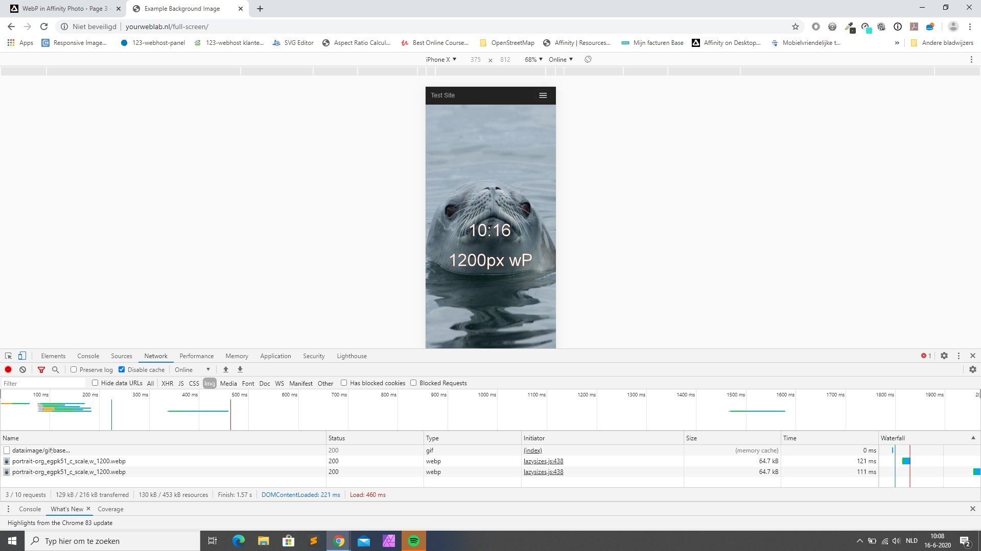
I wonder why you say that..... based on? Hope you have access to a Mac with Safari and or Xcode and a Chrome browser or any other browser that accepts webp. Try this full-screen image system I developed my self with webp and jpg fallback based on: https://github.com/aFarkas/lazysizes. Open the dev tools and notice in Network that you save up to 60% bandwidth compare to the jpg (optimized with jpegMini) that are there for fallback. The issue is not only speed advantage, but also it saves energy in a huge way! And of course it's a SEO boost. https://yourweblab.nl/kit/
-
WebP in Affinity Photo
All Media Lab replied to Burndog's topic in Pre-V2 Archive of Desktop Questions (macOS and Windows)
I agree! Google measures the page loading speed in general (no matter if the faster page load is caused by the use of webp, minifying code, async loading of the scripts or what ever), so when you use webp with jpg fallback you have a 30 to 40% smaller bandwidth of the particular web page on almost all modern browsers except for Safari. The page speed advantage reflexes in the search results. But like me lot's of people use Chrome or Firefox on their Mac. Nothing unfair or noncompetitive! Everybody is entitled to implement webp for free in their websites and use the source code in apps like the Affinity ones. The problem is that there is no alternative at the moment for webp and works in most browsers. So Google is not dictating, but strongly advising in a smart way😉. https://developers.google.com/speed/webp/docs/api -
WebP in Affinity Photo
All Media Lab replied to Burndog's topic in Pre-V2 Archive of Desktop Questions (macOS and Windows)
Yes but this is what you have to deal with on this forum when it comes to Affinity comments about webp. A honest discussion based on facts seems to be impossible. -
WebP in Affinity Photo
All Media Lab replied to Burndog's topic in Pre-V2 Archive of Desktop Questions (macOS and Windows)
I'm not the one who was saying this! Moderator and Affinity staff member @Ben was! I quoted him to show you the way they think about it and with what info on the subject they motivate their ideas. -
WebP in Affinity Photo
All Media Lab replied to Burndog's topic in Pre-V2 Archive of Desktop Questions (macOS and Windows)
Hi @R C-R Think you didn't read this: https://forum.affinity.serif.com/index.php?/topic/85857-affinity-not-for-webdesign-no-webp-still/ -
WebP in Affinity Photo
All Media Lab replied to Burndog's topic in Pre-V2 Archive of Desktop Questions (macOS and Windows)
Yes true! I even linked them to the Google developers page with the source code to implement webp, but no luck. Of course we all use some other app to solve this problem, but it's strange that it's still missing in Affinity apps. -
WebP in Affinity Photo
All Media Lab replied to Burndog's topic in Pre-V2 Archive of Desktop Questions (macOS and Windows)
Hi @NoSi Because despite the fact that all major browser support webp (except for Safari) and it's widely used in modern webdesign and game design, somehow the Affinity staff and some developers don't see the importance of having webp in the export panel. Have had discussions with a developer from Affinity on this forum and it's like talking to a brick wall. This feature is ask for for years now! David -
Yes they are square nodes. Do they only appear when you activate them with the pen tool or can you pull them out with the node tool? (it's my first tutorial with the pen tool, but it's not well explained).
-
Hi, I'm working with the pen tool to create some shapes that are merged together with "add" later on. Some nodes that I have created don't show the handles. What can be the reason? Regards & Thanks, David
-
Hi, Is there any way to create for example a square and change the stoke thickness only at the bottom of the square in Affinity Designer? Regards & Thanks, David
-
Hi, I have set the preferred application (Affinity Photo) for my Tiff files in my Mac. Now part of the Tiff's only show the Affinity Photo icon instead of the thumbnail image. How do I get only the images shown instead of the icons? Regards & Thanks, David
-
Thanks Walt! Editing text works now. But it still doesn't look like it should. The text is grayed out in Affinity Photo and in Photoshop it looks like a engraved peace of rock/stone.
-
Was trying this one, but can't edit the text: Stone_engraved_text_effect.zip
-
Thanks for your reply!
-
Hi, Just wonder when I export slices in multiple sizes in Affinity Photo is sharpen already taken in account by the application or is there a way to apply sharpen to the slices during the export? Regards & Thanks, David
-
Hi Mark, When you are UX and UI designing for an IOS application the "points methode" can be a way to do it, but this is a very specific app in devices design methode. There is a whole chapter in the Affinity Designer workbook about this! The title of your post and your questions have lead me to the impression that you wanted to make a website mockup? If so that "points methode" is completely unnecessary and you can use any PPI DPI (it doesn't make any difference) and use the Bootstrap mockup templates I provided you with. Stay in the "web 72 dpi" modes (for you own well being😉 makes no difference anyway) of the Bootstrap mockup template document setup and start filling in the multiple device templates with content like text and images etc. And that's all there is to it!!!! Be aware that common icons that are part of a font set (like font awesome) are all made out of vectors and don't need any responsive images (you can scale them without quality loss). For images you only need one size (and orientation/art direction for all devices in the template) and the webdesigner takes care of the multiple sizes. In most cases web design companies use a service like Cloudinary that can resize and optimize images on the server and on the fly. In one of the seal examples I gave you the link for I used imagekit, It takes care automatically of all image sizing cropping etc. when it is loaded in a device. All I have to do is deliver 1 image in a big size and the art directions to the imagekit server. And if they (the web design companies) want you to deliver the images you can do it the way I showed you in the Affinity Photo export examples in my previous posts. Regards, David
-
Hi Mark, https://www.udemy.com/course/web-design-affinity-designer-affinity-photo-windows-serif/ I did not give you the link for nothing! Your replies in German still prove you don't understand it. I attached the grids for you to this post. They come from: https://hackerthemes.com/bootstrap-4-affinity-designer-grid/ Have a close look at it! They contain the proper sizes as a start and give you a idea how to set it up. Regards, David There are two links at the bottom: bootstrapGrid.afdesign bootstrapGrid_noArtboard.afdesign
-
https://www.udemy.com/course/web-design-affinity-designer-affinity-photo-windows-serif/ Mark, I suggest to follow this course first to clear all things up! Regards, David