abra100pro
-
Posts
510 -
Joined
-
Last visited
Everything posted by abra100pro
-

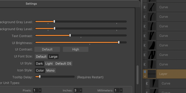
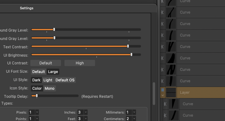
User interface Text contrast has only partial effect
abra100pro replied to abra100pro's topic in V2 Bugs found on macOS
Thanks @NathanC, Affinity might consider fixing the above mentioned bugs features, as well. It's about time... -
User interface Text contrast has only partial effect
abra100pro replied to abra100pro's topic in V2 Bugs found on macOS
Why, but why? I work in web development. when our applicatiins do have issues (I don‘t even call them bugs) like that, we fix them within days. customer happy. I changed gladly from Illustrator to Affinity years ago, because the apps were easier, lightweight, faster(!). But there are some issues I simply don‘t understand why they‘re still there: above all these: this one above (fixing time: 15mins, no?) artboard placement on the canvas and the impact on their dimensions (major super big issue for years). it‘s been discussed a lot in here IMHO there is no reason to not call this an issue but a feature. The super lousy preview on export - that‘s more like from an unbeloved project all students had to to finish quickly. stroke weirdness when fiddling with their thickness artboards having a background colour and bleed: background colour is not extending to bleed at export. yes this is no a bug, but think only 30 seconds (or hours if you wish) and it is obvious that this makes no sense in any situation. -
Text contrast (3rd slider) does not change the (very weak) layer names – please see images.

-
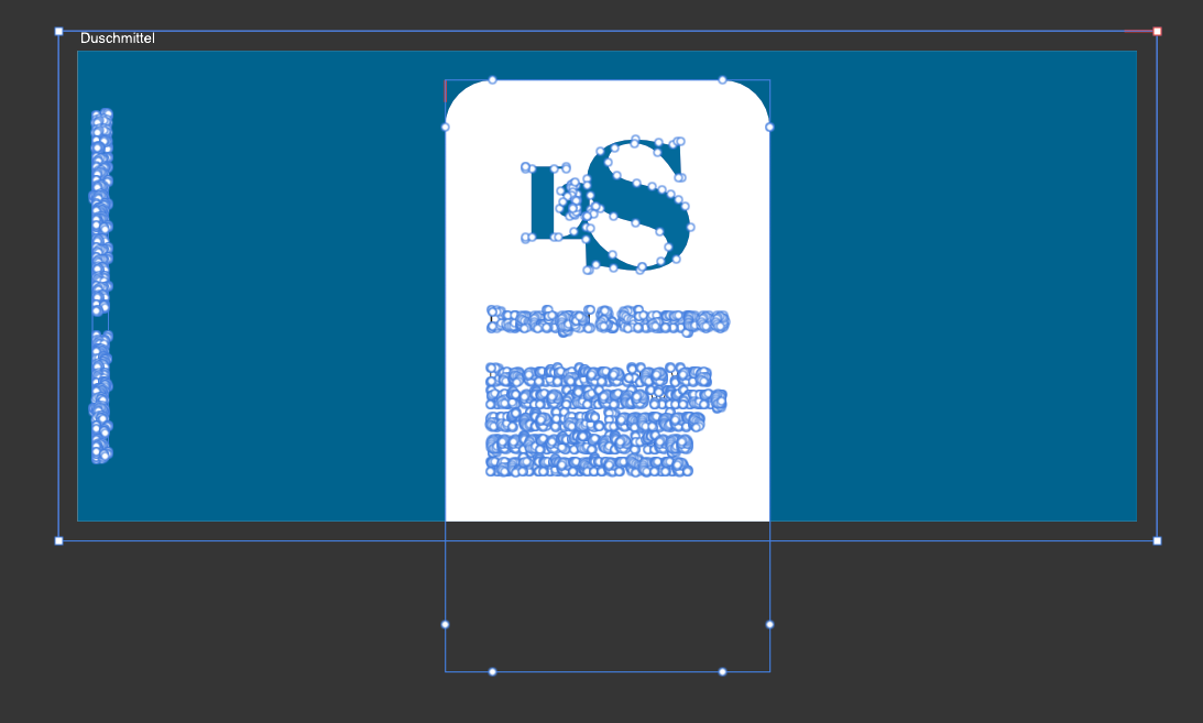
All unusably rendered as pixels though there aren't any.
abra100pro replied to abra100pro's topic in V2 Bugs found on macOS
...... it was the selective color adjustment layer that was still on top. I wasn't aware that this makes it pixels. But the shadow makes it also pixels – shouldn't shadow be (part of) vector graphics? -
All unusably rendered as pixels though there aren't any.
abra100pro replied to abra100pro's topic in V2 Bugs found on macOS
AD 2.6.2 Yes. please find it attached.Las Guschgel-Etikette.afdesign Am I curious. -
All unusably rendered as pixels though there aren't any.
abra100pro replied to abra100pro's topic in V2 Bugs found on macOS
I've converted everything individually to curves and still export says "some areas will be rasterised". I go for a walk.
-
I have this design and everything is vector/font but the Export seems to render the whole PDF output into an unusable pile of pixels. Also destroys layout when converting to curves. See video. In the video you see, that I removed the shadow in order to be sure not to have anything to be rasterized (however: why?). Also: "Some areas will be rasterized" is as helpful as "you have an error in your 30'000+ lines of code". Why not showing the areas? AND: The preview of export is still complete c**p. Of no use at all. Still. I'm a bit tired of this, I must say. AD-Problems.mp4
-
See movie: moving the artboard zooms slightly out the canvas. AD Zoom out canvas.mp4
-
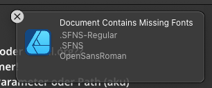
If there are any fonts missing, why not allocate them and giving a possibility to replace them? And why do they not appear in ressources manager? This would in fact be gorgeous: replace all comic sans with Helvetica ;-).
- 1 reply
-
- 1
-

-
Slow startup (all Affinity apps)
abra100pro replied to Andrew Berth's topic in Desktop Questions (macOS and Windows)
Here on my M1 Sequoia AD,APub and aPh are ready in 6 seconds after click to open. -
I gave up on this – it won't come anymore. This is the way it started with Adobe, then. Just ignore the folks hard enough. At that time in lack of alternatives it worked. Not so anymore.
-
Selecting elements doesn't work (as it used to)
abra100pro replied to abra100pro's topic in V2 Bugs found on macOS
Not sure, but you're right, that was the issue. Thanks for making this clear. I assume it's a feature, then... -
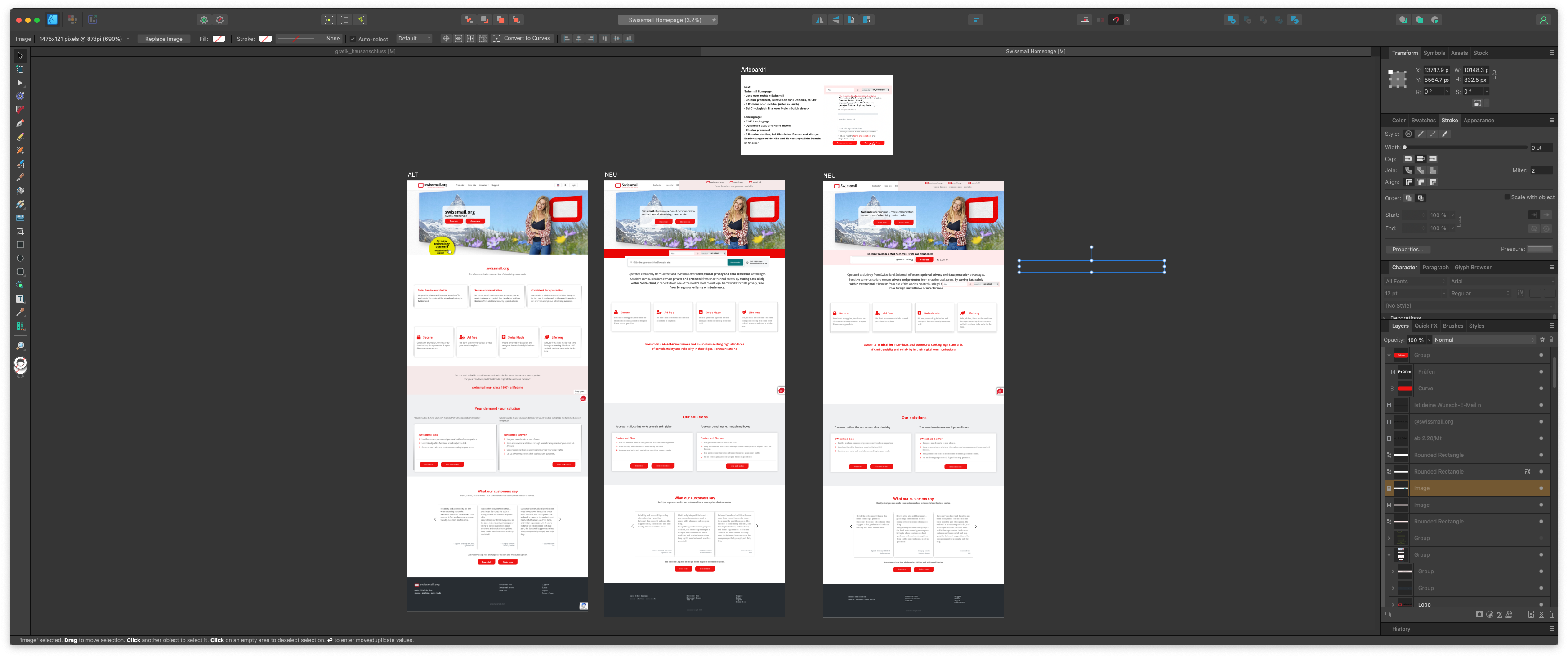
Hi, I cannot select elements, that are obviously on the artboard – see movie. I have the appropriate preference set: Any clues or confirmations? Screen Recording 2024-12-03 at 14.59.32.mov
-
Right Said Fred. +1
-
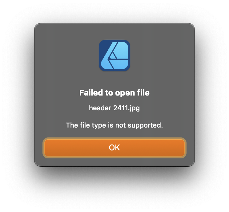
Hi @Hangman It is a JPG I export from a PSD in Photoshop, each time I change it. It's on my internal drive and linked to in AD. (Should I mention: copyrights apply).
-
I get this message everytime I update the JPG and AD syncs with the updated, linked file. The update itself works. AD 2.5.5 / Sequoia 15.1
-
That is 2.6 and yes, it was Edit all layers at the Layers panel's bottom.
-
As always (I can remember) @walt.farrell you're right. The edit all layers was the culprit. Now it works again in 2.5.5. Thanks!
-
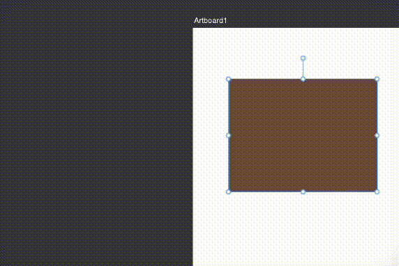
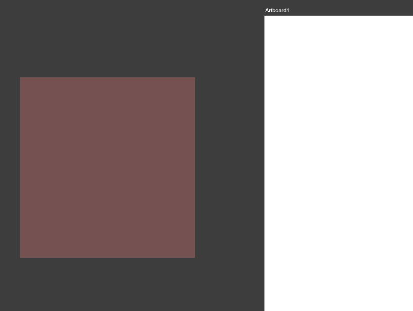
So, I downloaded 2.6 and – tadaaa! – there it is (again?): elements outside the artboard are visible, respectively act exactly as described by @walt.farrell. Either my 2.5.5 has an arrow in the back or I and Walt really messed this up.
-
One more thing that I dislike, the list gets larger... how am I supposed to work fluently in a design process, when I can't put things around the artboard? And if @walt.farrell is mentioning it, I think there is/was a way, no? really?
-
I'm pretty sure this wasn't always so.... and it would be incredibly stu**d . Ho should I arrange stuff, Juggle with elements? It can be, that I confuse it with Lunacy, which handles out of the artboard stuff as expected (and described bei Walt).
-
The object is still within the artboard layer-wise. I dodn't know if that was always so.
-
macOS Sequoia 15.1, AD 2.5.5
-
In AD this used to be but now, as soon as I draw something completely out of an artboard it is invisible. Do you have any clues?