Bit Disappointed
-
Posts
550 -
Joined
-
Last visited
Everything posted by Bit Disappointed
-
I haven't fiddled with it long enough to have a definitive conclusion, but isn't it my understanding that we can't control which blend mode FX is rendered with? I work with very accurate colours in some of my elements, and I can see on greyscale elements in particular that 3D FX changes the colour towards blue. At least that's what happens in my current design. It's frustrating that the colours shift when I put FX on some elements as the last modification. I would really like to be able to set the blend mode for FX to luminosity in this case. Can you already do that - and don't I have a point?
-
 🥱 Yes, but I'm not a hobbyist, so I prioritise stability and performance above all else.
 -
Now I'm depressed. I struggle with and curse this bug every single day on the fast iPad Pro 2022 M2, and never imagined you didn't fix the problem in a subsequent 2.2.x fix. I can't, may not, and won't use beta software for production work, so I'm going to be waiting months for a fix I don't know is coming, which is also frustrating.
-
I did notice.
-
Does this mean that there will be no v2.2.2 etc. or simply that these will be handled in production groups/threads?
-
Thanks @retrograde I know about it. I think it's functionality that was added not long ago so that impact can be handled with bicycle patching gear when an accident has happened, and as useful in other contexts of course. So Serif, it would be so helpful if you could set the default in a predictable and central location so that the accident never happens. 🙂
-
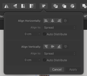
Thanks for your reply @ash If you notice, the UI around this pop up dialog is significantly more readable, I just don't understand why this dialog should NOT stand out. It is the reverse logic of how you normally present a pop-up where the rest of the program is muted while the pop-up appears clear. HERE I AM! You use the reverse logic that the pop up has less contrast and no prominent icons. The icons in the box appear gray and without contrast, however in contrast to the fixed icons JUST ABOVE which appear with a clearly lighter color. Thus, there is no consistency in how icons look as active or inactive. I also don't think those contrast ratios pass an accessibility inspection. The customer does not have to adjust the interface to make it accessible and user-friendly, that is the company's task. 🙂 Also, I use monochrome icons - I don't see any blue lines. It's all washed out. The icons above appear clearly, the dialogue below significantly weaker. It makes no sense! Default settings used. Look at how Adobe has done it in the Creative Suite - here it is clearly signaled which icons are active and inactive, and their inactive icons look like your active ones. Adobe signals clearly and correctly what is what. Further, the icons in the toolbar and in the dialog have same visual appearance active as well as inactive - and they are also synced. Link to Adobe example video

-
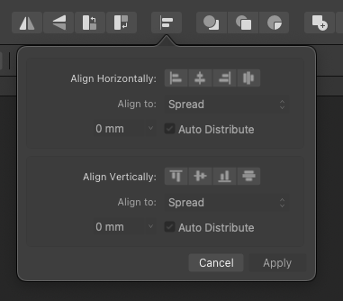
Hi Serif staff macOS 14, AD 2.2.1 I don't know how many times I've opened this dialogue from the toolbar in Designer, thinking that all these icons are inactive and that I've selected something wrong, because there is no contrast or contrast difference between what is active or not, even the text disappears in a grey fog. Only cancel stands out. And yes, staff, this kind of thing is a bug. It's incorrectly implemented, it's not opinions or colouring, it's a bug.
-
GAP Tool in Publisher
Bit Disappointed replied to nmatsuo's topic in Feedback for the Affinity V2 Suite of Products
- 3 replies
-
- 1
-

-
- affinity publisher
- layout
- (and 1 more)
-
Previous discussions were centered around creating a cut line yourself but it seems to be automated now: https://www.stickermule.com/eu/support/cut-line I've printed stickers before for fun mostly, otherwise I've mostly printed my stuff like large posters and larger framed illustrations. Do any of you have any recommendations or experiences? It needs to be shipped to the EU, so distance and taxes are relevant to me. Just to say my need is not super serious this time, but I'm looking into doing some marketing products myself and expanding my activities for special and isolated events without having to initiate everything and everyone. So I'm also interested in whether the quality of prints and products is ok and whether there are better alternatives.
-
No thank you, because it will continue the problem in exactly the same track that Serif has been on for as long as I can remember. Memorize the software or study manuals like in the 90’s. It's all well and good to have a supplementary, easily accessible icon as you illustrate for ad hoc changes to individual elements, but it's not good usability for settings you need to be able to set and forget in one place. Furthermore, Serif has implemented several settings messily and all over the place in toolbars like in your example - but not consistently sticky - and hasn't fixed it for years. It's a mess. On top of that, it requires everyone to memorise all those little icons. And you have to memorise that in an extra edition if you also use iPad - either how to do it or live with the fact that there is no space in the user interface and no equivalent to the desktop feature. I request central settings for key functionality and behaviour that can be set collectively and professionally in preferences after any installation, be it Windows, Mac or iPad, so I can work risk-free and as expected without having to make sure icons that are placed all around the user interface are enabled or disabled. For months or years. It's high time Serif streamlines preferences, usability and workflows.
-
To Serif Staff and @Ash I've been meaning to write this feature request for years, and it's been partly written before by others, but now I'm doing it with passion, two dashes underneath and weariness in my soul. Because I spend too much time correcting the flaws in Affinity in my work. There are a number of usability flaws in Affinity, and they are well-reported. I can live with some, but not with others. There are some flaws that simply must be fixed now, and not as small fixes, but in a fundamental and structured way. I can only recommend that a future release should be dedicated to only settings, usability and workflows. That you take all these reports from customers seriously and resolve them in a serious and structured way. And give yourself the time, space and dedication to stop and rebuild some of Affinity instead of patching holes as you go. I would just like to request two things to be fixed at this time, and at the same time I would like to ask you to have preferences expanded and structured so that your customers can avoid workarounds and endless detours to the greatest extent possible by setting good default settings in one place. Not small additions - but get it set up professionally and user-friendly. My specific request: In ALL my work, I want to use FX: Scale with object ON and Stroke: Scale with object. The few times the opposite is the case, I want to be able to disable it. The opposite of today. But they are not enabled by default, and in the case of stroke scaling you have to change a default for the object, which you can't do with FX. But somehow again and again I find these settings disabled. On my computers, on others... constantly. I create lots of small and large objects with FX, and I can't believe I have to set scale with object on each one. Why on earth can't I just set defaults centrally in preferences once - and change them again if I need to use other defaults? All the nonsense that has built up over time in Affinity deserves its own release, so you can also build architecture and methodology around the corrections, so that it is corrected logically and technologically appropriate. Preferences as of today is still pretty messy. I am not looking for workarounds or object inheritance. Just want to enable scaling and never look back.
-
Select same fill doesn't
Bit Disappointed replied to Bit Disappointed's topic in V2 Bugs found on macOS
Ah, I may have switched to my favourite HSL along the way. Well, Serif, if there is no way around the colour space technicalities, it would be really helpful to turn up the usability and notify the customer that different colour spaces are in play in the document that may affect the outcome of 'Select Same'. There's real potential for what I experienced to happen again and again with customers. "Furthermore, I consider that true graphic styles must be implemented." (Bitarts the Elder) -
"Serif customer since 2007" I'm a veteran of Serif's waiting room. 🙂
-
Thanks for the workarounds and explanations, guys. I will be sticking with my feature request as I think it's a natural natural and common need, while it's somewhat mechanical for me to have to adjust to these tricks. I don't build my rather complicated designs in a linear, predictable and logical hierarchical structure, but it all emerges along the way, and I build the structure as I go, tidying up with groups and hierarchies - and have many clipping objects. I just need a small feature to accommodate people who work this way.
-
Interesting advice, thank you for your time @Hangman Probably not always possible due to my complex designs but I'll give it a go.
-
Hi Serif I never myself needed the 'Select all items on current layer' command but I do often need something like a Select all items on current level (in layers hierarchy) no matter what context they are in: grouped or nested. One could think that selecting them indirectly selecting the group element or mother element (nested items) would be sufficient, but I need to select the items individually in several use cases. For example when I need to change properties like FX that I need to be preserved if I later move some of the items to another location. In that case FX properties from the group element are lost. Again, having this and with a shortcut it would make my life easier on desktop and especially on an iPad Pro with a keyboard. Mentioned here with examples of workarounds and no workarounds:
-
Ah, of course. Thanks! Well, it is such scenarios where I would like a select all on current level command that just does exactly that. 🙂
-
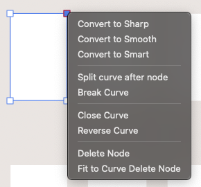
I would like to see keyboard shortcuts implemented for: Convert to Sharp Convert to Smooth Convert to Smart in both the desktop and ipad version. On the iPad they would really help together with my keyboard!
-
I just tried it in this quick'n'dirty file where disabling edit all layers has no effect? Select same fill.afdesign This happens when I then select an object in a group and then command+a for select all:
-
Select same fill doesn't
Bit Disappointed replied to Bit Disappointed's topic in V2 Bugs found on macOS
Thanks for the tip and for the reply @NathanC It's a bit of a weird rounding error, as it's an incredibly primitive sketch I've made in just a few minutes using ordinary, mundane work processes, so the risk of the error occurring must be high. Select same... is also a method I don't like to use for much of my work. Serif can solve so many problems for the meticulous or professional customer by implementing true graphic styles that would put Designer in a whole new league. Have a great weekend -
Bulls eye. AHA! Thanks - that is what I am looking for!
-
If you select the group only the group element is selected - not the individual elements - and if you alter values like FX for the group and later move one single object from the group to another group - it won't have this FX value. So I am looking for an easy shortcut to select all individual elements on the current level in the layers hierarchy. In several use cases. Typically inside a group. It would really be helpful on the iPad.
-
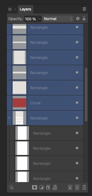
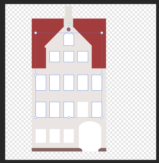
macOS Sonoma 14.0 and Designer 2.2.0 + 2.2.1 release candidate 3 Now, I am tired and struggling with a fever so my concentration could be weak, but this is not working as it should, right? All these elements have a white fill colour, same value. Select the door only. Select -> Select same fill color. Only these objects are selected: Select one window from the third row from below. Select -> Select same fill color. Only these objects are selected: I see only this fill color value whatever object I inspect, so what the duck? Select same fill.afdesign