Belldorado
-
Posts
6 -
Joined
-
Last visited
-
Spiral Tool
Belldorado replied to Ash's topic in [ARCHIVE] 2.4, 2.3, 2.2 & 2.1 Features and Improvements
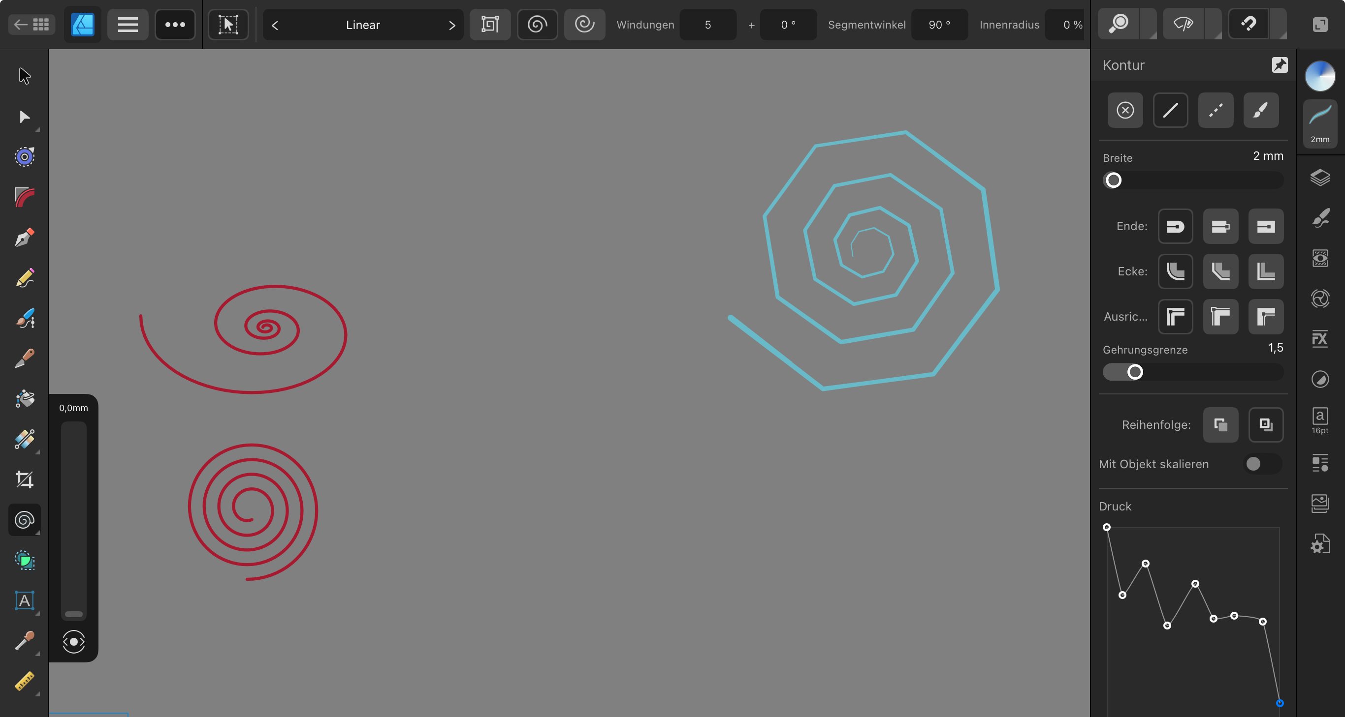
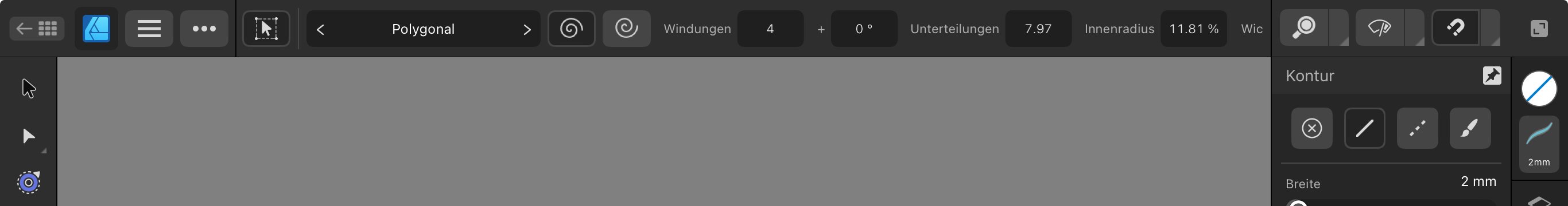
I like the new spiral tool a lot, very handy addition to the existing tools! Since I mainly work on the IPad version of AD, I want to report that for some types of spirals some of the panels to enter the values and the „bake appearance“ buttons are cropped. At least with the German version. I think nothing of the usability got lost, yet still I am wondering if a function remains hidden under looking glass, windshield wiper and magnet. And I am super curious to learn the full description of „Wic“ with the polygonal spiral. Using landscape format, with portrait format the tool is almost useless. —- after writing this I found out that the bar is scrollable! „Wic“ is „Wichtung“! I have never heard this word before. Richtung? Wicklung? Gewichtung? The scrollbar is very hard to grab without creating another spiral instead, especially when not using a pen but a finger. It also always jumps back to the left start after changing a value which make it very complicated to compare the results. Especially with the decreasing spiral some interesting features are hard to use. Nevertheless a cool instrument!
-
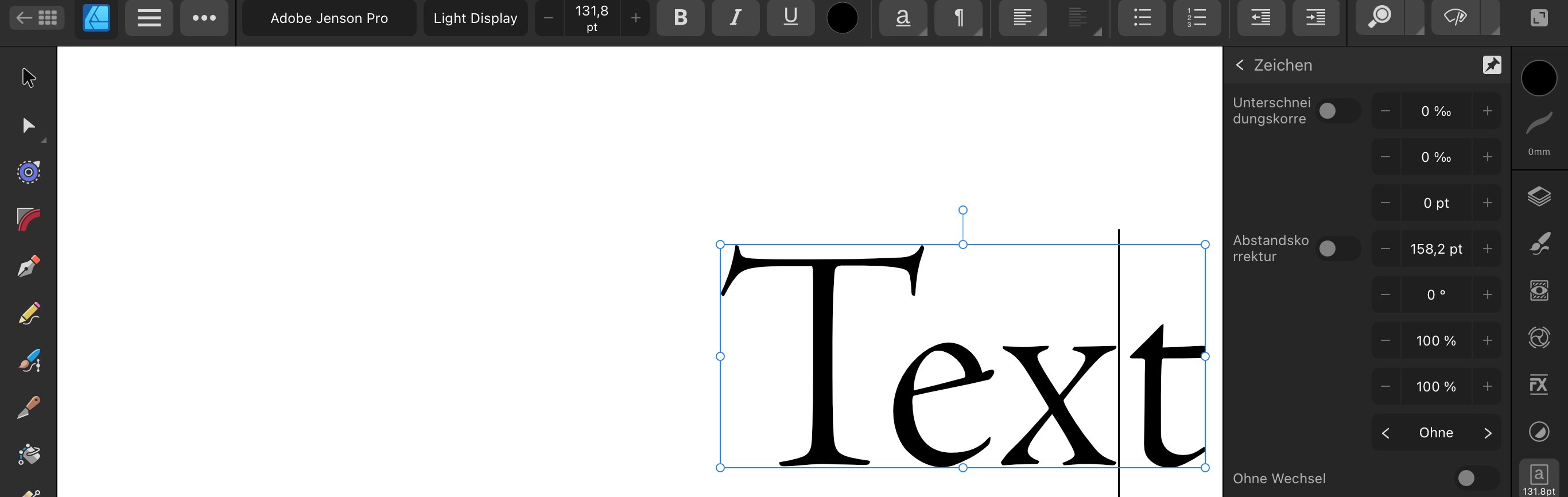
I know it is - but it’s a very ”hidden feature” and now with 2.2 almost became unusable – at least in the German version. Something got very messed up with the describing text (if it is still there) … see attached screenshots. It‘s a problem with both, Designer and Publisher. If you wonder how to access that feature: you have to hit the arrow on the right side of the B I U S buttons in the text studio, and then select ”position” – now you would be able to do your corrections if you knew what value has to be changed. Adjusting kearning and letter-spacing is very important for a designer working with text. I suggest to completely reconsider this section of the text controls. Go back to icons, don‘t use text (this would also avoid problems with strange wording – nobody uses ”Unterschneidungskorrektur” or ”Abstandskorrketur” … ). Some information is over prominent, double or triple, even if not needed a lot, while other important tools are so hard to find. The whole interface here should be more like the desktop version and pick up the visual standards we have learned using Quark Xpress, Freehand, InDesign, Illustrator … Except for the text studio I am very happy with the current version of the IPad apps! Thank you, keep up the good work – I am sure you will have a nice Christmas present for us
-
I have been testing the new function and also if it is not the super direct solution I would have preferred (double tapping the name in the layers menu) I think it‘s more intuitive, easier and faster than the old way of renaming things. There’s one rather cosmetic problem, at least with the German version: no matter what you want to rename, it is called „Ebene umbenennen“ (rename layer) - although it might be an artboard, group, object, path or layer. I guess it is the same with the English version and I suggest to simply use “rename” or „umbenennen“ as a more generic expression that will fit for all kind of elements.
-
 Ash reacted to a post in a topic:
Designer V2 IPad change layer names
Ash reacted to a post in a topic:
Designer V2 IPad change layer names
-
Cool! Thank you, Ash - I‘ll try it!
-
Affinity Rat reacted to a post in a topic:
Affinity Designer V2 iPad taking up all available storage
-
This is such a sad and embarrassing topic! I have experienced the „iPad storage full“ alert twice within the last two weeks now and I think its a total shame … I didn’t find a solution except migrating all files to a safe place, delete the app and reinstall to free up space. However, I found out it‘s good idea to run Affinity Photo next to Designer – even if you don‘t use it – because that way all the fonts, brushes and color palettes you have installed will be saved in a shared folder and you won‘t have to reinstall them after starting over with a fresh copy of AD. You just have to do some adjustments to your preferences and after you have done this for a couple of times you will get really fast at it 😂😵💫
-
Hi there, it‘s Adam from Munich. I had a long list of issues with Designer 2 for IPad after it got released and signed up for the forum to let you know about it - but then came 2.03 and fixed almost all of them! This was probably the best Christmas gift I have received! Not only did it solve some of my problems but most important it showed that you guys read, listen, think, work and deliver. Thank you for continuously improving the product, together with us! That said there are still a couple of things that I encounter to be worth improving while working with Designer for IPad on a daily basis: first, and most important - and I know it has been asked before by someone else, but I do it again because it would be such a workflow optimizer - please make it an easier way to change the names of layers, groups or single objects! Double tapping on the name would be the most clever way because that‘s how it works on the desktop version. This is now occupied by the open or collapse a layer functionality but could be changed. Doing a long press on the name would be another option - everything is faster than taking the odyssey via the three dots … the second topic is also related to the layers panel: could you please add a button to collapse all layers immediately. Working on files with hundreds of objects in a couple of layers makes you get lost quite fast and scrolling up until you can collapse the layer you are in takes ages - better to start navigating again from the start. The next point has also been mentioned by a fellow user and I was sure it‘s going to be fixed soon but it wasn‘t with 2.04, so I am mentioning it again: the text of the buttons inside the German version of the three dotted menue is incredibly small and almost unreadable - if it was the same size as with Publisher for IPad then it would be perfect! Color swatches. I would love to drag them around to create a better order in the panel, double tap them to change properties, multi-select swatches to move around or delete … and keep their name when copied to a different project. And if you‘d ask me what I like for Christmas next time: it‘s the „morph tool“ or „object blender“ … but it will come when it‘s ready, take your time I didn’t find a lot of time to work with Publisher for IPad, I have to do these kind of thinks on V1 for desktop (High Sierra only 😭) but there‘s one thing that would make me go nuts when having to use it on a regularly basis: super important information on kerning and spacing is hidden deep down within the text panel! You have to click on the arrow behind the underline and crossed out S, then hit the position button until you finally get there. For somebody working with text this is extremely important and must be accessible at top level. Sorry for the long list of requests, it‘s just because I enjoy working with Affinity products and want to contribute my part to make it even better. Thanks a lot for giving us designers the tools for doing the things that we do without making us slaves to a subscription! Adam