christerdk
-
Posts
58 -
Joined
-
Last visited
-
 lepr reacted to a post in a topic:
Combine traditional mask with shape based mask - ELI5
lepr reacted to a post in a topic:
Combine traditional mask with shape based mask - ELI5
-
Dang, I thought I had tried everything. But I kept trying to change things at the compound mask level. Thanks for the quick response, I appreciate it.
-
christerdk reacted to a post in a topic:
Combine traditional mask with shape based mask - ELI5
-
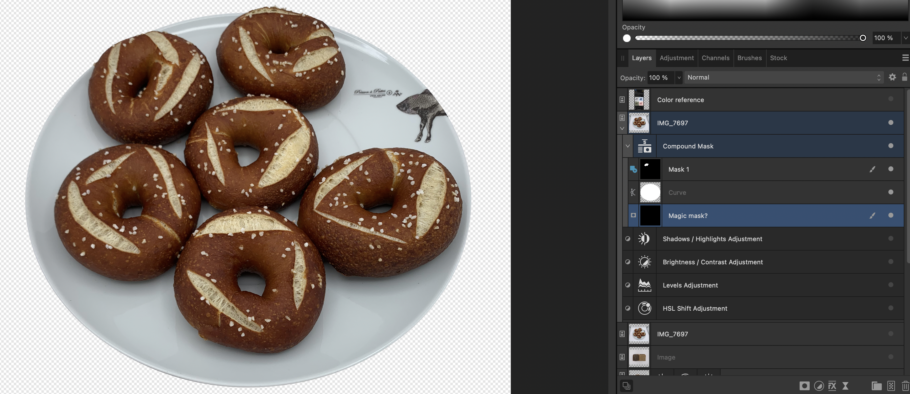
Normally it's fairly easy combine a stack of masks and they'll all add up nicely. In this case however, I'm using a white shape as a mask to align with the plate. But as you can see, there is some of the pretzel bagel sticking out. I then created Mask 1 with the intent of showing these parts by selecting and filling the selection with white. But it didn't work as expected. They were behaving almost as if the mask and the shape were negating each other instead. But then I added another mask below (name Magic Mask?), and now the two layers above combine to the create the result I initially expected. What's going on here - is my expectation unrealistic or am I going about it the wrong way? Thanks! Affinity Photo 2.5.7 -

-
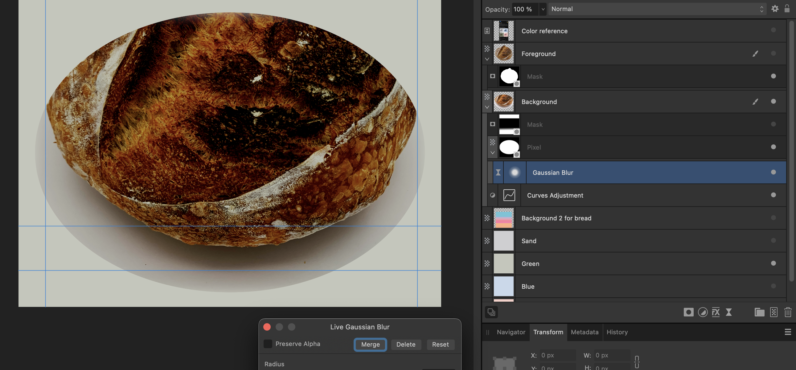
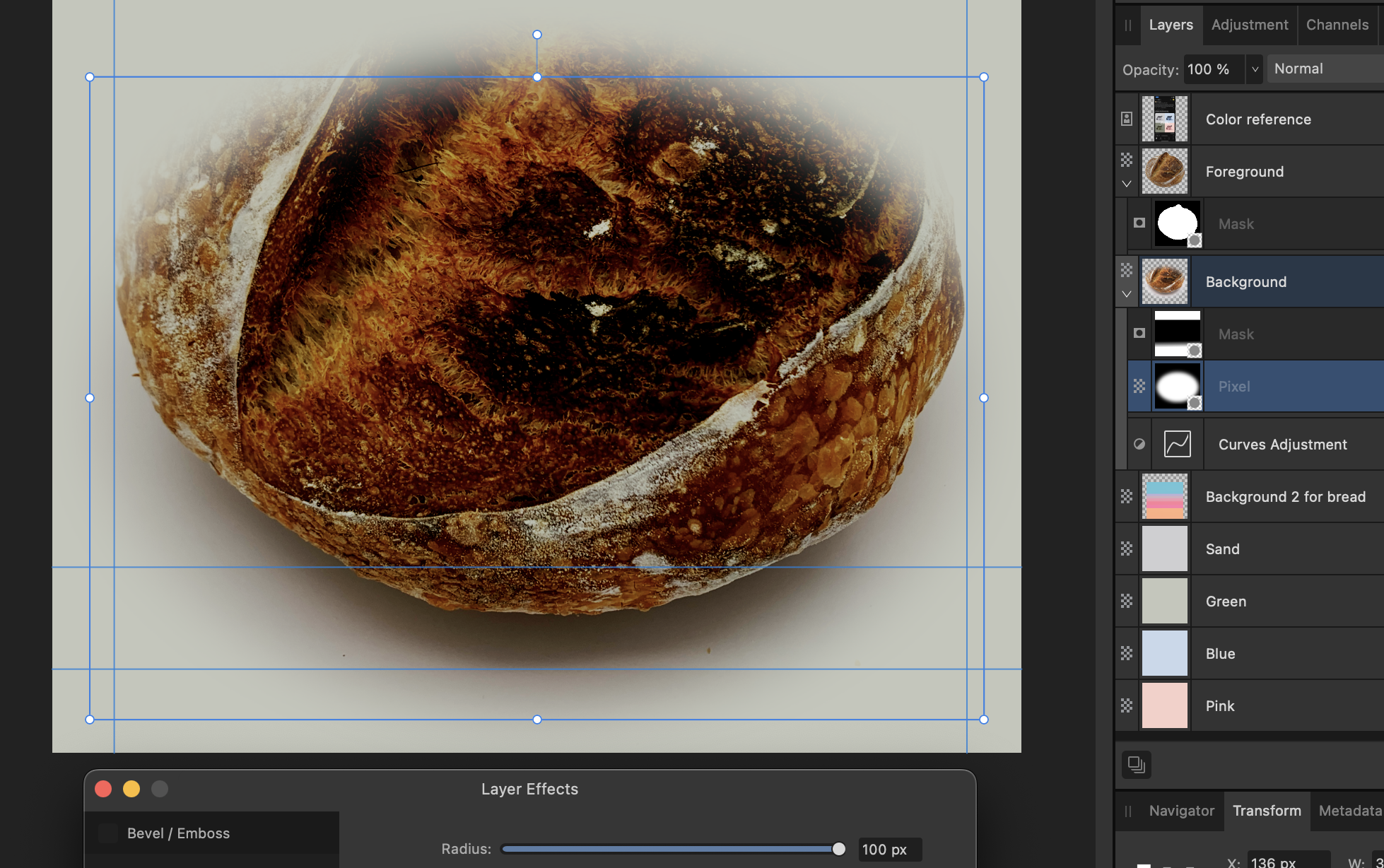
So i'm continuing my shenanigans of taking pictures of my bread and posting it online. It's been going really well based on the high quality feedback I got in this thread. I essentially have two layers, one for foreground and one for preserving the original shadow, using Linear burn in combination with Curves adjustment, to have a natural looking shadow on a one color background. Sometimes however, I have to limit the visibility of the background layer. I use a shape for this. In this context, what I don't understand is the difference in result between a live filter and layer filter. In this example I want to add a gaussian effect to the rasterized shape used as a mask. The layer effect result is what I aimed for. But why is there a difference in result between these two seemingly equally named functions? I'll gladly admit I'm new to working in depth with images, but I'm compelled to ask as it seems there's something more general to learn about why one would choose one type of function over the other. Thanks! Using Live filter (the edge blurs inwards) Using Layer effect (the shape gets blurred, making a smooth transition in the mask)
-
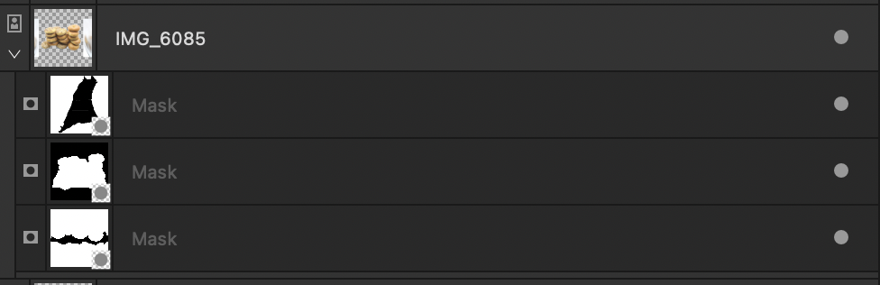
Is is possible to merge these mask layers into one? It's the result of several mask processes and I'd just like to combine them to ease the work from here on. I've tried merge down, merge visible. Nothing happens. Not interested in Compound mask in this case.
-
christerdk reacted to a post in a topic:
Photo 2.3.0: Please critique my result / technique
-
Sure, I'll definitely give it a go. Thank you for checking up on this. I didn't realize until now, however, that the program is only for Windows and I am on Mac. Seems to be for Mac too, so I'll check this one out. Thank you for your inputs!
-
Thanks. My kitchen isn't very inspiring, both in terms of light and content, which is one of the main reasons why I'm trying this new style with a different background. But I do have a nice cutting board I might feature down the line. On the topic of vignette, I was considering a white outline for the next series of photos, to make it stand out and also to give it a little more cartoon style. Let's see how it goes...
-
Thanks! I am aware of the concept, but don't really have much practical experience. In the case of, say, the white plate in the previous photo, wouldn't it be prone to the reflection of the green color? And would the green color not change the overall tone of the light box? Color correction might be the way - or would that be taken care of my this specialized software? On the topic of the suggested software, didn't know about these, so thank you for the tip. The former is $99, the price on the other is ... 0? Also, ReMask is made for Adobe PhotoShop, would Affinity Photo be able to load it (plugin compatibility?)?
-
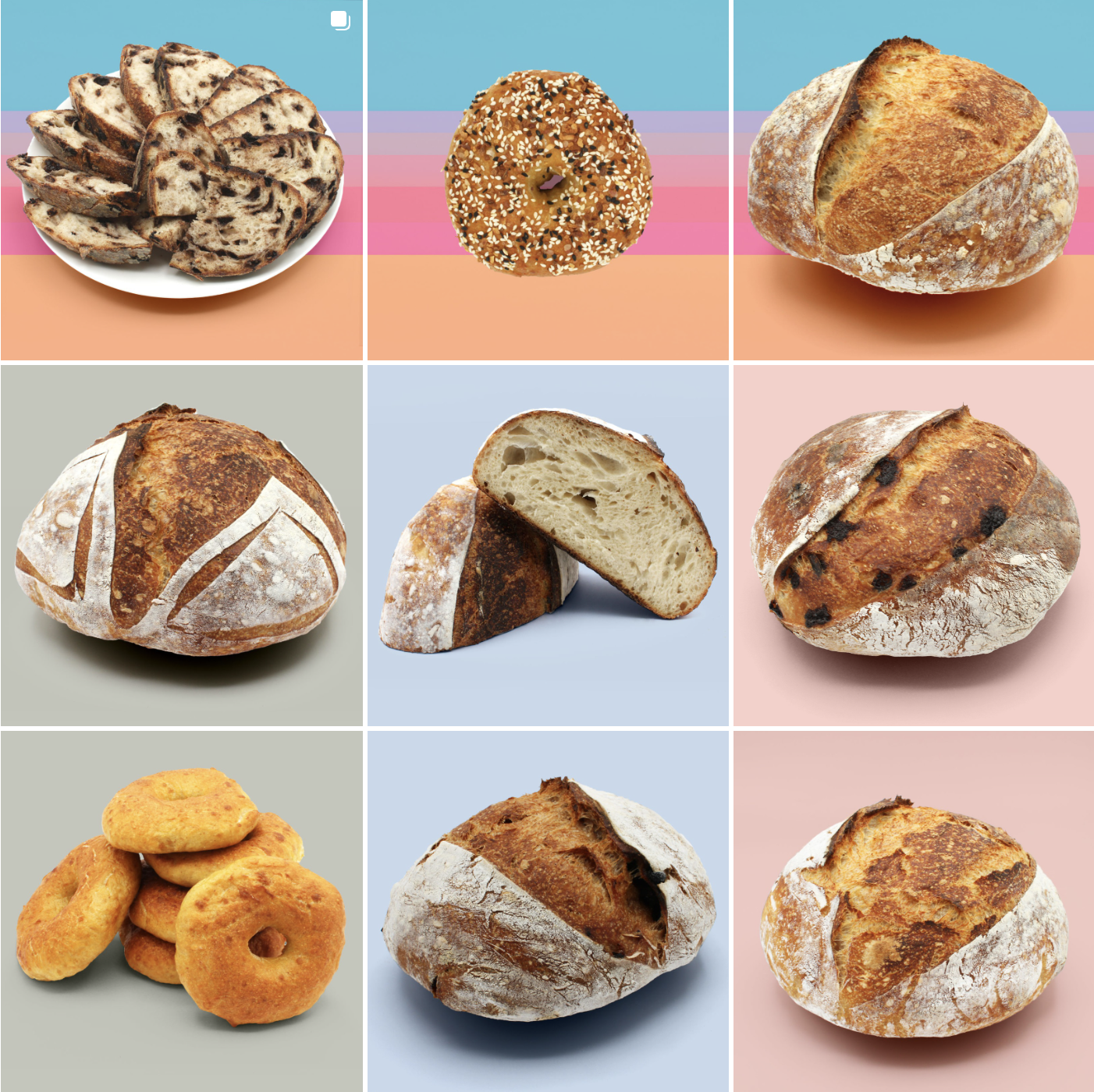
Thank you for this feedback. I haven't work with converting to curves yet, so it'll definitely take a look at that for next time. Good point. Currently testing this style to make it stand out. It's fortunately only for social media, not a catalogue or similar. See other color tests below. Hehe, to an extent that's true. It started with the Christmas patterns, but since then the patterns haven't been too busy. Below is an overview of the latest few posts. The images are getting better, and I'm ok with making mistakes along while learning (for example there some very light residual coloring of the background (outside the shadow, coming from linear burn) that I'm masking out from now on... and so on and so on An interesting challenge is consistency: like the consistency of the foreground (saturation, curves adjustments) and background colors (the result of linear burn), and of the shadows (some come across more light than others). Also, I think I need to become better a using the measurement tools in Affinity to verify that colors truly are that they are (comparing pixels), because sometimes colors are off by so little that the eye will hardly pick them up. You know, comparing the original background color with the one resulting from burn, even after doing my best with curves adjustments etc.
-
debraspicher reacted to a post in a topic:
Photo 2.3.0: Please critique my result / technique
-
So, in the end I solved it by making an oval shape fit the plate, then making a mask from it. From there I "cherry picked" the edges I needed (because the layer was already rasterized, unfortunately), making for a well formed edge of the plate, but still allowing the bread to stick out. Curious to hear how those of you that are more experienced would have fixed it, I'm sure I can learn something!
-
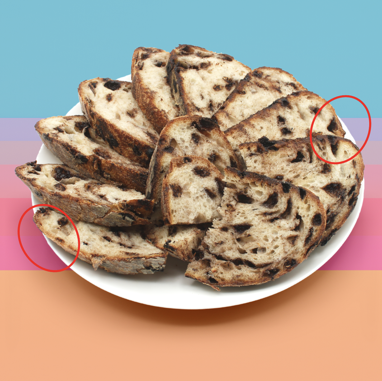
Good folks, 'Tis me again - I hope you're not getting bored with this thread 😆 I have an ultra detailed process question... I took a picture of this (chocolate sourdough) bread placed on white plate on white background (that choice is probably my main issue). After using the Selection Tool Brush quite a few times I think my output is pretty goood, but i struggle a little in areas where plate is hard to tell apart form the background. The edge becomes uneven and will only get worse if I try to fix it manually. What strategy can I use here? I've considered adding some adjustment layer that potentially could make even the smallest differences stand out. Then after finding and adding that to the mask, remove the adjustment again. Alternatively, maybe I can use a shape of sorts that offers a bent line, create a mask from it, then merge to existing mask or make compound mask? Thanks in advance for your inputs!
-
debraspicher reacted to a post in a topic:
Photo 2.3.0: Please critique my result / technique
-
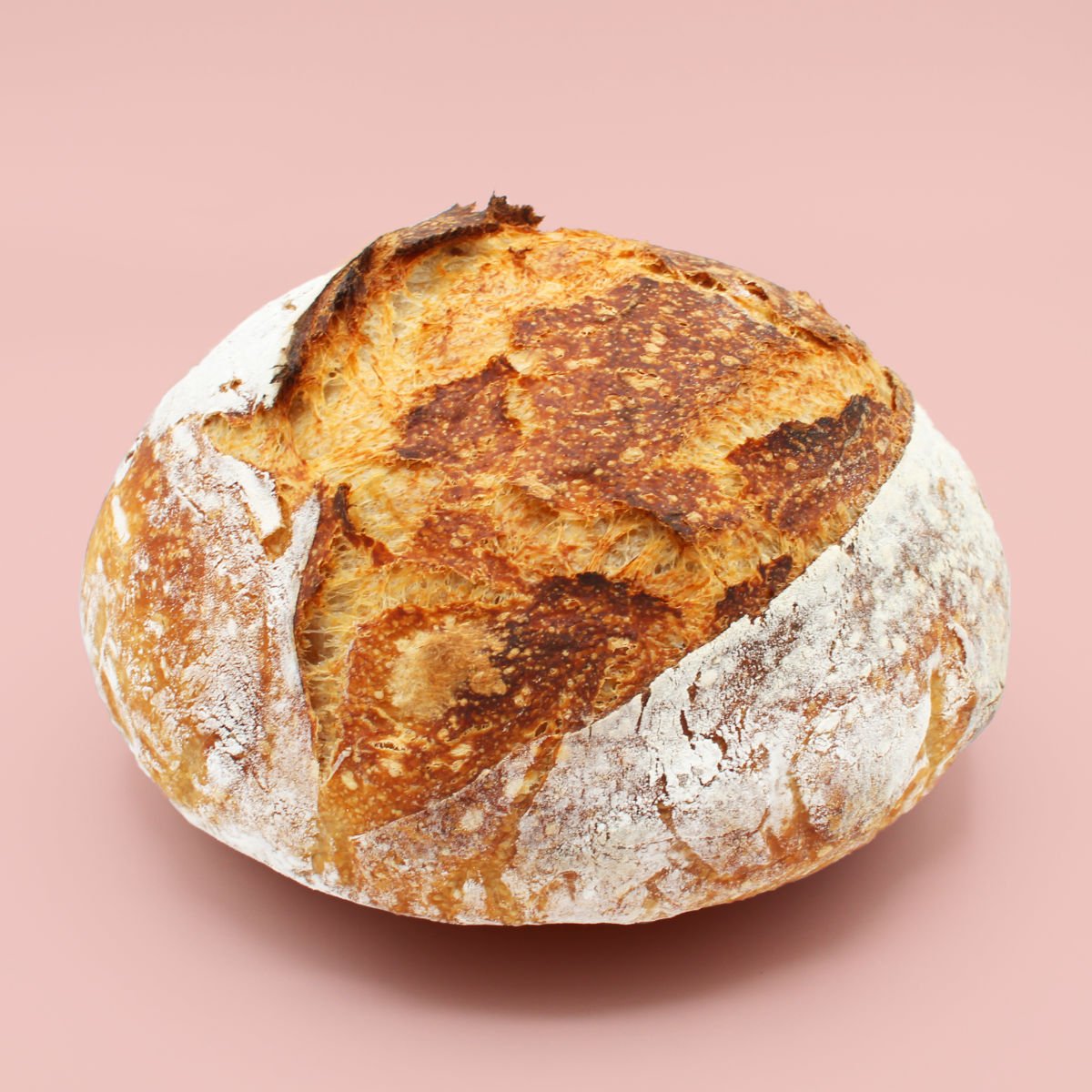
@Dan C I used your proposed process for this one, preserving a copy of the original below to have that serve as the shadow with linear burn. How am I doing? A challenge was that the white balance was slightly off original picture, making the white have a grey tint. To make up for that without loosing too much of the shadow (loaf is slightly lifted over the surface, fyi), I used a Curves adjustment and adjusted the brighter parts. I'll try to fix the white balance at the source next time. @debraspicher Resizing after upload worked great 👍🏻
-
Dan C reacted to a post in a topic:
Photo 2.3.0: Please critique my result / technique
-
Haha, you're not wrong! This view is the "classic" angle / view for bread hobbyists posting online, FYI. I really like your ideas, thank you for lending me your creative mindset, I'll try some of these suggestions on upcoming loaves. I have made other types of shots, with more angle and such, for clusters of bagels, but I haven't considered this so much for loaves. It'll try to get more creative with my newly acquired light box! Definitely so. Didn't know that you could resize here in the forum, good to know!
-
Another attempt. Improved: the aperture is higher, so better edges on the bread to trace. Definitely a lesson learned. Not yet improved: I don't have a proper stand for this bread, so I had to hold it quite high. Therefore I had no natural shadows to use, so the shadow is fake.
-
Dan C reacted to a post in a topic:
Photo 2.3.0: Please critique my result / technique
-
Indeed, that would probably be my preference too - and probably my wallet's preference, too 😆 Apple's trackpads are truly amazing for the everyday use. I produce music as well, and it works really well. In the context of Affinity, I've used the stabilizer to make up for lack of precision. Since I'm a hobbyist I'll probably go down the mouse route first, so see if that is enough for now. Not sure if it's allowed to post here, but here is my IG sourdough page (let me know if not, I'll remove). As you can see, I was taking photos for a while in natural light outside. But after a move this was not possible anymore, so I shot pictures in the kitchen, now with lovely lovely florescent light. And after seeing some of those picture, a friend of my mine commented that "it's time to get a lightbox"... 😄
-
if I understand you correctly: the inherent perspective of the original picture / plate and the "flatness" of the background yields a strange perspective mix, you mean? That makes sense, yeah. The reason for the strong colors in the background is that I wanted to emulate wrapping paper. But I did spend some time considering the contrast between background and foreground. Only solution I did for this image was adjusting the levels of the foreground. I definitely get what you mean. My thinking behind having the bread / plate taking up such a good amount of space is because it's aimed towards Instagram, so I'm trying to make it "pop" from that little square in the viewers hand. I have some more Christmas themed pictures coming up, and I'll definitely take your input into consideration. Thank you!