

MoonaticDestiny
-
Posts
476 -
Joined
-
Last visited
Everything posted by MoonaticDestiny
-
Ugh. Then you took the context control in v1 and split it into 2. Thats so bad. Now, users have to look in 2 directions just for 1 one action. You took the context control and split it into sliders and context bar. This really is bad design. You cant have a context bar at the top where you already have a bar at the top reserved for other buttons. You got a bar within in a bar. You cant do that. You also cant put a context bar at the top because the hand covers the artwork when youre making changes to controls or attributea and you cant see those changes because your hand is covering the artwork. Thats why its better to have the context control bar at the bottom so that the users hand doesnt cover their artwork with heir hand. Again, serif is not designing the ipad app with a hand holding a pencil in mind. You think you can just place things all around the UI. You cant. This is why procreate places their context bar at the bottom. Its so frustrating and it got approved and we're teaching users to work this way. The context bar or context control goes at the bottom like in v1 and the "customizable toolbar" goes at the top. The customizable toolbar was a bar that users had been requesting for years but was never made. Now, serif made a customizable toolbar of their own in v2 but THEY get to customize it. not the user. So now you have the customizable toolbar and a context bar BOTH placed at the top of the UI and its bad because you cant have a bar within a bar. Just so many things wrong. Again, serif is not designing the ipad app with a hand holding a pencil in mind.

-
So they call them "sliders for attributes." Again, you CANT do these sliders. You can't. Its bad design. I gave you so many reasons above on why they're bad design. I love how the description in the photo says "attributes like brush width and opacity, stroke width, filter effects settings" BUT serif doesnt tell us those attributes in the sliders. They dont spell it out for us. They instead created these weird icons that users are just supposed to know what attribute each slider is for. Like, its wrong. Its wrong on so many level. You have to spell out these "attributes" or "controls" because some words CAN NOT be translated into icons for users to easily recognize. You also cant hide other attributes within sliders and expect users to know that theyre there and expect to know how to toggle into them by hitting that little white circle icon under the slider. Its just wrong. Its THE WORST thing in v2. The v1 context control was perfectly designed. It had all the attributes there. Everything was spelled out for users. No dial within a dial. No weird icons users are supposed to know. No long sliders.
-
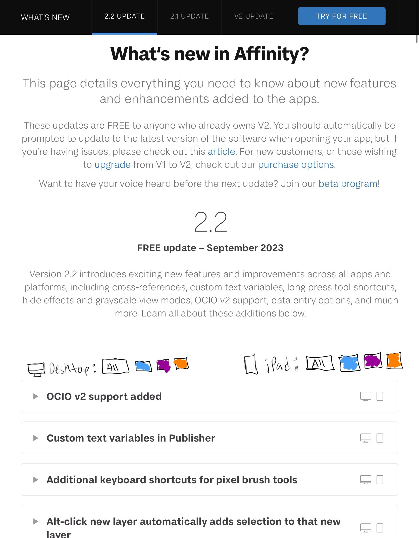
I dont know where to put this question on these forums. Version 2.2 came out today and I wanted to read all the new updates and whats new. Serif has a page on its website dedicated to all the new updates for v2. Heres the website. https://affinity.serif.com/en-us/whats-new/#version-2 My only issue is that I wish it was even MORE organized. Currently, the website tells you what each update is for by putting a desktop computer icon or an iPad icon on the far right of each update. However, I want to just see all the updates for Affinity Designer on the ipad. I can't do that. I have look at all the ones with an ipad icon and hope its for designer. I wish there were 2 device categories with 3 buttons for each app name so I can click on the app name I want under the device category and it would show me every update for that app on that device. Right now it only shows you the apps the update is for by clicking inside the update topic. Is there any way we can do this in the future? I dont want to click each ipad update topic looking for every Designer update on the ipad. Again, I just want to read all the affinity designer on iPad updates. Now, I have to go looking for them. It'd be nice to have a button that would just show me all the updates for what Im looking for. Let me draw out what I'm thinking. Its 2 categories. A device category and the 3 apps for that category that you can click on to see all the updates for that app in that device category.
-
This really is bad. its insanely bad. This is why the app is unusable. Ugh. And youve already made tutorials with this new context control design and youre teaching all your affinity users to work this way. This is why you need to test things. You shouldn't have just announced this new context control design. Like, this new context control design is not going to change because its v2. Yall got other things to work on. Youre just gonna leave this badly designed context control in v2 and force us to work this way. Its not ok. IDK who made the bad design decision to change the context control design but its so bad. It really is. I'm not just randomly saying all this in this forum post. I'm a graphic designer. I pay attention to bad design. I study how iPad apps are designed. I pay attention to how apps are designed and if they are designed around a hand holding a pencil and the affinity apps are not designed around a hand holding a pencil. Serif, you need to get a designer that knows how to design your affinity apps with the hand holding a pencil in mind because right now you dont. Youre just taking the desktop app and placing things all around the interface and its wrong. You cant put the ? button and undo/redo buttons on the bottom right of the interface because the hand goes there. You cant put the deselect and delete icons on the bottom left of the interface because left handed users exist and their hadn goes there. You cant put these sliders on the left side of the interface because controls have large inputs. you cant create icons for controls that don't translate into icons. you cant put controls at the top of the UI because the hand covers the user's work and you dont get to see the changes being made because the hand is covering the work. its all bad deisgn. youre not designing the app with a hand holding a pencil in mind.
-
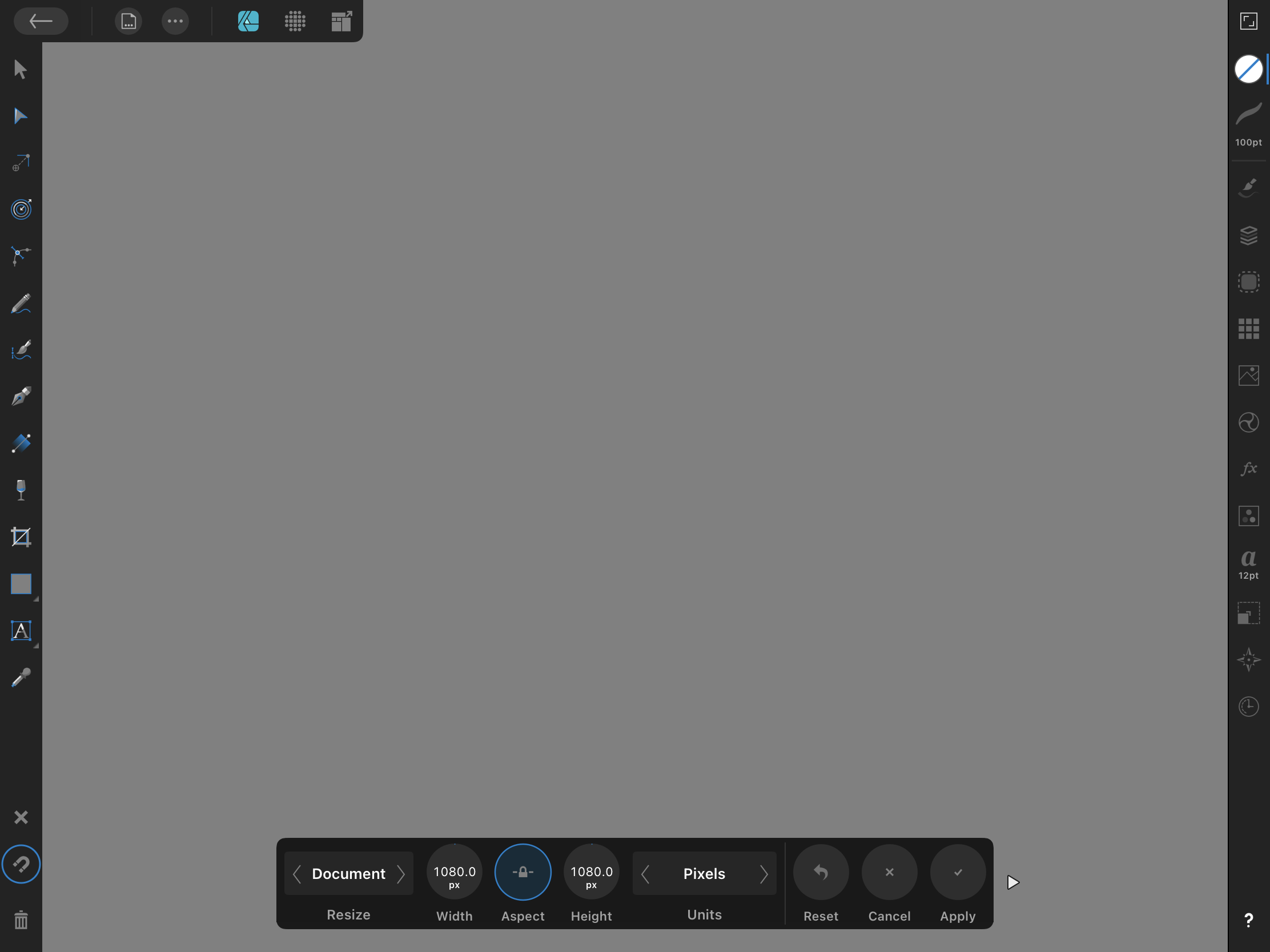
I just found out that even the resize canvas has the new context controls. Its really bad. Its so bad that i couldnt even figure out how to resize my canvas because its that confusing. Look at how the sliders on the left have no icons. This justifies what i said early where some things can not be translated into icons for the sliders. You can not translate height and width into icons. You need to just spell them out so what serif did was place a gray square as a placeholder for the icon. This is so bad because before you made icons for the sliders that users were supposed to guess what they meant and now you dont have icons for the sliders. So youre playing games with us because you couldnt decide if your new design works or not. it doesn't. You just have to spell out what each control does like in v1. Like just spell out height and width so that i know 10.000in represents my height and width. You dont need a whole slider for this. Then you have a slider that read 300. 300 to me registers as DPI. You cant translate dpi into an icon for the slider. But then I found out that DPI is actually at the top of the UI. You spell out DPI. Which is great! Thats what youre supposed to do but now I have to guess what this 300 slider is. I cant because theres no word or icon to tell me what it does and now I have to do this new workflow of having to hit the ? button to tell me what it does when Serif should have just told me what it does from the begining. This is why its so bad!!! And then you have other icons at the top that I dont know what they do because nothing is spelled out for me. I cant keep hitting the ? button to figure out what the controls do. Its bad design. Its workflow interruption. You need to go back to how the context control was in v1 because you spelled everything out for users and everything was better as dials.
-
this context control in v1 was just so perfect. the new context control in v2 is probably THEE worst design change/mistake in v2. THEE WORST. It makes the app unusable.
-
You dont need a slider to get to 100. You don't. And then it doesnt make sense to have a slider because some sliders for effects go beyond 100 so the slider fills up past 100. The dials actually take up less UI space than these sliders. Its better to have a dial with the input in the middle and the text for that dial spelled out on the bottom to tell users what this dial does than it is to have a slider with an icon users are supposed to guess what this slider does with the input at the top. I just found A BIG ISSUE with these sliders and this should be the deal breaker on why sliders are bad for this new context control in v2. The WHOLE NEW DESIGN of the context control in v2 is bad. The slider that controls offset in the inner shadow effect is located on the left side of the UI under the middle slider. If I slide the offset slider all the way to the top of my screen it only goes up to 500px. If i want to go beyond 500 I can not do that. I can not slide my slider upwards to go beyond 500. When I go back to the bottom of my offset sliders to slide my slider upwards even more to go past 500 it puts my input below 500px. It resets the slider because the app thinks I'm making a low input for my offset slider. THIS is why these sliders are so SO SO BAD. You cant go past 500px. You have to manually input the amount. This is why these sliders are bad and pointless. This goes back to the point I made above in a previous. its point number 5) "5) the sliders are bad because theyre placed on the left side of the UI. Why is this bad? If you want to change your input on your slider to a higher input you have to slide up on the slider but thats bad. especially when you put a slider above another slider on the left side of the UI because theres not enough space on the top left to slide upwards. you can only slide up so much because of the limited screen space at the top left. this is why its better to have the controls on the bottom middle, how you did in v1, because now i more screen space to slide upwards in the middle or to the left or right. " You need to bring back these dials, serif.
-
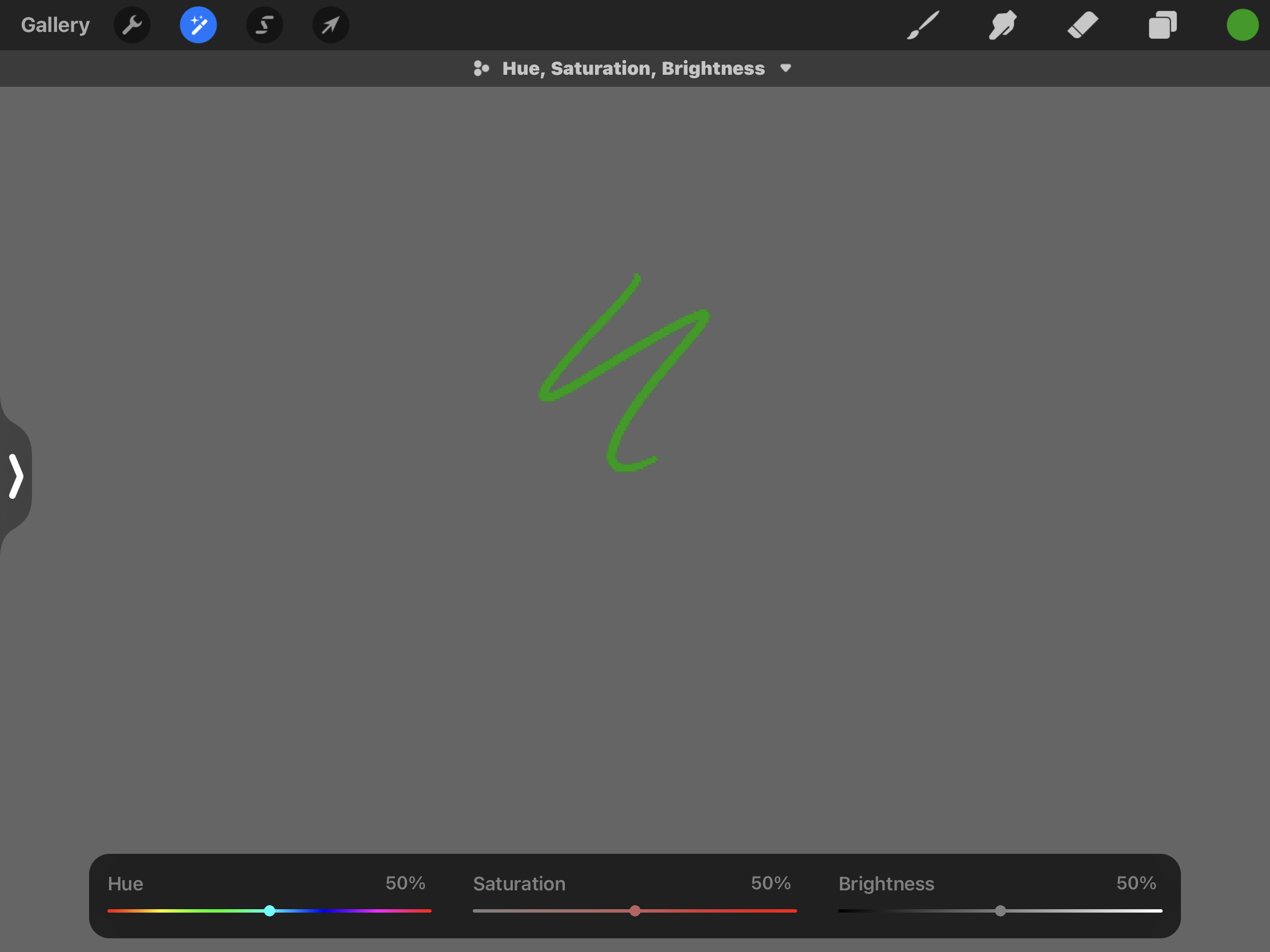
Heres a photo of procreate's context control for their hue, saturation, and brightness. They dont make 3 sliders and put them on the left side of the UI. Why? because designers at procreate know how to design the app around a hand holding a pencil. they know having 3 sliders on the left side of the UI is going to make the users cover their work when making these control changes. They dont want that so they place it at the bottom so that users don't cover their work and are able to see the changes they make while changing their controls. They also dont have controls at the top of the UI. They know to put everything at the bottom middle of the UI. They also dont create an icon for hue, saturation, and brightness. They spell it out. They dont make an icon and make users guess what their context controls do and mean. They dont mess their users. They give them context on what their controls do. Theres no slider with in sliders. Each control has its own individual control. Procreate isnt playing hide and go seek with their users.
-
Look at the photo below. This goes back to the number 6 point I made above. You cant have control sliders on the left side of the UI because the hand covers the users work so as you make those control changes you cant see what youre changing because your hand covers your work. This is why it's bad design to have sliders that change controls on the left side of the UI. You also cant have the rest of the context controls at the top because your hand ALSO covers your work so as youre mkaing those control changes you cant see what youre doing because your hand is blocking it because the design of the context control is at the top. Its bad. You cant make me change controls but then have my hand in the way. Its better to have the controls at the bottom, how Serif had them at the bottom in v1 of the AD ipad app, because my hand is off the screen and I can see the changes in my work as I'm making those control changes. This is why it is bad design to have the context control in AD v2 as sliders and placed at the top of the UI. I forgot to also make a point 7) 7) You took the context control in v1 and split it in half in v2 and now make users look at the top and to the left of the screen for their context controls. This is insanely bad. I dont know what serif is even thinking to be doing this to users. This is what serif is saying. "Hey, look over here at the top of the UI for your controls. Oh! But wait! Also look over here to the left for the rest of your controls. But wait! We're gonna hide your controls in other sliders because we love playing hide and go seek. Wait! We're not gonna tell you what these sliders or controls do. We're just gonna create icons with no context and make you guess what they mean because tricking the user is fun. Oh! Wait. Theres more. We're gonna split your context control into 2 and place them at the top and to the left of the UI so that when you make your control changes your hand covers your work and you cant see what youre changing. Such great design!" Sigh. I just need serif to go back to the context control design they had in v1. The top bar of the UI was supposed to be the customizable tool bar that users have been requesting for years but someone at serif made the bad design decision to take the context controls for tools and effects and place it at the topbar and to the left of the UI. Its wrong. it shouldnt be like that. Tools go on the left. Studios go on the right. Context controls go at the bottom and the customizable toolbar goes at the top. Now you've introduced v2 for users. The context control has been placed at the top and to the left and its ALL WRONG for all 3 apps. Again, you are not designing the app around a hand holding a pencil.
-
I want to revisit this post because it seriously is an issue. You just shouldnt design it this way. There are things that translate well into icons and there are things that dont translate well into icons. You can not translate offset, radius, and intensity into icons. You just can't. You cant do that and make users guess what those icons mean. You also shouldn't have sliders within sliders. Like, I'm getting frustrated at how bad this design is and how it got approved by serif. Icons like pencil and pen and layers CAN be translated into icons. Thats why theyre there on the tool and studio bars as icons but you CANT translate offset, radius, and intensity into icons and make users hit the help button to figure out what they are. You cant. Thats why they need to be spelled out for users. How serif spelled them out in the context control for v1. You CAN translate tools and studios into icons but you CANT translate "controls" into icons. Examples of controls are hue, saturation, blur, offset, radius, intensity, etc. You cant. You need to spell those out. So thers many reason why this is bad design. 1) you cant have 2 controls within one slider. you cant. each control should have its own dial like in v1. 2) the icon to toggle between sliders is bad. thats not a universal icon for toggling. you cant just put a small white dot above an icon and say "here, this is how you toggle." its wrong. I cant believe you would design it that way. its so, SO wrong. 3) sliders are bad for controls. they take up more you UI than dials. Dials are better because they take up less UI space. 4) you cant put icons under sliders and make us users guess what these sliders control. you cant do that because these icons are unrecognizable. you cant tell us that these icons mean offset, radius, and intensity. you cant. you need to spell them out for us. 5) the sliders are bad because theyre placed on the left side of the UI. Why is this bad? If you want to change your input on your slider to a higher input you have to slide up on the slider but thats bad. especially when you put a slider above another slider on the left side of the UI because theres not enough space on the top left to slide upwards. you can only slide up so much because of the limited screen space at the top left. this is why its better to have the controls on the bottom middle, how you did in v1, because now i more screen space to slide upwards in the middle or to the left or right. 6) this is probably THE MAIN reason why having the control sliders on the left and top are bad. our hand holds a pencil when using the ipad app. when you make us change those sliders and buttons at the top our hand covers our work. Thats why its bad. Our hand covers our work when changing our sliders on the left and buttons at the top. You cant see what youre changing because you designed the context control to make our hand cover our work that we cant see what we're changing. This is why its so, so bad to have the context control on the left and top. This is why procreate puts their context control on the bottom middle, how you guys had it in v1, because procreate knows how to design for a tablet app. Procreate knows that they need to put their context control in the bottom middle of the app because when users place their hand and pencil over their context control their users can change the controls and see what is changing in their work. thats why procreate puts in the bottom middle. not on the left or top. because procreate has designers that know how to design for a tablet app. they know a hand a pencil is introduced in their app that they have to design their app around this hand and pencil. The real issue is that someone at Serif is designing the ipad app like the desktop app and theyre wrong. Theyre wrong because they think they can put icons and sliders around the UI but you can't. You cant because this is not a desktop app. This is an ipad app. The desktop app introduces a mouse icon while the ipad app introduces a hand and pencil. You have to design the ipad app around the hand and pencil and this designer at serif isnt doing that. They think they can place icons and sliders around the UI and say this is good design when its not. Youre taking "desktop design logic" and applying it to a tablet and its wrong because youre forgetting about the hand and pencil thats introduced when using a tablet and youre not designing around this hand and pencil. You cant put the "?" and undo/redo buttons on the bottom right corner of the UI because thats where the right hand of right handed users go so as theyre working theyre hand is going to trigger those buttons causing workflow disruption. But that designer at serif says its ok to put it there because they dont know how to design for a tablet. They just take desktop deigh logic and apply it to the tablet. You cant put the deselect and delete trash can icon on the bottom left of the UI because left handed users exist! Their hand goes so as theyre working their hand triggers those icons causing workflow disruption. You cant put these control sliders on the left of the UI because of all the reasons I mentioned above. Again, someone at serif doesnt know how to design for a tablet and they think they can put buttons all around the UI. Its wrong.
-
even then the ? button does not justify why this new context control design is good and should stay. its very badly designed. theres so many things wrong with it and users should not be tapping the ? button continuously to remember what these sliders and buttons do because that app should spell out what they do in text. specifically for these controls because you cant translate these controls into icons. they need to be spelled out.
-
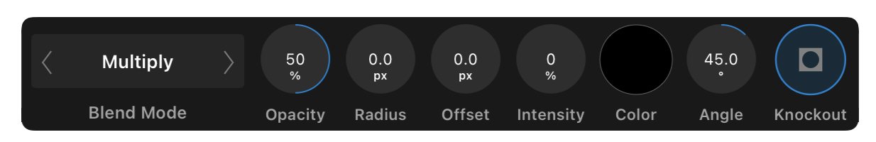
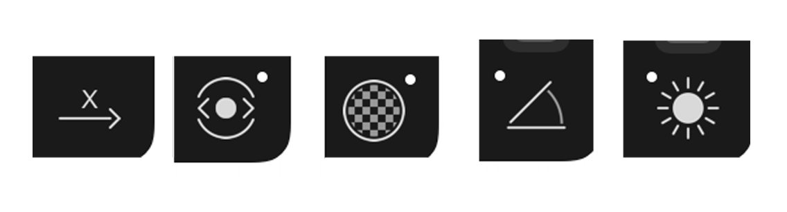
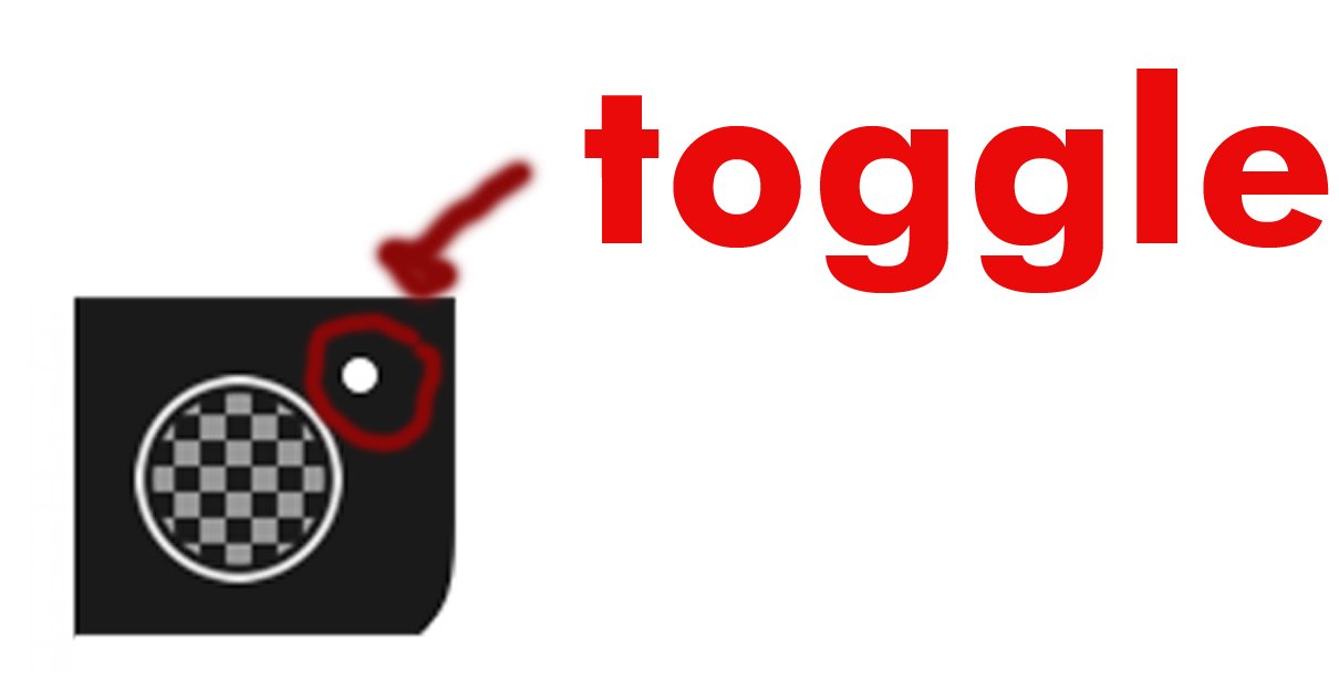
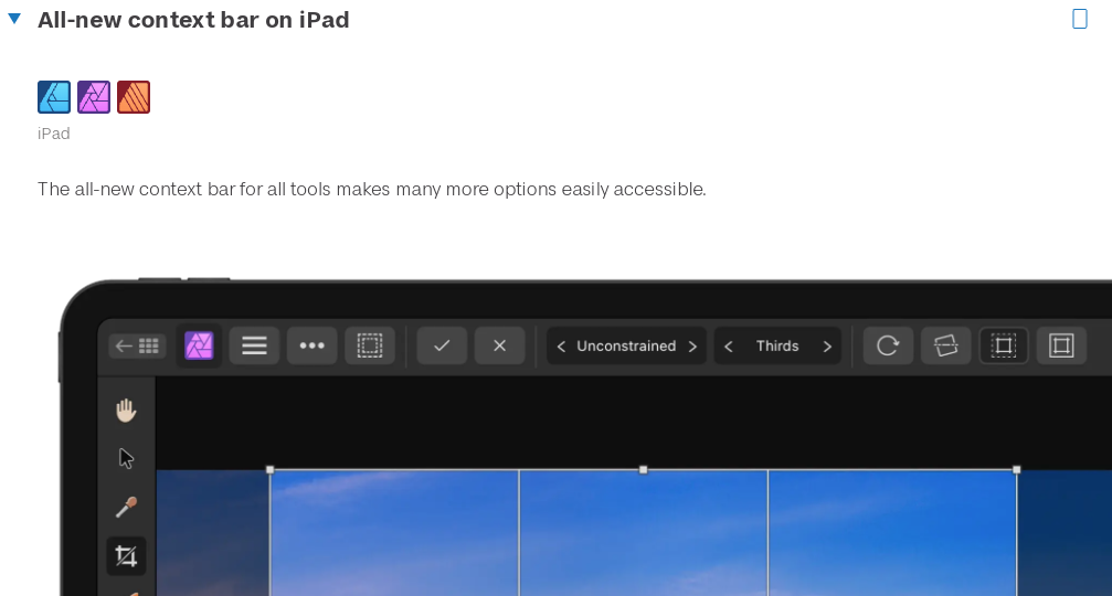
I bought Affinity Designer v2 for the iPad back when it was launched in 2022. Since then I have NOT been able to use the app because someone at Serif made the bad, BAD design decision to redesign the context controls for tools and effects on the iPad and the app is unusable. It upsets me so much because I BADLY want to use AD v2 on the iPad. I bought it! I want to try out all the new features it has, but I can’t because it's just unusable with this new context control design. It is REALLY bad design. Let me explain. The context control design in AD v1 on the iPad was perfect. Please see the photo below titled "ad v1 context." It had everything I needed. It was a little rectangle box that told me, in text, what each button and dial does. It is so easy to understand and its the ONLY reason why I use AD v1 on the iPad. This context control is just so well designed. Its so well designed that even Procreate, the number 1 art app in the App Store, uses the same design for their app. Please see the photo below titled "procreate context." Someone at serif made the bad design decision to take this perfectly designed context control, split it in half, take one half and add it to the left as sliders, take the other half and move it to the top, remove all the helpful text that helps tell users what each button and control does, and then created these unrecognizable biohazard looking icons that users are now supposed to guess what each icon is and what each control does and its just SO bad. Its so, so badly designed. This was not supposed to happen in v2. The context control was supposed to stay the same as in v1. No one said to redesign this perfectly designed context control into a new bad design context control. It really is bad. You just can’t design it this way. Please see the photo below titled, "new v2 context." Look at how there are now sliders with icons underneath and icons at the top. There is no helpful text to tell users what each slider or button does. And before you tell me to hit the "helpful" icon on the bottom right corner of the app to figure out what these sliders and buttons do, please know that if I have to do that then that's also bad design because the developers and designers for the app couldn't tell me what a basic slider and basic button do because they removed the helpful text. You can’t create new icons for basic controls and then expect users to know what these newly designed icons mean. You just can’t. Please look at the photo below titled "new icons." Theyre not universally designed easy to recognize and identify icons for users to understand what you mean, serif. You need to just tell us, in text, what the controls do. You dont need icons. You just need text. Tell me this control changes my stroke and opacity. Don’t design an icon that makes me guess what this control does. Thats where the bad design starts. You need to just tell me, in text, what the control does. Thats why the context control in v1 was perfect. It told users what each control does in text. Please look at the photo below titled "new icons." You just cant tell me that im supposed to know what these 5 icons mean. You cant! I'd probably only know the opacity icon in the middle and then rotate and brightness for the other 2 after. It turns out that the icons from left to right mean offset, radius, opacity, angle, and intensity. NO WAY, NO WAY was I supposed to guess right that these icons meant offset, radius, and intensity. NO WAY!!!! Thats insane!! Thats insane that you think users are going to guess what these icons mean and are supposed to work this way. Its insane that Im supposed to figure out what these icons mean. This is why its bad design. Just tell users, in text, that these sliders mean offset, radius, opacity, angle, and intensity. Its that easy. Another reason why this new context control is bad is because you have other controls hiding inside sliders. Please dont EVER do that. Dont EVER hide a control within another slider. That is such bad design. Its so bad. You can not tell me that I'm supposed to figure out that a control that i needed is hiding inside a slider and the way to get to that control is to tap the little circle icon above the icon to toggle into it. Thats insane. You can not justify that. Thats bad. You dont toggle sliders. A slider is meant for 1 control. You dont put 2 controls in 1 slider because you wanted to save UI space. You also dont tell users that you need to tap this little white circle to toggle into the other slider. Its just BAD, BAD, BAD design. Its so bad I'm overwhelmed. Please look at the photo below titled "toggle." I shouldnt be tapping this little circle icon to get to other controls. Just display my control as a dial, how you did in v1, and put text underneath it so that I know what I'm controlling. Please look at the photo below titled "ad v1 context." There are dials with text underneath that tell you what each control does. No sliders. No controls within slider or dial. Each dial controls 1 control. Thats it. simple and easy to understand. Theres so many other reasons why this newly designed context control in v2 is bad. I can list you 5 or more other reason but its so exhausting to explain it all in type here. Its so exhausting. I’m stuck using AD v1 on the iPad. I hate it. I want to enjoy all the new features that serif has introduced in AD v2, and I can’t because this new context control makes the app unusable. I need the old design of the context control back to work, so I have to continue using AD v1. It upsets me because this old context control design will never come back. Not now. Maybe never. I really need serif to fix this issue. Bring back the old context control. I don’t know why it was changed but please know that this new context control in v2 is bad design. Very bad. ad v1 context procreate context new v2 context new icons toggle
-
example 1 is actually bad design. nothing about it is improved. its just more clutter and more button. its fine the way it is right now. you just need 1 button to remove color. you dont need 2 of the same buttons to remove color. you dont need 2 buttons that do the same action. so no to the first example. please provide the 100 examples. thank you.
-
Good eye, my friend. Another issue is the "use fill" check box on the pencil context toolbar wasnt even turned on so why would it fill in your stroke? Why is there even a "use fill" check box? This check box is not necessary. Its an extra step just to do something basic. It needs to be removed and the stroke and fill icon on the color studio needs to be copied and pasted on the pencil context toolbar so that both of them are in synch. And then if I wanted a fill I can just pick a color. I dont have to turn on a check box to have a fill.
-
Oh! Yes. I see it. Im working on AD v1. If you go to the document menu, under canvas, theres a clip-to-canvas option and a transparent canvas option. I selected transparent canvas and now when I export to PNG I get my file with a transparent bg. Thank you! @walt.farrell
-
I know this is silly but can someone teach me how to export a PNG. When I create a document it has a white background. Every time I export a PNG theres a white BG to the PNG. How do I get rid of this white background so that its transparent when I export a PNG. I am working on Affinity Designer for the iPad.
-
So I used affinity designer for the ipad yesterday to do some art and its still happening. Im clicking on the stroke studio to change my strokes color because the color indicator for the stroke studio is telling me that my stroke's color property is in the stroke studio and when I tap to open it its not there. So then I realize that my color property is in the color studio, and I have to open the color studio to change my strokes studio. Its this color indicator that the stroke studio has thats confusing users. Its confusing me because I see stroke and color and think stroke's color is in this studio. A stroke fill icon needs to be made like the photo above. This will indicate to me that this outlined circle is my strokes color fill and this will open my color studio to change my stroke's color.
-
This is how it should look. Much better. Theres no 2 icons. Its all just 1 icon and theres a stroke color indicator for users.
-
It does exist. This is why I brought the issue up. I showed you a serif employee going through this issue in the video above and if you used the app consistently then you will find yourself doing this issue over and over again because that color indicator for the stroke studio is really fooling users. Its not ok. Its a problem. Yes! Thats it! Why didnt I think of that? This is the answer. This is how it should be instead of 2 separate icons. Great job! I think i kept them separated as 2 icons because I wanted users to do their gestures on them where you long press and swipe up and down. The finger is enough for 1 icon. Combining them might be hard now. Or maybe not. No. This is a whole new icon. This icon is an icon that users arent familiar with right now. The first icon you mentioned is better because users are already familiar with it. You also wouldnt be able to do your long press gesture on this because you cant select the stroke of color fill. Its all just one icon. This "long press gesture" on the studios is the reason why I kept them separated as 2 icons. Not to add an extra icon to the studio bar to make your studio bar even more cluttered. This isnt an icon that Im randomly adding just because. Its an icon that is there to solve an issue that exists in the app. You havent provided me evidence and logic as why this problem is GREAT for users to not put this icon in. Only the too many icons on the studio bar logic that I somewhat agree with. It not OK. Its not. Its a big workflow disruption issue for right handed users. It really needs to be moved else where.
-
And you know what else? Scrolling may need to happen. I hate saying that because thats probably not what you want but understand that your working on a small device. It can only fit so much. So much that scrolling would need to happen.
-
........But we can change the system to make it better for users and not let them get confused while working........ Ive always said that the undo and redo buttons should not be at the bottom right corner of the interface because they cause workflow disruption. Im so glad we can hide them in the preferences. Ive also said the help "?" button shouldnt be at the bottom right of the interface because it too causes workflow disruption. I made a whole forum post about it a while back. The help bottom seriously needs to be moved some place else and that would make room for this new stroke indicator. However, thats still the same amount of icons on the studio bar. I know that Ash is going to introduce tool and studio customization in a future build. That would allow users to remove studios they dont use to make room for more space on the studio bar. If thats still an issue then the spacing between each icon on the studio bar needs to be less. And if thats still an issue youre going to have to work portrait mode on your ipad. I hate suggesting this to you. But I truly believe this new stroke indicator icon has to happen. It has to because it solves an issue where as the undo/redo and help bottom cause workflow disruption. Id rather have a problem solved than workflow disruption. Sigh. This is going to be a process. The new stroke indicator needs to be added, the redo/undo and help buttons need to be placed somewhere else, studio customization will eventually happen, youll be able to remove studios you dont need then, and that will make room for users hands and their smaller ipads. If thats still an issue the spacing between the studio icons needs to be less and if thats still an issue users will have to work portrait mode. But I dont think that will happen once studio customization happens.
-
I just wanted to show 3 examples of how this new stroke icon on the studio bar would work. The 1st example is a pink square. The color fill is pink but the stroke fill has no fill. The 2nd example is a blue stroke. It has no color fill but has a blue stroke fill. The 3rd example is an orange square with a green stroke. It an orange fill and a green stroke. Now, I can click on my new stroke icon to change its color instead of clicking on the stroke studio icon because it no longer has a color indicator for my stroke. This new stroke icon will take me to the color studio to change my stroke color. I want to also note that whatever icon you click on, the circle color fill or the outlined circle stroke fill icon, will open up the color studio and depending on which one you clicked on will be the one that is above the other. So if I clicked on the color fill the color fill will be above the stroke fill in the color studio. If i clicked on the stroke fill the stroke fill will be above the color fill in the color studio. That way the app presents to me which fill I want to change based on which one I clicked on. So in the 3rd example the orange fill is above the green stroke fill in the color studio. That means I had clicked on my color fill icon on the studio bar to change my color fill. So in the 2nd example, I wouldnt click on my stroke studio icon to change the color of my stroke because theres no longer a color indicator. Its now grayed out. Now, I would click on the new stroke fill icon to change my strokes color because of iconography and color indication. The iconography of an outlined circle icon to represent stroke and the color indication of the color blue.
-
The problem is the color indicator for the stroke studio is confusing users into thinking that the color property for their stroke is in the stroke studio. Its not. So users are left confused into why their color isnt in the stroke studio only to realize that they have to go to the color studio to change it there causing workflow disruption. The solution is to create a 3rd icon on the studio bar that will represent the color of a stroke. This 3rd icon will be represented by an outlined circle icon. Then you need to take the color indicator that the stroke studio previously had, remove it, and apply this color indicator to this new outlined circle icon because this icon will now indicate the color of your stroke. And now if I want to change the color of my stroke I would click on this new 3rd icon. The outlined circle icon because this icon represents my stroke and the color indicator tells me this is where i change the color of my stroke. Im not going to click on my stroke studio icon no more because theres no color indicator there. I wont be confused anymore because theres no color indicator on the stroke studio icon to confuse me. Its now gray colored like the other studios. No studios will be combined and the color fill icon and stroke fill icon will both open the color studio while the stroke studio icon opens up the stroke studio. THIS is the solution to everything. Please watch the video below. solution.mp4
-
I no longer agree that the color and stroke studio should combine. I found the solution to all this and I will share it in a video soon. This solution will solve EVERYTHING.
-
@fde101 @Old Bruce I apologize for my noise removal request. Im educated now on why it should stay in the color studio. Disregard this feature request, Serif.
.jpg.5851b68f3ac6fcc316ad5e9c832c0d1a.jpg)


.jpg.aff35eeec4e1bf0ea9b971a60b0c5de7.jpg)