EEvgeniy
-
Posts
41 -
Joined
-
Last visited
Everything posted by EEvgeniy
-
"Master" artboards in Designer V2
EEvgeniy replied to EEvgeniy's topic in Affinity on Desktop Questions (macOS and Windows)
Thanks, Thomaso! Never heard about "Symbols", will look more into this solution. -
Hej! I really love how good Publisher is with creating any of things that could be either shown or printed. But when it comes to a creative process, pages are more variants than really pages. And today was a day I saw that Designer have "artboards" that seens far more convenient for that purpose. So I tried but can't figure out is it possible to set guides, columns and rows as default for every new artboard? PS Or maybe there's "special mode" in Publisher available where pages can be displayed like artboards?
-
Affinity Publisher for macOS - 1.10.5
EEvgeniy replied to Patrick Connor's topic in News and Information
But you can have pictures either included into the Publishers file or linked right now. Even more, when you create a project from scratch, Publisher will ask you after several pictures whether you want to keep multimedia files included or switch to linked files to save resources. -
I would assume, that Publisher is pushing rather master pages than templates. Basically, it looks like master pages are "templates" in the Publisher flow, but only within one file. As for me, I would rather have the possibility to use/move master pages between different files — a kind of a "library for all master pages I've created.
-
No, it was useful. Thank you!
-
It was only my concern that I got term "imposition" correctly. I've never faced it before.
-
Well, according to https://affinity.help/publisher/English.lproj/index.html?page=pages/Publishing/print.html?title=Print Imposition means that your pages are flipped and reordered at print time so that when printed sheets are produced, they can be folded so pages come together in their correct order. So, I guess, workaround with sections and then exporting it as brochure is special case of imposition, isn't it?
-
I totally agree with you, that cover handling can be managed better with Affinity UI integrated option, since there're much more questions with covers than just put nice picture. But at the same time a workaround with separate master page for a cover doesn't seem too workaround since I can do everything cover-related in the master-page, including page size and separate bleed, with no edits on the two different pages in the opposite ends of the document. Seems legit for me. A workaround with sections and brochure is interesting, but to my opinion seems more complicated. I'm not sure I got you. Could you please clarify?
-
Brilliant solution! Many thanks to all who shared their ideas!
-
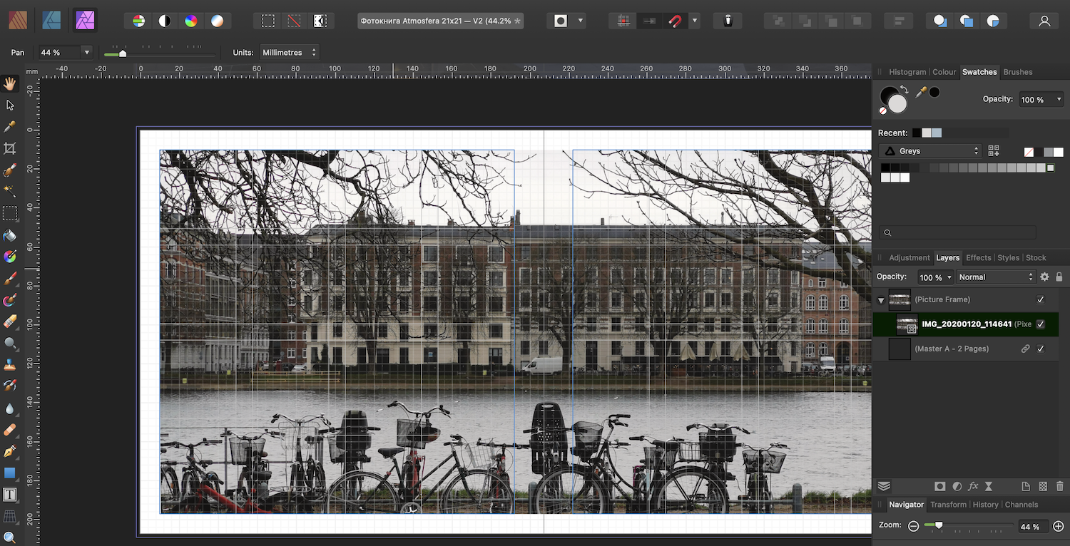
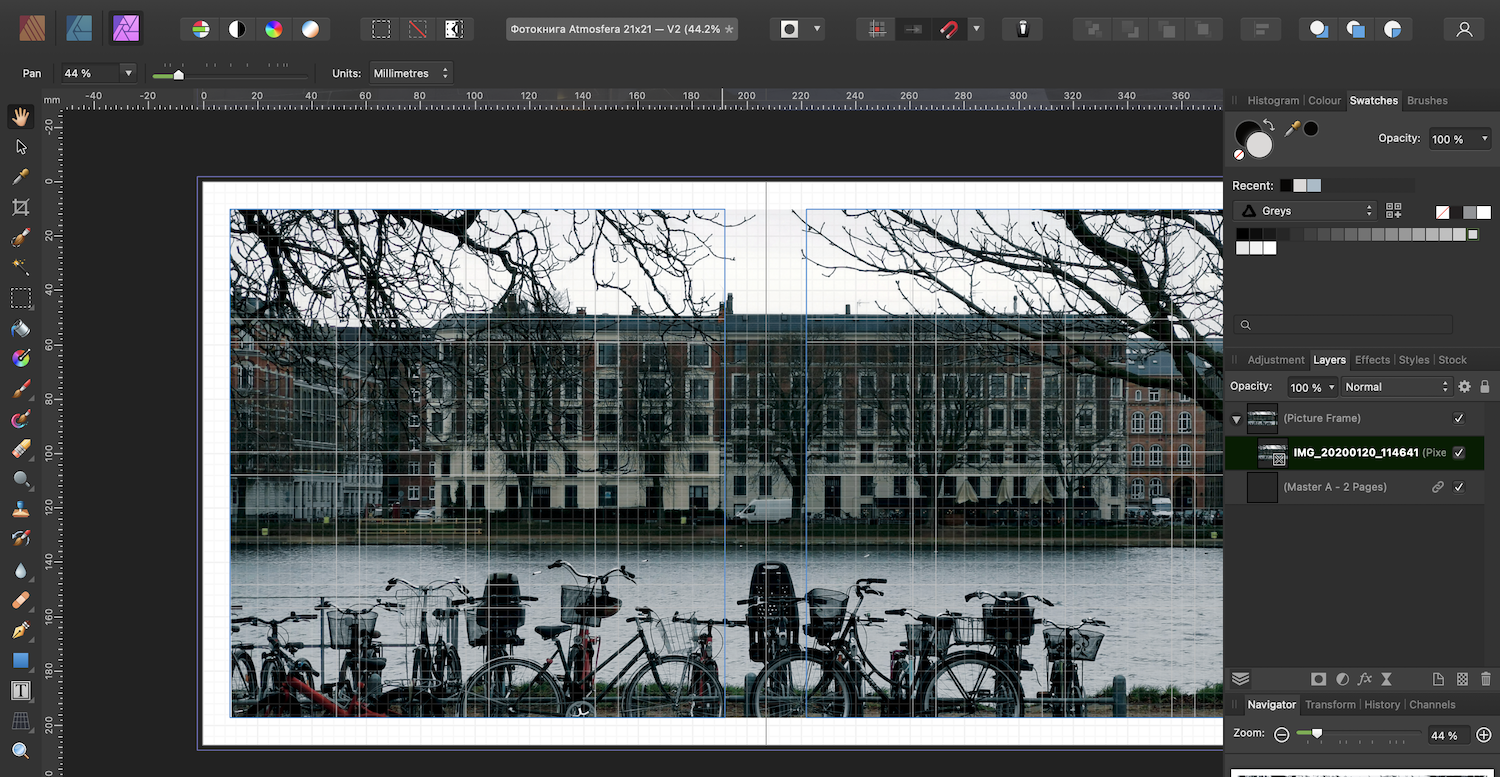
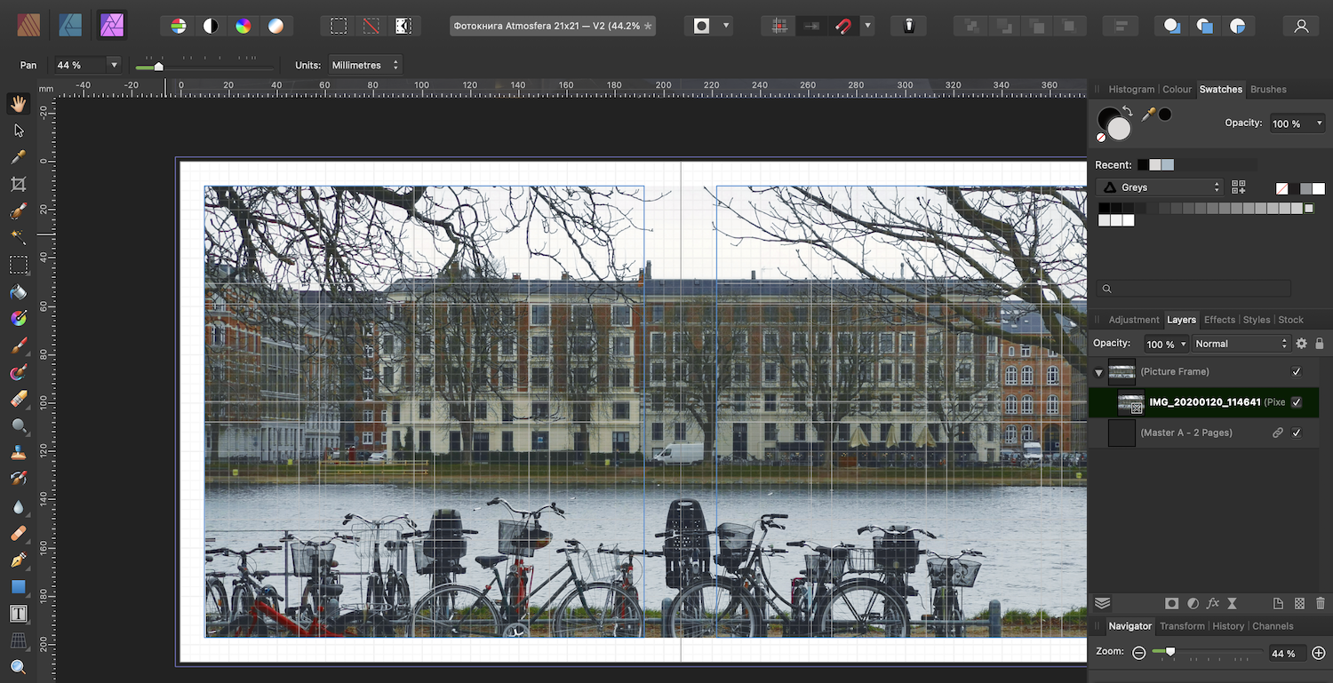
Good day to you! I wonder if there's simple solution to make photo spread for cover? Like on the picture below: For the brochure this kind of pages are used: So. If I need to make photo spread for pages 2 and 3 — I just cover both pages with picture frame (btw best solution for pictures ever, thanks!) But what i should do if I need photo spread for FRONT cover and REAR cover? Thanks in advance!

-
I deeply appreciate all your replies, many thanks for your help! So. For kind of simple tasks would it be correct to handle your document (with all images included) in RGB and convert the final document to CMYK when exporting PDF?
-
Good day to you! It is stated in Printshop rules that: Where in Publisher I can check that, taking into consideration that all my images are RGB and are converted in CMYK automatically by Publisher? Thanks in advance!
-
Yes, all my images are definitely RGB! But not only "auto" — everything is working in "another" way. So what is supposed to be done in such scenario? Yes, these adjustments works as are supposed to, as adjustment layers, looks like they're the only available in my scenario. I totally agree with you, thanks, but what am I trying to say is that in my scenario all these things works like in another way they should. As Walt mentioned, that's because my document is in CMYK but the pictures are RGB. Looks like that is the point.
-
Here's my settings and CMYK is recommended by this particular print shop. Do you think this is not appropriate CMYK so photo persona does not work well? So, that didn't work apparently — but still I understand that there will be slight difference between paper and screen.
-
Hej! I ordered to print a photobook a few weeks ago. I'm not professional designer, but I don't like options for print available, so I've decided to make this photobook with Publisher. When the photobook was printed it turned out that it was too dark. I can't say that the PDF that I've made was the same dark as printed, but still I've decided to make V2 of the photobook. I've never edited any pictures using Publisher, so according to youtube videos there's Photo persona for that. And tried to use auto-correction: So strange. Okay, Command+Z and let's try to use auto-color Well, it looks something is going wrong. My question is more about is in Publisher the way to edit photos slightly (brightness/contrast/colorbalance) before sending to print?
-
Thanks! I watched almost all available Affinity videos. Well, yes — I was thinking about it. Thanks!
-
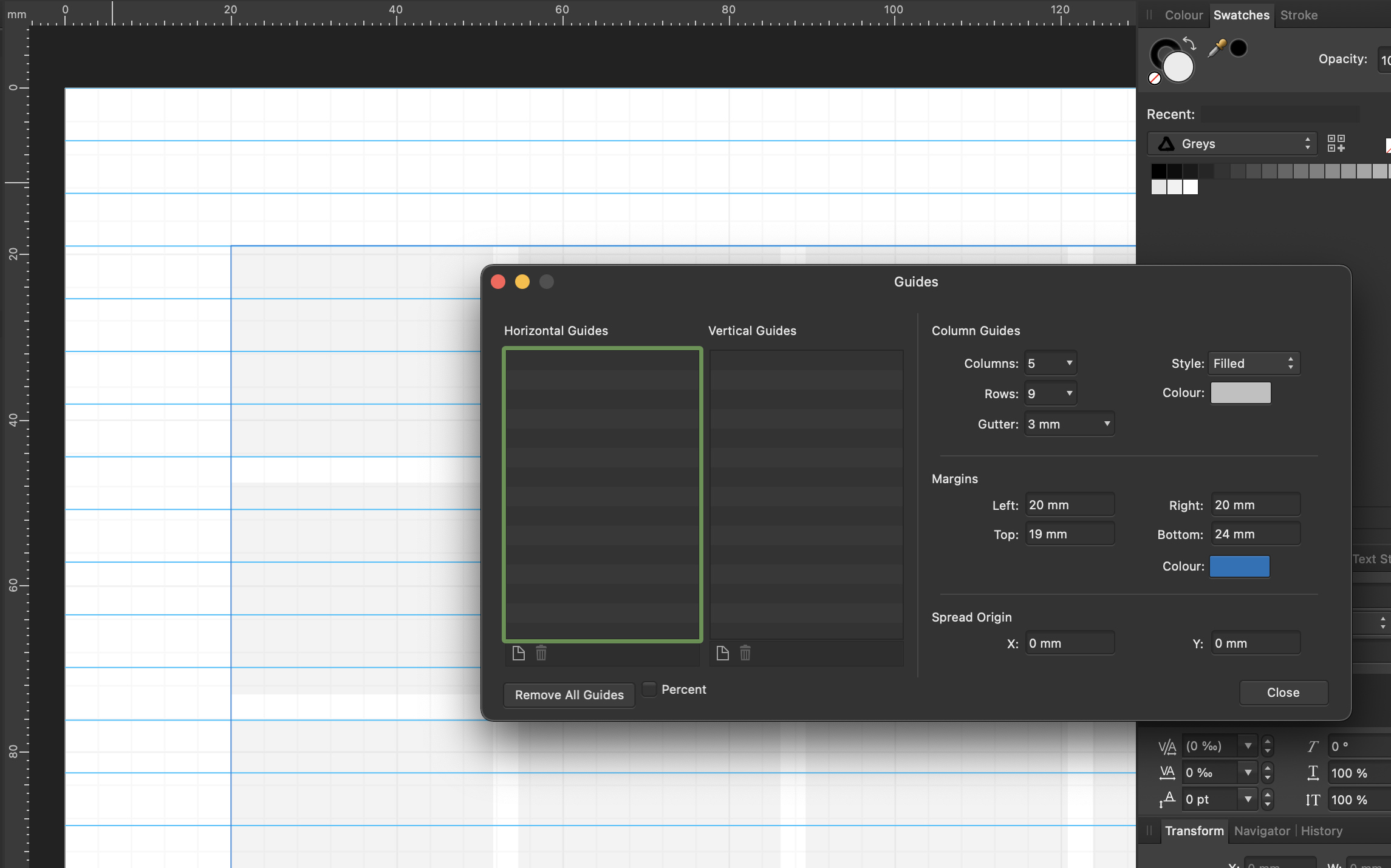
Hej! Hope you're doing well. I do not often make any documents, but I want them to look nice. And that's why I like the approach like Publisher do when you can set document structure. I read some articles about the topic and they said that I should set some basic things like number of columns, number of rows and size (hight) of the line. And most of the articles shows me as an example a picture where the height of the line is exact hight of the column/row spacing. But... I just can get that to be precise! Okay, I set up margins to fit line hight, but still can get rows to fit height of the line! There's screenshot attached — that's how I try to fit A4 paper. Anyway, is there, maybe, some secrete knowledge to set up the grid that will look nice in most of cases?
-
Well, actually I wanted to delete the topic but haven't seen corresponding option... 🤭 But still who knows, maybe it will be more usefull now 😆 This can be either all or preferred, why not? I double that, but don't you think in case we mix English (whatever you want) and Russian — that will be much easier for AI to split text block into languages? What I wanted to say with my post is that maybe we do not need 100% correct spelling check, but when 90% of the text is underlined with red is kinda frustrating. I totally agree that it would be tough task to separate British English from USA, but what about, for instance, German and Japanese? Dutch and Italian? I don't think Publisher should check every dictionary available when user can set preferred.
-
Well, solved by myself. There was different language set in the spelling section of the Character tab. BTW, why isn't there any "auto" option?
-
Hej! I have small issue with spell checker on MacOS — it looks strange when it knows some words, but the most of them not. Like there's a lack of dictionary. Where can I check and fix the issue?
-
You're awesome. Yes! That's what I looked for. That even works with image placeholders, so thanks you a lot!
-
Good day to you! I wonder if in Publisher there's not complicated way to put the pictures inside the text. What I have now is blank white canvas with three image place holders and art text above them. What I want is to "inverse" so the pictures were visible only within the text, so the rest of the canvas remain white. Thanks in advance!
-
Stupid me. I checked that for a couple times. Thanks.
-
Well. I started from making grid and guidance for the single page (the last image in my initial post) —> Everything looks fine. Then switched to the Master page A and repeated guides and grid settings for the master page (the first image in my initial post) —> And it looks not so good. As far as I can see, settings in the Giudes manager are totally the same. But there's huge visual difference. And I do not know why. And if I create new single page with master page applied I will also get "no so good" result.
-
Today I wanted to make some stickers for routine use — I got special pre-cut Lomond self-adhensive paper for that. So, I created blank A4 and used columns and guides to mark cut line for every sticker. I was not intended to make different variants, so I made guides for the page. After I did the first try I realised that I want to try different designs, for what decided to create the second page — and guess what? Right, no guides because I should have use Master page for that. So, I decided to make things right and repeated guides and grid for the master page. But when I had finished I saw some difference: guides and grid did not look the same for master page and single page! With taking in consideration all above, I have two questions: 1) Why is there a such difference? 2) Is there any fast way to copy grid and guides settings from single page to a master one? Thanks!