David Allen
-
Posts
27 -
Joined
-
Last visited
-
Hello Hangman thank you for the assist. Well I'll be ....! Thank you! I have never used or have any idea what Passthrough or Interpret is, but that is the solution for display and output. Interesting before I messed with that setting, I noticed in the Designer master, saving as PDF, if I saved Selection Only, it was perfect. If I saved Whole Document, it remained rasterized. But both are fine after changing layer to Interpret. Some logo sections on a business card as examples. BC test logos placed Interpret.pdf BC test logos placed.afpub Logo test saved Selection Only.pdf Logo test saved Whole Document.pdf
-
Further to this I've just had an issue sending a job to print from Publisher and I hadn't noticed the linked PDF logo had been rasterized. Taking a second look, and zooming right in, within Publisher, it is not displaying as vector either. So this is not just when being output to PDF. Reading the above, I thought maybe my logo was not saved correctly in the first place, so I re-saved the logo using PDF/X-3:2003 and noted, Allow Advanced Features, was check on by default. Same rasterized display. Baffled and in a hurry, I resaved the logo as what I though was considered old school EPS, and problem solved. The logo is basic flat white text converted paths, a box and a line on a flat blue background. Nothing clever there. Any suggestions? Attached is a screenshot from Publisher of a logo section of the PDF logo placed above the EPS.

-
 David Allen reacted to a post in a topic:
Tagged PDF support for accessibility
David Allen reacted to a post in a topic:
Tagged PDF support for accessibility
-
David Allen reacted to a post in a topic:
Tagged PDF support for accessibility
-
HawaiiAna reacted to a post in a topic:
Tagged PDF support for accessibility
-
 David Allen reacted to a post in a topic:
Text Box background V2
David Allen reacted to a post in a topic:
Text Box background V2
-
Text Box background V2
David Allen replied to Marti4x4's topic in Desktop Questions (macOS and Windows)
Thank you Walt! Thought I was going mad today wondering why a copied and pasted text frame with background colour from Publisher could not be modified. Seems like a strange omission in Designer considering all the information is still there and editable if copied back to Publisher. -
I'm a Mac user and trying to avoid going back to Adobe after enjoying the warm embrace of Affinity products, but now have a client asking for accessible PDFs. As a complete noob to tagging and making accessible PDFs, this question might seem naïve, but here we go. As Affinity products still can't generate accessible PDFs, is it possible to make a standard PDF from AfPublisher then "retro-fit" all the accessibility features in software like Foxit Pro?
-
David Allen reacted to a post in a topic:
Request for a statement about PDF accessibility from Serif please
-
WestSacGreenDesignGP reacted to a post in a topic:
Publisher, Mac OS - Export fail for PDF if hyperlink error, but doesn't show in preflight
-
Thank you for this, but it seems more like a programming work around. Like my dashboard instruments are not telling me anything, so I have to open the bonnet and get my hands dirty. I hope pre-flight is an area of priority for future releases.
-
I too can't export to PDF with some hyperlink error. But seriously, do I have to trawl the entire document of hundreds of hyperlinks for a rogue space or something? I will need to send this to the client very soon, and this is a serious fault in Publisher. Any suggestions apart for sit there for hours trawling and then wait in hope that the next Publisher update includes pre-flight and robust correction functionality?
-
David Allen reacted to a post in a topic:
Affinity Publisher for macOS - 1.10.0
-
Hello D Wright, thank you for the response. Sorry for the delay, I didn't see a notification of a reply. The document is US Web coated swap v2. Not something I've meddled with because pretty well everything I've had printed (digital and offset in UK) gives me results pretty close to what I was viewing on screen. I just checked another image and had the same results. The image is high res, but RGB. Not sure that should make a difference especially as it's rendering correctly in the master. Thanks, hope to hear from you soon.
-
David Allen reacted to a post in a topic:
Linking pages in Publisher to flow text from page to page
-
David Allen reacted to a post in a topic:
Option to replace matching text styles on paste/import
-
David Allen reacted to a post in a topic:
Can text styles be saved?
-
OK, thanks Lagarto (to the rescue again!), for confirming. Mmm, happy adjusting to a new way of doing things in many areas, but the colour UI seems unfriendly. Love using Affinity software so far, but I hope the dogs breakfast of colour management doesn't become a "Quark style" thing that's overlooked for 10 years whist adding more "bling" to the rest of the software!
-
Publisher question. Hello, I've made CMYK swatches of my client's pallet. Then I made various standard tints and also added those to the swatches. I wanted to see the percentage breakdown of each process colour. So, how much C and M is actually in that 15% tint of the full strength version for example. Am I missing something? The only way I could show the actual values of the tinted version of the colour was to use the Colour Picker pipette and select an area where the tint is used. All other options of showing sliders in various places only showed the full strength original, which is incorrect.
-
David Allen reacted to a post in a topic:
Affinity Publisher for macOS - 1.9.1
-
In Publisher, importing a CMYK jpg or png and using the K only button to convert to a spot colour monotone and I have these results (see attachment). The master displays correctly, but the document page has some kind of super intense duotone effect. I could only change this by editing detached on the document page and re-clicking on K only. Kind of defeats the purpose of having the master! Also had some odd effects importing B&W images made in Photo which end up looking washed out in Publisher. What's the story here?
-
lacerto reacted to a post in a topic:
PDF-Export problem: Black Text is not 100 % K in PDF
-
OK thanks Lagarto, very useful info. 👍
-
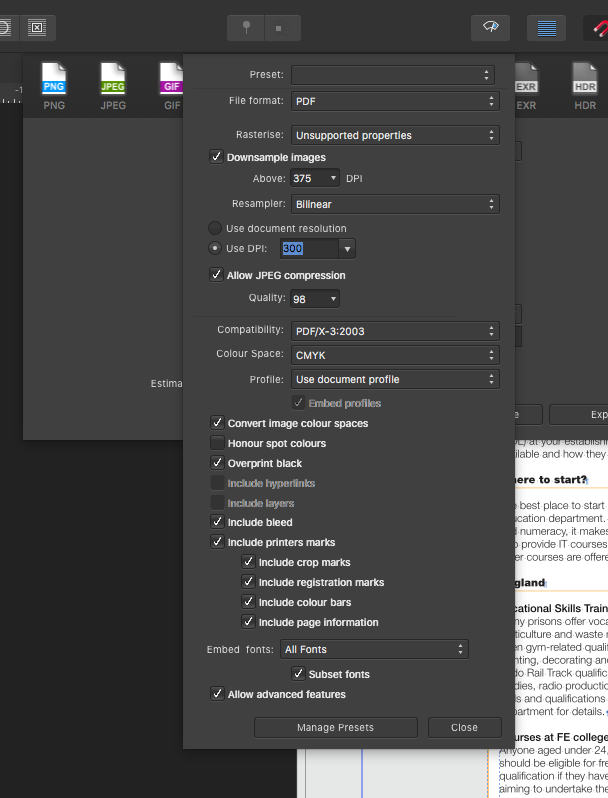
I feel like I've come to this party a bit late, but hoping Lagato etc. will be able to suggest a thing or two, or just confirm what I'm doing looks OK. I've read through this entire subject which seems overly complicated compared with my previous years of InDesign and Quark. But I guess this is how it is in Publisher for now so I must deal with it! For the last 10 years I've only used two printers and I've never been asked for any specific PDF format or colour space so I'm completely unfamiliar with PDFX. I just make CMYK documents some with RGB images and I just save a generic press ready PDF, all spots and RGBs converted to CMYK. Some might call this a little basic, but I've always had nice looking books and reports. So despite my years, here's the noobie question, what exactly happens with PDFX3 compared with say a standard Quark "Press Ready" PDF and is it any better than PDFX4? Messing around with some settings I think I've found the right combination. Attached is what I've come to (based on some suggestions earlier) for my CMYK report. RGB images will convert to CMYK without the laborious task of editing the originals, and most importantly all the text will remain K only. I've checked "Convert image colour space" as I presume that covers the RGB to CMYK images? "Looking OK here?
-
Hello, I've made a discovery which might be useful for some of you wanting to make duotone (effects) or for me in the case of this client, a monotone with 100% of a specific colour combined with a tint of the same colour to reduce contrast. I was using Lagarto's suggestion of an overlaid rectangle, and I applied transparency to mix with my image on the layer below. But I thought that extra layer was just a bit unnecessary so started having a poke around! Try: View -> Studio -> Effects -> Colour overlay. It means you can colour the image as well as fill the picture box without having a second box overlaid – Quark style! I do note that it's only for PDF documents and CMYK print jobs, because I just tried a duotone and I also could not achieve spot separations. So for me, an exciting discovery that suits my needs for this client, but would be better if it separated for those who want single or two colour print jobs. I hope this helps.
-
David Allen reacted to a post in a topic:
Affinity Publisher for Windows - 1.8.4
-
Thank you, some very good tips there. My job is actually just monotone (the look of) either for CMYK digital printing, or (mostly) viewed as PDF. Combining various tips mentioned by you all, I've managed to replicate the previous style created in QXP. So I have a monotone PMS spot colour photo combined with an overlay in the same colour with transparency setting plus multiply to deepen the darker areas. I did the overlay to remove white and reduce the contrast for legibility of the document title and logo. Two page PDF attached to show first just the monotone, followed by the monotone plus box overlay. I really appreciate the swift response! Monotone_example_1and2.pdf
-
Ah, Mike to the rescue! Hey this is great, and non-destructive too! That's a powerful tool. I do note that I can't add say a 30% tint of the spot colour (like I've done with QXP in the picture box) if I want to reduce the contrast to overlay white text. Although in a 5 min play just now, I added a second box on top filled with 100% of the blue spot colour and used transparency for the same effect. Thank so much for that. Onwards an upwards!