

Jbones
-
Posts
20 -
Joined
-
Last visited
Posts posted by Jbones
-
-
Can I send it to you directly?
-
Quote
Just to clarify, these are hyperlinks to pages, not to some piece of text or some object in the page?
Correct
-
I've exported my Publisher doc to PDF. It has numerous hyperlinks which link to internal pages within the doc. When the PDF is open (I'm using Adobe Acrobat) and you click the links it sometimes "transfers" you to the top of the destination page, and sometimes transfers you to the same "height" as the starting page. For instance, I have a hyperlink at the bottom of every page that links back to the Table of Contents. If I scroll down later in the document so one of these TOC hyperlink is towards the top of the page I'm viewing, when I click it the TOC will be scrolled down as well. Does this make sense?
Is there anything I can do about it? Ideally the destination for a hyperlink would always be the top of the destination page.
Thanks!
-
-
17 hours ago, JuanitaT said:
- Be aware of your outlines and try to be consistent with them. To make things look more streamlined, try to keep the widths of the stroke the same and also try to keep all of them the same color (or you could try having the outlines be a slightly different shade than its fill). The guy in the first image has really thin arms that are smaller than the other outlines.
- Try to limit your color palette. Having too many colors can muddy up a picture. Also you want to try to make sure the colors you choose are a similar intensity. For example, try to pick only colors that are bold, or only pastels, or only muted. The rocket, to me, has too many unrelated colors. However, the witch looks pretty good as well as the guy smoking.
- On top of that, also make sure to choose your colors carefully. The yellow of the smoke on your rocket is kind of green and doesn't fit well with the other colors.
Thank you so much - for the specific comments above and the rest of the post. It's really helpful!
-
I'm a hardcore graphic design newbie and an untrained doodler. Here are my first original e-creations (that I feel brave enough to post...)
I'd love to get some thoughts and feedback for ways you might have approached these designs differently, details you might add or adjust, obvious newbie choices/errors, or anything else. All suggestions are welcome!
For instance, shadows are still very much a crapshoot for me. I play around and hope for the best
") What I need is a foundational art class, but one won't be in my future any time soon...
What I need is a foundational art class, but one won't be in my future any time soon...
Anywho, thanks for any feedback you provide!
-
So good! That clothing is on point! Do you look at costume time pieces to assist, or is this all from your mind?
-
These are delightful
-
Super helpful, Lagarto! Didn't realize that was an option in Document Setup. Mission accomplished, thanks again!
-
I'm pretty new to the world of graphic design. 😔
Can you help me reproduce the blue I created in Gravit in Affinity Designer? So far it sounds like I need to be using the CMYK mode...
-
Thanks very much, Palatino. I know how to switch between RGB and CMYK here (right?):
I tried switching to it and using the eye dropper again, but same result. And I don't see a place for CMYK hex codes. What am I missing?
-
I made a design using Gravit.io with a distinct blue color. When I use the eye drop selector - or copy and paste the HEX code - in AD it comes out a different blue. Try as I might, I can't figure out how to configure the color settings to match the original. The color's hex code: #0061FD
Any tips/tricks?
Thank you!
This is the blue from Gravit.
This is how it shows in Designer:
-
Oh man, ya'll are SO helpful. Really appreciate the videos, screenshot, and tutorial recommendation. Thank you so much - thomaso, appearsharmless, and Bad_Wolf!
-
Gooh boy.
Newbie here, attempting this tutorial and it's not going... great. Lol.
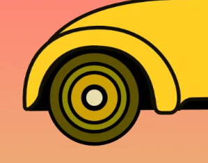
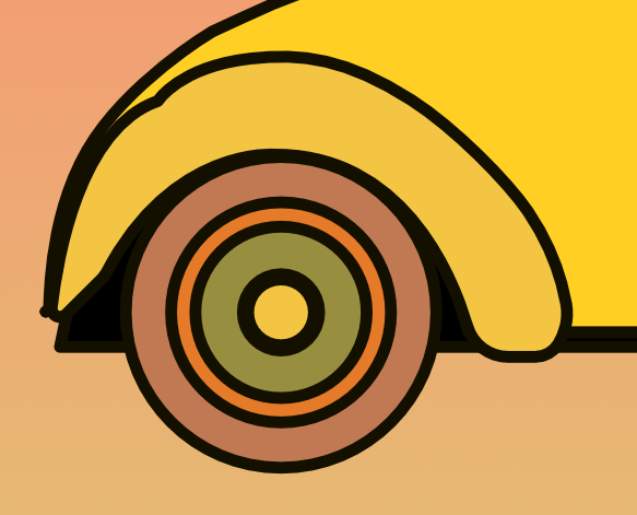
Trying to wrap my brain around the pen tool. I wanted my car fender to come out like this:
But it came out like this:
Two questions:
What is the simplest way to fix the kink in the top left of the vendor - other than to redraw it?
Similarly, the right lower part of the vendor is fatter than I wanted. Is there a quick way to slim it up?
Thank you!
-
Success! I had tried clicking "Document Setup" and choosing "Prefer Embedded" in the Image Placement Policy option, but clearly that isn't how you Embed pictures
Thank you so much, Walt!
-
Thank you, Walt. I tried embedding them, but that didn't work. The images were originally contained in an InDesign file (.idml), so I don't have individual files to link to. I tried linked directly to the IDML file but that didn't work. Do I have any other options?
-
As the title says, I was working on AP project on one computer. I saved it as an .afpub and moved it to another computer. Now all the raster images are low resolution. Any ideas?
-
This did it! Thank you both!!
-
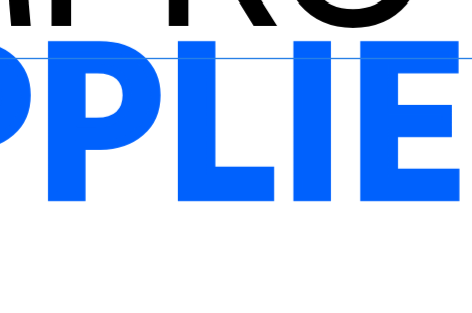
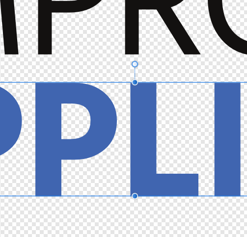
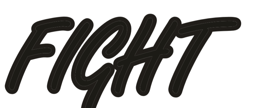
I'm a fairly new designer, and this is my first post! Really enjoying Affinity Designer, but can't figure this one out:
I've created text with additional stroke outline, but there's a gray hairline outline that separates the text from the stroke. How can I eliminate this hairline outline? Many thanks!!

Publisher hyperlinks arrival location
in Pre-V2 Archive of Affinity on Desktop Questions (macOS and Windows)
Posted
Just sent!