Unlikely Moniker
Members-
Posts
14 -
Joined
-
Last visited
Everything posted by Unlikely Moniker
-
It's very easy to convert shapes or curves to frame text unintentionally by accidentally clicking the shape/curves with the text tool still selected instead of the move tool. While simple conversion is extremely useful to all users, it would also be helpful to fat-fingered individuals like myself if we were able to disable automatic conversion in the settings menu. We would still of course be able to convert via the move tool context menu.
-
How to flip Ruler scale
Unlikely Moniker replied to Parmanand's topic in Feedback for the V1 Affinity Suite of Products
Also hoping for ability to flip ruler scales/set origin at bottom left- 12 replies
-
- reset ruler origin
- flip ruler scale
-
(and 1 more)
Tagged with:
-
Reorganizing Rows in Table
Unlikely Moniker replied to Loquos's topic in Feedback for Affinity Publisher V1 on Desktop
+1 from me too -
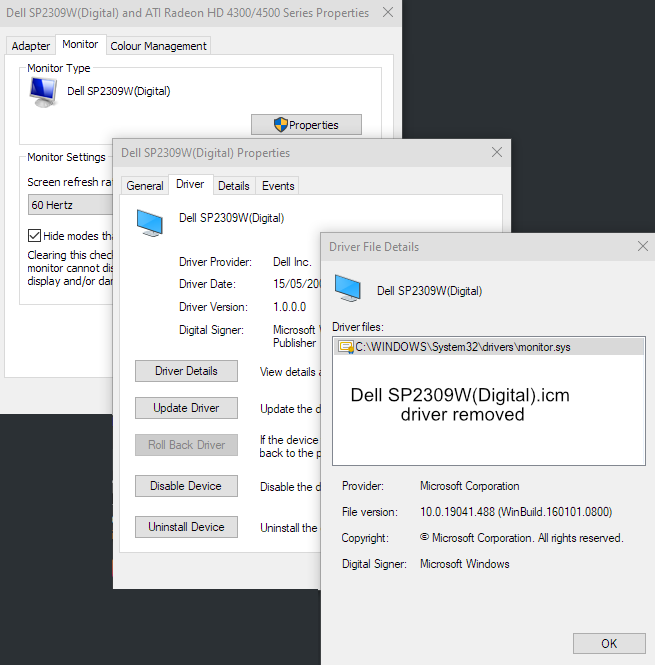
Thank you for the help. I have been able to (almost) solve the problem. It was indeed related to the Dell monitor driver. I had tried reinstalling the driver and trying update it (although there wasn't much point since the monitor and driver are pretty old by now). I had not checked the driver file details, though. That showed the generic Windows driver location plus the SP2309W.ICM file (in C:\Windows\System32\spool\drivers\color). I renamed the SP2309W file as .old and restarted. Now Affinity shows (almost) the right colours - cyan is perfect, red a tiny bit off as in 255 2 3 and yellow is ever so slightly bluer at 255 253 31. Anyway, I can live with that. Do you think the Dell SP2309 profile is one of the ones that doesn't work well with Affinity? I'll attach it in case someone wants a look. Hopefully the BENQ replacement will play nice with Affinity when it arrives. SP2309W.ICM.old
- 8 replies
-
- colours
- render error
-
(and 2 more)
Tagged with:
-
Confirms the problem is restricted to just the Affinity apps on my Dell Inspiron, not your machine or my laptop. Back to the original question, since the Affinity apps are the only ones on that PC that have the problem - not MS Office, Paint, Paint Shop Pro, Drawplus, Pageplus, etc. etc - does anyone have a suggestion why Affinity might behave differently? Maybe if I back up my shortcuts etc and completely remove Affinity including everything in AppData?
- 8 replies
-
- colours
- render error
-
(and 2 more)
Tagged with:
-
RGB/IEC61966-2.1 afpub file showing RGB values divergence between Publisher and Windows screen picker. Yellow agrees but not red and cyan. The pdf is the above file, exported on the 'digital high quality' setting, also RGB/IEC61966-2.1. The output RGBs now agree with the pnes set in Publisher. I have installed Publisher on another machine, ASUS laptop. On that screen, all the RGBs are OK. Laptop version is 1.84 though, vs. 1.85 on Dell PC/monitor. publisher-cyan-red-yellow.afpub publisher-cyan-red-yellow.pdf
- 8 replies
-
- colours
- render error
-
(and 2 more)
Tagged with:
-
Hi Pšenda, Thank you for your reply. This is the profile for the monitor: I think that should be OK? In the meantime I should receive a new BenQ PD2700Q monitor today and I will see how that works and report further....
- 8 replies
-
- colours
- render error
-
(and 2 more)
Tagged with:
-
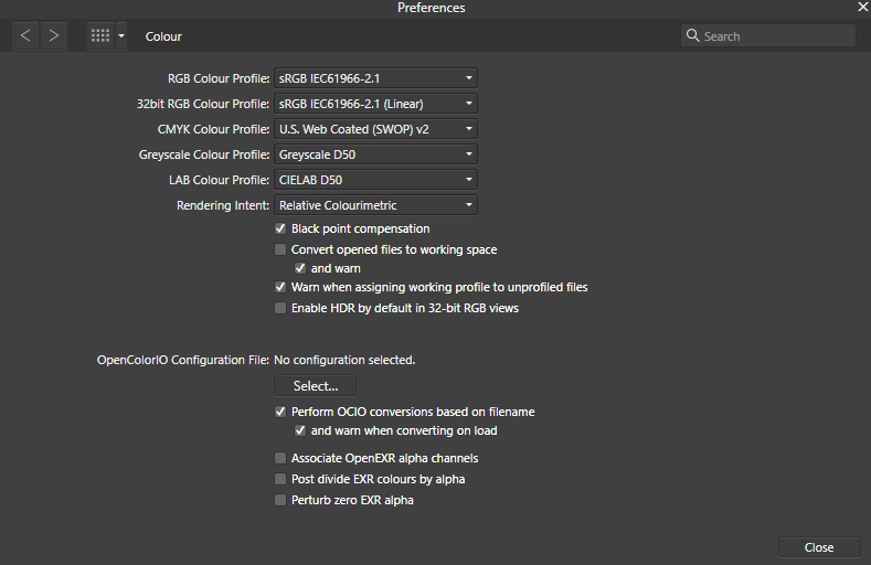
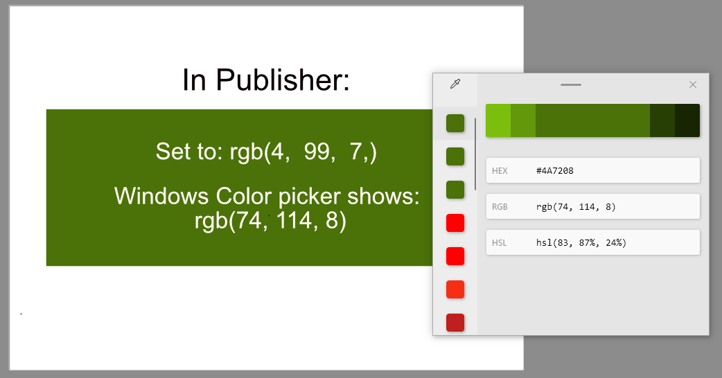
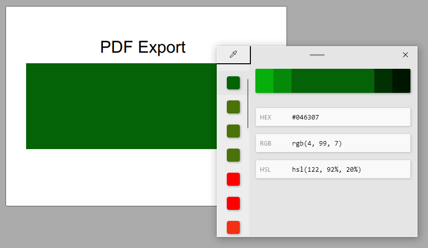
Affinity Publisher workspace recently started rendering colours differrently to all other apps on my PC. For example, if I set the RGB sliders to 255, 0, 0, i.e. red, the resulting swatch colour is noticeably orange and a colour picker such as Pixie or the Windows Powertools picker shows the swatch as RGB 246, 47, 20. Colours are consistently "off" across the spectrum and across sessions. The problem doesn't appear to be caused by instability. The same problem appears in Photo and Designer. Example: Here's how Publisher renders a fairly cool, mid-dark green colour: RGB 4, 99, 7. As you can see the external picker reads it as rgb(74, 114, 8). The document's colour format is set to RGB/8 and the colour profile is sRGB IEC61966-2.1. Below is the above Publisher file exported as a PDF, using the digital high quality preset with colours set to RGB/8 and sRGB IEC61966-2.1. The green is rendered how I'd expect RGB 4, 99, 7, to look like. Windows' colour picker agrees. Lastly here's the two colours next to each other in MS Word to illustrate that it seems to be Publisher that's having a problem with colour rendering, not other apps or necessarily my monitor. This is my Publisher's colour setup in Preferences (Publisher default I believe): My graphics card is an ATI Radeon HD 4300/4500 Series with the most recent driver available. The monitor is a Dell SP2309W on the standard preset. Windows colour management profile is sRGB IEC61966-2.1 profile. This is the same setup under which Publisher rendered colours reliably before. However, I have tried just about every combination of colour profile, monitor preset, contrast/brightness, Publisher colour management option and software calibration to see whether it made a difference. Unfortunately it didn't. Does anyone have any ideas why it's only my Affinity apps that render colours in a way that means that colour pickers show different RGBs to the one set in Affinity's colour Studio, whereas all my other apps render the expected colour consistently? Could it be a workspace rendering issue, since exported images and PDFs show the colours correctly? If it was a monitor problem, surely I'd be seeing inconsistencies with colours everywhere, not solely in the Affinity apps? Could this be related to the "washed out colours" issue reported in the past? Were any of those users able to resolve it?
- 8 replies
-
- colours
- render error
-
(and 2 more)
Tagged with:
-
Bit late to this topic, I know, but here's how I get the effect the OP is asking about using Affinity Photo desktop: Add a Black and White adjustment layer over the image. In the adjustment layer's properties options box, set the Blend Mode to Lighten Drag the layer property colour slider for your chosen colour, e.g. red, to the right (negative value) to bring out that colour leaving the rest of the image monotone Try experimenting with the Lighter Colour blend mode as well; it might give a slightly subtler effect.
-
The growing number of time and activity tracking apps for Windows usually rely on the title bar of the active Window for capturing details of the application/document being worked on. The old Serif suite did this, as per the screenshot, which allowed accurate logging of time spent per document, making the suite ideal for commercial design jobs. Since Affinity suite doesn't display this information in the title bar, my tracking app can only report "Designer" or "Publisher" etc. Could this feature be included in future releases?
-
Inconsistent colour rendering in Publisher
Unlikely Moniker replied to Unlikely Moniker's topic in V1 Bugs found on Windows
I have calibrated the monitor using the Windows' internal tool. Colour preference for RGB is sRGB IEC1966-2.1. in all Affinity and legacy Serif apps. That gives acceptably predictable rendering of RGB outputs across the devices and monitors I've got access to. The issue is with Publisher seemingly randomly deciding to render colours wrongly - in some sessions until I restart the PC. It hasn't happened again since I made the post. All the same, I now regularly open the afpub file with Cyan and Fluorescent Yellow to double-check Publisher is behaving as expected. I'll update this thread if it happens again. Likewise, If there's no further recurrence over the next few weeks, I'll put it down to a one-off glitch with my Windows and update. -
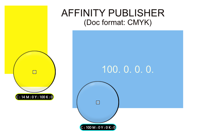
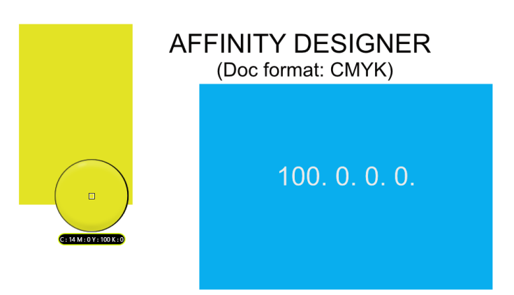
*If Publisher isn't showing you colours as you expect, try opening and closing it a couple of times and restarting Windows first before bashing your brains out on the colour management settings.* Working on a Publisher document this morning I noticed the colours were way off what I expected compared with the doc elements I'd done in Designer. As an example, here are two colours - Cyan and CMYK 14.0.100.0 (aka "fluorescent yellow") - as I expected from what I was seeing in Designer: But here is what Publisher showed with EXACTLY the same colour management settings as Designer for the document and the programme itself: The point is not whether either of the above are "accurate" renderings of Cyan or 14.0.100.0. The problem is Publisher disagreed with every other app on my PC including Affinity Photo and Serif Page and Draw Plus. I tried every combination of colour profile and document intent available in Publisher. None of them made a discernible difference except for changing the doc format to RGB/8, which improved the Cyan noticeably but not the yellow-green. Publisher exported the intended colours (i.e. as displayed by Designer) as images and PDFs (CMYK and RGB). Those files displayed correctly on other monitors and devices, with only the slight variations you'd expect. But it wouldn't display correctly on the monitor. I did the two docs shown in the screenshots to report the problem, then went out for a meeting. When I came back, signed back into Windows and reopened Publisher, all documents now displayed colours consistent with Designer etc. So it was "just" a glitch - albeit one that cost me half a morning's work, making Affinity a very expensive choice if you want to look at it that way. But looking around, I notice other users reporting "washed out" or otherwise incorrect colours. For that reason, I am reporting this behaviour as a bug in 1.7.3.481


