Jump to content
You must now use your email address to sign in [click for more info] ×

Palatino

Members
  • Posts

    406
  • Joined

Everything posted by Palatino

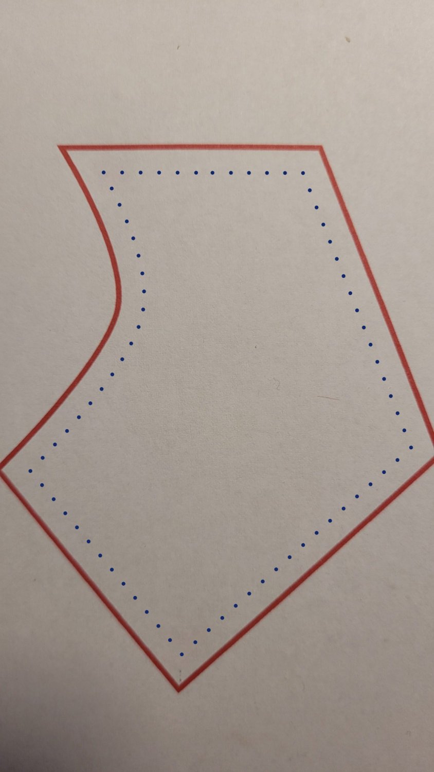
  1. Bitte, du bist auf dem Holzweg. Der Gestaltungsansatz ist bei der Zielsetzung einer Plotterverarbeitung blödsinnig. Denk doch einfach mal nach! Außerdem ist die Cutcontur – Schneidekontur! – so nicht zu schneiden, in keinem Format. Die Kontur wird am Ende mehr gestochen als geschnitten sein.
  2. Für die Cutcontur wirst du die Konturen erweitern müssen (Menü – Ebene – Kontur erweitern). Danach kannst du der Cutcontur die 0,25pt zuweisen. Bitte den Anschnitt nicht vergessen.
  3. Oh Mann – das Video ist „noch beschissener als die Frauen-Basketball-Liga“ (Originalton Video).
  4. Keine Ahnung, ich vermute gar nichts. Für mich war das bisher kein Problem, weil ich jedes SVG (kommt jetzt nicht so oft vor) sowieso manuell überarbeite. Mit dem, was mir Affinity beim Export liefert, bin ich eigentlich zufrieden.
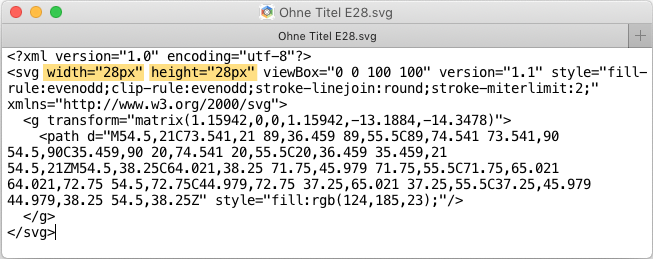
  5. Affinity exportiert immer mit width="100%" und height="100%" – unabhängig von dpi-Vorgaben (dpi ist keine SVG-Größe, siehe Programmfenster von Boxy SVG oder SVG-Definitionen).
  6. Either 28px x 28px or doesn't matter. See screenshots: 1. Export as SVG 2. Open SVG file in an editor and resize it (original size was 100px).
  7. Okay, dann der Wink mit dem Zaunpfahl: EPS ist kein Grafikformat, das noch verwendet werden sollte. Hier schon mal gar nicht. 😉 Die Beschreibung von thomaso ist zwar grundsätzlich richtig, kann man so machen, doch als nahe liegendes Werkzeug würde ich das Umrandungswerkzeug sehen. Und bitte die CutContur, wenn sie wirklich eine Schneidekontur werden soll, nicht erweitern, das muss eine Kontur bleiben.
  8. The letter spacing is very large, which also increases the word spacing - and at some point the word spacing is just too large.
  9. You can do whatever you want on your screen, of course. Just don't expect the whole world to follow you around and ruin their eyes just to see a picture exactly the way you do. So that you get an idea of the "quality" of your screen: Panel test image / traffic light (Source)
  10. Yes, only one space. The spacing still differs, it's just not as noticeable (another advantage of the space). I don't think this is a mistake. (The space character corresponds to the font size in each case, so it is smaller after "Becher").
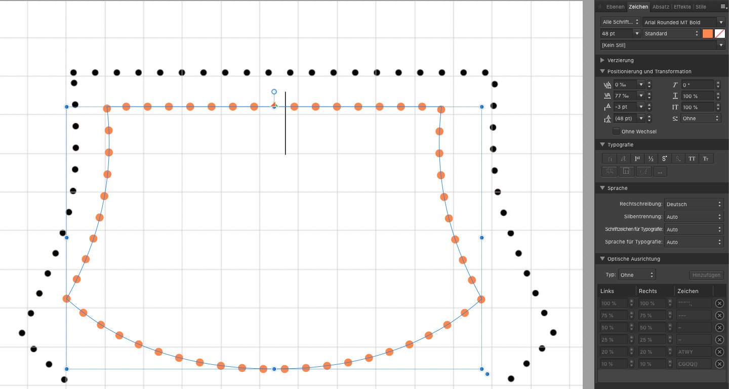
  11. Correct observation. For typographical reasons alone, I keep a distance to the right and left with the dots.
  12. With "Text on Paths" you can change the point spacing for entire sections as well as move each individual point with the text tools. The points can be aligned even much better than I did. Only dots, no spaces.
  13. Good keyword: There is nothing wrong with a very large color space, even Adobe RGB is never wrong. I work with sRGB throughout, but don't want to recommend it to everyone. For me, it works for web as well as for jobs for printers (then I convert to cmyk myself, as the printer wants). Unless you know exactly the strengths and weaknesses of each color space and consider them in all exports, sRGB is a good choice.
  14. Too early is always when image information is lost that would be needed later. It makes sense that the image should still be suitable for all applications at the end of the processing. For example, converting to cmyk too early can make it difficult to use the image in other media later. Even a change in printing technique can then result in inferior print quality.
  15. Bitteschön: Die manuelle Option wäre, die Kontur in Kurven umwandeln: Menü > Ebene > Kontur erweitern
  16. There is no such thing as "too late" for color space conversion, but there is very much a "too early".
×
×
  • Create New...

Important Information

Terms of Use | Privacy Policy | Guidelines | We have placed cookies on your device to help make this website better. You can adjust your cookie settings, otherwise we'll assume you're okay to continue.