
tom d
-
Posts
46 -
Joined
-
Last visited
Everything posted by tom d
-
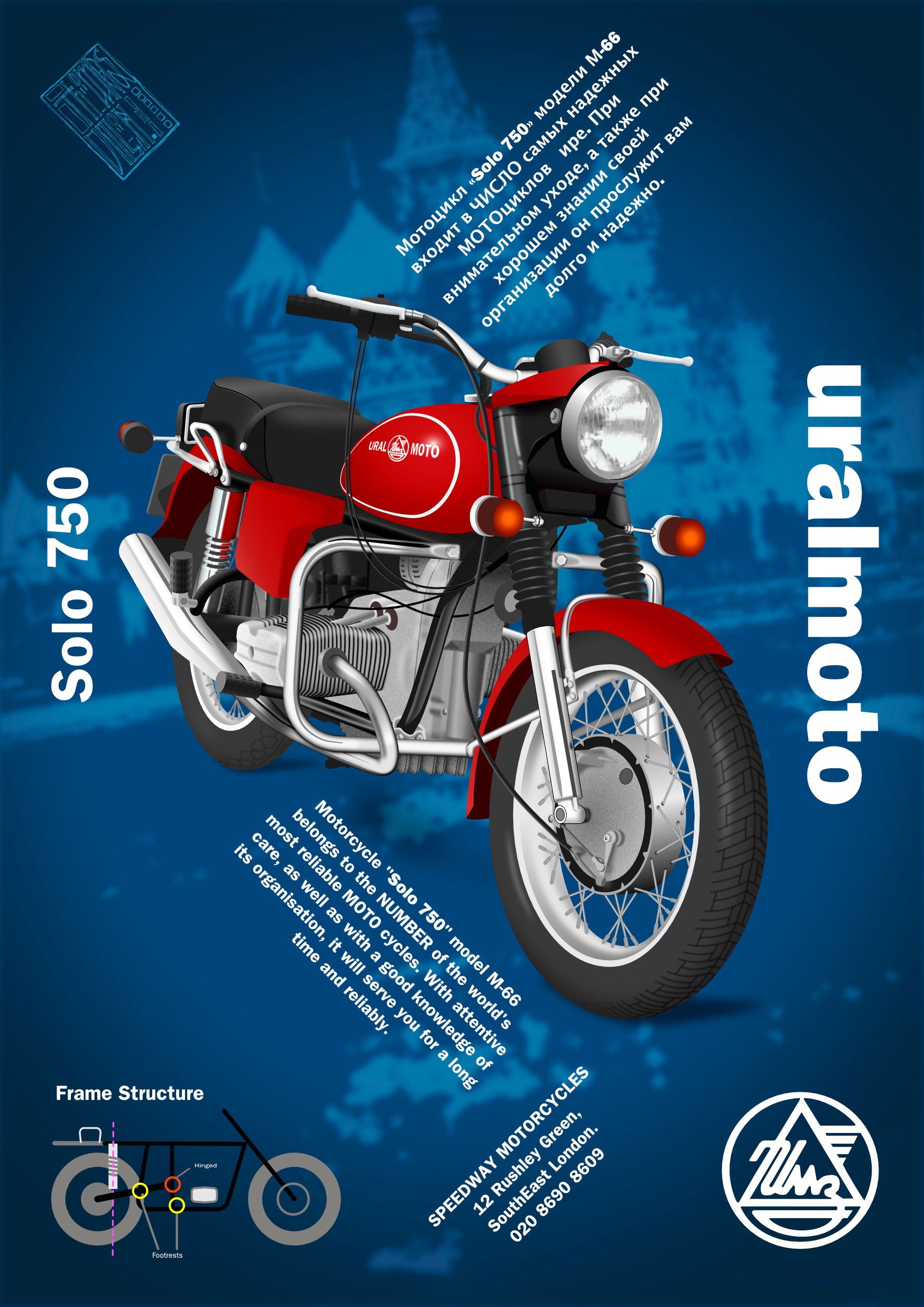
Amendments. I gave this another go. Just to tighten up some of the more clumsy bits. The cylinder cooling fins are tighter. In adobe illustrator, the blend tool would build a sequence of stages from the first shape to the final shape. Affinity doesn't have that tool, but the workaround I used was command J and the handy facility to align and distribute selected nodes, which was new to me. Where the exhaust pipe meets the cylinder is improved by dampening down the 'inner shadow' FX in that specific place. The extra shading on the fuel tank works better with the black edge of the headlight assembly. And there's a little more subtle detail in the dark area below the headlight and where the indicator lights are attached. I learned that raising the noise helped the engine appear less reflective than the chrome. I have never used the noise option before. The headlamp is a cheat. It's from a photo, but it did need a few adjustments and mesh warp in af photo, but everything else (apart from the fuel tank logotype) are vector with plenty of fx adjustments.

-
Slammer, you know history. BMW set up a factory in Russia before the war while the non-aggression pact between Germany and U.S.S.R still held. It is still the same war-time engine in the Uralmoto. I imagine the BMW has advanced more since then, but it's essentially the same design that polish civilians were glad to see leave. Fortunately, they have a reverse gear. Did you consider getting the side-car with it?
-
What fun. I did a vector Uralmoto. The text was a direct translation using google translate, and it's is not a bit addy, which suits the brand well. Unsophisticated and proud of not being a Harley Davidson. Playing with the type (Franklin Gothic) in the layout somehow worked for me. I'd never have got away with it in art school. But my work my rules.
-
Cheers telemax.
-
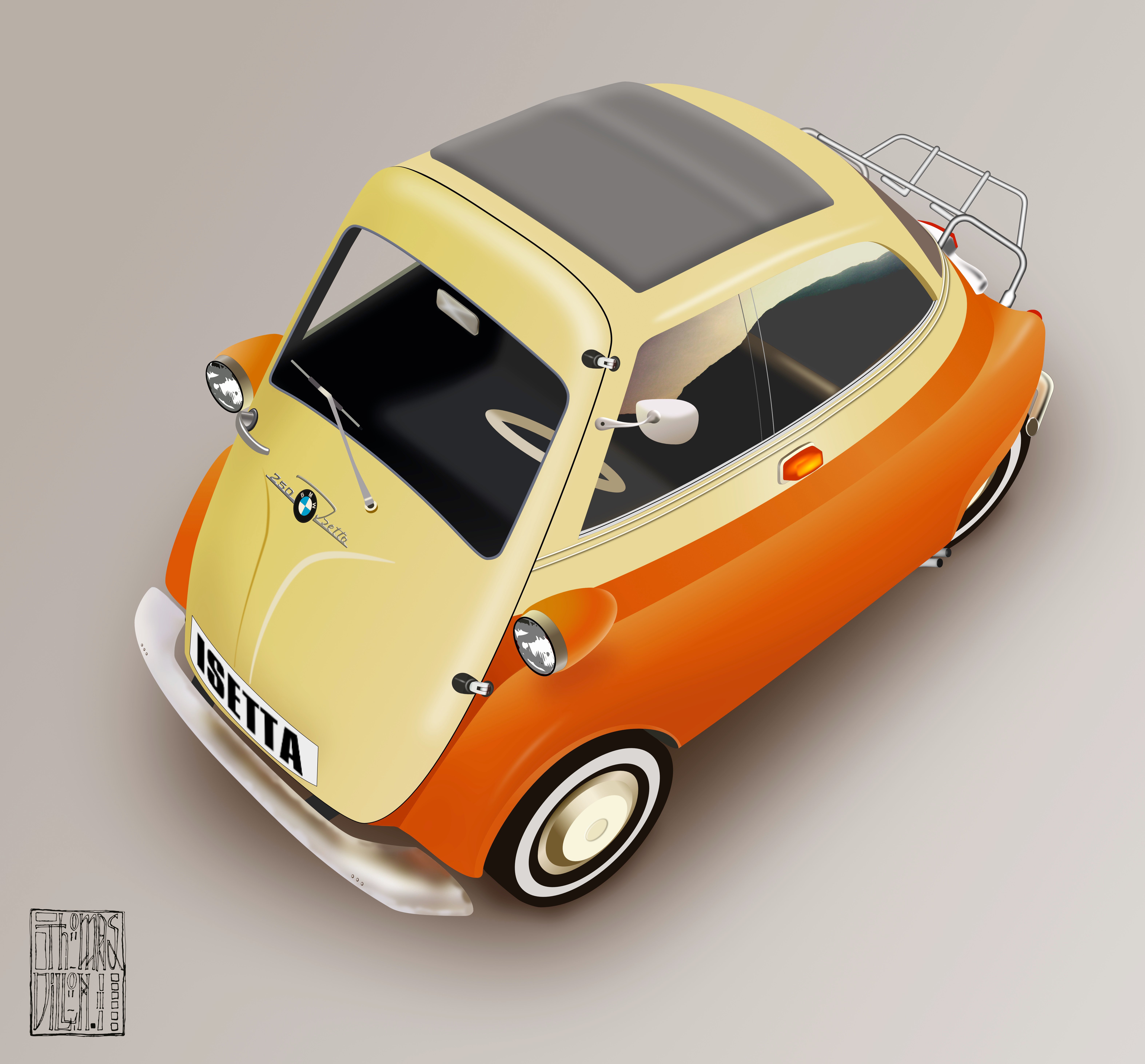
This is a model. But with plastic mirror, windscreen wiper and door handle missing and the luggage rack at the back bent and twisted, I finished it by referring to photos of a real Isetta.
-

Idml editing easy but not obvious
tom d replied to tom d's topic in Feedback for Affinity Publisher V1 on Desktop
Cheers d I was wondering what the orange lines were for. The problem I had was searching the help site. I didn't have the precise wording for the search that would drill down to a solution. I tend to learn stuff by trial and error with a bit of intuition. And even the things that don't work teaches you something sometimes. I think the way you can edit master page items on specific pages is brilliant. It was worth the effort. Thanks for the info. And your attention. Cheers, Tom -
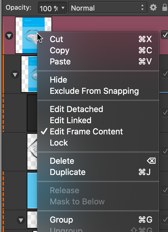
I had major problems getting a solution to this. Imported Idml files were imported ok but I couldn't get any tweaks done. None of the layers were editable. But I found out that if you right click on the original layer the pull down menu changes, giving you the edit options. Edit Detached was the one I was looking for. Now everything works and the fine tuning needed after import is a breeze. There should be a tutorial on this. Many gnashed teeth, much wailing and lots of time got me this solution.
-
Highlight current brush and pen pressure as a default setting
tom d replied to Caliente's topic in V1 Bugs found on macOS
I have a similar issue. I'd like to save the style attributes of my pen or brush into the style panel which is possible but I have no idea how to reload them to my current pen or brush. -
additional persona suggestion
tom d replied to tom d's topic in Feedback for Affinity Designer V1 on Desktop
You're right, export will rasterise it. But while it's an .afdesign file it will always be a vector that can be edited. It's just a workaround until or if a mesh/perspective tool appears. -
Refinement of white inlay and better colour
- 3 replies
-
- 4
-

-
- semi-accoustic
- guitar
- (and 1 more)
-
additional persona suggestion
tom d replied to tom d's topic in Feedback for Affinity Designer V1 on Desktop
ralisdaum This guy has a handy work around for non-destructive vector perspective. It's quite clever and I've used it. Check it out. It's towards the end of video. Rory Townsend. https://youtu.be/UQc9IPUkMBc -
I think you're right
-
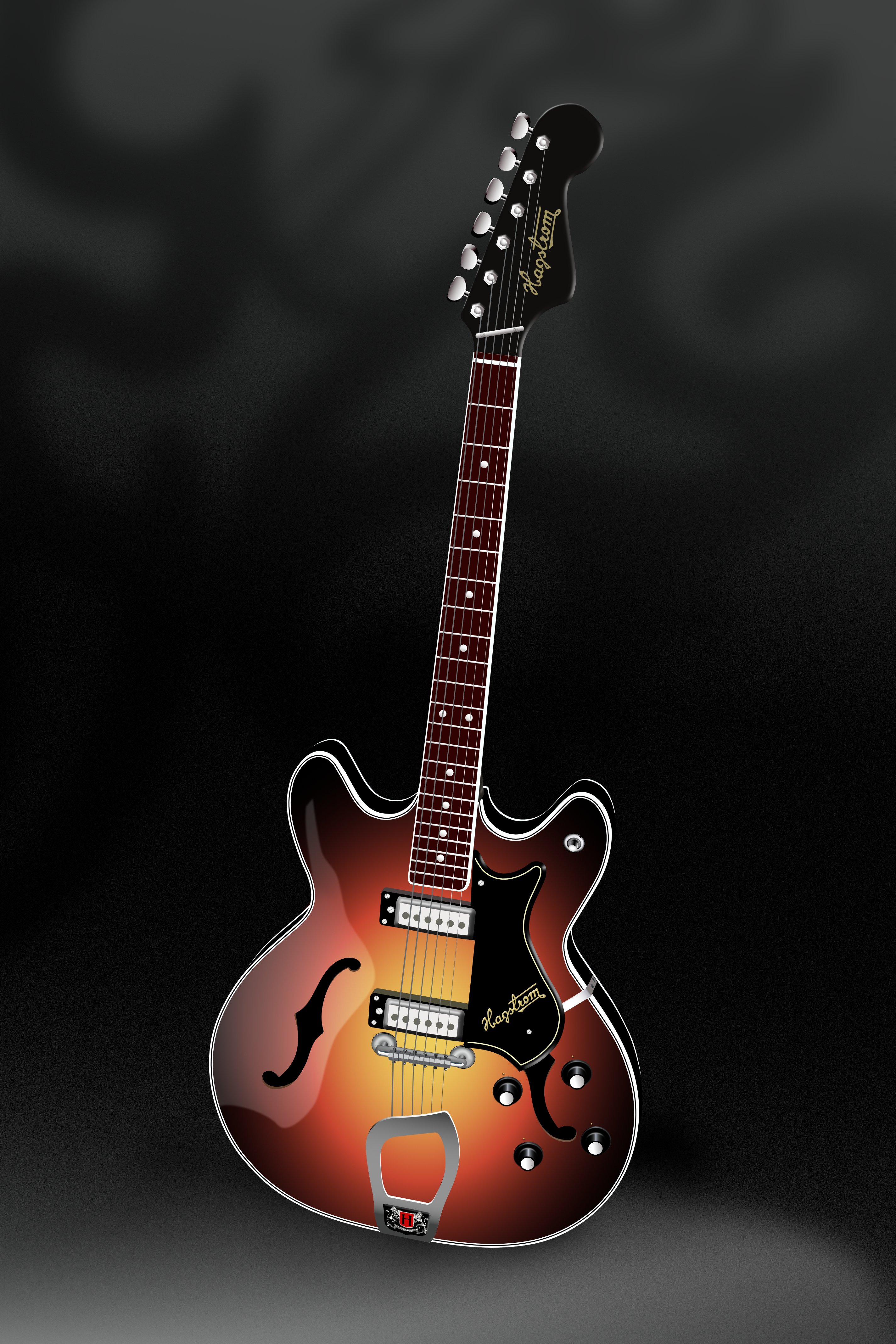
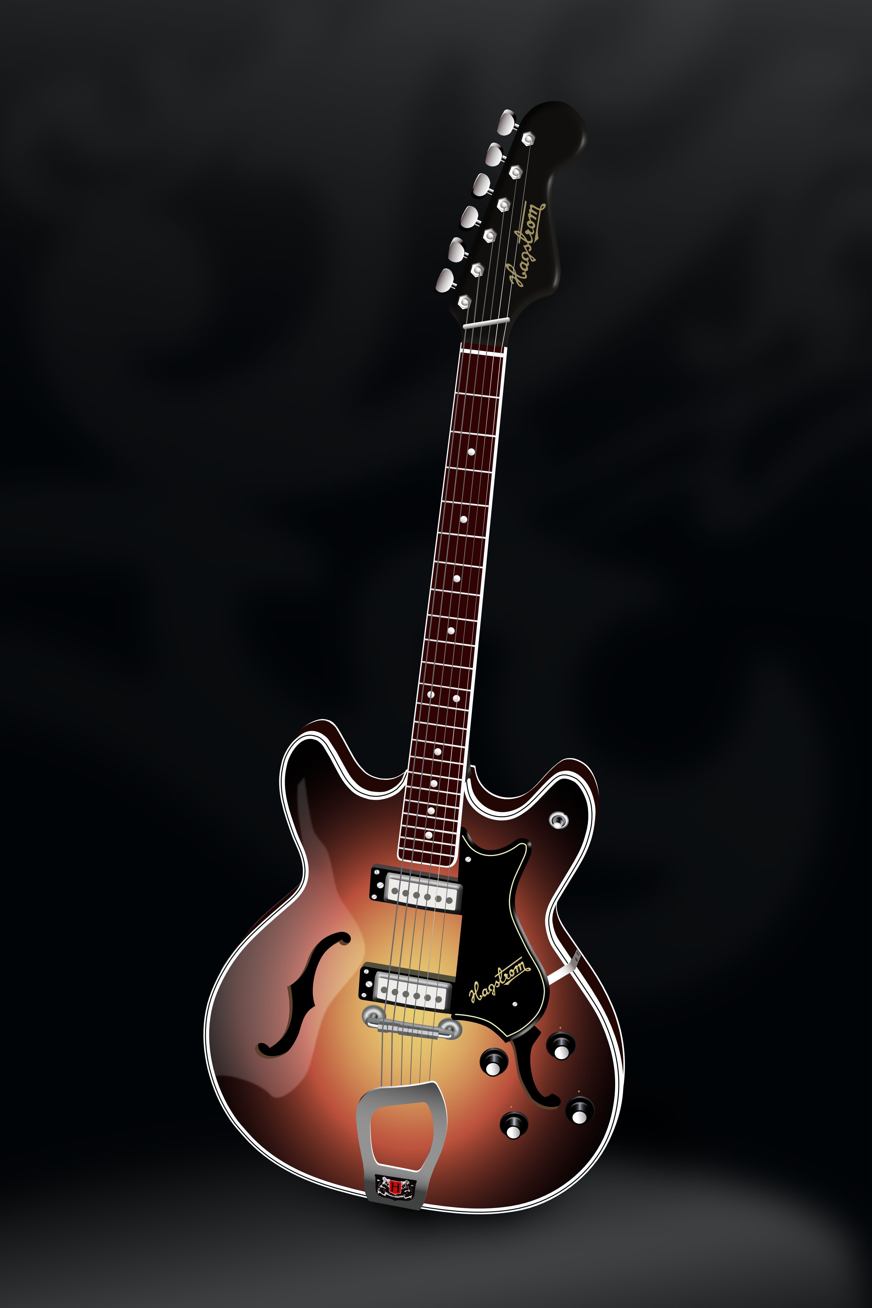
Thor’s Axe. This is my Swedish made Hagstrom Viking. It’s a vector drawing done with affinity designer on my Mac. If it wasn’t for the shutdown I’d never have done it. This is the kind of stuff I've been killing time with. Bet you didn’t know that Thor had more than a hammer.
- 3 replies
-
- 8
-
-
- semi-accoustic
- guitar
- (and 1 more)
-
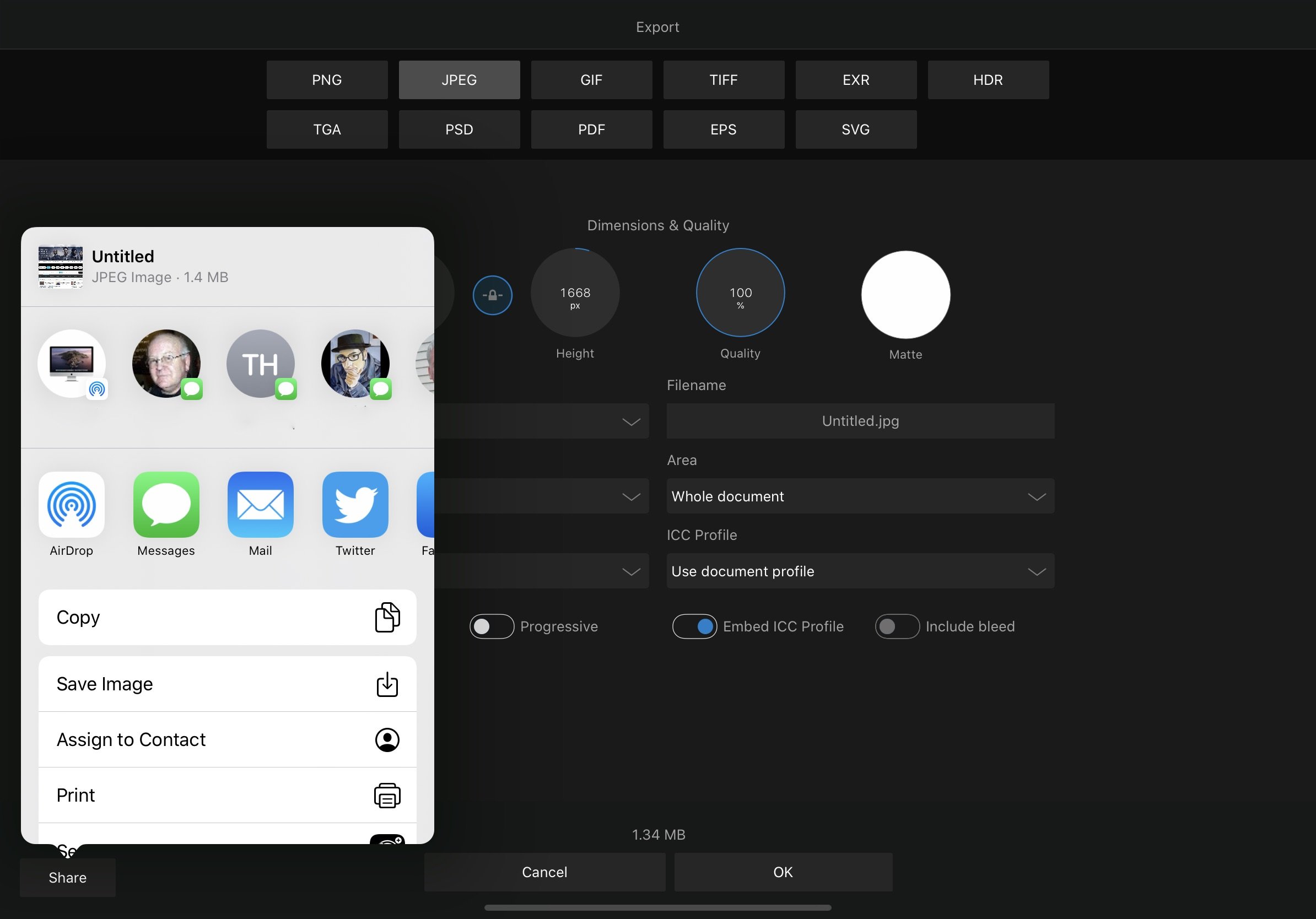
arezendes. It can be done. It's just not as obvious as other apps. When you take a screenshot on an iPad it will be saved to apple's iPad photos.app. Open affinity and press the plus sign to import an image. Then you should see 'Import From Photos'. Press that and you'll find your screenshot under 'Recents'. Press the image you want to work with and do your edits. When you've finished your edits use export. At the bottom left off the screen, you'll see a 'Share' button. Pressing that will give you options for direct sharing by mail, iMessage, social media. In the list below 'Copy' you can use 'Save Image' to place it in the apple's iPad photos.app as a modified photo alongside the original. I don't know why it doesn't say save to Photos. It seems a long way round but it becomes second nature after a while. Is this a solution for you?
-
I have frustrations with Designer. Auto-trace, Line/shape blend, direct single line segment selection, Vector image brush and warp/perspective. In illustrator, there's an outline pointer that allows you to work directly on line segments with copy and paste. This is quite handy. But instead of having a different pointer, we could have a new persona for line work. This persona could have (when they're available) the bitmap auto-trace, line/shape blend and knife tool and anything that we may need only occasionally. And it wouldn't clutter up the existing design persona, which is very elegantly arranged. It would also save you having more than one pointer (illustrator had three the last time I used it). The vector image brush like Inkscapes (although I would prefer Illustrator's random duplication) and warp could be added to the existing design persona without much detriment to its elegance.
-
How very useful. This has sorted out my problem. Thanks markw.
-
I had the same problem. For me it was a. type 1 font. True type and open type fonts work fine
-
PDF Export Jumbled
tom d replied to waynenoel's topic in Pre-V2 Archive of Affinity on Desktop Questions (macOS and Windows)
I get this too. I found that it seems to be related to the font. If your using Mac, check the fontbook app for errors in the font. Type one fonts can become corrupted over time. In my case it was Mgillsans from monotype which has been hanging around my system from the time I had a Classic2. I switched it to adobe gill sans and that works but I had to sort reflow. The same issue happened with Univers which was also really old. First try another font to see if it still happens Hope this helps. Out of interest does this error show in acrobat or when you re-open the pdf in affinity? -
I figured it out. The eps option needs to rasterise the graduations. This has to be set in the more menu under rasterise unsupported properties. The pdf setting had that, eps export didn't. I recreated the logo with the same colours and similar typeface capital style remake.afdesign and then exported to eps capital style remake.eps. I also used Inkscape for the same process and this seems to be just how eps files deal with graduations. so there is nothing wrong with affinity designer. It was a missed option all along.
-
Thanks Old Bruce, These files are 2 decades old (we are both old). And to tell the truth they never reliably worked. There'd be discoloured banding that looked awful, parts of the the graduation would disappear, showing the red background colour and this would happen randomly. I even remember rejecting proofs because of this and then checking the logo and wondering why the designer chose to do everything the hard way. It's like he chose not to do it elegantly. The tech might have been new to him. I wanted to maintain the integrity of the original format because that's how it was imported to the layouts that were originally Quark Xpress files that were then converted to Indesign. I don't want to open and edit them. I want it to place it in a document without dropping the masked graduations. Affinity suite won't play but everything else will now that I've cleaned them up.
-
Buckle in, this is going to be complicated. I have an issue with a logo that was created using illustrator. It has gradient fills masked by outline of letters. The logo wasn't created by me but I did use it for a job. I used adobe Indesign and illustrator to do the finished layouts and saved them as eps files. The logo construction is a mess.No-one would do it this way now. The original eps of the logo displays correctly in preview but drops the Graduation and mask for designer.GLONLC.EPS. I believe that it will open and display OK on illustrator but I don't have that app anymore. But for affinity designer I reconstructed it, reducing the complexity and generally cleaned up the untidiness of itGLONLC.afdesign. But affinity designer still drops the masks when reopening after exporting to eps. Preview still displays it correctly and inscapes opens it and displays and exports it correctly so that it can be opened in designer without the issue of dropping masks. GLONLCink.eps I think this is a bug. Or I am missing an option when exporting?