

lacerto
-
Posts
5,783 -
Joined
Posts posted by lacerto
-
-
I have not followed the full discussion but only part (and using Google translate as my command of German is at level of my high school days several decades back), but because Firefox and Display P3 were mentioned, want to point the following. [Sorry for not Google translating this in German, but it is complex enough for someone not speaking native English to write about these kinds of things in English.]
As long as I know Firefox does not have by default have full color management turned on so it is possible that it shows full display color gamut for images not color managed, while e.g. Chrome would force sRGB for these kinds of images.
When full color management in Firefox is turned on, the settings look something like this:

If color management is not turned on, Firefox would show RGB images more saturated on a wide-gamut display (like Display P3, Adobe RGB or displays with yet more wider color spaces) than viewers that would force sRGB for non-color managed files (meaning that sRGB color profile is simply just assigned). On macOS screenshots are typically saved in a .PNG file and the system display color profile is embedded. I am not fully aware of recent development on macOS platform but on my MacBook Air M1 the display color profile is currently Display P3 and this is what also gets embedded in screenshots. Display P3 is a wider color space than sRGB while I think that the display in my mac model is not capable of showing more than (approximately) sRGB color space, and I recall that originally (using previous operating system versions, like Big Sur that initially came with the computer), the embedded color profile used to be called just "Display". Because I cannot test this on my mac, I cannot say whether macOS actually converts a wider than Display P3 color space to Display P3, if necessary, or if it simply just assigns the profile (would assume so), but in both cases, it is possible that a non-color managed RGB image shows more saturated colors on a wider than Display P3 color gamut display when viewing it in a non-color managed Firefox (or any other non-color managed app), than what happens when a screenshot of the same image saved by embedding Display P3 profile in it shows when opening it in a color managed app like Affinity apps.
Having a wide gamut profile embedded in a screenshot is somewhat confusing since it is of course clear that just embedding a Display P3 profile in an image does not make it wide-gamut (> sRGB) on a system where display is limited to sRGB or lower (like my MacBook Air M1), and I do not know why this now happens -- perhaps all modern macs now come with displays that are capable of showing full Display P3 gamut (and if there are wider-gamut displays, they by default are configured to be limited to P3)? On the other hand, this is basically in line with what Adobe has done for years when using Adobe RGB as the default RGB profile within Adobe ecosystem.
On Windows making a screenshot normally captures raw image color values (the full display color gamut) so the typical workflow on a wide-gamut display on Windows is to paste a screenshot by using the monitor color profile assigned to the captured image (when pasting it) and then converting it to some generic color space (like sRGB, Adobe RGB, Display P3, etc.) to be more generally communicable. Color managed apps typically have a user-definable behavior for dealing with non-color managed images so e.g. in Adobe apps non-color managed images would by default have Adobe RGB color profile assigned to them, while in Affinity apps the default working RGB color profile is by sRGB, meaning that the same non-color managed image pasted in a system capable of showing wide-gamut color could in Adobe apps show more saturated than in Affinity apps. On Windows, to have matching colors (raw display color values) on a non-color managed Firefox (or any other non-color managed app, since Windows OS itself is not color managed), and in a color managed app like Photoshop or Affinity Photo, would require that the pasted image is assigned with the monitor color profile (e.g. a calibrated profile used as the system display color profile).
On macOS, where the operating system GUI itself is color managed, this might actually be still more complicated (and apparently simpler), so with hardware that I have available on macOS, I am not too sure that what I have explained above is accurate, at all 🙂 But it does explain what I can experience on non-color managed Windows GUI (Pro 11) with non-color managed and color-managed Firefox on a wide-gamut display hardware assigned with hardware calibrated system color profile.
-
4 hours ago, TrinityO said:
Thank you so much for this visual footage.
You're welcome. I later printed this from Adobe Acrobat Pro onto my local printer on an A4 sheet, and the distances remained at 5mm throughout (180mm total from first to last point) so there is nothing wrong with the PDF. I would check two things: that you do not accidentally have scaling down to paper size other than Letter on the second tab of your Brother driver, and that if you have multiple trays, there is no setting that forces feed from a wrong tray (automatic selection might also fail sometimes so forcing paper feed manually from the right tray might be worth a try).
It might also be useful to check that you do not have wrong default paper size set in the printer's own control panel (which you should be able to access also via browser). I have noticed that sometimes paper size selections made via driver or manufacturer's own printer app do not "take" (I am not sure if this is something that is related to ongoing changes in Windows 11 OS -- I have recently had all kinds of minor issues with my newish Xerox color laser printer which make me wonder if this company really has what it takes to get ink (toner) on paper, somehow I have assumed so...). Anyway, these kinds of errors can often be fixed by restarting the computer, or unlnstalling and reinstalling the printer driver and the app (I have done this a few times already).
-
2 hours ago, TrinityO said:
I honestly just need someone to print out this pdf and tell me if it's not spaced in incremements of 5mm. My sister printed it out on her end as well and it's off.
Could it be that you are printing a letter size (8.5in = 215,9mm) document on an A4 sheet (=210mm) so what happens is that the printer software fits (scales down) the document on the physical page?
I do not have letter size paper to test this on a printer, but used Adobe Print virtual printer to do the job, and the distances are kept:
-
2 hours ago, DianeF said:
print dialog box in the Sonoma OS is different from the print dialog box in earlier versions. It is less clear how you choose which pages to print.
In a way it is possibly clearer and hopefully unifies printer interface so that it is pretty much similar to choose options for different printers in different apps. But changes of course require also new learning, and having minimalist scrollable options seemingly grayed out does not necessarily make learning easier! Also, the option for double-sided printing is not available unless you have at least 2 pages (which is of course logical but also might fool a user to think that the option is grayed out for the active printer in general).
-
As AirPrint and Sonoma are specifically mentioned, and the mentioned printer is also listed as one of the officially supported [AirPrint] printers, there might be point in consulting
https://support.apple.com/guide/mac-help/print-documents-mh35838/mac
....which basically shows the UI shown in my first post. But perhaps there is some printer-specific that causes that the option for double-sided printing is not available.
-
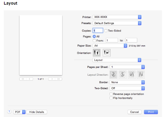
According to the HTML manual specific to your printer (and many other Brother printers), duplex feature should be available under the Layout options (Two-Sided), as follows (twice, first as a check box and then lower with additional options):
...but it might well be different under Sonoma.
-
I am not sure if I have done something to enable the feature, but whenever I select the Gradient Tool and start dragging within a selected object, the result is a linear gradient with start and end stops at ends of the dragged line (I tried to make elliptical, radial, or conical gradient as the default, but could not, so the app just seems to remember the last used setting document-wise).
- walt.farrell and ecureuil
-
 1
1
-
 1
1
-
8 hours ago, DianeF said:
Now, when I go to print with this printer, the option to print double-sided is no longer available.
Do you mean that the control for double sided printing does not exist, or that it does, but is grayed out and not selectable? What if you try to print from within other apps (e.g. Pages, or some other app by Apple)?
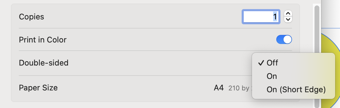
The issue is not related to OS, not at least Sonoma 14.1.2, since I have the following shown whenever printing from Affinity apps:
Sometimes availability of double-sided printing can be dependent on general printer settings, e.g. some printers might require that ability to print double-sided or from multiple trays is explicitly enabled in printer's "hardware" options, so I would check if such settings are available within operating system's Printers & Scanners settings.
-
On 1/14/2024 at 3:17 AM, nbk_haw said:
Is there a way I can auto-populate each cell to be numbered in sequence without any extra characters besides the number?
I would use Data Merge feature to fetch an autofilled number sequence from an Excel sheet and use Data Merge Layout control to specify the number of columns and rows per page, and then use a paragraph style so that it is easy to change formatting afterwards. An underlying table with an equal number of cells (columns and rows) could be used to add a desired border formatting.
After the data merge:
UPDATE: If the table to be created is something that is desired to fit on a single page, obviously the easiest method to have sequential numbering in a table would be creating an autonumber sequence in e.g. Excel or other app supporting this feature and then converting a number sequence to a table with desired number of columns in Word, LibreOffice Writer etc. and save it as a .docx file and then import into a Publisher document. Using the data merge feature would allow creating multipage table-like constructions and complex designs with multiple items placed per cell.
-
In Excel sheet, I would define both visible data fields and more complete link fields that can contain e.g. mime prefixes like https:// and tel:, and for email, could additionally contain subject and message parameters (or group multiple email addresses, cc and bcc addresses):
When setting up data merge, you would then extract both the visible fields, and then select the data merge field and use Text > Interactive > Insert Hyperlink, and pick the appropriate data field where you have the link format:
When you merge and export to PDF (enabling inclusion of hyperlinks), you will get this:
-
More importantly, there is not even backward compatibility so there is no way to save in v2 apps an Affinity document that could be opened in v1 apps. Only awkward workarounds (like saving in PDF or SVG format, or copy pasting via Clipboard from v2 to v1), and hoping for the best.
-
Please post some further information on the document you have and what the printshop requires.
I wrote lengthy instructions for diverse cases but accidentally lost the text before sending it, and do not want to re-create the post. The instructions depend on whether what you now have is in CMYK/8 color mode (and you have color photos in the job, and/or native shapes and other elements defined in color), or Gray/8 color mode, and whether what you need to output must be in CMYK or Grayscale mode, and whether the printer requires a transparency flattened PDF (or possibly a PDF/X based PDF).
-
3 hours ago, Eisbar said:
If I create tonal values from the Spotcolor, then the individual tone values are created - but converted into process colors. But it would be very practical if these tonal values were defined as a percentage of the spot color. (So print density, ink application)
I may have misunderstood something so if you have questions, please post comments and I try to answer.
A spot color (or any other color) that serves as a master (parent) must be marked as a global color swatch to be able to serve as a parenting color. All tones that are children of a master retain this relationship so for user-defined global colors (including spot colors) if the master changes, the children change accordingly; however, the library based spot colors cannot be redefined:
Tints of a spot color (whether library or user defined) however show correctly as shades of parenting inks:
Note that unlike in InDesign (and possibly other layout apps), you cannot use a tint of a spot (or another global) color as a base and parent of sub child swatches (and still dependent of the original master) so the dependencies can only be direct master-children based within Affinity apps. Affinity apps also do not allow replacing one global color with another, and inheritance of tonal dependencies, so the ways you can benefit of master-children dependencies in Affinity apps are rather limited. -
1 minute ago, Dan C said:
personally I'd expect both '@' and '%40' to be supported
")
Yes, it is not clear why this changed (but is still supported when entering multiple receiver addresses) -- perhaps it is related to just requiring in actual parameter part only valid url-encoded special characters, and accordingly spaces, too, needing to be encoded (version 1 allowed space characters e.g. in at least the subject parameter).
-
This topic has been discussed multiple times on the forum, to some depth e.g. here:
For Windows users, it is probably easiest to use G'Mic plug-in and Photo. GIMP itself can be used for this, too (both to produce palettes and reduce colors with palettes).
If Affinity app alone is wished to be used, then using Gradient Map, Posterize (with exact number of colors specified) and Black and White adjustments in this specific order can produce something similar (with exact number of colors and no shades in between). An alternative is using LUTs.
The result of course is not an indexed image because they are not supported in Affinity apps but the effect is similar.
Searching the forum using e.g. the following keywords should result in some hits: indexed, palette, palettized, color reduction, quantization, posterization, colorization
-
On 1/10/2024 at 6:46 AM, Sirajum Munir Galib said:
I am also facing this problem with object that has a opacity gradient.
If you export using PDF (any other than PDF/X-1a or PDF/X-3 which flatten live transparency), you should be able to export gradients containing <100 opacity values without causing rasterization. The objects will show as "Non-Native Art" in Illustrator (at least CS6) if you have only two gradient stops. But if you have three or more, they show as gradients also in Illustrator (even if the transparency is achieved with a transparency mask rather than gradient stop values with an opacity percentage).
-
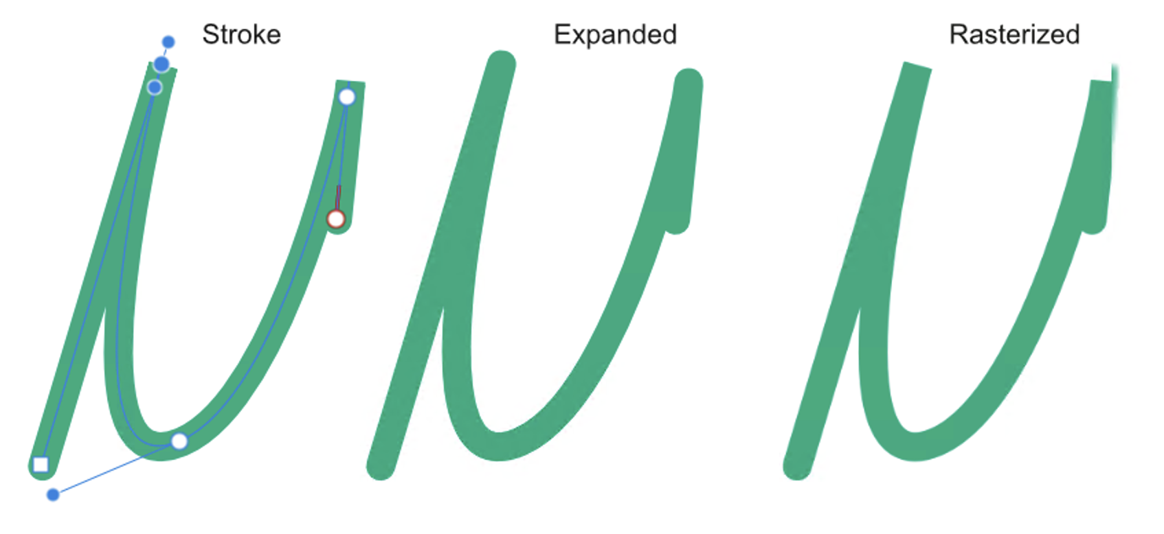
Related, but a bit off-topic: expanding a stroke can deviate from what is seen on canvas also in diverse situations where stroke parameters are somehow extreme or untypical (e.g. abrupt smart nodes with bevel joins). In these kinds of situation rasterizations typically give what is rendered on screen while expanding gives what will happen when the stroke is exported to vectors (in OP's case the opposite is true: exporting to vectors retains the visual rendering).
It is also interesting to compare how different apps do expanding. E.g. in VectorStyler the resulting shape at least in auto-expanded strokes can be dependent on current zoom level (accuracy of rendering on canvas). In CorelDRAW (2023) expanding strokes often causes distorted shapes. Illustrator (CS6) appears to outline paths generally as rendered but similarly as Affinity apps struggles with untypical node type + attribute combinations and might produce three different versions (when rendered as stroke on canvas, expanded, and stroke exported as vectors).
-
15 hours ago, Dan C said:
I'm getting this logged with the team now, as it may be an oversight of the panel, rather than a decisive removal
@Dan C, I just ran another test, and if you replace the @ signs in cc and bcc with %40, all the mail fields work fine, and you can have multiple receiver addresses marked with @, so having
email@address.here.com;another@mail.com;third@testing.com?subject=This%20is%20a%20test&cc=secondary%40mail.com&bcc=hidden%40mail.com&body=This%20is%20body%20textentered in the Email-type of Hyperlink box, gives you this:
The screenshot above is from macOS Mail (Sonoma 14.1.2), but it works the same on Windows (Outlook in latest Office 365 on Windows Pro 11 tested).
So the only difference to version 1 seems to be that in version 2 the additional parameters &cc and &bcc require the @ sign to be url coded as %40.
-
1 hour ago, DJP said:
So I wish there were a better solution.
These kinds of problems often require manual work and some "cheating".
We have done lots of books and basically always aim at "full columns" for flown (continuing) text so I get your point, while I also agree that these things can be a matter of personal preference and taste -- sometimes they can also be kinds of house rules, and then you just need to show your professionalism and try to achieve what is asked.
Often problematic layouts require adjustments made to preceding pages and can be time consuming before a satisfactory result is achieved, but when working with ragged text alignment (as in your glossary example), you can often get columns evened out by forcing extra line breaks without visual distortion (it does not matter even if you occasionally have clearly shorter lines). A common cheat is also widening or narrowing columns (just make sure to keep the alignment with header and footer elements, and if necessary, change their positions spread-wise -- this can of course be easily seen when browsing pages in a PDF viewer, but this works just fine in a printed product. It is also perfectly fine (IMO) to make exceptions and add extra space before headings (like glossary capitals).
I would also clean those ending "to"s -- not necessarily each and every instance, but especially when something like this repeats, it becomes a disturbing pattern. In a glossary context I would probably always tie "to" to the following verb -- splitting a clear infinitive definition seems just "wrong".
-
49 minutes ago, Dan C said:
it appears as soon as there are multiple '@' symbols within the Hyperlink, Publisher deems this invalid
Note though that it (both versions 1 and 2) still accepts multiple email addresses separated by a semicolon (the delimiter might depend on regional settings?) so it is not just the number of addresses as parameters, but possibly a deliberate omission of cc and bcc fields (probably not very often needed, though bcc can be quite convenient sometimes).
-
Perhaps there is some reason for making this feature less powerful in version 2, but at least in Windows 1.x version (1.10.6), the full email url syntax was still supported and worked without any obvious issues:
Note how in the body part even line break works. Perhaps there was some security concern, or possibly IDML compatibility based cause (as InDesign only supports the sender address and subject line)?
-
24 minutes ago, walt.farrell said:
True. Some viewers have an option to examine the text and "invent" links for things that look like they should be linked.
Yes, e.g. Acrobat Reader. But in case of tel: link, the link works as it is, so the link physically exists and works as it is, so there is no assistance on behalf of the app itself when it invokes the app call, it basically just passes what is given, what it recognizes as a link, so what happens, depends on the system configuration. So in Adobe Acrobat Reader, app call is invoked based on existing link, whether app based link generation is disabled (like it is below):
But when clicked, Adobe Reader will require document-specific acceptance from the user before actually passing the call.
In the following link are formal specs by Nokia from year 0, and also examples, so the link above is formally correct:
-
1 hour ago, walt.farrell said:
But, from a PDF, it may depend on what PDF viewer you use.
It may be so, but e.g. in Adobe Acrobat Pro and Reader, the link works as it is, without Acrobat needing to generate a link, and where ever I have tried this, the link basically invokes something like this (this time in Firefox):
...both on Windows and macOS, so the link itself seems to be syntactically correct, and if an app is configured to make a call, this will happen. But it may of course be that some PDF viewers do not invoke an app call, or that making this to happen requires a supporting app preference, or user-confirmed system security agreement, or that the system ignores the call if there is no calling device configured. But e.g. Windows will suggest downloading Microsoft based Windows store apps that allow creating such configuration if it does not already exist. On macOS it may be that only Apple mobile devices are supported...
-
15 hours ago, Callum said:
Would you be able to provide the .afpublisher file used in this demonstration so I can log this issue with our developers?
I seemed to have deleted it but re-created it now based on a generated PDF and the one attached below should behave similarly (it was initially a Designer 2.3.0 file but this one, created with 2.3.1, still seems to behave similarly, so [a PDF export created from ] it opens fine in Inkscape but a bit confused in Designer 2.3.1).


Farbabweichung beim Import
in Affinity on Desktop Questions (macOS and Windows)
Posted
I checked this now and the color gamut on my MacBook Air is slightly wider than sRGB. I had not noticed that because by Windows laptop has a wider color gamut and I had just assumed sRGB on my mac, which is also not hw color calibrated. Anyway, the embedded color profile used to be called just "Display" in earlier systems but I never examined it closer and now do not seem to have a profile with that name on Sonoma any longer.
As for Firefox, I now downloaded it on my macOS Sonoma and it seems that nowadays (at least on macOS) the default in FIrefox, too, is, similarly as on other browsers on macOs (Safari, Chrome) a fully ICC enabled color management. But depending on user's setting, I think that what I described above is something worth a check, and is a fully reproducible recipe for getting this discrepancy when using non (or partially) color managed apps on a > sRGB capable display, taking screenshots, and pasting/opening them in fully color managed apps (like Affinity apps).