Nazario
-
Posts
316 -
Joined
-
Last visited
Everything posted by Nazario
-
Crash Report: Reorder swatches in panel
Nazario replied to Nazario's topic in V1 Bugs found on macOS
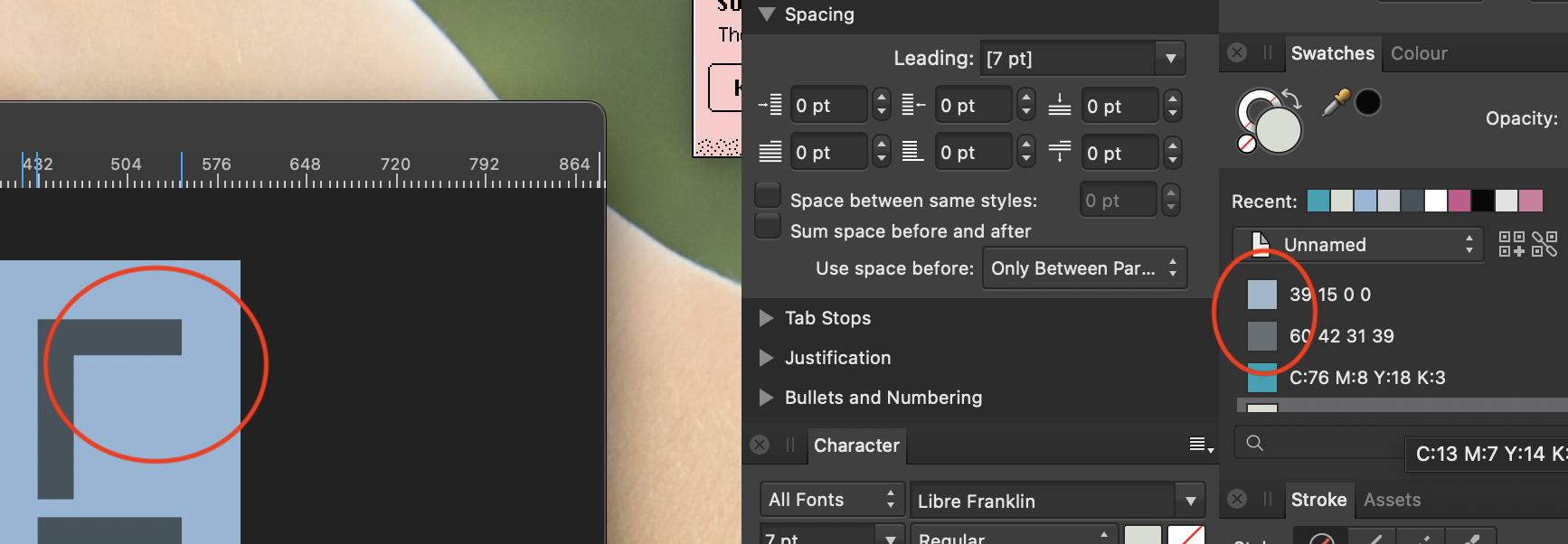
Hard to see in the screen shot but the elements on the page are a different colour to the swatches in the panel. If you colour pick the highlighted light blue in the palette and the element on page on the left you will get two different hex values. Some colours its a big difference. This is on a CMYK document. Yes I understand im looking at CMYK through an RGB spectrum but the colours should match on screen at least.
-
I've never been able to reorder the swatches in the swatch panel without Affinity immediately crashing to desktop. Please can you finally fix this as its very frustrating. Also you REALLY need to fix the mismatch between the colour of the swatches and what you actually see on the page. The difference is vast even when working in a purely RGB set up. The problem is then compounded when using tints of a colour. You just don't know which swatch is which without either having to have list view active showing the actual code/name. Crash report for reordering issue attached. crash.rtf
-
PDF import crashes to Desktop
Nazario replied to Nazario's topic in [ARCHIVE] Publisher beta on macOS threads
1.8.6 is to bring Big Sur and Apple Silicon compatibility. -
Just realised it changing the selected page not the one I'm viewing. Makes sense but do you not think the page being shown in the view port should auto select as the active page? I mean you cant really edit a page you cant see right? Or at least have a clue which page you are setting up guides on in the Guide manager.
-
No matter what value I enter into 'gutter' under column guides it always displays guides with 8.5mm gutter. 1.8.4
-
I agree with most of these points to get Affinity to a usable state. The duplicate point is a big one for me. You end up destroying your layout to get to the thing you want to duplicate then have to put it all back together again. Even in the layers panel its a pain in the ass. If you could drag an element first then you'd know that you have the right piece and you're already halfway to having a duplicate where you want before you even press option to confirm the duplicate on release. It's little things like this that REALLY make a difference in a workflow. I created a thread in feedback section about sorting out the colour palettes and posted a video of a guy taking nearly 4 minutes to add 5 swatches to a palette. We need to be able to drag and drop colour swatches from the builtin colour books into a SEPARATE document panel. It would then probably take 6 seconds not 4 minutes!
- 32 replies
-
- 2
-

-
- separations
- proofing
- (and 8 more)
-
I've recreated the designer document. Set up a 1px grid to make damn sure everything is aligned to 1px, recreated the logo from scratch and this time Im getting better results. There are only 32 nodes to check and every one is perfectly placed like the last file but this one is working AND its not appearing upside down in Photo afterwards! No idea what the issue was but its taken me since 8.30am until 415pm to export one logo to an acceptable standard.
-
Nope. Literally this morning I created the doc I sent you and thats all ive been working on trying to get an export from them that doesn't blur.
-
Can you provide the link please. The Designer view is the right way up I've now checked. I didn't even know you could rotate the view like that to begin with! When I open the exported file(s) into Photo they appear upside down. Rotate view indeed fixes the issue but why is it appearing upside down in the first place? If you can provide the link I'll send you the designer working doc and two exported pngs from it that both appear upside down in Photo. Also even with 6 decimal places and no 'half pixels' in the pixel transform window im still getting blurry exports. Take close look at the pngs when you get them.Maybe have a look at the designer file to see if i'm missing something with regards alignment? Ive spent all morning trying to export the same logo at two different sizes.
-
Thank you MEB. Never really clicked what that preference panel did but now you mention it in context thats a very powerful feature for high precision work. Pretty cool. A question however is why should 'move by whole pixels' be switched OFF? Sounds counter intuitive? Or is that just to counter the minute fixes after changing the decimal places? Oh and why does the exported image appear upside down in Affinity Photo after exporting?!
-
Yup done all that. Im a professional designer. Everything is pixel perfect in the app. Forced on, everything is created using exact pixels in the transform window, no hand drawn boxes etc. Everything perfectly aligned.
-
Designer at first but then Photo. Same result. Ive used the export persona and exported from standard persona's. Ie tried every setting bicubic etc and while there are slight differences NOTHING will export without being blurred.
-
How do I export an image without it being blurred? Im trying to export a very simple graphic with only straight edges and no matter what settings or formats I use every single one is blurry. As i cant use Affinity for my professional print work (see my other posts) I thought I'd have a crack at designing a new website and the graphics for it and literally the first thing I do, as is usually the case with Affinity, I hit a massive stumbling block that puts a complete halt to my attempts to adopt this software, 6 years on! I see numerous posts about blurry exports but nothing conclusive to fix it. I want to export what I see on screen, pixel for pixel, why cant I do that? When I try to open the exported file again in Photo to see how bad it is the image appears upside down too?! What is going on?!
-
Update: Some people have reported success simply redownloading the Easy Start HP software but that didn't work for me. Halfway through the installation the messages started appearing again obviously because they are now back on my system. Here are a couple of links for anyone interested. https://malwarefixes.com/hp-printing-problem-on-mac-will-damage-your-computer/ https://h30434.www3.hp.com/t5/Printer-Setup-Software-Drivers/HPDM-Framework-will-damage-your-computer/td-p/7824131/page/2
-
This has nothing to do with Affinity but I thought it worth sharing... Today (23/10/20) Apple updated its Xprotect anti malware list in macOS Catalina and as such has rendered many HP printers useless. MacOS now determines many of the frameworks within the HP software to be malware and pops up with a warning every tens seconds or so until you delete the offending files. Problem is you need the files to be able to print correctly and/or check on the status of your printer etc. There's a post over on HPs support website that is rapidly growing which only started today. Luckily I have a wireless printer (7110 Wideformat) with no scanner etc, its just a pure A3+ printer. As such I was able to uninstall ALL of HPs software and use the AirPrint driver to print. If you have printer with a scanner and email etc then the AirPrint driver is only going to allow you to print and nothing else. Apparently the HP software is still running on an old verification certificate which apple now deems invalid and untrustworthy so is blocked from operating. It looks as though until HP update said certificate many people will have issues with using HP printers on MacOS. Hopefully it won't be for long. Just thought id let people know and give a possible workaround until its fixed. Hope it proves useful, if not and it becomes redundant feel free to delete.
- 1 reply
-
- 1
-
-
Can't seem to edit a layer mask with paint brush
Nazario replied to Nazario's topic in V1 Bugs found on macOS
hmm... maybe this is why I really struggle to get my head around using colours in Affinity. Also Trying to reorder swatches causes a crash to desktop which I submitted quite a while ago. It’s still not fixed in 1.8.4. Maybe I have a very wonky installation regarding colours, swatches and panels?! -
Can't seem to edit a layer mask with paint brush
Nazario replied to Nazario's topic in V1 Bugs found on macOS
Haha thanks for spotting that too MEB I totally thought I was going mad. Sumpin' definitely wonky it's broken again after working after a restart. All I did was change the opacity in the slider Carl pointed out and now the paint brush no matter the colour is erasing the mask again. -
Can't seem to edit a layer mask with paint brush
Nazario replied to Nazario's topic in V1 Bugs found on macOS
I vaguely recall this happening in the past if im not mistaken. I thought it was me not doing something correctly and went back to Photoshop. Its working as of right now as I say after a restart, if it happens again I will let you know. -
Can't seem to edit a layer mask with paint brush
Nazario replied to Nazario's topic in V1 Bugs found on macOS
There's nothing selected. If there was should it not stop me from editing anywhere outside of that selection? i.e. you wouldn't see the erasing that is happening unless im within the bounds of the selection? A further note even if I right click on the Layer Mask and choose 'Edit Mask' it only 'paints black'. After a restart however it seems to work. File attached anyway. deaf_girl_gmap.afphoto -
Not sure if its me doing something wrong but im unable to edit a layer mask using the black and white paint brush?! Ive created a mask and now need to amend small areas of it so was expecting to paint white and/or black on it to adjust accordingly. But all that happens is I get is the mask being erased no matter what colour I use. Any one else have this issue? 1.8.4 movie.mov
-
While that is an interesting idea and one I would be greatly interested in, it would also open up a can of worms regarding people asking further questions in response to Affinity's responses which would take them away from fixing and/or implementing new features. For the sake of the developers, even though I would love to know the thinking behind some of their decisions, I don't think it would be worthwhile. That being said PDF passthrough would have been the first thing on my list to implement but thats by the by.
-
Please can we have a separate panel for the document colour panel and the swatches panel. Using colours in Affinity Publisher is a nightmare! How do you get a spot colour from the swatches book to your document panel without needlessly applying the colour to an element on the canvas first, then having to click back to your document panel (that you have to add manually) and then clicking 'add colour to palette'. As an aside in 1.8.4 on MacOS Add global colour to palette doesn't work so I have to jump through the hoops above then change it to global colour. Thats 6 clicks to add one single global colour to the document palette. Not including setting up the document palette in the first place and undoing the colour change to the element on the canvas just to help get the colour from one panel to the next. Having the panels all hidden behind a drop down menu is not efficient at all. We need panels side by side so we can simply drag and drop swatches between the colour books to the document panel. Ideally it would be beneficial if we could (if we wanted to) have all the colour books in their own panel all out at the same time. I have linked a YouTube video below to show just how poor the implementation is. This doesn't cover getting a colour from a colour book into the document palette but it shows getting 5 colours from a colour strip imported into Publisher. It takes him 3 minutes (with the video sped up!!!) to add 5 colours to the document panel!
-
I think in AI the gradients are shown as a gradient swatch and not all the individual colours/shades one could pick from the gradient. Obviously anything raster based wouldn't add the palette. How I see it (and I could be overlooking something here) is if you created a triangle for instance and then set the colour to yellow. A Yellow swatch would then appear in the palette (much like it does with recent swatches panel). If you created another shape and made it red. A red swatch would appear in the panel. If you edit either the red or the yellow triangle to another colour, that particular swatch could update in the palette as not to have an overly messy palette with every colour you ever created in the document. If you have two yellow triangles and you edit one to be green. Instead of the yellow swatch updating, a green swatch would be added to the palette so now you have a green and a yellow triangle and the corresponding swatches are available within the palette for consistent use through the rest of the design. You could then choose if that colour is going to be a global colour or there could be a default option for any colour created to be global which would then stop the creation of a new swatch when having two or more elements like in the yellow triangles example above. Obviously in that instance if you change one of the yellow triangles to green and its set to add any new swatches as global then the second triangle would update accordingly and no new swatch is added to the palette.. The current recents panel is only useful up to a point. Especially if you're experimenting and you decide to go back to a colour you created but initially discarded and it was more than 10 iterations ago (which is quite easily done when choosing colours and shades). So if my idea above works we could do without the recents panel and have cleaner more useful and optimised colour palette/panel and there would be a lot less faffing about adding colours and breaking train of thought. Think that makes sense but again like I said maybe i'm overlooking something whereby maybe it wouldn't work because X.
-
This is one reason why i keep saying any new document should open a new document palette and the colours should be added automatically to the palette when either created on the paste board or pasted onto pasteboard from elsewhere.
-
Crash to Desktop when reordering colours in palette
Nazario replied to Nazario's topic in V1 Bugs found on macOS
FYI this is still happening in 1.8.4. I don't have latest beta to check.