Search the Community
Showing results for tags 'Colour Profiles'.
Found 4 results
-
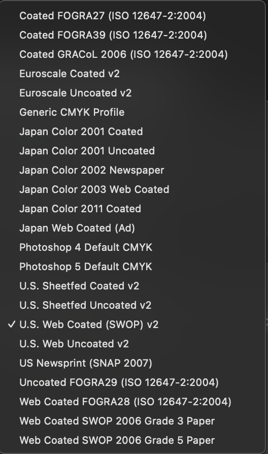
 Hi, I recently updated both Designer and Publisher to the latest version and I have noticed that the CMYK profiles ISO Coated v2 and ISO Coated v2 300% are now missing. Any idea why? (Is Euroscale Coated v2 the same as ISO Coated v2 - see attachment?) Thanks for any help anyone can offer.
-
 Hello, I came across another mystery. I have several Global Colours set in the document. But with one special text frame, these colours look differently. They're much brighter almost like they're in another color space. Please, help me 🙂
 -
 Hi This is a novice question, so please excuse my ignorance. I usually work in video production, but the company I work for has asked me to put together a promotional postcard for print. I have a "Brand" document that lists the correct colour values for the company logo (RGB, CMYK and #value). I know I need to use CMYK for print. My confusion comes from how to use the correct colour profile. If I import the brand guide PDF into Affinity Publisher it gets converted to the currently set colour profile. But now the colour values no longer exactly match the values I've been told to use. Of course, the same thing will happen if the printers then tell me to change my colour profile to something else. The colour values will change again. So my confusion is when do I actually set my colour values to be correct? Do I set the colour profile first and then adjust my logo colours to match the ones stated in the brand document or do I set the correct logo colour values and then convert the document to the desired colour profile? I'm also not sure what option to use in the document setup, "assign" or "convert" to colour profile. Any guidance gratefully received. Thanks
 -
 This is the sort of question to which I feel I ought to know the answer but... My monitor is an LG E2551, which is colour-profiled using an X-rite ColorMunki Display, permanently connected via USB, obviously, which monitors ambient light as well as requiring/requesting me to re-profile the colour output of said monitor once per month, which I do. So, I think the colours seen on screen should be "correct"? Using both AD and AP on Windows 10 I'm very uncertain about which colour profile I should choose in Edit>Preferences>Colour. Should I select for the 16-bit and 32-bit Colour Profiles the latest one created for the monitor, or should I simply use the defaults, or even, one of the several available created for my Epson Stylus Photo P50 printer? I'm simply attempting to be able to produce print-outs from both AD and AP that are as "close as possible" in colour to what I see on screen. Yes, I do understand the screen is RGB and any print-out is CMYK and hence "exact" colour matching is impossible, but I would like to get the two to be as close as possible! Many thanks for any advice offered. Jeff